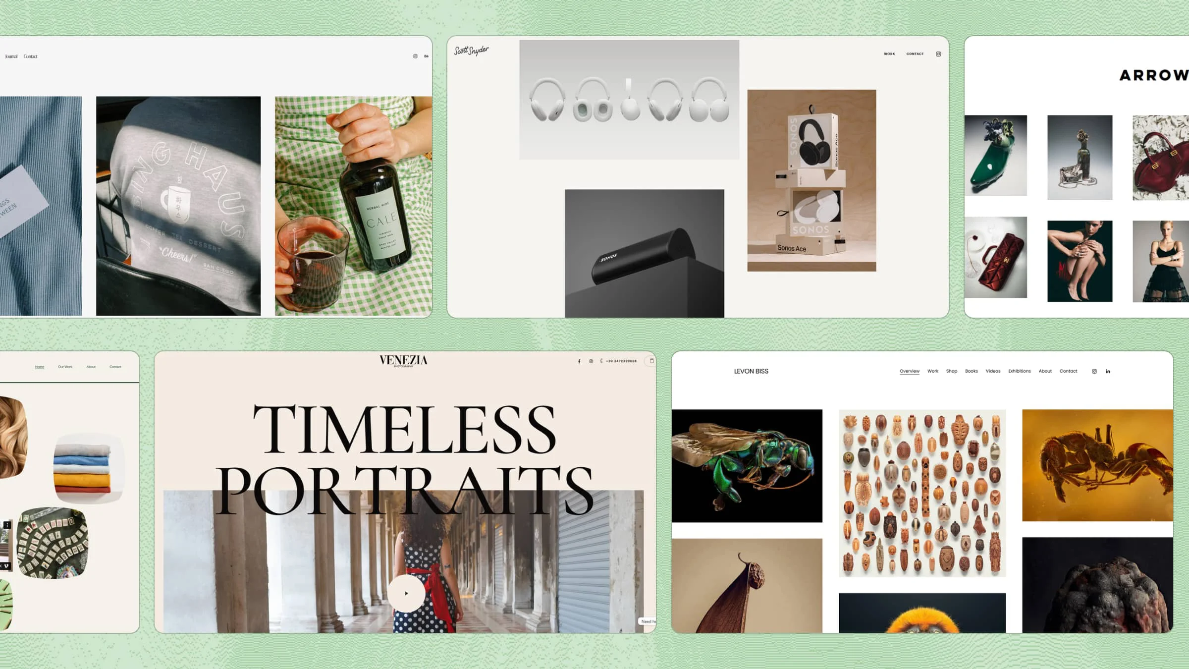
If your photography website does not feel as impressive as your photos, the design may be holding your work back. Finding a good balance between large images, simple navigation, and useful information is not always easy, especially when starting from scratch. Looking at photography website examples can help you see what makes a portfolio feel clean, creative, and easy to explore.
Overview of 15 popular photography websites
Choosing the right style for a photography portfolio can be easier when you have strong ideas to work from. Different layouts, image styles, and navigation choices can show you what works well for different types of photography. Explore 15 photography website examples below to find inspiration for your own website.
| Photography website | Photography type | What makes it a good example |
|---|---|---|
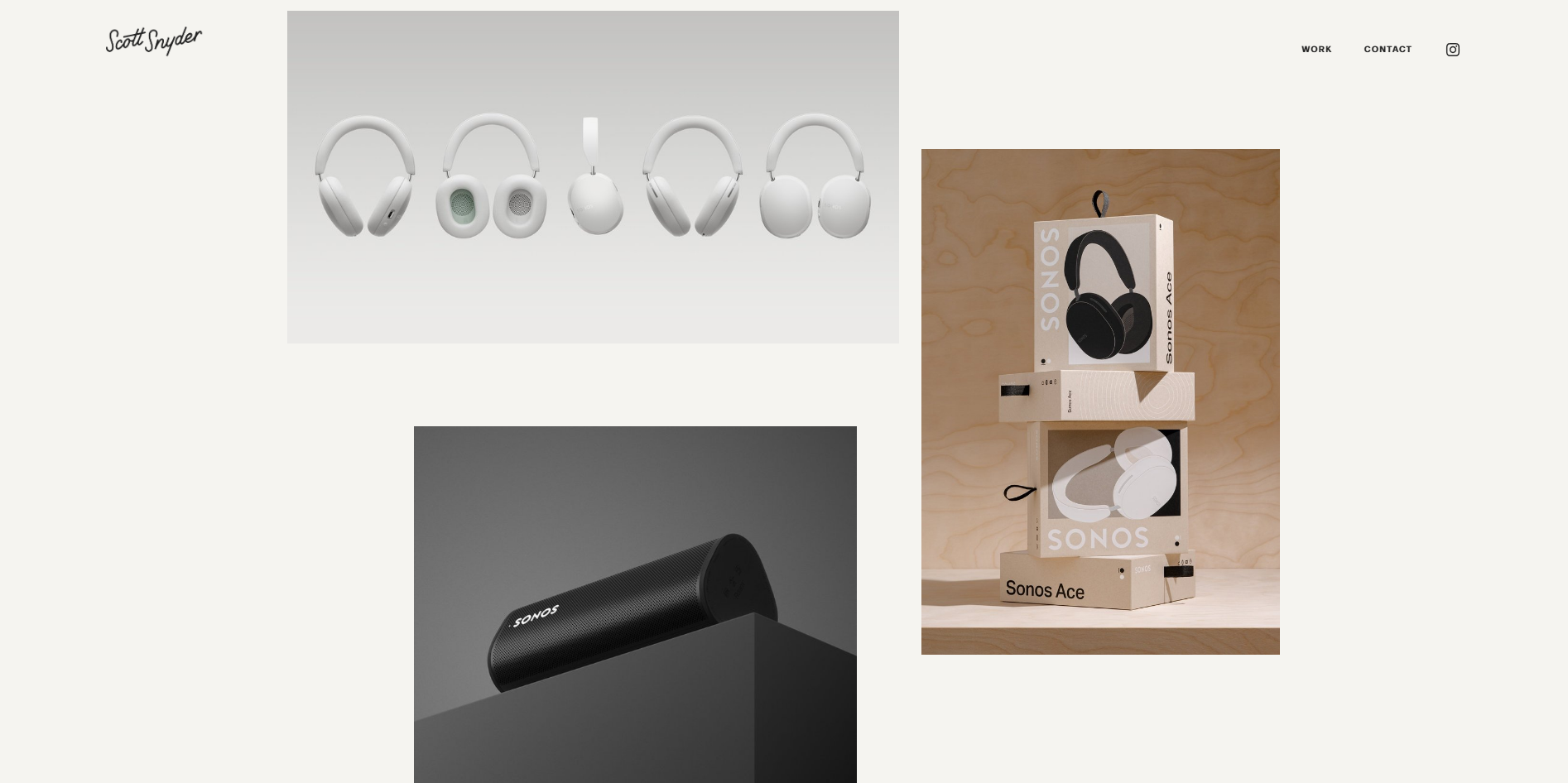
| Scott Snyder Photography | Product & object | Uses generous whitespace and a clean two-column portfolio to put the photography first, while individual projects provide additional context about the work. |
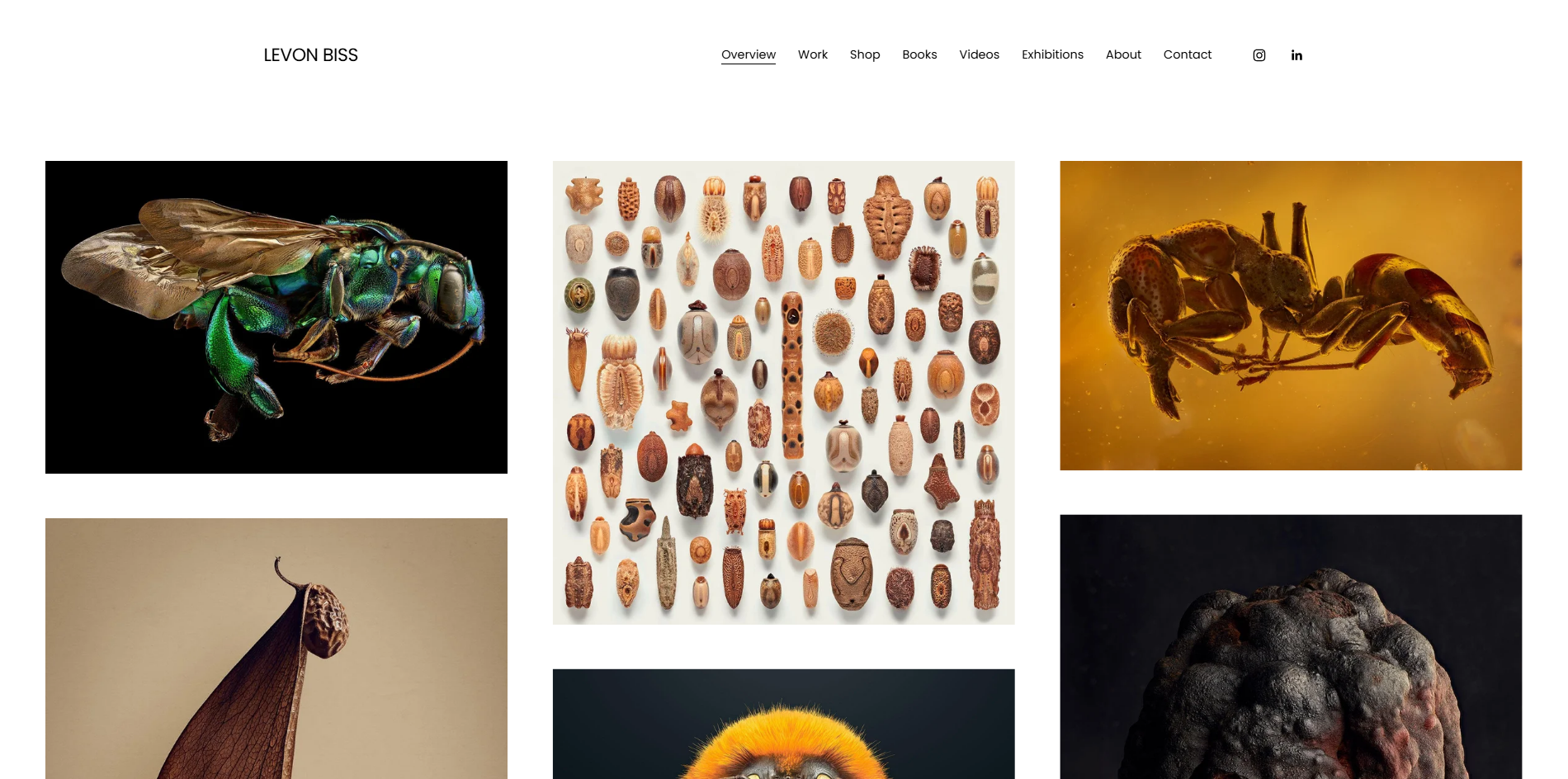
| Levon Biss | Macro & insect photography | Known for his Microsculpture project, which combines extreme macro photography with museum-style presentation to reveal intricate insect details that are invisible to the naked eye. |
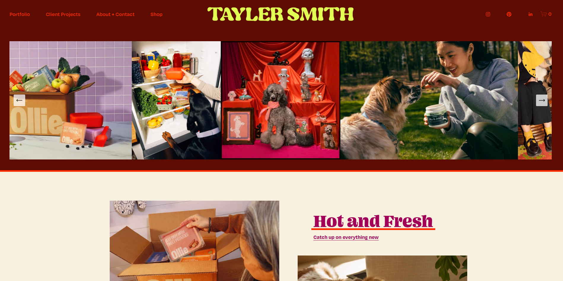
| Tayler Smith | Pet & commercial photography | Combines vibrant photography with bold typography and simple navigation, while organizing diverse work across pets, people, places, and objects for an engaging portfolio experience. |
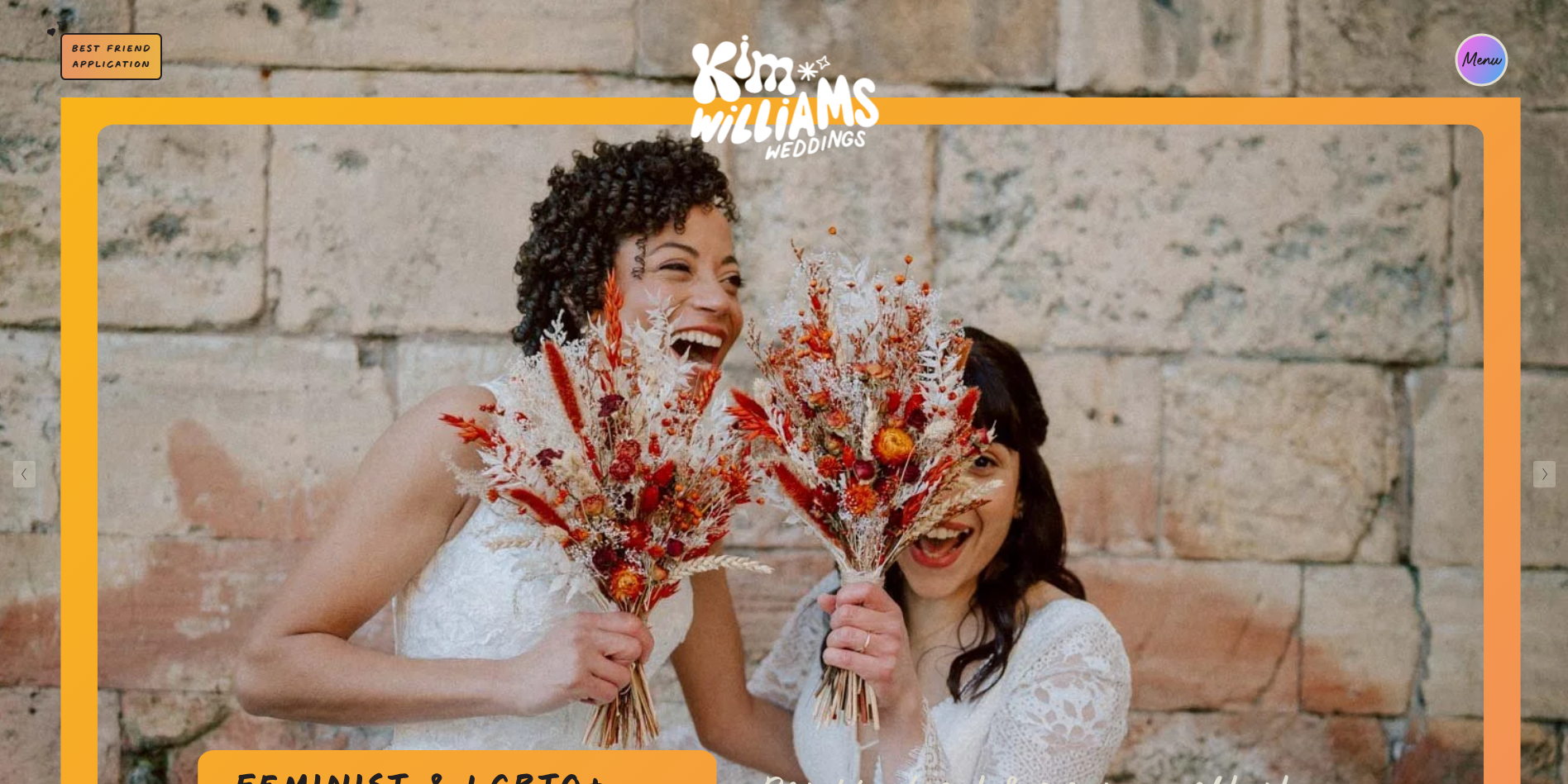
| Kim Williams Weddings | Wedding | Uses bold branding, candid photography, personal copy, and a clear sense of personality to appeal directly to couples looking for a less traditional wedding photographer. |
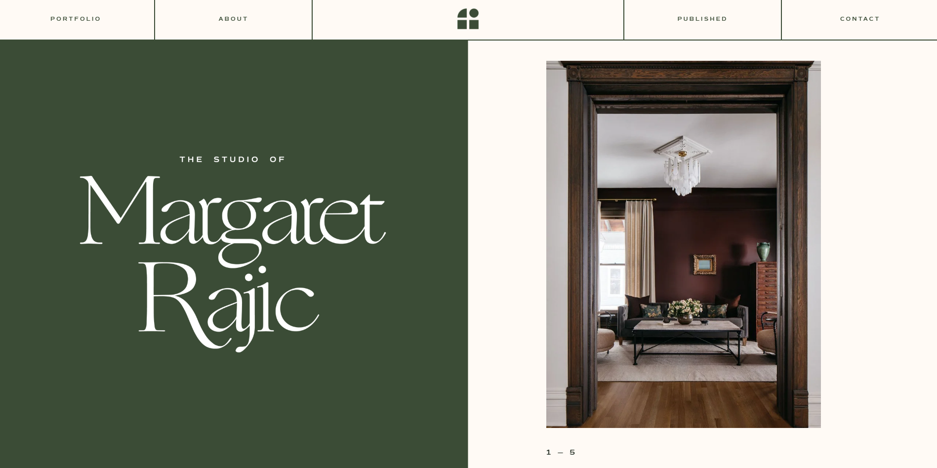
| Margaret Rajic | Interior | Combines elegant typography, restrained colors, whitespace, and subtle scrolling effects to complement polished interior photography. |
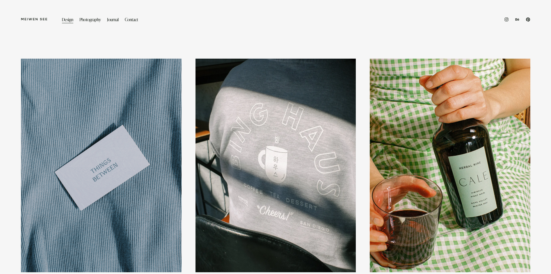
| Meiwen See | Travel & editorial | Keeps the homepage minimal with selected projects and a short introduction, then uses a structured portfolio to showcase photography alongside design and creative services. |
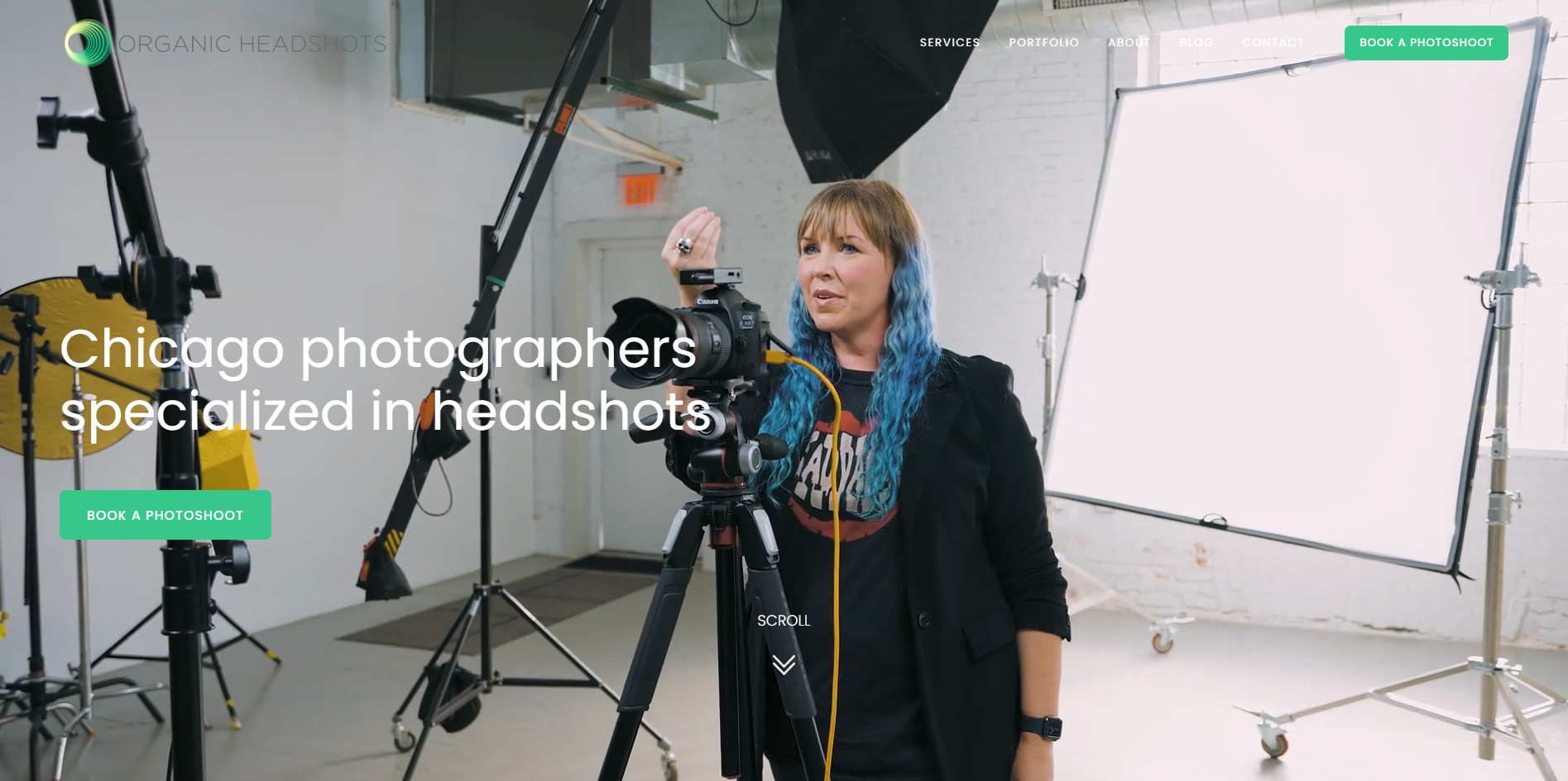
| Organic Headshots | Headshots | Makes its service immediately clear through strong imagery, video, pricing, testimonials, certifications, and prominent booking CTAs. |
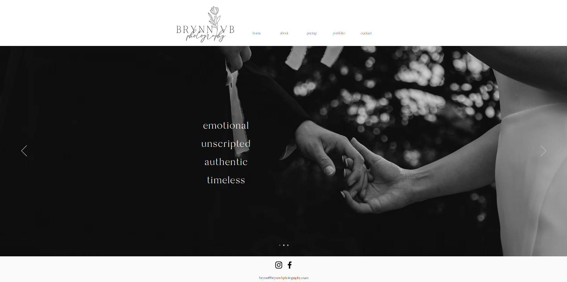
| Brynn VB Photography | Wedding & family | Combines emotional storytelling with organized galleries, transparent pricing, a personal About page, and a straightforward contact process. |
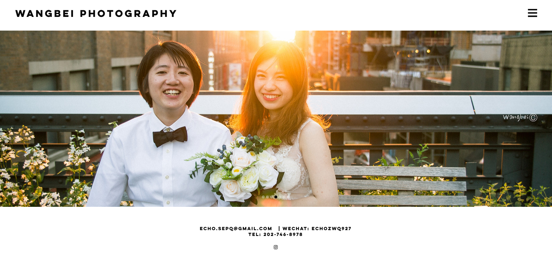
| Wangbei Photography | People, nature & film | Organizes different photography styles into clear categories while using personal storytelling and accessible contact information to build a stronger connection with visitors. |
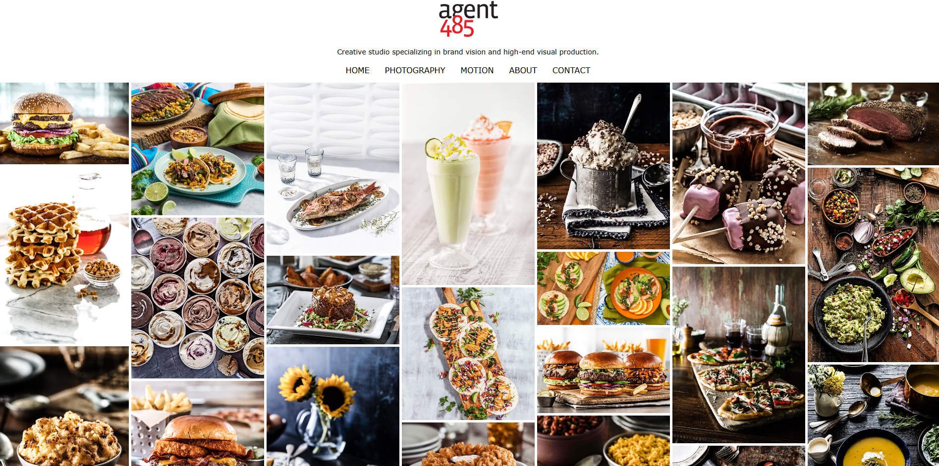
| Agent 485 | Food, beverage & commercial | Uses high-quality commercial imagery, motion graphics, and distinct project sections to make the portfolio feel dynamic and showcase multiple specialties. |
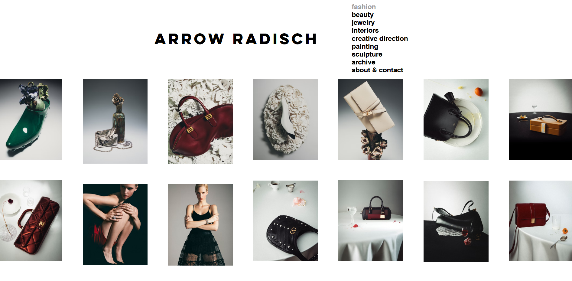
| Arrow (Sharon) Radisch | Fashion, luxury, interiors & fine art | Creates a polished, editorial-style presentation with bold imagery and a carefully arranged portfolio that reflects work for luxury brands. |
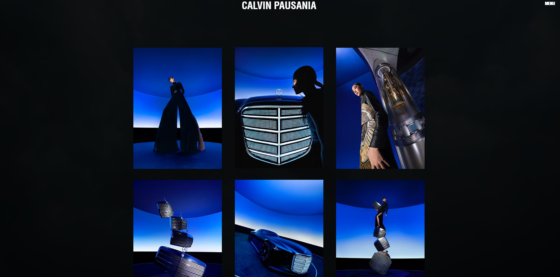
| Calvin Pausania | Commercial & creative | Opens with a striking visual introduction and minimal interface, allowing the photographer's identity and imagery to make the strongest first impression. |
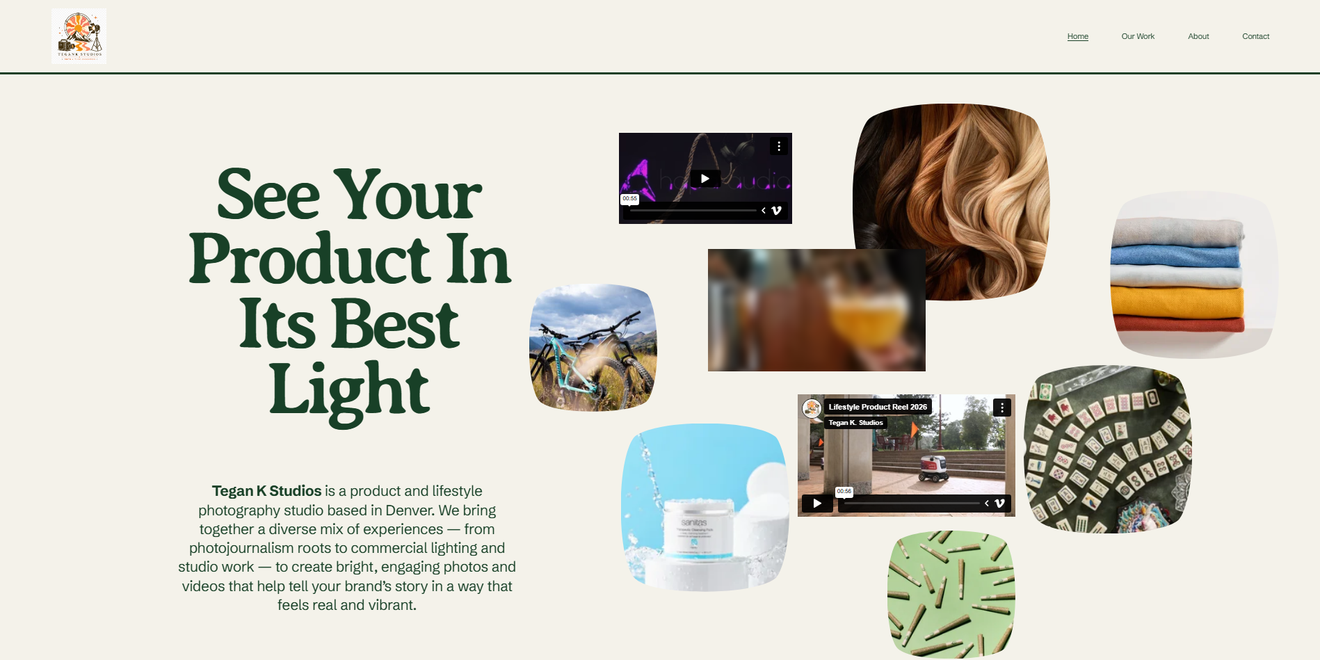
| Tegan K Studios | Product & craft | Uses a dedicated portfolio section to showcase textiles and crafts, demonstrating how composition, color, and texture can communicate a photographer's specialty. |
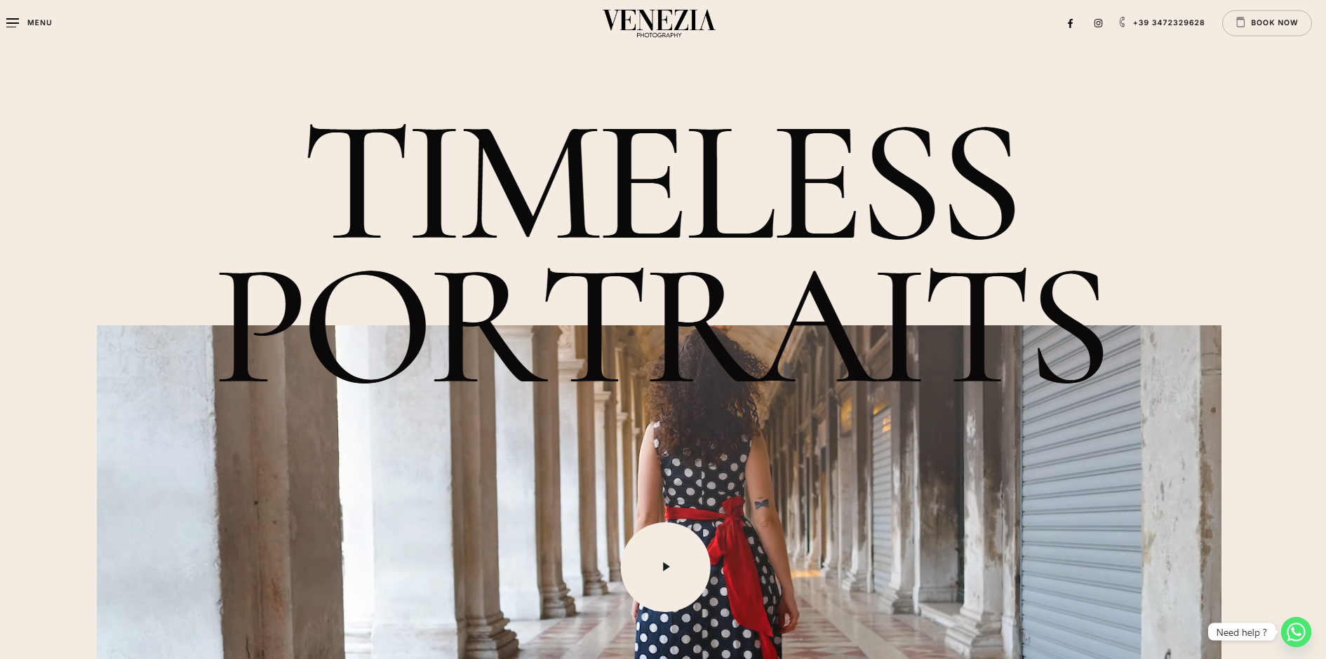
| Venezia Photography | Film & landscape | Embraces a larger collection of images instead of aggressively reducing the portfolio, using the volume and film aesthetic to reinforce its creative positioning. |
| Jade Nikkole Photography | Wedding & portrait | Makes its service packages easy to understand with clear descriptions, inclusions, pricing information, and direct paths into the booking process. |
15 photography website examples for inspiration
The following 15 photography websites showcase exceptional design, thoughtful user experience, and effective business strategies. From minimalist portfolios to vibrant brand-focused sites, each example offers unique inspiration for building your own photography website.
Scott Snyder Photography
Scott Snyder, a product and object photographer based in Costa Mesa, California, showcases his clean-cut, top-of-the-line photography through a minimal portfolio website. His approach uses plenty of negative space to let his work breathe, with each photography project providing detailed insights into his creative process, client details, and project outcomes.
Key characteristics
Clean, minimal design with generous negative space that puts photos front and center
Detailed project pages explaining roles, client details, and creative process
Separate "Work" page featuring a beautiful two-column gallery layout
Easily readable typography with smooth scrolling animations and strategically placed CTAs
Levon Biss
Levon Biss is a London-based photographer whose work has graced the pages of TIME, National Geographic, Sports Illustrated, and The New York Times Magazine. His website showcases authentic and stunning work spanning people, sports, and insect photography, using a unique gallery layout that prioritizes visual impact over rigid structure. Rather than following a fixed column format, the site uses a flexible container width with defined whitespace, allowing images to flow naturally based on available space.
Key characteristics
Unique, flexible gallery layout that breaks from traditional fixed-column structures
Left-side navigation that hides behind an icon for a full-screen gallery experience
Featured photos displayed in an organic, whitespace-defined arrangement
Clean, professional design that lets high-quality imagery take the center stage
Tayler Smith
Tayler Smith is a New York City-based photographer whose work features dogs, still life, portraits, and live events with a cool, modern, and fun aesthetic. Her website design perfectly complements her vibrant photography with bold, colorful fonts and energetic contrast. The design's simplicity makes everything easy to find with intuitive navigation and a clear flow, while a small slideshow at the top gives visitors a quick preview of her distinctive photography style.
Key characteristics
Bold, colorful typography that matches her energetic and fun photography style
Small slideshow at the top for quick style preview
Simple, typical navigation flow for easy browsing
Perfect balance of aesthetics and functionality
Kim Williams Weddings
Kim Williams is a Brighton-based wedding photographer who captures inclusive, fun-loving celebrations with bold colors and unapologetic personality. Her website stands out with an instant identity established through a bold orange frame and phrases like "Feminist & LGBTQ+ Wedding Photography," clearly communicating her values and creative approach. The site showcases vibrant, playful, expressive photos that highlight authentic moments, making it ideal for non-traditional and diverse couples seeking a photographer.
Key characteristics
Bold orange branding frame that establishes instant visual identity
Inclusive language like "Feminist & LGBTQ+ Wedding Photography" and "Best Friend Application"
Vibrant, authentic imagery that captures genuine moments and personalities
Personal "Hi! I'm Kim..." introduction with van-lifestyle photo for personal connection
Margaret Rajic
Margaret Rajic is an interior photographer based in Barrington Hills, serving the Greater Chicago area and Southern Wisconsin. Her professionally designed website demonstrates exceptional attention to detail, featuring chic typography, clean lines, beautiful scrolling animations, and a gorgeous green color palette. The design thoughtfully complements her interior photography work, creating an immersive experience that allows visitors to appreciate her craft as soon as they land on the homepage.
Key characteristics
Chic typography and clean, sophisticated design lines
Beautiful scrolling animations that enhance user experience
Gorgeous green color palette that complements interior photography
Design perfectly complements the interior photos displayed
Meiwen See
Meiwen See is a professional designer and photographer featuring travel, people, editorial, and interior photography. By combining her artistic talents, she offers clients branding and art direction services alongside photography, making her an excellent example for photographers selling complementary services. Her minimalist homepage focuses on a short bio and a curated selection of her photography and design portfolio, with a minimalist navigation bar that directs visitors to more portfolio items and social media profiles.
Key characteristics
Minimalistic design with short bio and curated portfolio items
Clean navigation bar with quick access to Behance, Instagram, and Pinterest
Gorgeous four-column portfolio layout for photography work
Combines photography with complementary design and branding services
Organic Headshots
Organic Headshots is a Chicago-based photography business specializing in professional headshots with a clean, modern, and visually appealing website design. The site combines high-quality images, videos, and concise text to showcase their expertise, featuring a prominent green "Book A Photoshoot" call-to-action that stands out throughout the site. A large banner video offers an authentic behind-the-scenes feel, showing photographers and editors in action.
Key characteristics
Prominent green "Book A Photoshoot" CTAs throughout the site
Large banner video showing behind-the-scenes action for authenticity
Modern sans-serif typography with clear hierarchy for easy navigation
Well-organized sections for services, testimonials, and photo galleries
Brynn VB Photography
Brynn VB Photography's website masterfully balances emotional storytelling with clean, client-friendly design. Her "About Me" page feels deeply personal, revealing a genuine, relatable photographer who values connection over perfection. The portfolio is well-organized by session type, like weddings, couples, families, and seniors, making navigation effortless. With clear calls-to-action, transparent pricing, and a simple contact form, the site supports both aesthetic appeal and business functionality.
Key characteristics
Authentic personal branding with a values-driven "About" page
Emotion-driven visual storytelling showcasing "unscripted, timeless" style
Well-organized portfolio galleries by session type
Clear, user-friendly client journey with transparent pricing and easy booking
Wangbei Photography
Wangbei Photography, created by Wenqi Zhao (a CPA by day and photographer by soul), feels deeply personal yet professional. The "About Me" page shares an authentic origin story that builds trust and explains the photographer's mission. The site's clean structure includes separate portfolio sections for People, Nature, Film, and Client Showcase, making it easy for visitors to explore different styles. Contact details and social links are clearly displayed for potential clients to reach out directly.
Key characteristics
Authentic storytelling with a personal bio building genuine connection
Well-organized portfolio divided into People, Nature, and Film categories
User-friendly "About Me & Contact" page with multiple contact methods
Clean navigation showcasing versatility while remaining navigable
Agent 485
Agent 485 is a standout photography website combining aesthetic appeal with practical functionality. The design is visually striking, with high-quality images that capture attention and showcase expertise across food, beverage, and commercial photography. The seamless integration of motion graphics and GIFs adds a dynamic, modern feel that brings the portfolio to life, while the well-organized structure with distinct sections for different photography styles makes browsing intuitive.
Key characteristics
Crisp, high-quality professional images highlighting versatility
Dynamic use of GIFs and motion elements for interactive browsing
Well-organized sections for different photography styles
Modern, engaging design that feels cutting-edge
Arrow (Sharon) Radisch
Sharon Radisch's photography website immediately sets a sophisticated tone, blending striking visuals with a polished, easy-to-navigate design. Her work with renowned luxury brands shines through, giving visitors an instant sense of her artistic range and refined style. The gallery is thoughtfully arranged to explore her world of fashion, interiors, and fine art, with every page thoughtfully designed to reflect a sense of luxury that mirrors her high-end client collaborations.
Key characteristics
Polished, sophisticated presentation reflecting luxury brand collaborations
Bold, vivid imagery that tells stories behind each project
Clear structure with smooth navigation through the portfolio
Refined design that lets the work speak without distractions
Calvin Pausania
Calvin Pausania's photography website is a striking example of minimalism and focus. The clean, modern design ensures attention remains on the photographer's name and professional identity, with a bold visual introduction that creates a memorable first impression. The site's simplicity highlights the brand with a sleek, professional aesthetic, while the intuitive layout makes it easy for visitors to engage and explore further.
Key characteristics
Striking minimalism with focus on photographer's brand identity
Bold visual homepage introduction for immediate impact
Clean, modern, and professional aesthetic
Intuitive layout for easy engagement and exploration
Tegan K Studios
Tegan K Studios demonstrates exceptional skill in product and textile photography through a dedicated portfolio section. The website showcases a colorful array of creative projects with a focus on texture and composition, highlighting the photographer's expertise in capturing the intricate details of craftwork and textiles. The gallery demonstrates how to present specialized work effectively, with images that emphasize the unique qualities of each piece.
Key characteristics
Dedicated portfolio section for textiles and crafts photography
Expert handling of texture, color, and composition
Specialized gallery that demonstrates niche expertise
Professional presentation of product photography work
Venezia Photography
Venezia Photography presents a beautiful collection of film photos of Colorado, with a focus on landscape imagery. While the portfolio is extensive, it works because it perfectly emphasizes the business's film-focused, old-school style that appeals to creatives with a passion for art. The site demonstrates how breaking "best practices" can be effective when it authentically represents your artistic vision and brand identity.
Key characteristics
Extensive film photography portfolio showcasing Colorado landscapes
Authentic old-school aesthetic emphasizing artistic passion
Gallery design that matches the film-focused brand identity
Creative approach that breaks conventional portfolio rules effectively
Jade Nikkole Photography
Jade Nikkole Photography presents specific, detailed packages with clear titles, descriptions, and buttons that guide visitors directly into the booking process. Each package includes a shoot duration, number of images, and printing rights, making it easy for potential clients to understand exactly what they're getting. This level of transparency and directness might seem counterintuitive, but it actually attracts serious inquiries and filters out "tire kickers," saving time for both the photographer and potential clients.
Key characteristics
Clear, specific package descriptions with detailed inclusions
Direct pricing transparency with "Anything + Everything" options
Easy-to-use booking buttons for immediate action
Friction-reducing structure that attracts serious inquiries

Create a photography website around your creative vision: Kimi Build
Kimi Build, an AI website builder, makes it easier for photographers to turn their creative ideas and visual references into a polished website without coding. You can bring together your photos, written content, mood boards, and other references to shape the overall look and structure. It can create everything from a focused portfolio to a complete photography website with project, service, and branding pages.
Main features
Turn your photography and ideas into a website: Bring together your photos, portfolio concepts, written content, mood boards, screenshots, videos, or other visual references. Describe the look and experience you have in mind, and Kimi can transform your inputs into a photography website tailored to your creative direction—no coding required.
Create distinctive, aesthetic websites: Build a website with a refined visual style that reflects your photography and stands out from generic templates. With the MusePool plugin, Kimi Build can also draw inspiration from real-world design references to develop a distinctive aesthetic direction while keeping the overall experience cohesive.
Create a full website, not just a portfolio gallery: Expand beyond a single portfolio page with dedicated pages for projects, services, client work, personal branding, and more. Kimi Build can adapt the site's structure and functionality to the content and workflows you provide, while full-stack capabilities give you room to create more tailored experiences.
Fine-tune every part with AI: Describe what you want to change and let Kimi handle the adjustments. You can reorganize galleries, rewrite project copy, modify typography and layouts, or polish individual visual elements. Make precise edits to specific sections without having to start from scratch.
Check, publish, and share your finished site: Preview how your photography website looks on desktop and mobile to check galleries, images, and navigation before publishing. Once everything looks right, publish your site with a shareable link and access the source code for HTML, React static sites, or full-stack applications.
How to make a photography website with AI
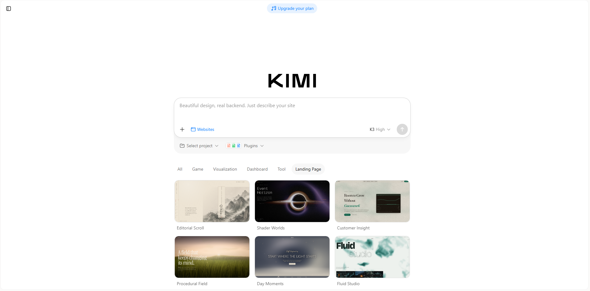
You do not need to start with a blank page when creating a photography website with AI. Instead, you can describe your work and the type of online presence you want, then use the generated result as a foundation. Here's how you can create a photography website with Kimi Build.
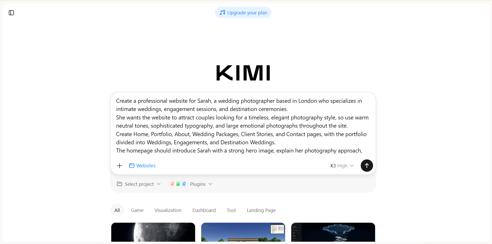
Step 1: Enter a clear prompt
Begin with a detailed description of your photography, preferred visual style, website structure, and the experience you want to create. Mention the pages, layout, colors, and image presentation you have in mind so the AI can generate a more relevant starting point.
Example prompt:
Step 2: Edit your website
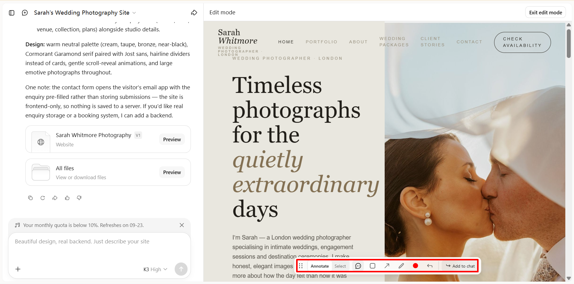
Review the generated pages and refine them to better match your photography and personal brand. To make a change, you can use "Annotate" to comment on a specific area, or use "Select" to choose a specific element and describe how you want it changed. You can also give direct instructions to update the content, images, layouts, galleries, colors, or typography without rebuilding the entire website.
Step 3: Preview and publish
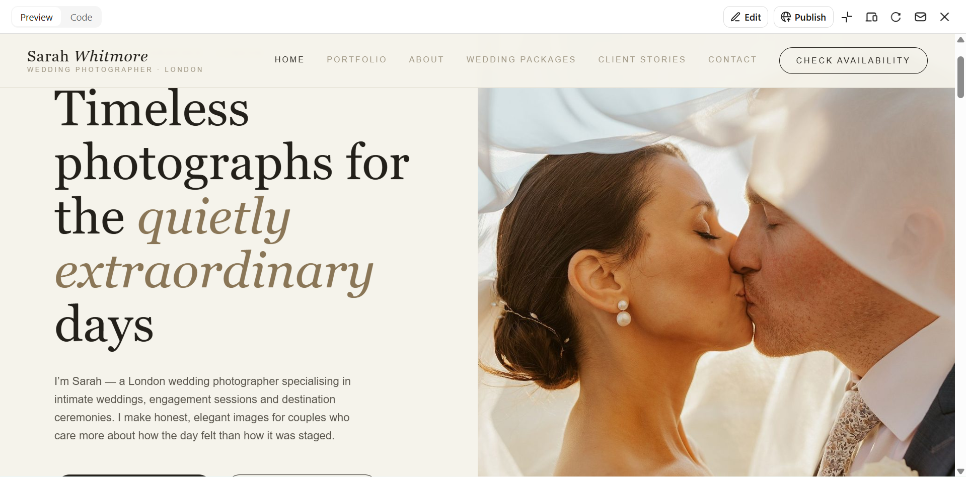
Check the complete website to make sure your images are displayed properly and the navigation works smoothly. Make any final changes needed, then publish the finished website once you are satisfied with the result.
Tips for making your photography website more appealing
A photography website should do more than display your work. It should create an experience that makes visitors want to explore further. The design, imagery, performance, and storytelling all play a role in how professionally your work is perceived. Use the following tips to create a website that feels engaging.
Lead with striking, high-quality imagery
Start with your strongest photographs to immediately capture visitors' attention. Choose sharp, well-composed images that represent your photography style and create a strong first impression. Give important images enough space so they remain the main focus of the page.
Keep the visual style clean and cohesive
Choose colors, fonts, spacing, and layouts that complement your photography instead of competing with it. Keep these elements consistent across different pages to create a polished and recognizable look. A clean visual structure also makes it easier for visitors to focus on your work.
Curate your strongest work
Avoid adding every photograph you have taken simply to make your portfolio look larger. Select images that demonstrate your skills, creative style, and ability to produce consistently strong work. A focused collection makes your portfolio easier to explore and leaves a stronger impression.
Add subtle motion and interaction
Gentle animations can make your website feel more engaging without distracting visitors from your photographs. Consider using smooth transitions, subtle hover effects, or animated gallery elements where they naturally fit the design. Keep interactions restrained, so the website still feels refined and easy to use.
Prioritize speed and responsiveness
High-resolution photography can make pages heavy, so optimize your images while maintaining enough quality for them to look sharp. Make sure galleries, navigation, text, and other elements work smoothly on phones, tablets, and desktops. A fast and responsive website keeps visitors engaged.
Make your story part of the experience
Give visitors a reason to connect with the person behind the camera, not just the photographs. Share your background, creative approach, influences, or the type of clients and projects you enjoy working with. This context can help clients understand what makes your work different.
Conclusion
A photography website can become a powerful way to shape how people discover and remember your work. The right approach depends on your style, audience, and the kind of experience you want to create. Photography website examples can help you find ideas that feel relevant to your own direction. When you are ready to turn that idea into a real website, Kimi can help you build it with AI. Try Kimi to bring your photography vision to life without starting from scratch.