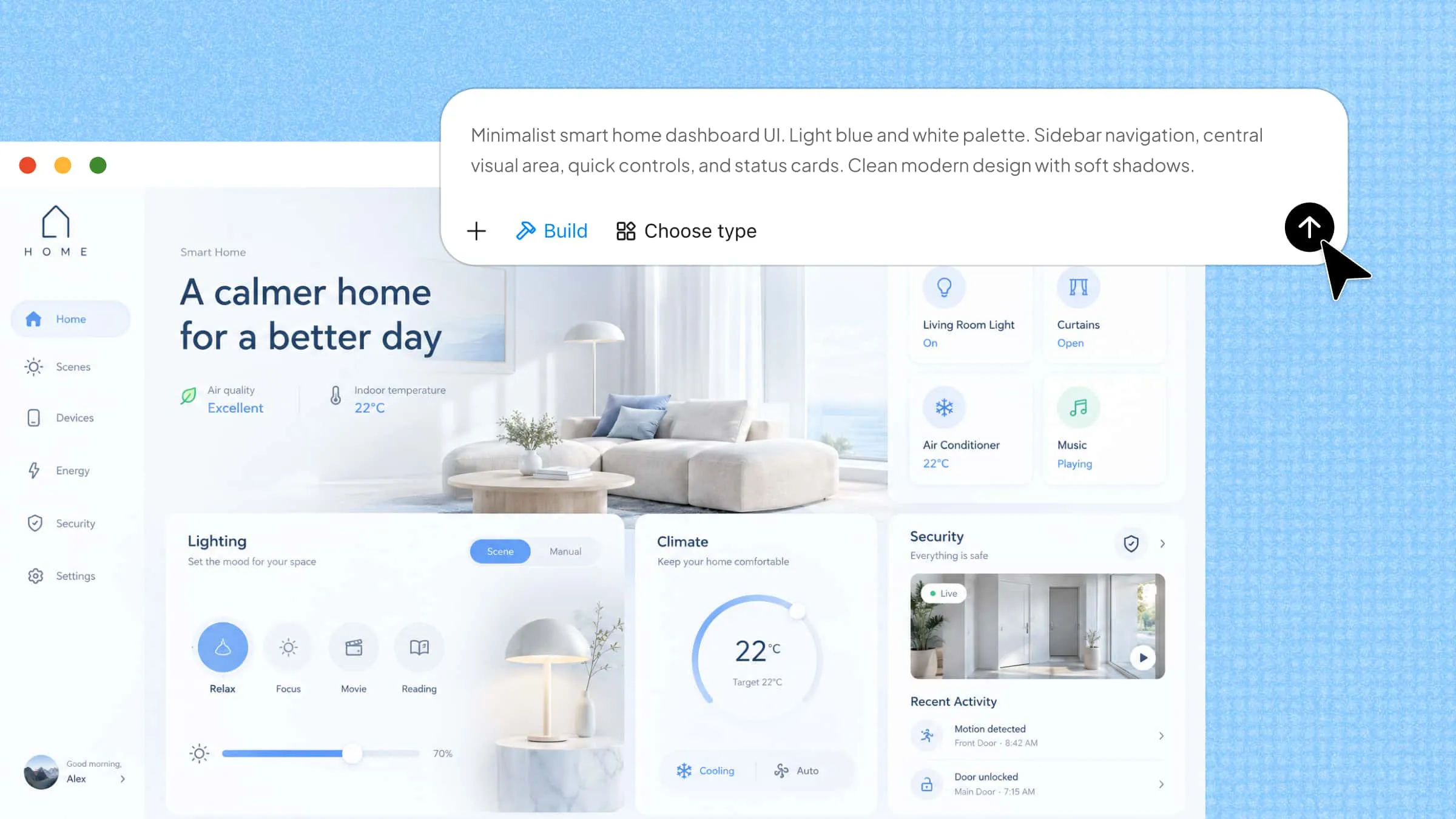
A website or app does more than share information; it needs to make every step easy for the people using it. This is where user interface design comes in, helping you arrange visual elements in a way that feels clear, consistent, and easy to follow. Even small choices, such as button placement, spacing, and color combinations, can affect the overall experience. Let's explore the main design principles, elements, and tips that can help you build more user-friendly interfaces.
What is user interface design
User interface (UI) design is the process of creating the visual parts of a website, app, or digital product that people interact with. It focuses on how elements such as buttons, menus, icons, colors, and text look and work together. The goal is to make everything clear, attractive, and easy to use. Good UI design helps users find what they need and complete tasks without confusion.
Difference between UI and UX design
Although UI and UX design are closely connected, they focus on different parts of a digital product. While both aim to make products easier and more enjoyable to use, their approaches are not the same. UI design focuses on how a product looks and how users interact with its visual elements, whereas UX design focuses on the overall experience users have while using it. Here are the main differences between the two.
Main elements of user interface design
A good user interface brings several visual and interactive elements together to create a smooth experience. Each element has a specific purpose, from helping users find information to making actions easier to complete. Let's look at the main elements that make an interface clear, attractive, and easy to use.
Layout and spacing
Layout determines how different elements are arranged on a page or screen. A well-organized layout helps users find important information easily. Proper spacing between text, images, and buttons also makes the interface easier to read and navigate.
Color schemes
Colors make an interface visually appealing and help guide user attention. Designers use different combinations to highlight important elements and create contrast between sections. A consistent color scheme also gives a website or app a recognizable look.
Typography
The choice of fonts, sizes, and text styles affects how users read and understand information. Clear fonts and different text weights also help separate headings, descriptions, and important details while improving the overall reading experience and making content easier to scan.
Icons and imagery
Visual elements help communicate information quickly and make an interface easier to understand. For example, a search icon shows users where to look, while relevant images make products and content more engaging and visually interesting, helping users recognize important details at a glance.
Buttons and input controls
These elements allow users to interact with a website or app. Buttons support actions such as submitting forms, while text fields, checkboxes, and dropdown menus help users enter information and make selections quickly and accurately without unnecessary effort or confusion.
Navigation elements
Menus, search bars, breadcrumbs, tabs, and pagination controls help users move between different pages and sections. They should be easy to find and use so visitors can reach the information they need without confusion or unnecessary steps, even on larger websites.
Feedback and informational components
Notifications, progress bars, tooltips, and confirmation messages keep users informed about their actions. For example, a success message lets users know when a form has been submitted successfully, giving them confidence that everything worked as expected and their information was received.
Containers and content organization
Containers group related information and elements together, making content easier to explore. Cards, accordions, carousels, and scrollable sections are common examples. Organizing content into clear groups helps users find relevant information without feeling overwhelmed.add
Different types of user interface design
User interfaces come in different forms, depending on how people interact with digital devices and applications. Each type provides a different way to access features, enter commands, and complete tasks. Here are some of the most common types of interface design.
Graphical user interface (GUI)
A graphical user interface allows users to interact with a device through visual elements such as icons, buttons, windows, and menus. Users can select these elements using a mouse, trackpad, or touchscreen instead of entering text-based commands. A computer desktop, smartphone home screen, and web application are common examples of GUIs.
Voice user interface (VUI)
A voice user interface allows users to interact with devices through spoken commands rather than visual controls. It uses speech recognition technology to understand what users say and respond to their requests. Apple's Siri, Amazon Alexa, and Google Assistant are popular examples that help users perform tasks, search for information, and control connected devices using their voices.
Menu-driven interface
A menu-driven interface presents users with a list of available options or commands to choose from. Users navigate through these menus to find specific features or complete tasks without needing to remember complicated commands. ATMs, digital parking meters, and self-service kiosks commonly use this type of interface to make interactions simple and straightforward.
How to create a user interface with AI
Kimi Build, an AI website builder, makes it easier to create a user interface by turning simple text prompts into visually appealing website designs. You can describe your preferred layout, colors, components, and functionality, and let AI generate an interface based on your requirements. It also lets you refine the generated design, adjust individual elements, and bring your ideas to life without building everything manually.
Follow these steps to create a user interface with Kimi Build:
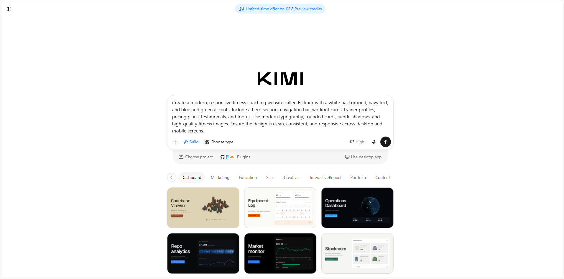
Step 1: Define your requirements and prepare a prompt
Identify your website or application's purpose, target users, essential features, and desired visual direction. Prepare a detailed prompt describing the interface you want, including its layout, content, color scheme, typography, and functionality. You can also collect reference images or videos to guide the design.
Example prompt:
Step 2: Generate your UI with AI
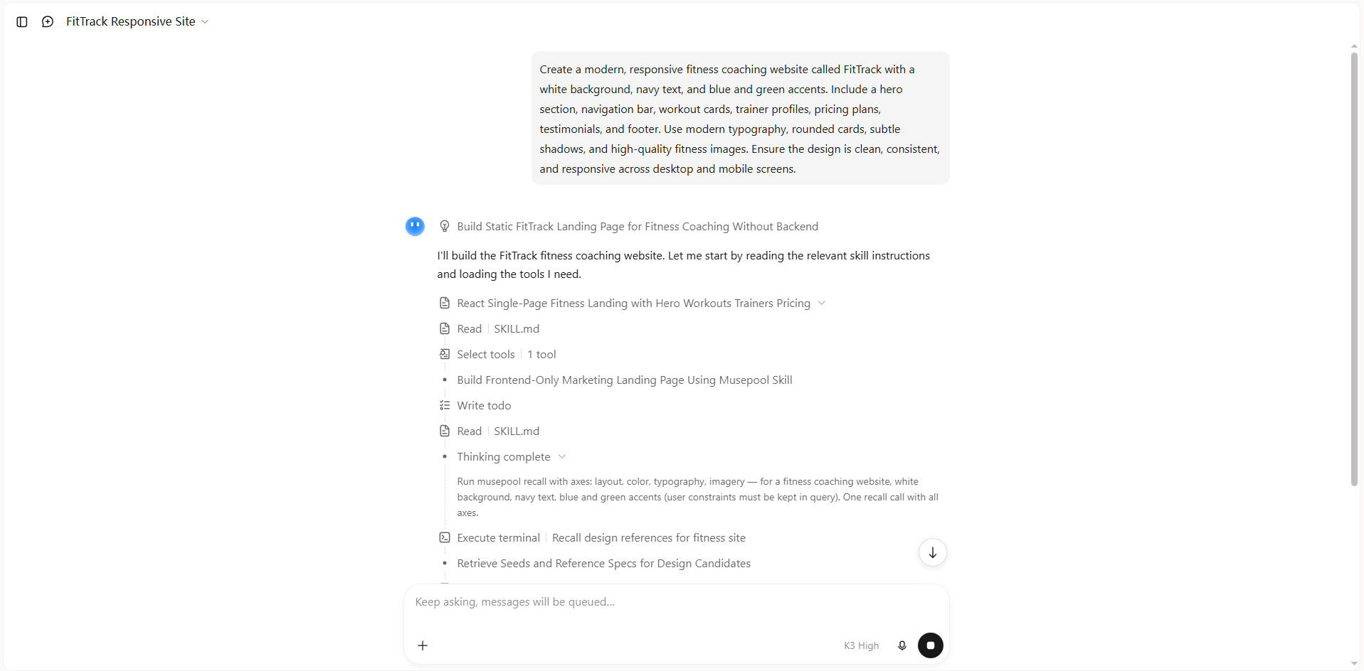
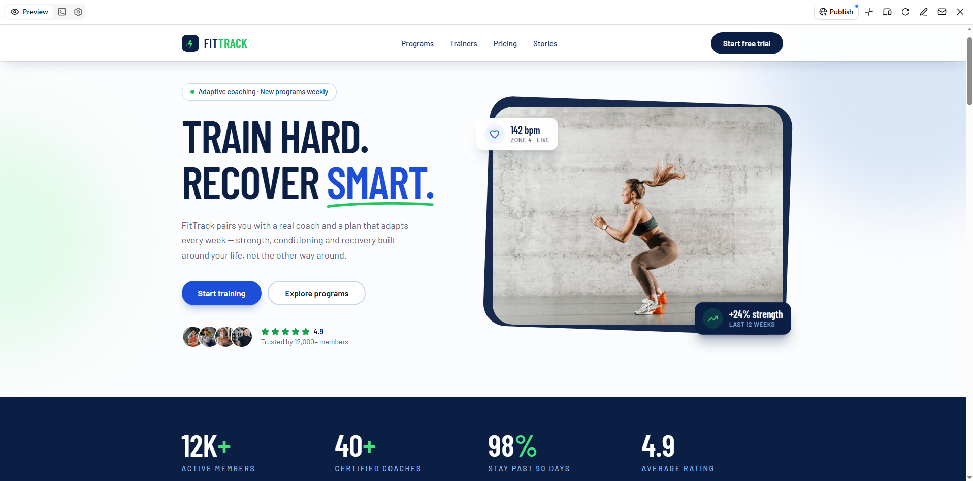
Enter your prompt into Kimi Build and submit it to start the generation process. Kimi analyzes your requirements and generates the interface, including its visual layout, content sections, and interactive elements.
Step 3: Review and customize the interface
Review the generated interface to check its layout, visual hierarchy, navigation, and consistency. Click "Edit" in Kimi Build to refine the design. You can enter prompts to modify the overall interface, add comments to specific elements to request targeted changes, or manually adjust text, images, colors, and other visual components.
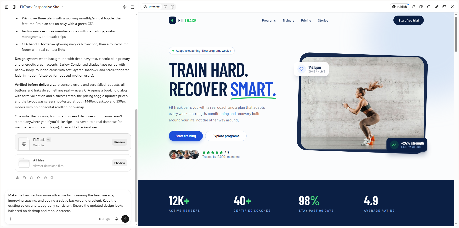
Step 4: Preview, refine, and publish your interface
Preview the updated interface and check whether its content, layout, and visual elements meet your requirements. Make further adjustments as needed, then publish your project and share it through a link. Depending on your project, you can also access the source code for further development.
Key features of Kimi Build
Kimi Build offers several AI-powered features that simplify the process of creating and customizing user interfaces. From generating designs using simple text descriptions to refining layouts, these capabilities help turn ideas into polished digital experiences. Some of its key features include.
Generate UI designs from text prompts and visual references
Create website interfaces by describing your design requirements in natural language. Specify the target audience, page structure, visual style, color palette, typography, and desired components. You can also upload reference images, screenshots, or videos to guide the design. Kimi Build interprets these inputs and turns them into webpage layouts with corresponding visual elements and interactions.
Turn design ideas into functional web interfaces
Go beyond static UI mockups by turning design concepts into working webpages. Kimi Build generates page structures, styling, and interaction logic, allowing you to preview how navigation menus, buttons, forms, and other interface components work in practice. This helps you explore how a proposed design translates into an actual website.
Refine interface details through AI-powered editing
Adjust your generated interface without manually rebuilding the entire page. Use natural-language prompts to change layouts, typography, colors, content, and visual styles. You can also click or annotate specific webpage elements to request targeted modifications, or manually edit individual elements. This makes it easier to refine the interface through multiple rounds of feedback.
Create responsive interfaces for different screen sizes
Build interfaces that adapt to desktop and mobile screens. Kimi Build supports switching between desktop and mobile preview modes, helping you review how page layouts, navigation, images, and other components appear across different screen sizes. You can make further adjustments to improve the consistency of the interface across devices.
Preview, publish, and access your website code
Preview your completed interface in a browser before making it publicly available. Once you're satisfied with the result, publish it to generate a shareable website link. You can also access or download the generated project code for further customization and development.
Tips for creating effective user interface designs
A good user interface should make every interaction feel natural and straightforward. Beyond appearance, thoughtful design choices help users find information, navigate features, and complete tasks without confusion. Consider these practical tips when designing your next interface.
Start with a clear design goal
Decide what users should achieve when visiting your website or application. Consider their needs, expectations, and the product's main purpose before choosing layouts or visual elements. This gives your design a clear direction and keeps decisions focused.
Prioritize important content and actions
Place essential information and frequently used actions where users can easily find them. Use clear headings, visible buttons, and suitable spacing to highlight important elements. Avoid unnecessary content that distracts users from their primary tasks.
Keep navigation intuitive
Organize menus, links, and navigation elements so users can find information easily. Use familiar labels and logical categories to make browsing straightforward. Maintain similar navigation patterns across different pages for a smoother experience.
Use consistent visual styles
Maintain consistent colors, typography, button styles, icons, and spacing throughout the interface. This creates a unified appearance and makes familiar elements easier to recognize. Avoid unnecessary design variations that may confuse users.
Design for different devices and screen sizes
Ensure your interface works smoothly across desktops, tablets, and smartphones. Adjust layouts, images, and text sizes to fit different screens. This allows users to access features comfortably on any device without unnecessary scrolling or zooming.
Test your interface and improve it iteratively
Test your design with users to identify navigation issues and confusing elements. Collect feedback and observe how people interact with different features. Use these findings to make improvements and refine the interface over time.
Conclusion
A well-designed digital product can make a lasting impression by helping people interact with it comfortably and confidently. Understanding user interface design gives you a strong starting point for creating experiences that look good and work smoothly. With the right approach, you can turn simple ideas into practical designs that meet user needs. Ready to bring your ideas to life? Try Kimi Build to create and customize your own website interface with AI.