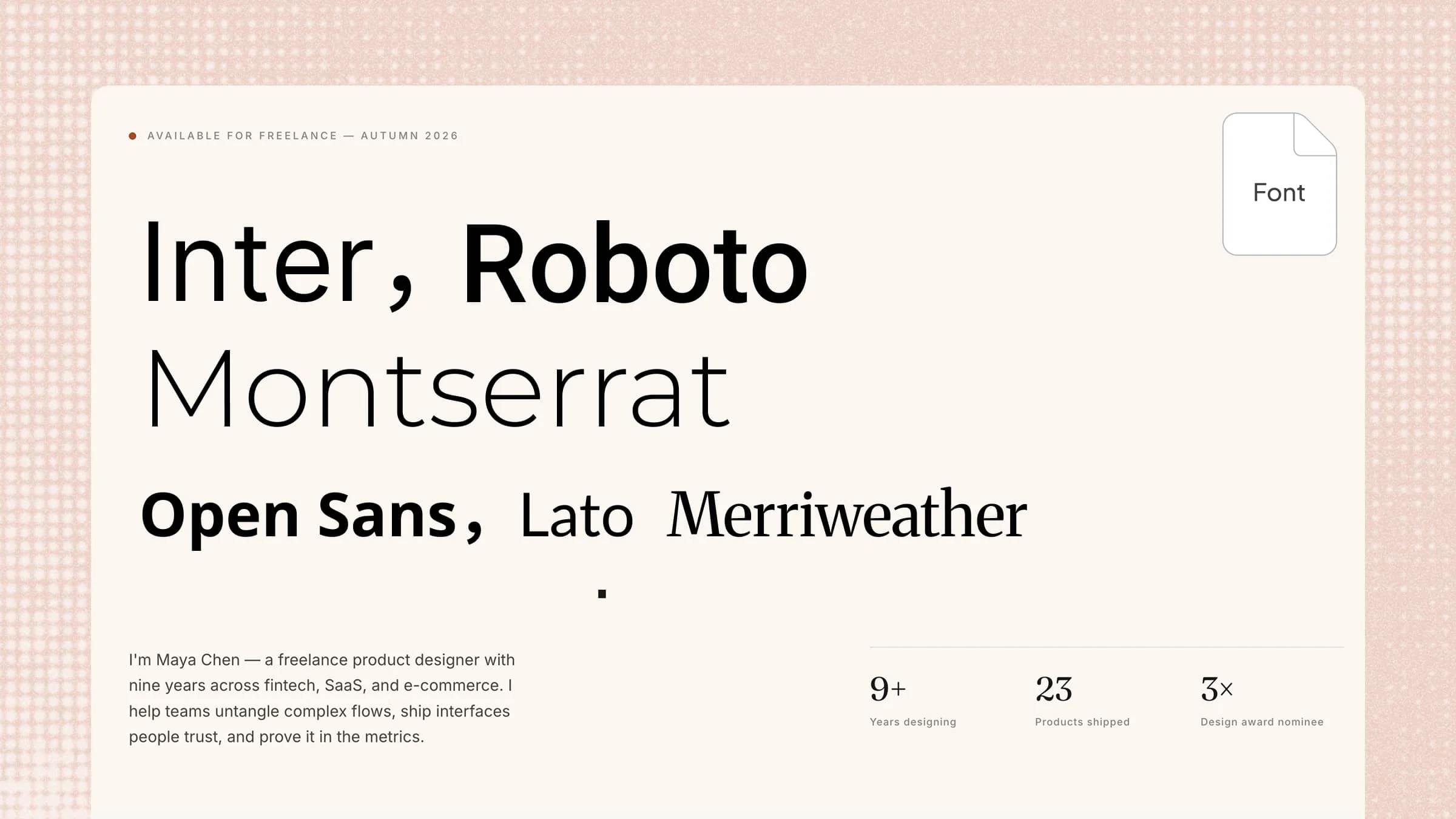
Finding the right fonts for PowerPoint can be challenging when your slides look plain, outdated, or lack a distinct visual style. The right typeface can instantly improve readability while giving your presentation a more polished and memorable look. In this article, we explore 10 of the widely used fonts for PowerPoint presentations, covering bold, elegant, modern, and creative styles to help your slides stand out.
Overview of 10 fonts for PowerPoint
The right PowerPoint fonts can instantly transform the look and feel of your PowerPoint slides. Whether you're creating a business presentation, pitch deck, portfolio, or class project, you can choose a typeface that matches your content while keeping every slide clear and easy to read.
Note: If you plan to use a font for commercial work, check its license before redistributing or embedding the font. The fonts marked Open-source / free for commercial use below are distributed under open-source licenses that allow commercial use, subject to their license terms.
| Font | Suitable for |
|---|
| Inter | Business, tech, SaaS, pitch decks | Clean and modern | Open-source / free for commercial use — SIL OFL 1.1 |
| Roboto | Business, data, and professional presentations | Neutral and versatile | Open-source / free for commercial use — SIL OFL 1.1 |
| Montserrat | Titles, marketing, and creative decks | Bold and geometric | Open-source / free for commercial use — SIL OFL 1.1 |
| Open Sans | Body text and information-heavy slides | Friendly and readable | Open-source / free for commercial use — SIL OFL 1.1 |
| Lato | Business, education, and presentations | Professional and approachable | Open-source / free for commercial use — SIL OFL 1.1 |
| Poppins | Creative, branding, and modern decks | Geometric and expressive | Open-source / free for commercial use — SIL OFL 1.1 |
| Merriweather | Storytelling, editorial, and academic decks | Classic serif | Open-source / free for commercial use — SIL OFL 1.1 |
| Verdana | Business and data-heavy slides | Clear and spacious | Proprietary Microsoft font — check applicable Microsoft licensing terms |
| Georgia | Editorial, storytelling, and formal presentations | Traditional serif | Proprietary font — check the license for the specific version |
| Segoe UI | Technology, SaaS, and corporate decks | Modern and neutral | Proprietary Microsoft font — check applicable Microsoft licensing terms |
Since you understand the importance of text style, let's take a look at some of the most liked fonts for PowerPoint slides that can give your slides a unique and fresh appearance. Whether you prefer strong and striking styles or neat and modern designs, these PowerPoint fonts can assist you in making presentations that are more appealing to the eye.
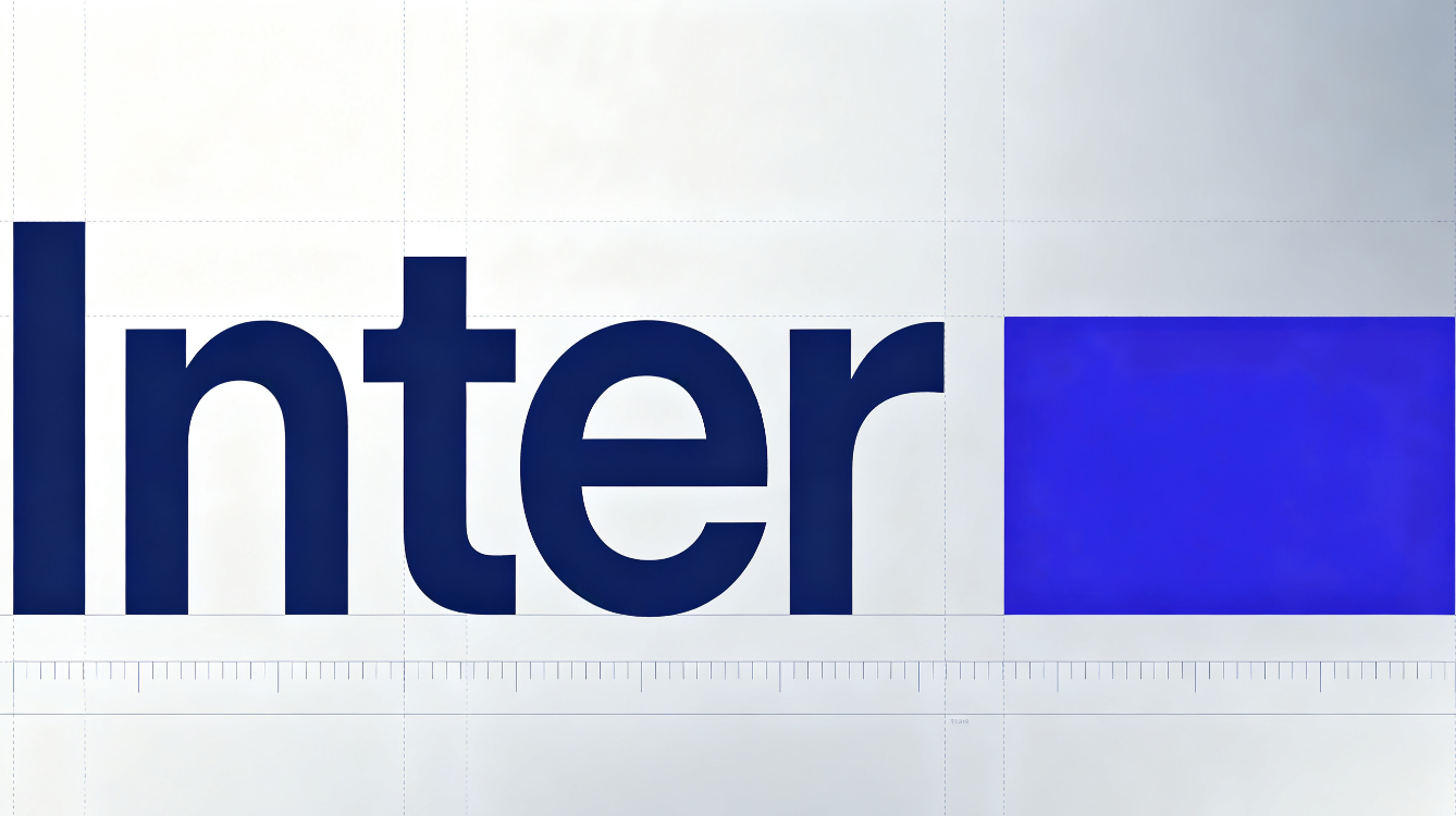
Inter
Inter is a clean and modern font for PowerPoint that works well for almost any type of presentation. Its simple letterforms make text easy to read, even when your slides contain smaller details. The font has a professional yet friendly appearance, making it a great choice for business presentations, pitch decks, portfolios, and educational projects.
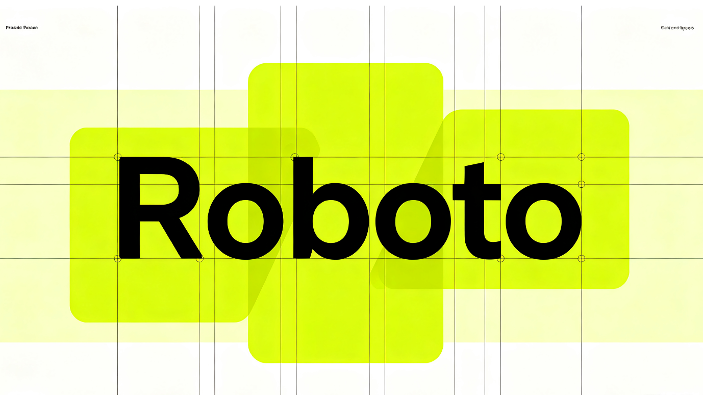
Roboto
Roboto is a neat and flexible font for PowerPoint presentations that looks modern and well-proportioned. Its straightforward letter shapes help make written content clear, ensuring your slides remain tidy and professional. It's suitable for corporate presentations, school assignments, reports, and pitch decks that require a straightforward and up-to-date style.
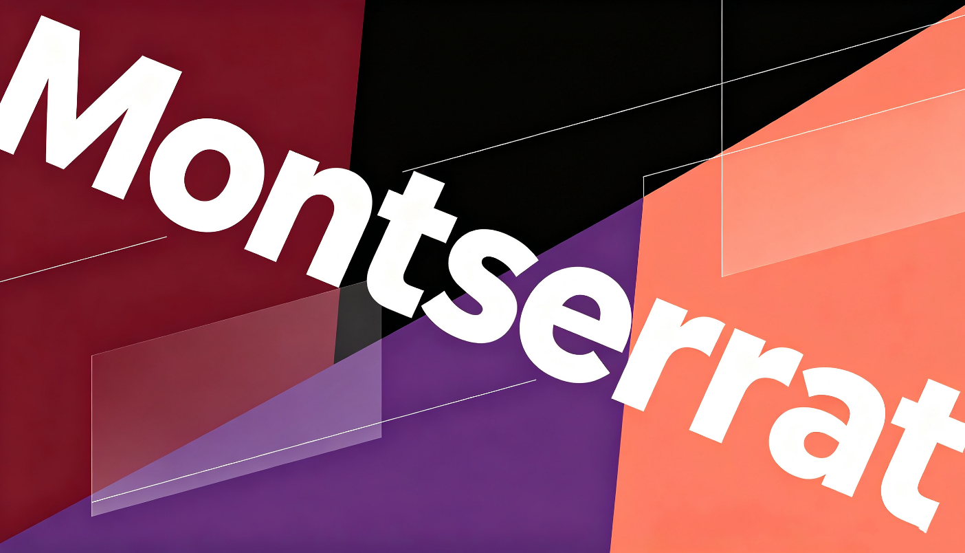
Montserrat
Montserrat features strong, shaped letters that can give PowerPoint slides a confident and modern appearance. Its unique shapes are particularly effective for headlines, titles, and any text you want your audience to see right away. This PowerPoint font is an excellent option for creative portfolios, marketing slides, brand presentations, and projects focused on visuals.
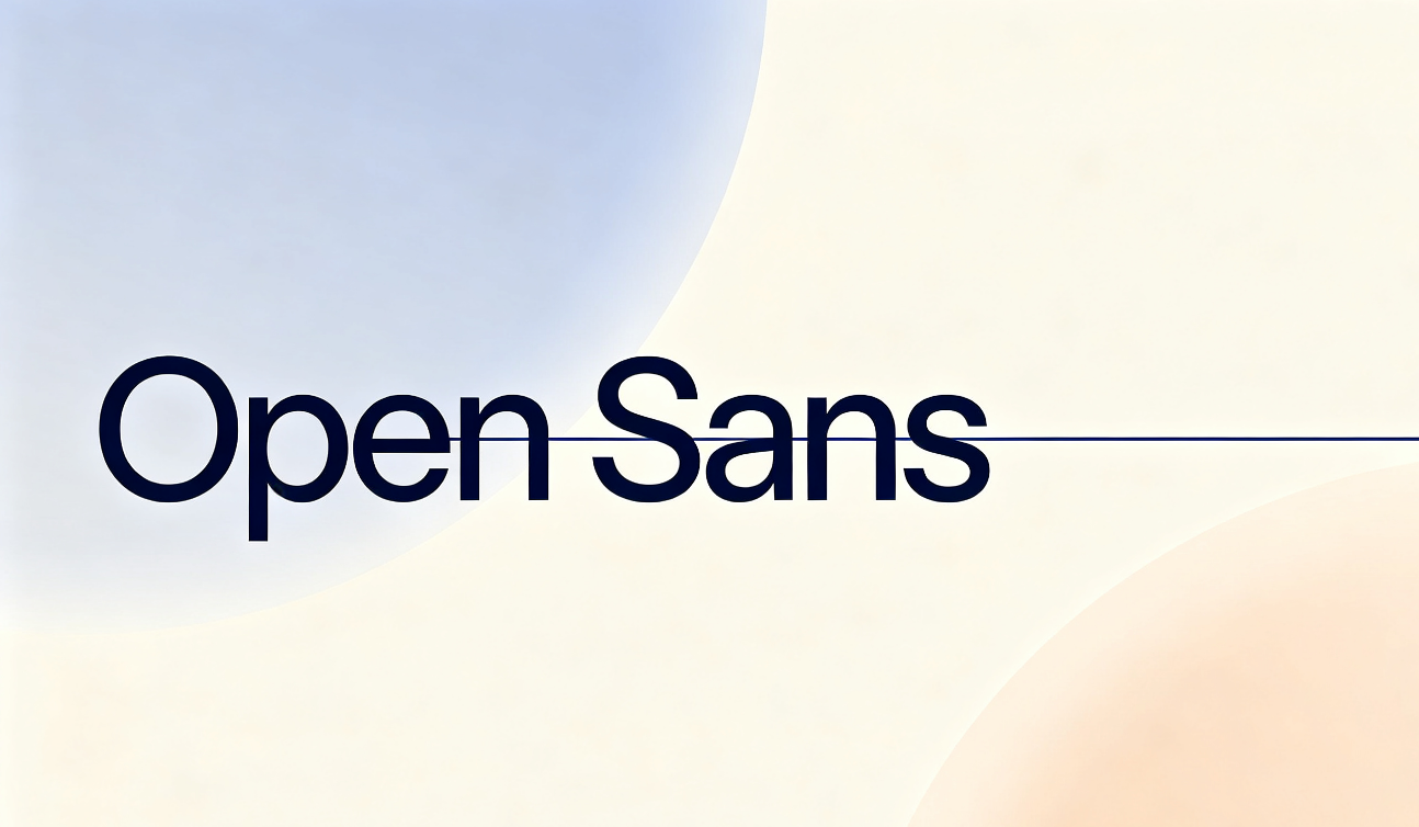
Open Sans
Open Sans is a welcoming and easy-to-read font for PowerPoint presentations, made for clear reading on screens. Its spacious letters are especially useful when your slides have longer text, explanations, or in-depth details. With its simple and friendly look, it is suitable for anything from business documents to school and company presentations.
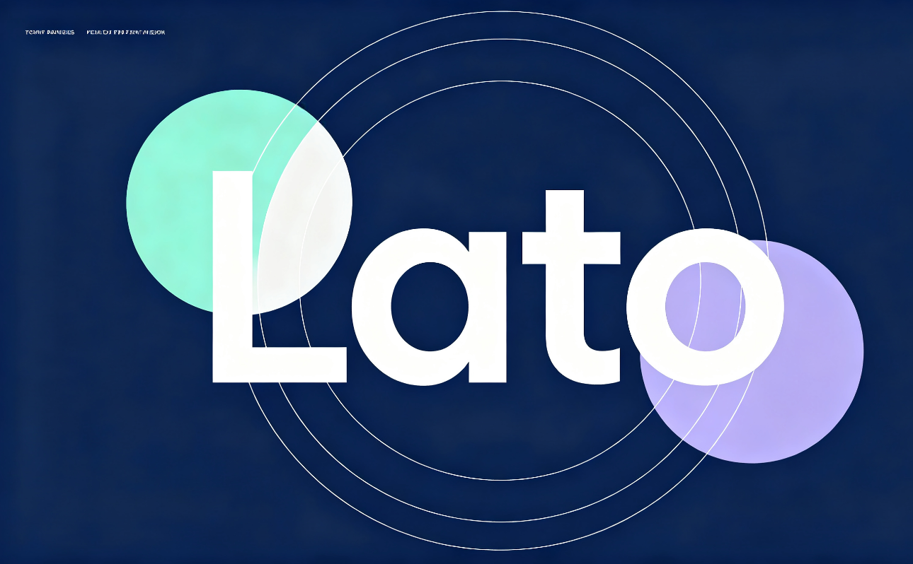
Lato
Lato provides a friendly and welcoming vibe to PowerPoint slides while still looking professional. Its slightly curved letters give the font a unique character, all while keeping a tidy look. This font is especially suitable for presentations that should appear serious, captivating, and simple for listeners to understand.
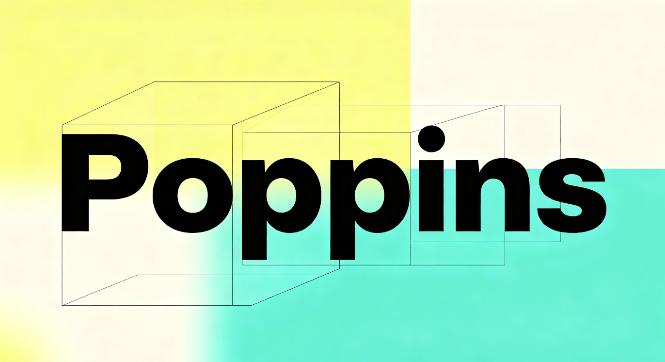
Poppins
Poppins is a geometric PowerPoint font with clean, rounded letterforms that give slides a fresh and stylish appearance. Its bold weights are great for making titles and key points stand out without overwhelming the design. It is a strong fit for modern presentations, creative projects, marketing decks, and brand-focused slides.
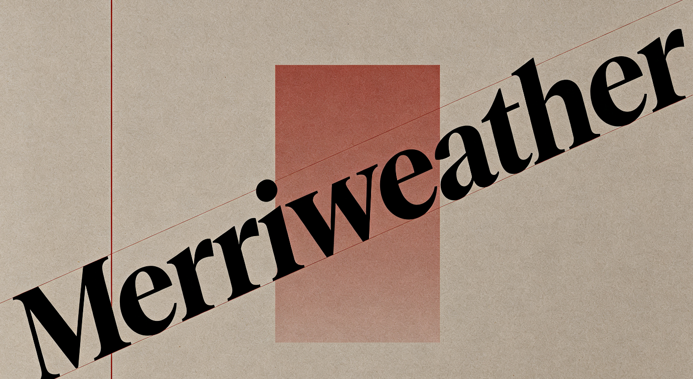
Merriweather
Merriweather is a classic serif font that brings an elegant and refined touch to PowerPoint slides. Its well-defined letterforms make longer text comfortable to read while adding more character than a standard sans-serif font. It works well for presentations that need a sophisticated, editorial, or traditional visual style.
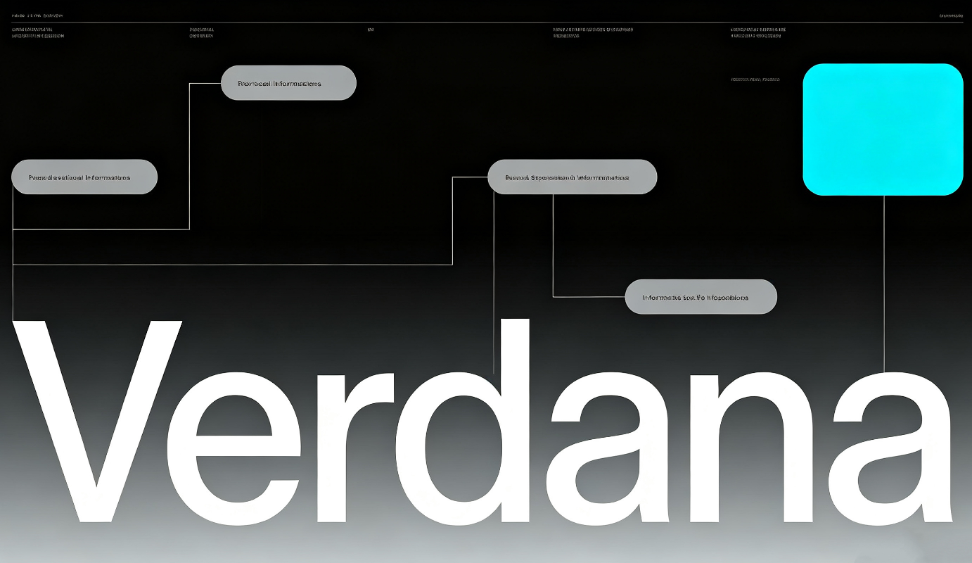
Verdana
Verdana is a handy font recognized for its broad and easy-to-read letters that work well on screens. It is still clear when it's in smaller sizes, which makes it great for slides filled with information. Its simple look fits presentations that focus on being clear and easy to understand.
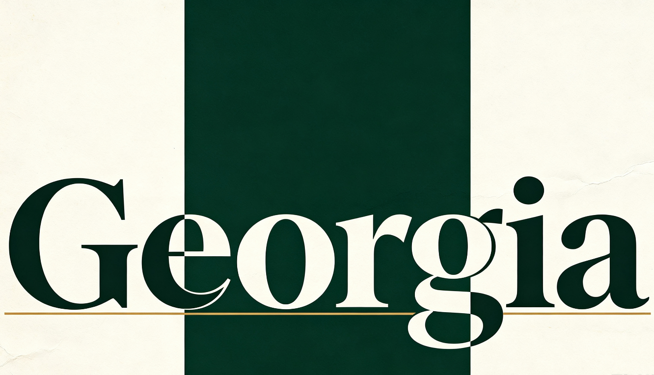
Georgia
Georgia is a classic serif font for PowerPoint that brings a neat and classic touch to presentations. Its unique letter designs enhance both titles and regular text, making them look more elegant while still keeping the overall look from being too rigid. It works well for presentations focused on literature, education, business, or topics that call for a timeless style.
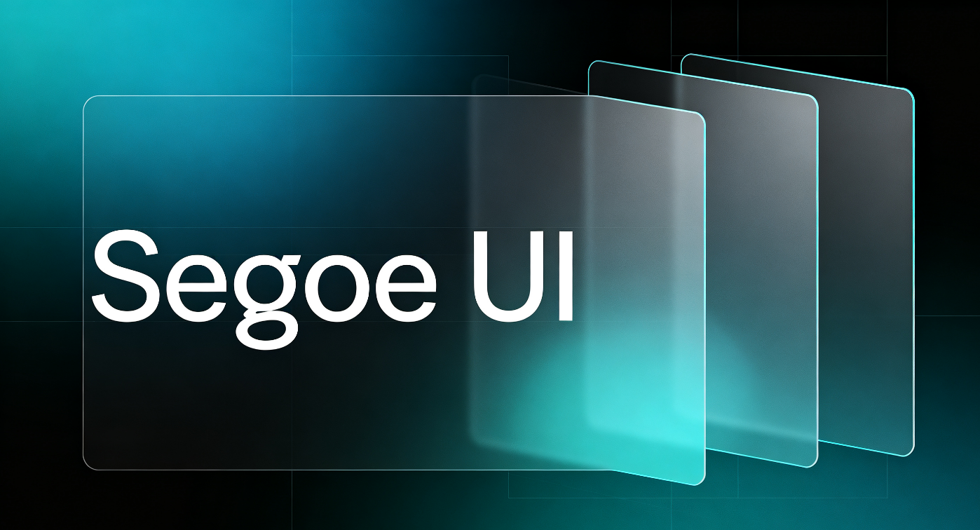
Segoe UI
Segoe UI is a clean, modern font for PPT designed with screen readability in mind. Its balanced letterforms give PowerPoint slides a polished appearance while keeping the text comfortable to scan. It is well suited to business presentations, reports, dashboards, and other slides where a simple, professional look works best.
Add custom typography to slides without manual work: Kimi Slides
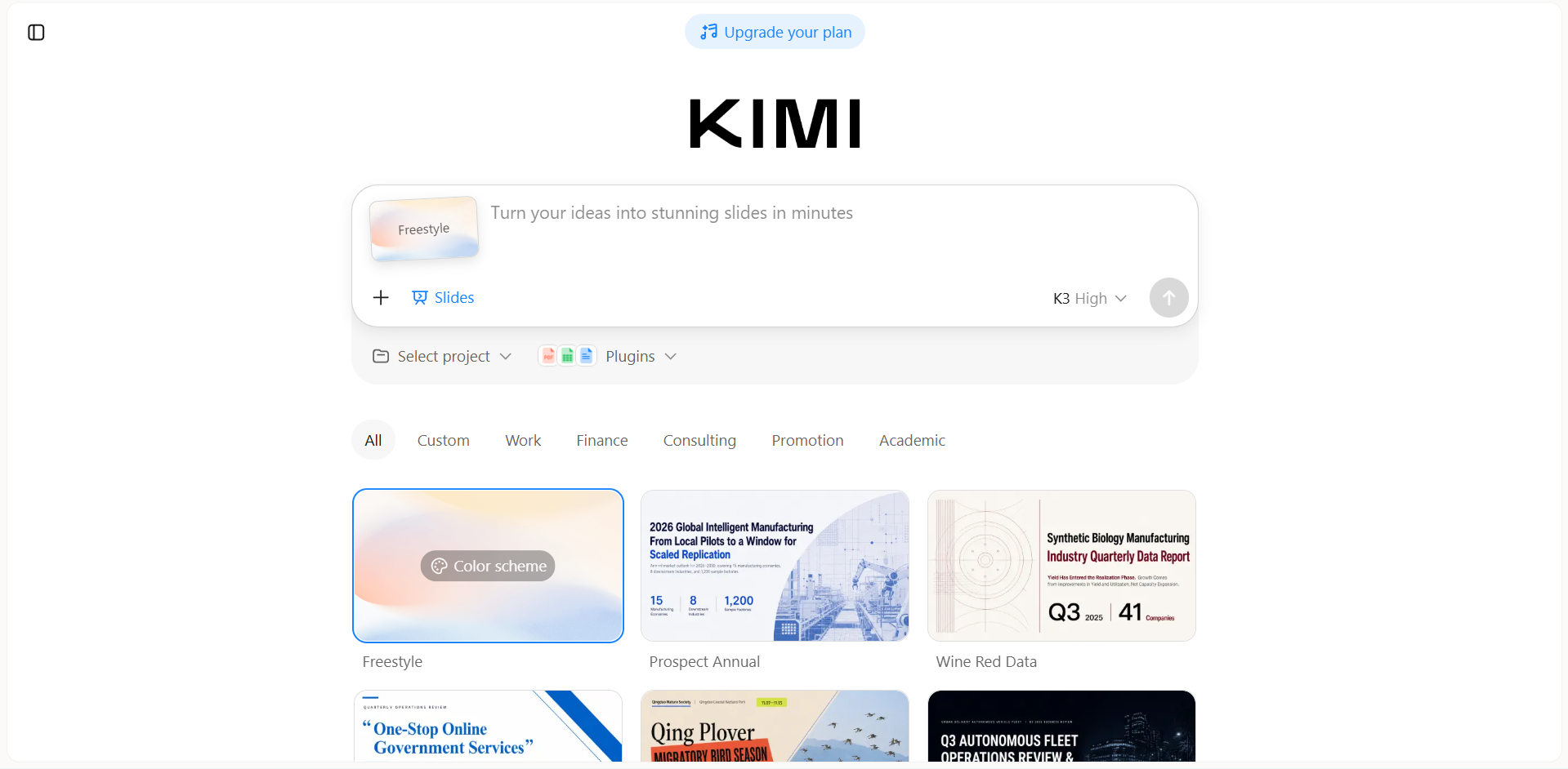
Picking out fonts and setting up text styles on each slide can be more time-consuming than you think. Kimi Slides, an AI presentation maker, makes this easier by allowing you to build professional presentation fonts with the right text styles without needing to change every detail by hand. You can concentrate on what you want to say while the tool takes care of a lot of the visual appearance, like font choices, spacing, and arrangement.
Main features
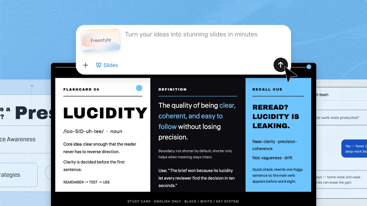
Generate fonts that fit your presentation: Describe your presentation topic, target audience, or preferred visual direction, and Kimi Slides can create slides with typography that fits the overall theme and mood.
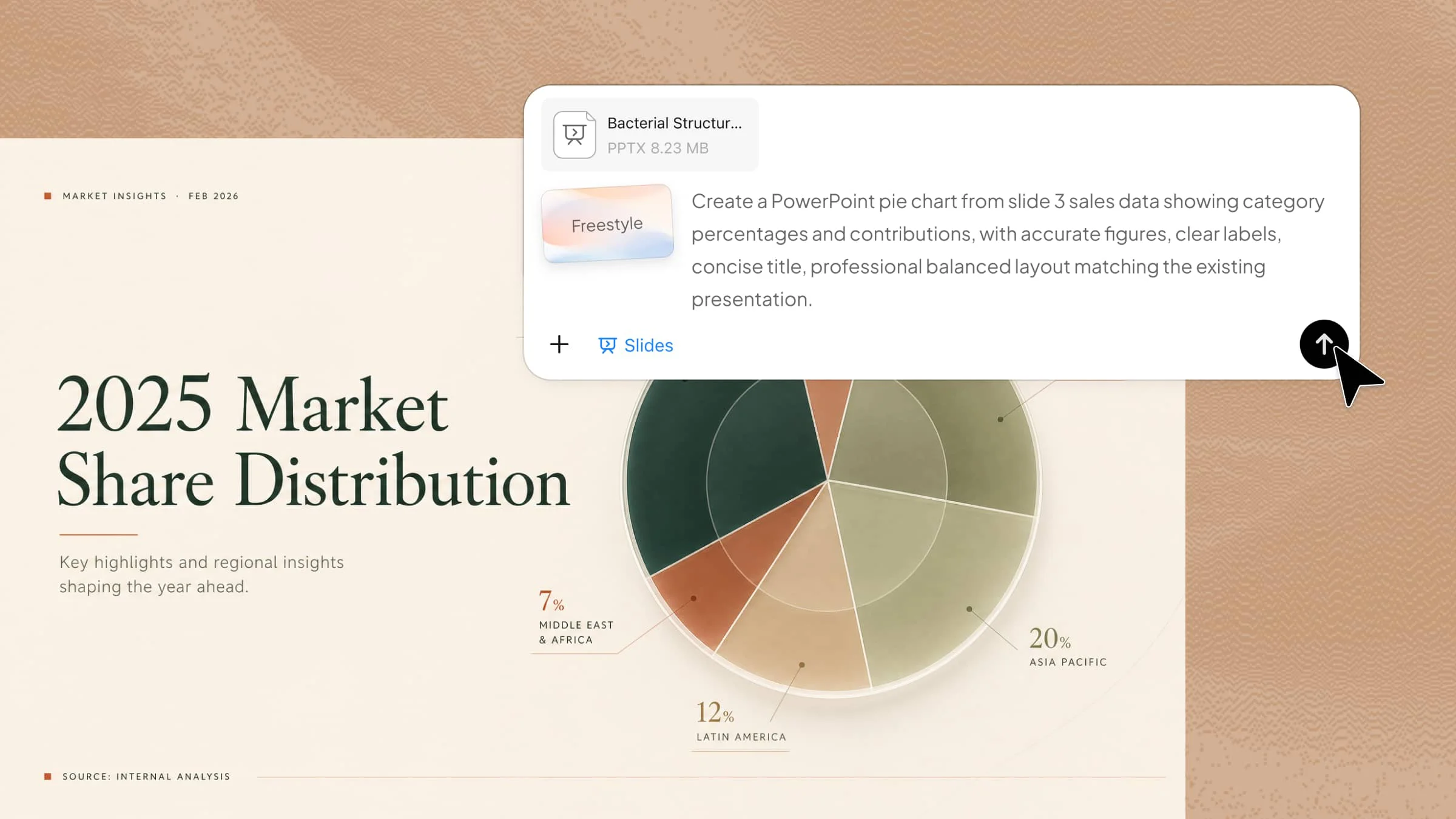
Create typography inspired by references: Upload an image or screenshot of a design you like, and Kimi Slides can use its visual style as inspiration when creating the typography and overall appearance of your presentation.
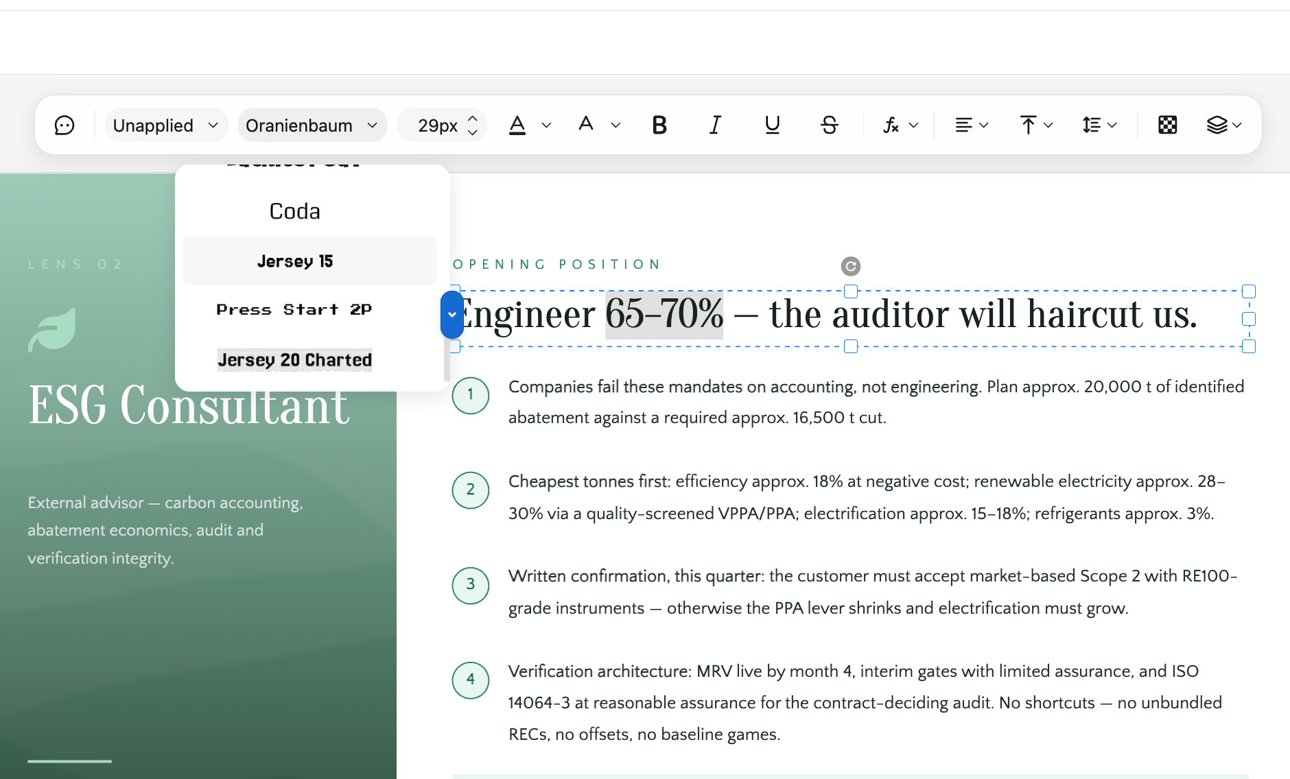
Edit text and fonts with ease: Easily revise your slide copy and fine-tune font details, including size, style, weight, alignment, and spacing. This gives you greater control over both the content and visual presentation of your slides.
Refine typography with natural-language instructions: Explain the adjustments you want in plain language, such as making headings stand out more or changing the overall text style of the presentation. You can also highlight specific parts and request targeted modifications without having to manually adjust each font option.
How to create slides with proper fonts in Kimi Slides?
Follow these simple steps to use custom fonts and create visually consistent slides with Kimi Slides.
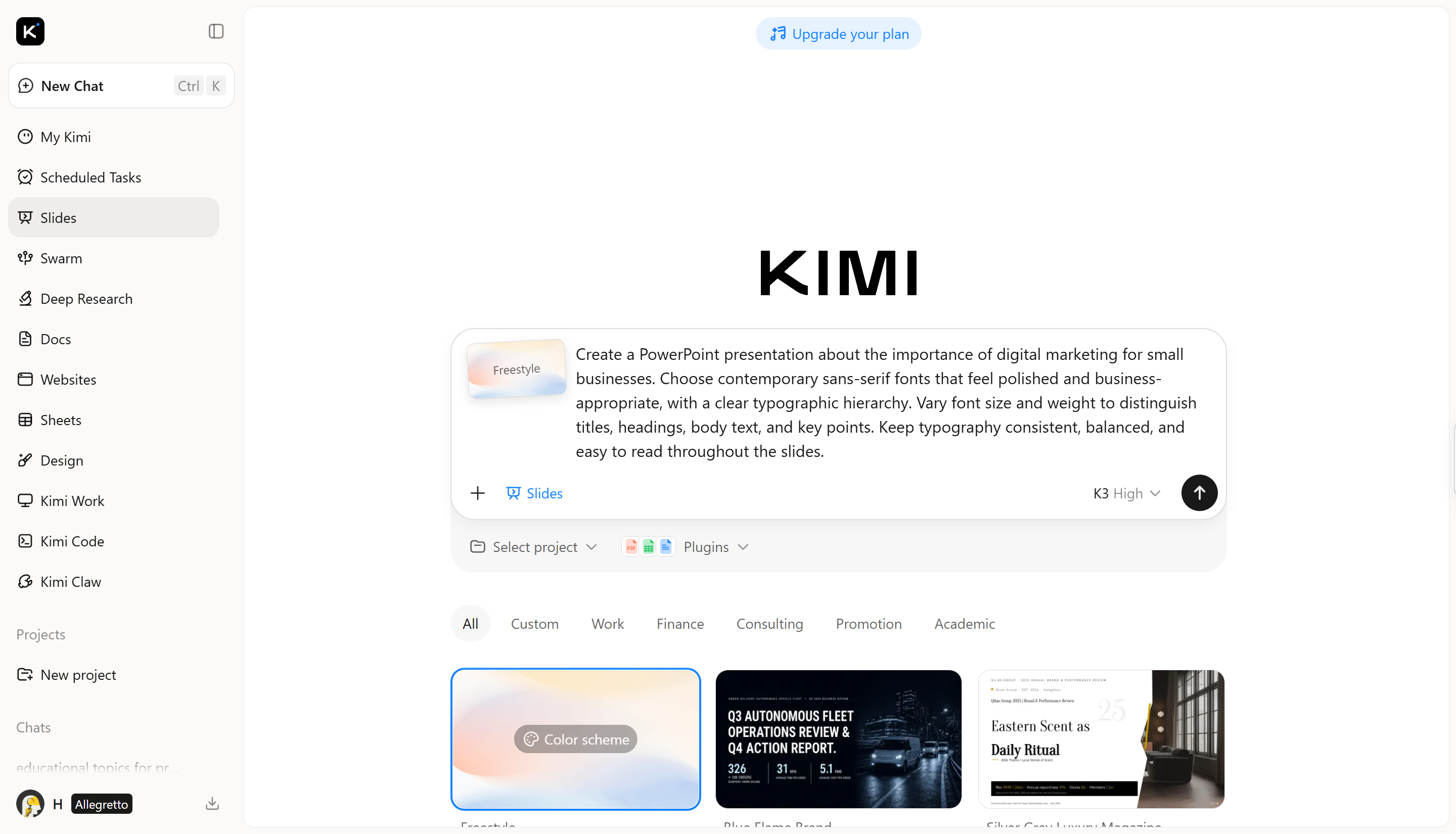
Step 1: Enter a clear prompt
Start by describing your presentation topic, audience, key points, and the visual style you want Kimi Slides to follow.
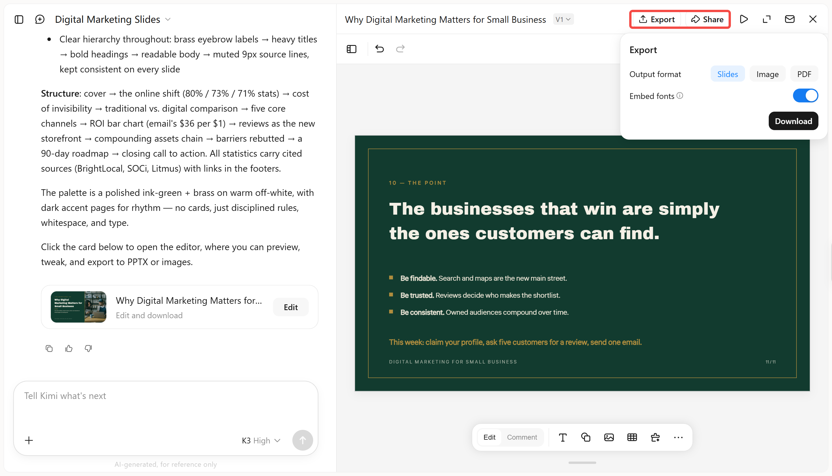
Create a PowerPoint presentation about the importance of digital marketing for small businesses. Choose contemporary sans-serif fonts that feel polished and business-appropriate, with a clear typographic hierarchy. Vary font size and weight to distinguish titles, headings, body text, and key points. Keep typography consistent, balanced, and easy to read throughout the slides. Step 2: Let AI process and generate results
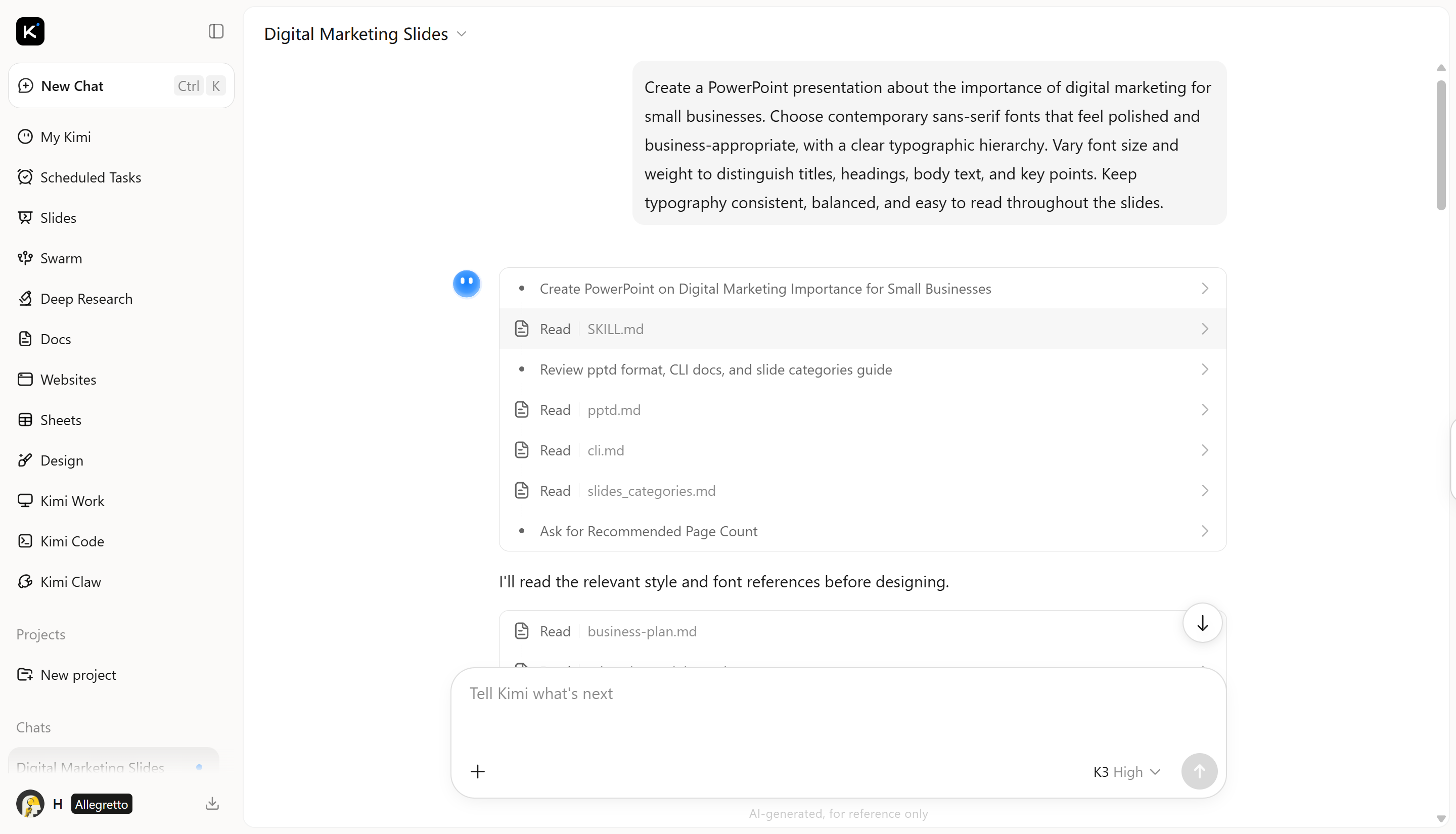
After entering your prompt, Kimi Slides processes your instructions and generates a presentation based on the topic, content, design style, and typography preferences you provided.
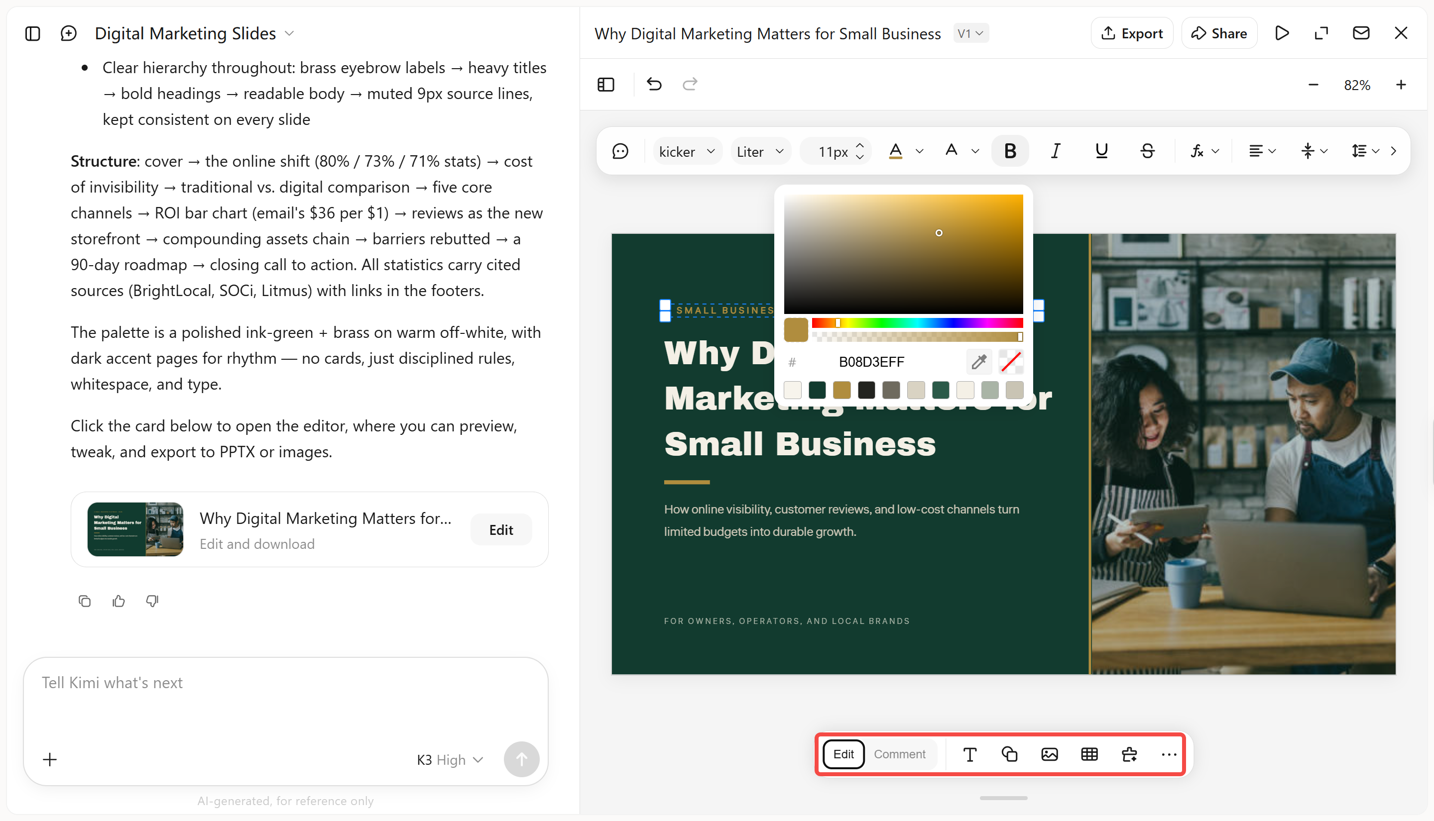
Switch to "Edit" mode to fine-tune your slides manually. You can adjust font size, spacing, color, alignment, and other typography details, or edit the text directly in the text box. If you want AI to make specific changes, use "Comment" mode to leave comments on individual elements and let Kimi update them accordingly.
Step 4: Review and download the file
Review your presentation to make sure the text, font styles, sizes, spacing, and overall typography are consistent across slides. Once everything looks right, download the PPT file and use it for your presentation.
Why choosing the right font matters
A font does more than just show the text on your slides. It influences how easily viewers can read what you have written, their feelings toward your presentation, and which details grab their focus first.
A simple font allows everyone to read your slides more easily, even those who are seated at a distance. When the text is easy to read, the audience can concentrate more on your concepts instead of having difficulty with the words.
Different fonts give off different vibes. A strong and modern typeface can make a presentation feel lively, whereas a more refined font may be better for a serious or imaginative subject.
Using a variety of font types, sizes, and weights helps guide the viewer's attention. It highlights important titles while making other details simple to grasp.
Choosing the right font for slides can enhance the concept of your presentation and help it stick in people's minds. When your type style fits the subject and the overall look, your message comes across as clearer and more powerful.
Tips for choosing suitable PowerPoint fonts
Choosing a PowerPoint font is not only about picking a style you like. A good choice should fit your presentation, work well with your content, and make it easy for your audience to follow each slide.
Consider the emotion you want to communicate and the audience who will watch your presentation. A colorful typeface may be appropriate for creative projects, whilst a tidy and official type is suitable for a business audience.
Make sure your writing is easy to read from a distance and at different sizes. Use larger or bolder letters for titles, and keep extra material simple so that viewers can quickly grasp the main themes.
Too many font types can make your slides look cluttered and unclear. Limit yourself to two identical typefaces or use different weights of the same font for diversity.
Test your fonts on multiple devices to ensure they appear decent. Furthermore, choose text and backdrop colors that contrast nicely, ensuring that every word is obvious and easy to understand.
Conclusion
Choosing the right font for PowerPoint can make a noticeable difference in how your PowerPoint presentation looks and how easily your audience understands it. The fonts in this list give you plenty of options, whether you want your slides to feel modern, creative, professional, or more traditional. Keep readability and your audience in mind when making your final choice. If you want to speed up the design process, AI tools such as Kimi Slides can also help you create visually consistent PowerPoint fonts with less manual effort.