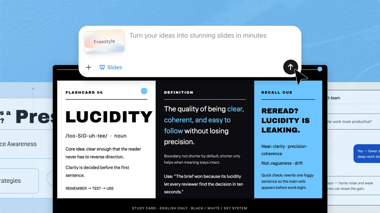
Whether you are creating a report, class project, or presentation, turning data into clear visuals can be challenging. Creating charts and graphs in PowerPoint manually can also take time, especially when you want them to look clean and professional. Luckily, PowerPoint offers simple ways to turn numbers into useful visuals, while AI tools can make the process even faster. Keep reading this article to learn how to make a graph in PowerPoint quickly and easily.
Overview of two methods to create charts in PowerPoint
There are two main ways to create charts and graphs in PowerPoint. You can use an AI tool like Kimi Slides to turn your data into a presentation-ready visual with less manual work, or use PowerPoint's built-in chart tools to create and customize the graph yourself. The table below highlights the key differences between the two approaches.
| Tool | Kimi Slides | Microsoft PowerPoint |
|---|---|---|
| How it works | Upload your data or materials and describe the chart you want with a prompt | Insert a chart, enter data, and customize the chart using PowerPoint's built-in tools |
| Data input | Can work with uploaded Excel files and other materials | Data is entered or edited in the embedded Excel sheet |
| Chart creation | AI analyzes the data and generates a suitable chart based on your instructions | You select the chart type and build the chart manually |
| Design process | AI automatically creates a polished visual layout, which you can refine with prompts or direct edits | Manually adjust styles, layouts, colors, labels, and other chart elements |
| Editing | Generated charts and slide elements can be edited and customized | Chart elements can be edited directly in PowerPoint |
| Efficiency | Faster for turning existing data into presentation-ready visuals | More time-consuming, especially for complex datasets or detailed designs |
| Best for | Quickly creating polished, data-driven slides with less manual work | Users who want full control over every step of chart creation |
How to make a graph in PowerPoint with an AI tool
Once you have your data ready, the next step is turning it into a graph that looks clear and fits your presentation. Instead of building everything manually, Kimi Slides, an AI presentation maker, can help you create polished visuals with less effort. Here's how to use it to make a graph quickly, from preparing your data to adding the finished result to your slides.
Step 1: Upload your materials and enter the prompt
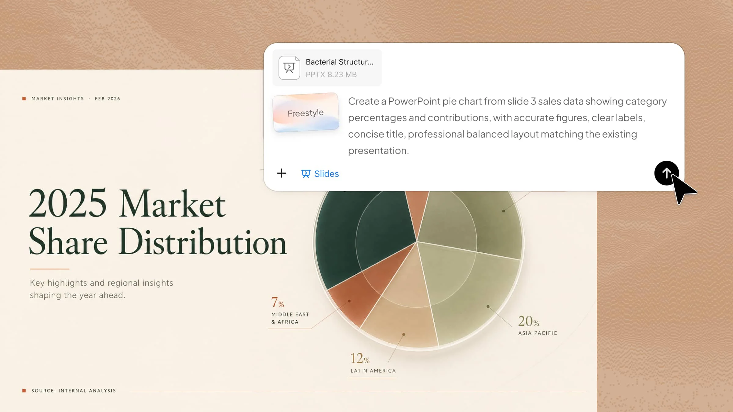
Start by uploading the Excel file containing the data you want to turn into a graph. Once the file is uploaded, enter a clear prompt that tells Kimi Slides what type of graph to create and how you want it to look.
Example prompt:

Step 2: Let AI process and generate results
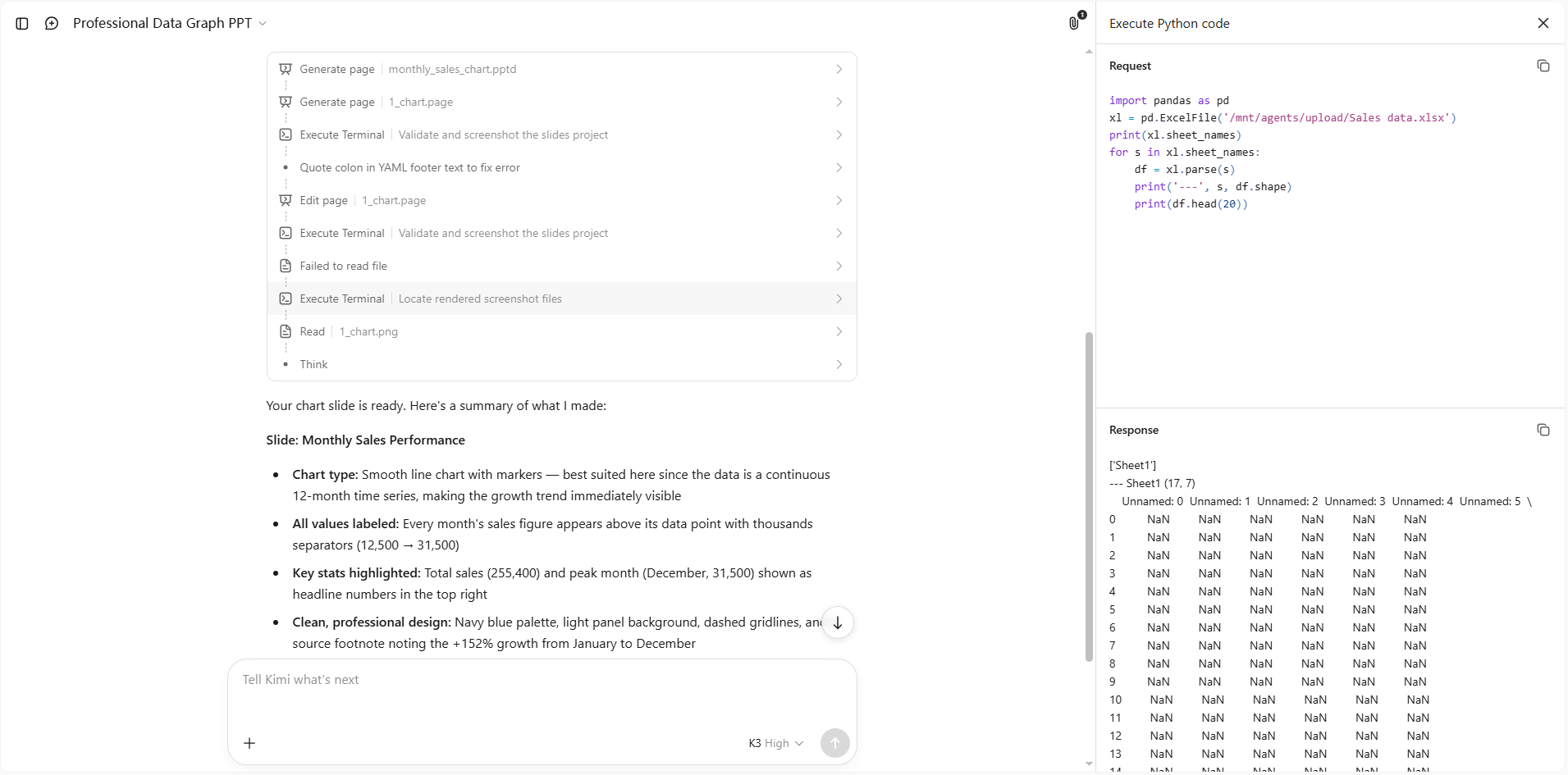
After you submit the prompt, Kimi Slides will analyze the Excel data and create a graph based on your instructions. It automatically organizes the information and presents it in a clear visual format, saving you from creating the graph manually.
Step 3: Edit the PPT file
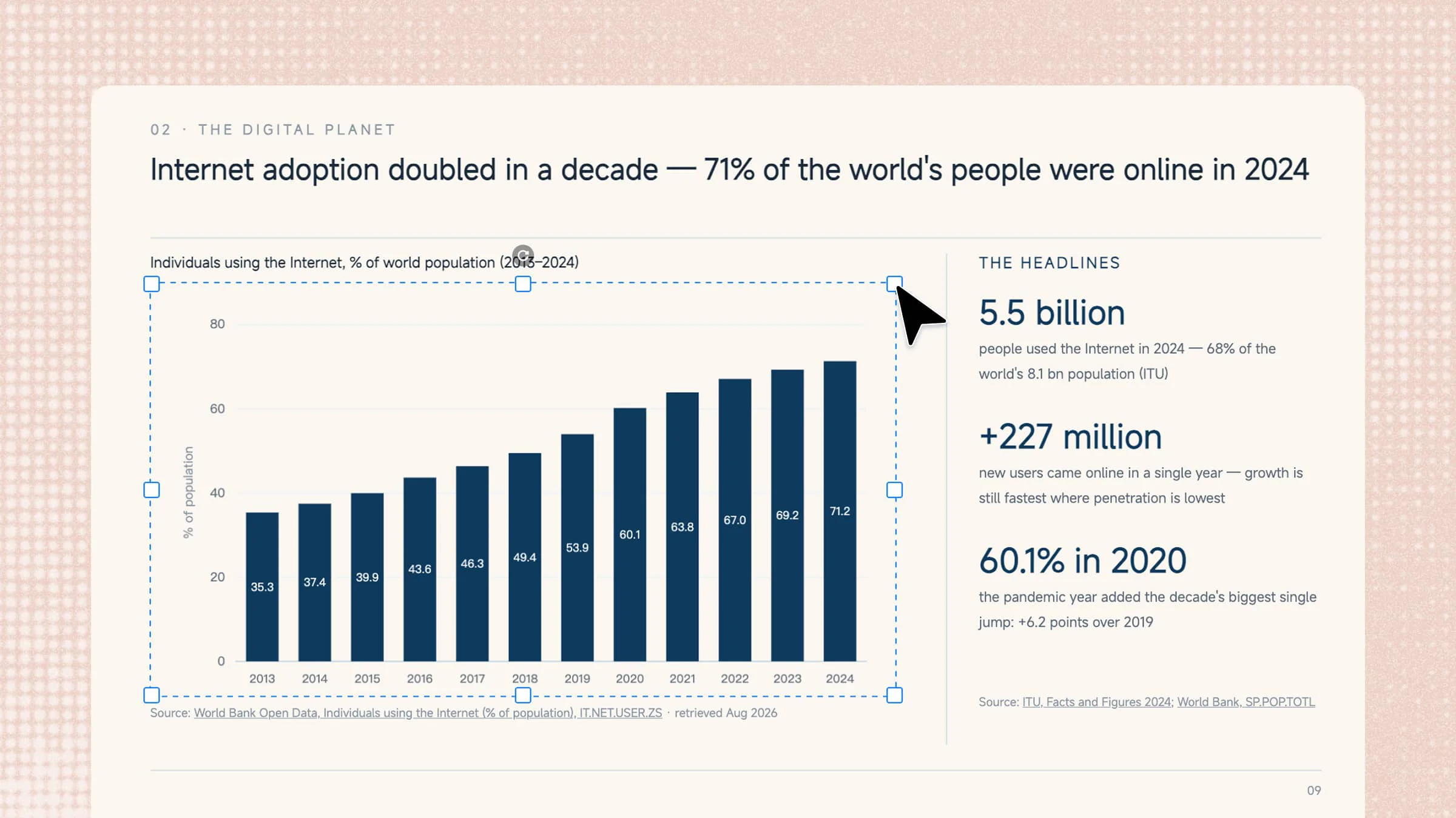
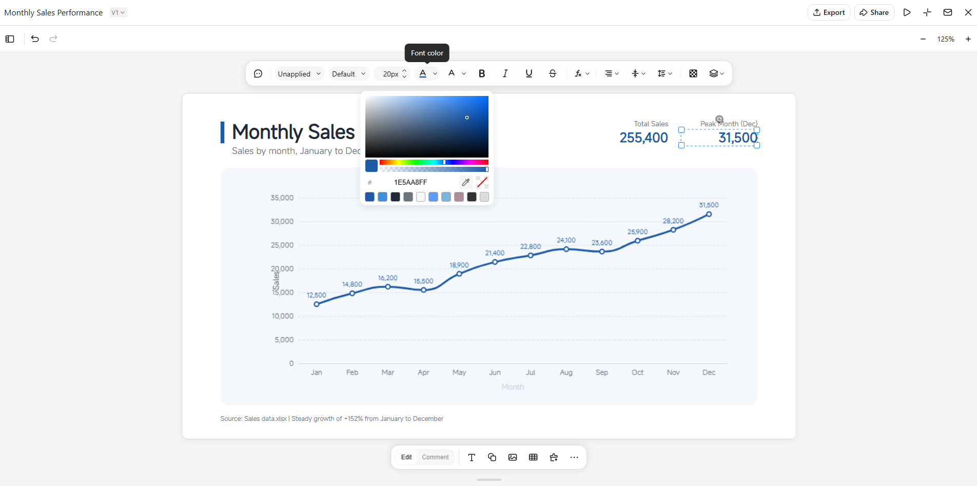
Review the generated slide and make any changes needed to the graph or presentation. In "Edit" mode, you can directly adjust the title, labels, layout, text, and other design elements. You can also switch to "Comment" mode to comment on specific PPT elements or describe the changes you want. Kimi Slides will use your feedback to make the requested edits, so you can refine the graph without rebuilding the slide from scratch.
Step 4: Preview and download
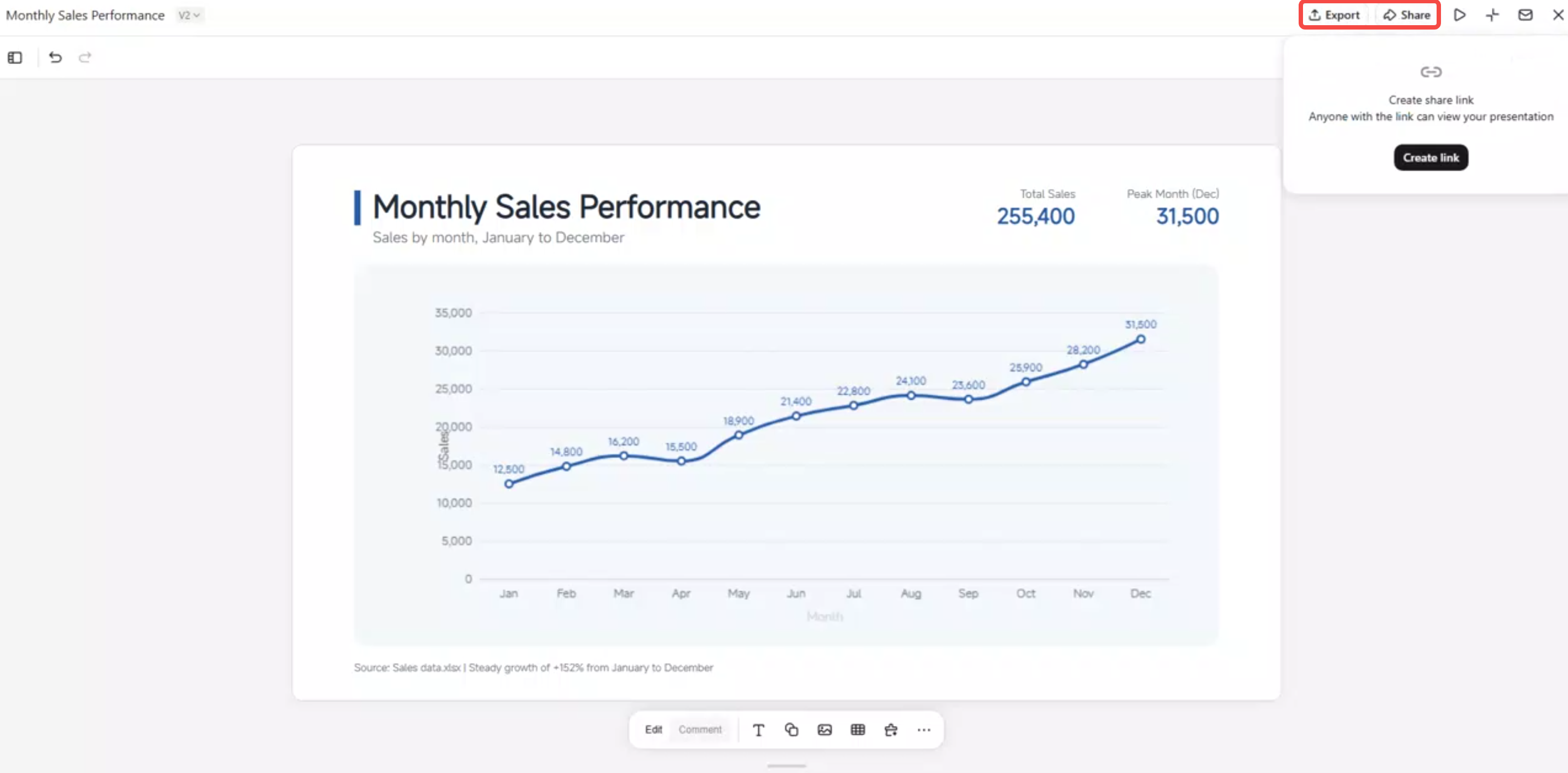
Preview the completed presentation to make sure the graph is accurate, readable, and properly placed on the slide. Once you are happy with the result, download the PowerPoint file and use the finished graph in your presentation.
Main functions of Kimi Slides
Kimi Slides offers several useful features that make creating and presenting data-driven slides much easier. From turning uploaded data into charts to customizing and animating each element, this AI PPT maker helps you create visuals without doing everything manually. Here are the main functions to know before you get started.
Turn data into charts with AI: Upload Excel files, images, or other materials, and Kimi Slides can extract key data and turn it into clear, presentation-ready charts and graphs. You can also describe the data or insights you want to visualize with a simple prompt.
Create the right chart for your data: Choose from bar charts, line charts, pie charts, area charts, and other graph types to present trends, comparisons, proportions, changes, and other data relationships in a clear visual format.
Add polished animations to chart elements: Bring static data to life with refined animations applied to chart elements. Use motion to reveal information progressively, highlight key figures, or make data-driven slides more engaging during a presentation.
Customize every chart element your way: Edit chart components directly with precise controls, since the charts are built as native, editable elements. You can also use comments or conversational editing to make targeted changes without rebuilding the entire slide.
Preview and export editable PPTs: Preview your charts and slides online before presenting, then export the finished deck as an editable PowerPoint file for further customization.
How to make charts and graphs in PowerPoint manually
If you want to create a chart without using an AI tool, PowerPoint has built-in options that let you add and customize graphs manually. You can choose a chart type, enter your own data, and adjust the design to make the final visual easier to understand. The process is simple, although it may take some time when working with large or detailed datasets. Follow these steps to create charts and graphs in PowerPoint manually.
Step 1: Insert a chart
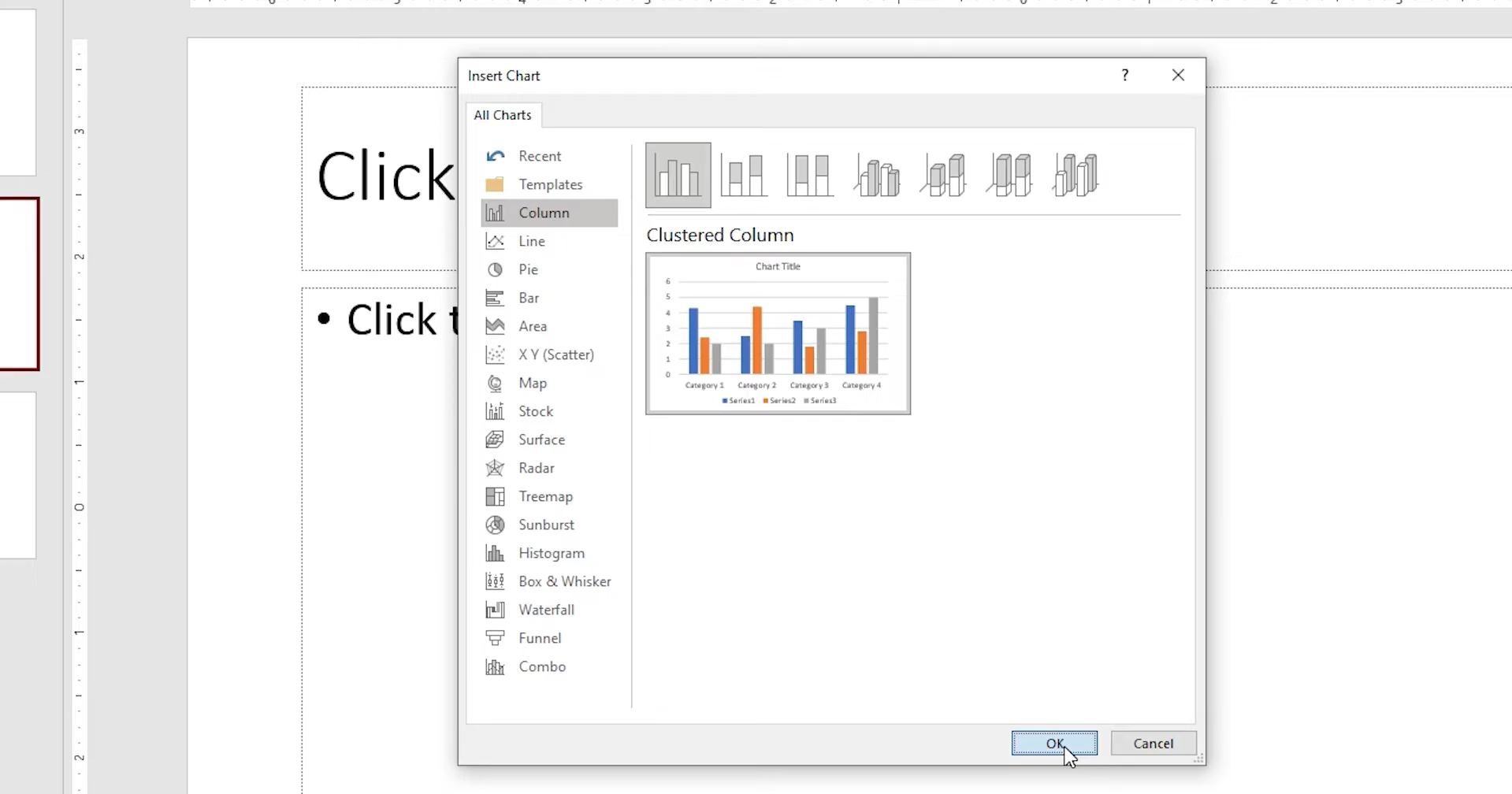
Open your PowerPoint presentation and go to "Insert" from the top menu. Select "Chart", choose the chart type that best suits your data, and click "OK".
Step 2: Add and edit your data
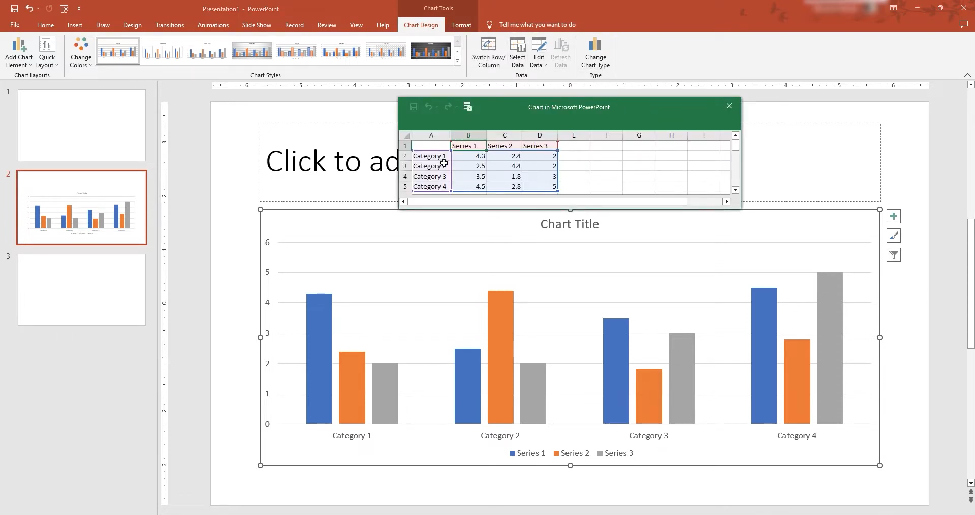
Click the chart and go to "Chart Design" on the ribbon. Select "Edit Data" to open the Excel data sheet, then enter new values or edit the existing rows and columns.
Step 3: Customize the chart design
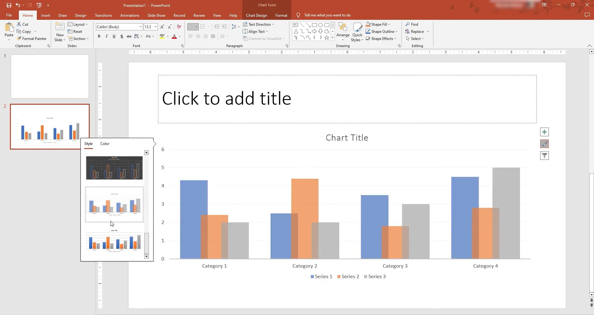
Use the options under "Chart Design" to change the chart style, layout, colors, and other elements. Remove unnecessary details and make important information stand out, so the chart remains easy to read.
Pick the right chart for your presentation
Choosing the right chart can make your data much easier to understand. The best option depends on what you want your audience to notice, whether it is a trend, comparison, relationship, or breakdown. Use these chart types to match your data with the clearest visual format.
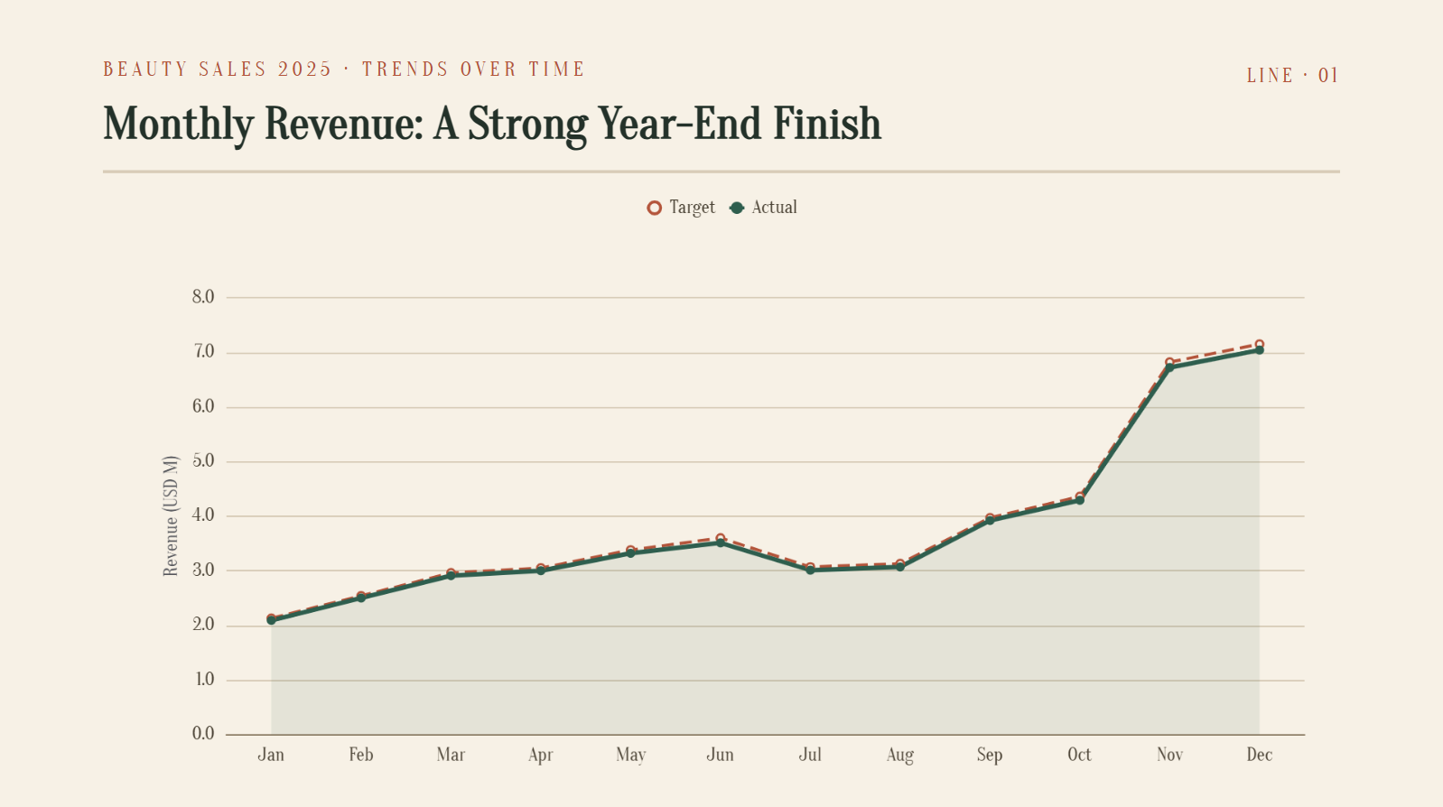
Trends over time: Line chart
A line chart is ideal for showing how values change over a period. It helps your audience quickly spot increases, decreases, and overall trends in the data.
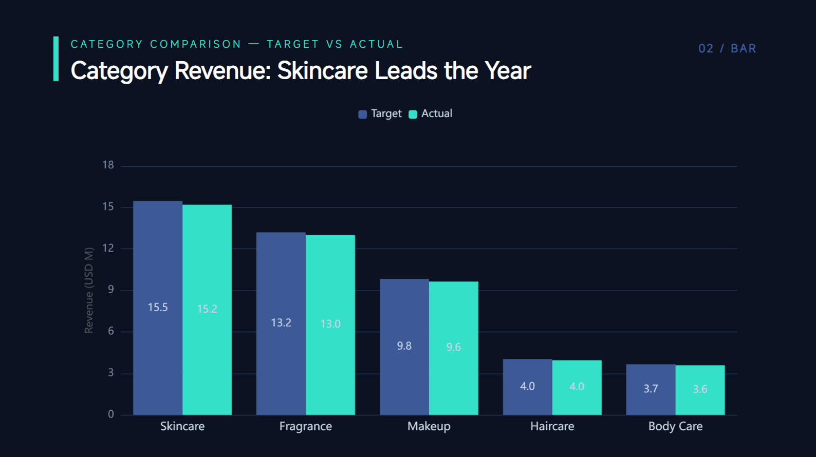
Comparing categories: Bar/column chart
Bar and column charts work well when you need to compare different categories. They make it easy to see which values are higher, lower, or similar at a glance.
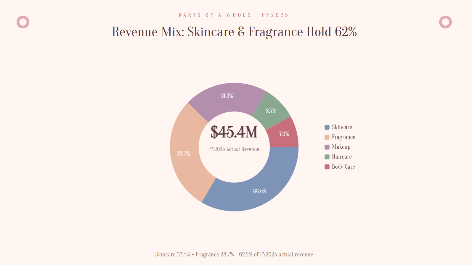
Parts of a whole (≤5 categories): Pie/donut chart
Pie and donut charts show how different categories contribute to a total. They work best with a small number of categories, so each section remains easy to identify.
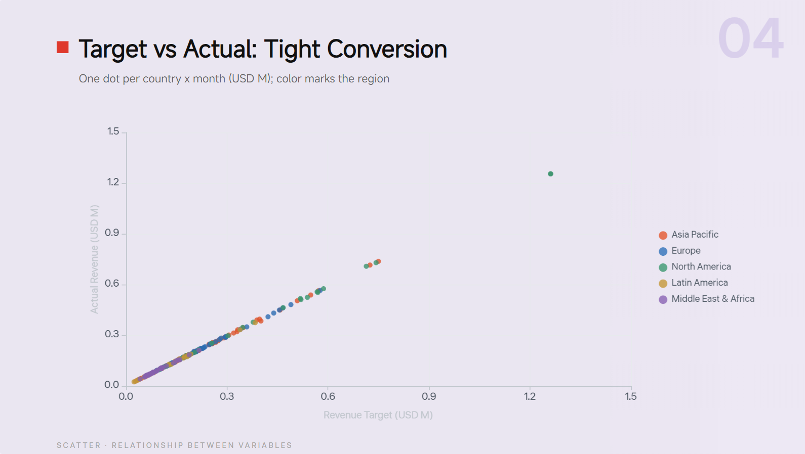
Relationship between variables: Scatter chart
A scatter chart helps show whether two variables are related to each other. It can reveal patterns, clusters, or unusual values that may not be obvious in a table.
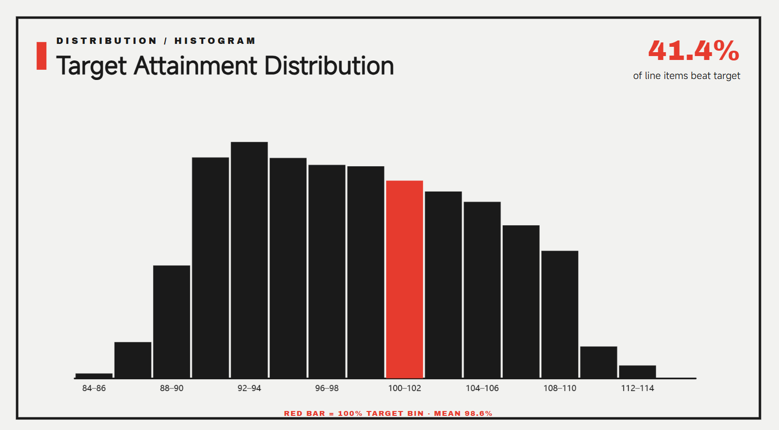
Distribution: Histogram
A histogram shows how often values fall within different ranges. It is useful for understanding the spread, concentration, and overall distribution of your data.
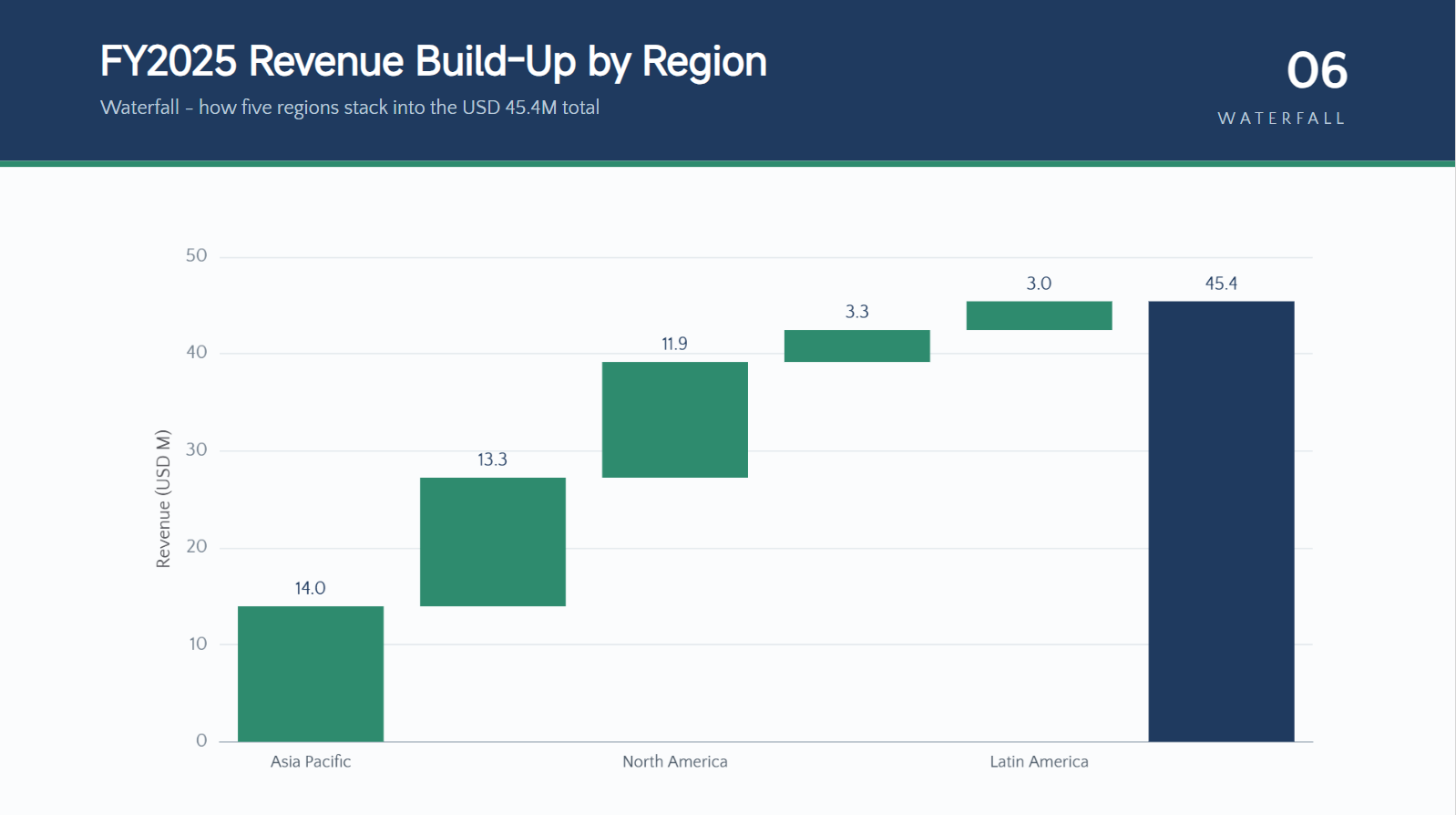
Cumulative changes: Waterfall chart
A waterfall chart shows how individual increases and decreases affect a starting value. It is especially useful for explaining financial changes, costs, profits, or other step-by-step totals.
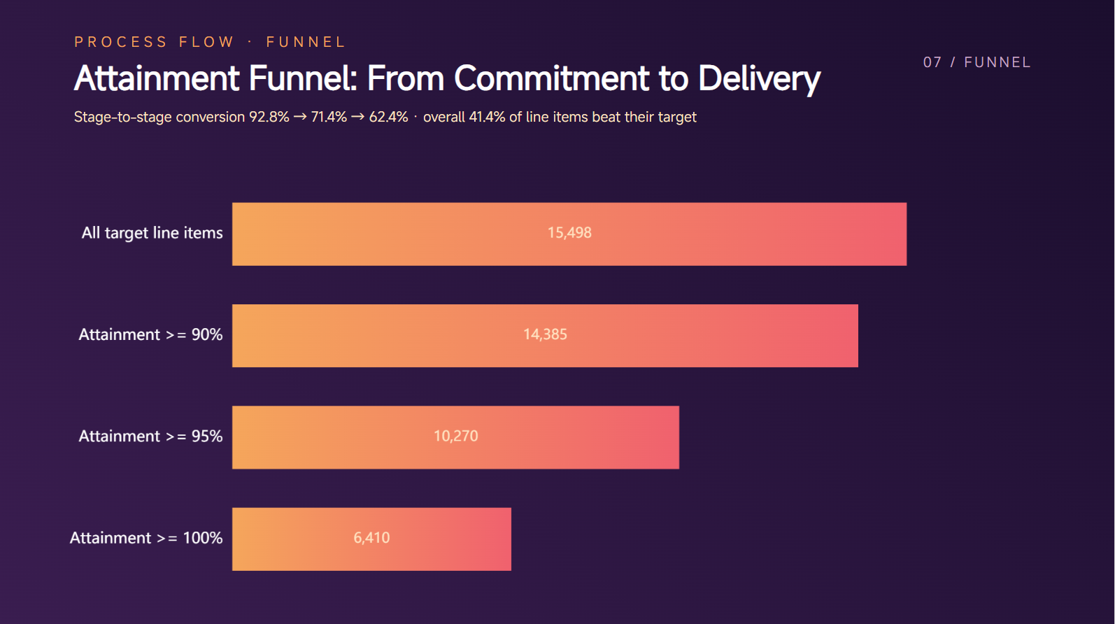
Process/flow: Funnel chart
A funnel chart is useful for showing stages in a process where the number of items changes at each step. It can clearly highlight where values increase, decrease, or drop off.
Multi-variable comparison (one item): Radar chart
A radar chart compares several different measures for a single item or subject. It works well when you want to show strengths and weaknesses across multiple factors at once.

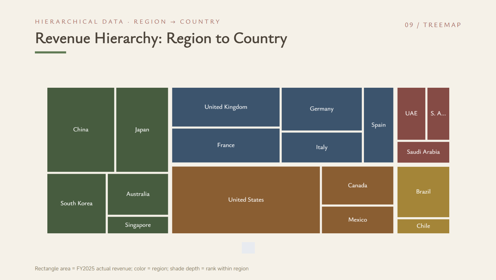
Hierarchical data: Treemap
A treemap displays hierarchical data using nested rectangles of different sizes. It helps you compare categories while also showing how smaller groups fit within larger ones.
Pro tips for creating graphs in your PPT
The right chart is only part of creating an effective data slide. A few simple design choices can make your visuals clearer, easier to read, and more useful to your audience. Keep these tips in mind when working with PowerPoint graphs and building your slides.
Match the chart type to your message
Choose a chart based on what you want your audience to understand from the data. For example, a bar graph in PowerPoint works well for comparisons, while a line chart is better for showing trends over time. The right format makes your main point much easier to see.
Give each chart one clear takeaway
Avoid trying to communicate too many ideas in a single chart. Focus each visual on one main message so your audience can understand it quickly. If you have several insights, consider using separate charts instead of overcrowding one slide.
Write titles that highlight the insight
A useful chart title should tell readers what the data means, rather than simply naming the chart type. Instead of using a basic title like "Monthly Sales," highlight the main finding, such as "Sales Increased Throughout the Year." This small change makes your PowerPoint graphic design more informative.
Highlight key data points
Use visual emphasis to draw attention to the numbers or categories that matter most. You can highlight an important value while keeping other elements more subtle. This helps your audience focus on key information without making the entire chart look busy.
Use consistent fonts and visual styles
Keep fonts, sizes, spacing, and design elements consistent across your presentation. A unified style makes your PowerPoint graphics look more professional and helps the slides feel connected. Avoid using too many different fonts or visual effects.
Check data before presenting
Always review your data carefully before showing the chart to an audience. Check the numbers, labels, units, and categories to make sure everything is accurate and easy to understand. A well-designed chart is only useful when the information behind it is correct.
Conclusion
Understanding how to create charts in PowerPoint can make your presentations more useful and easier to follow. The best approach depends on how much control you need and how quickly you want to turn your data into a finished visual. With the right method, you can spend less time building charts and more time improving your message. Kimi Slides can help speed up this process with AI-powered chart creation and editable PowerPoint output.