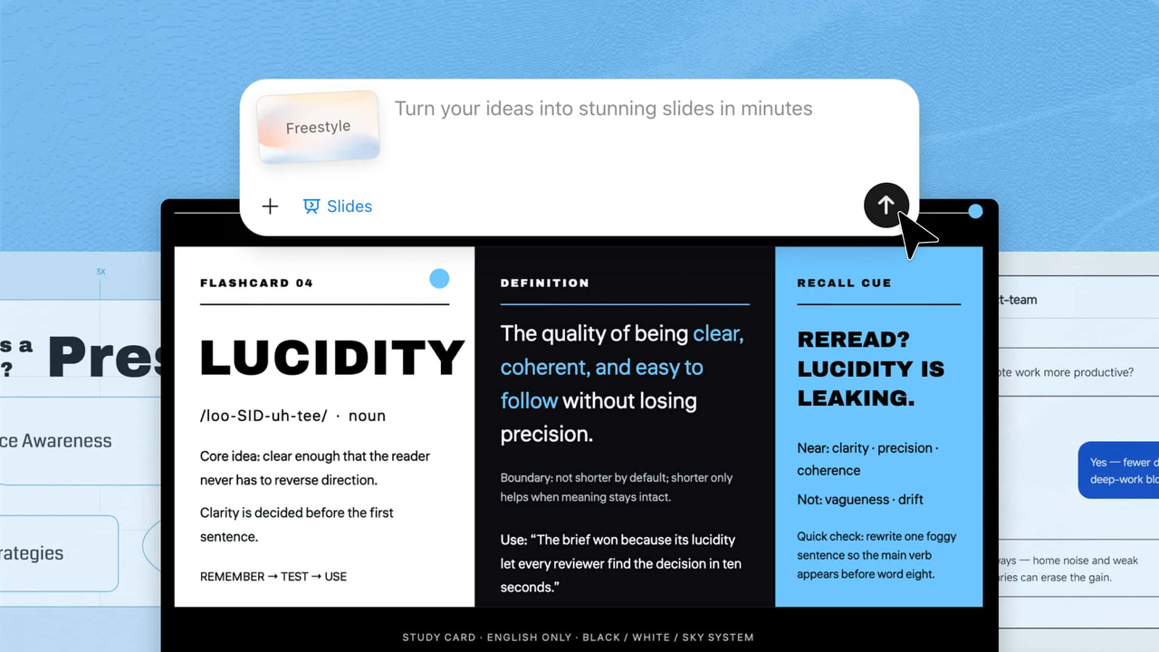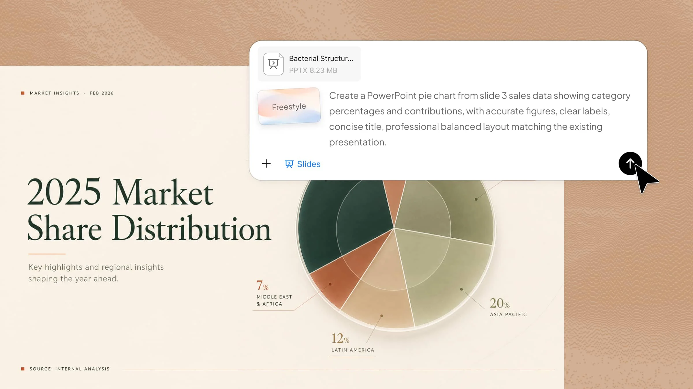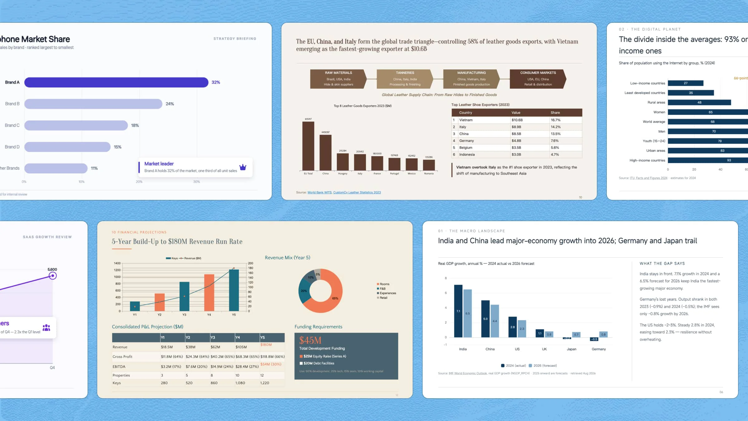
Data plays an important role in presentations, but presenting it clearly can be challenging. Graphs turn complex data into visuals that are easier to understand, helping highlight key trends and comparisons. PowerPoint graph templates make the design process simpler with ready-made layouts and styles. Here are 10 templates to help you create clearer, more engaging data presentations.
Overview of 10 PPT chart templates
These 10 graph templates cover a range of presentation needs, from tracking business growth and financial performance to comparing products and visualizing project progress. The table below summarizes what each template is best suited for and when to use it.
| Template | Graph type | Key data focus | Suitable for |
|---|---|---|---|
| Sales growth graph | Line chart | Monthly sales and overall growth | Sales reports, business reviews, performance updates |
| Revenue comparison graph | Grouped bar chart | Regional or segment revenue | Business reports, regional comparisons, management presentations |
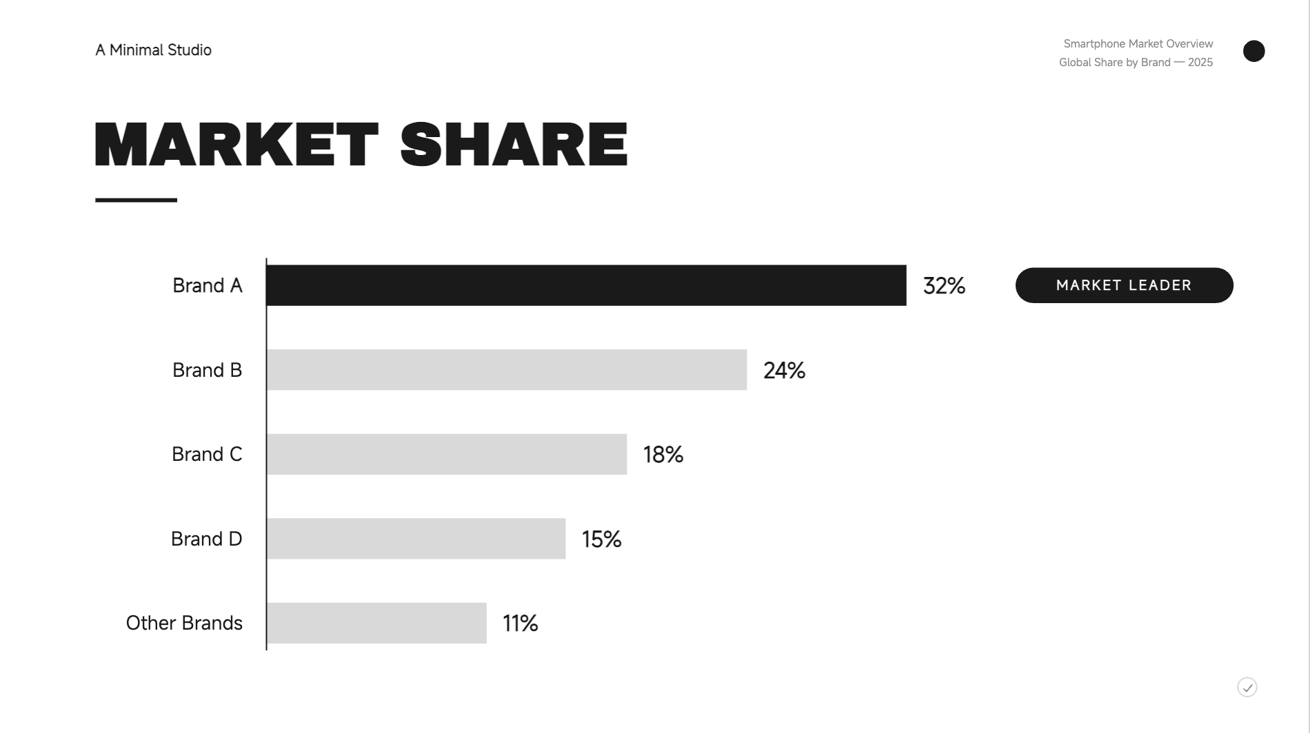
| Market share graph | Horizontal bar chart | Market share by brand | Marketing reports, competitor analysis, strategy decks |
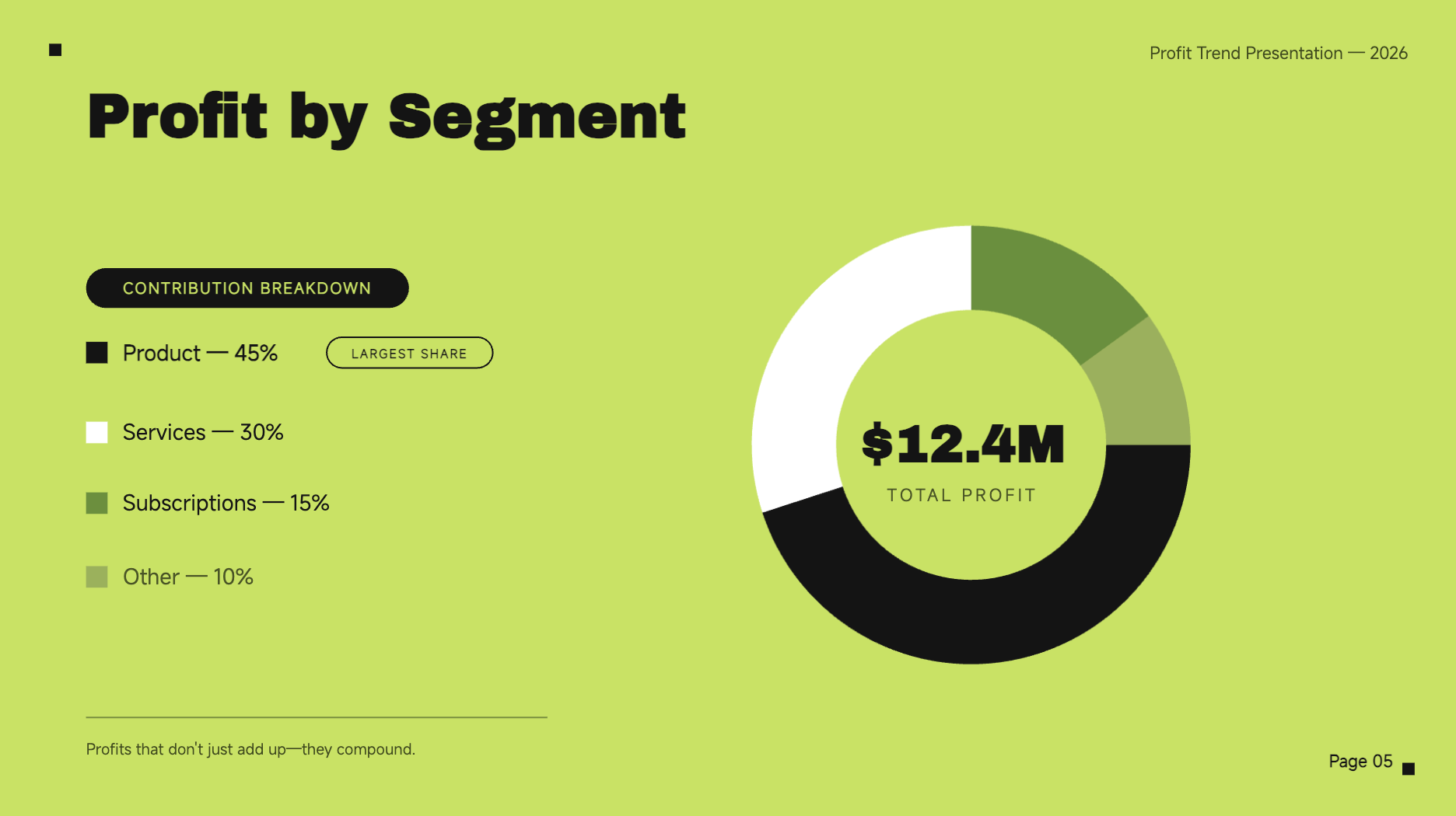
| Profit trend graph | Donut chart | Monthly profit, peaks, and declines | Financial reports, management meetings, business planning |
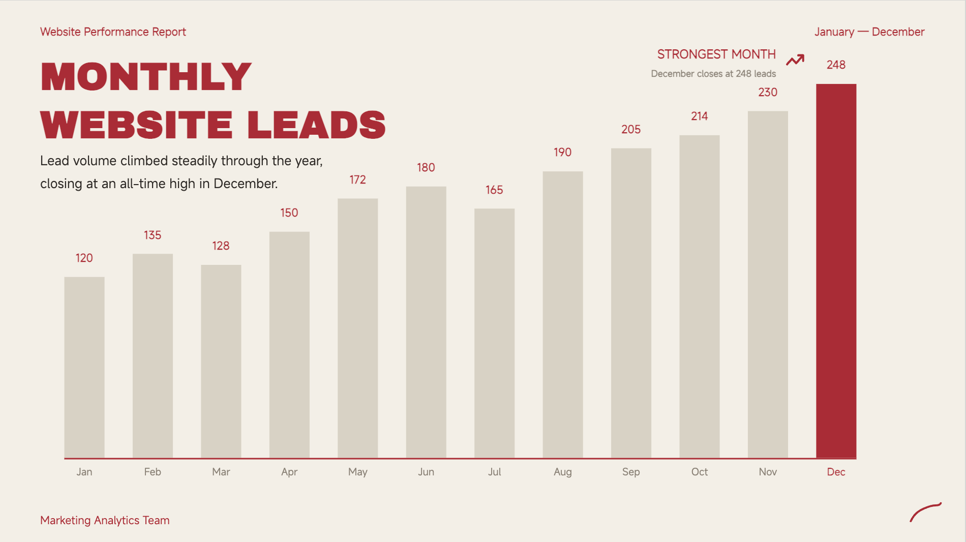
| Monthly performance graph | Column chart | Monthly performance metrics | KPI reports, lead tracking, annual reviews |
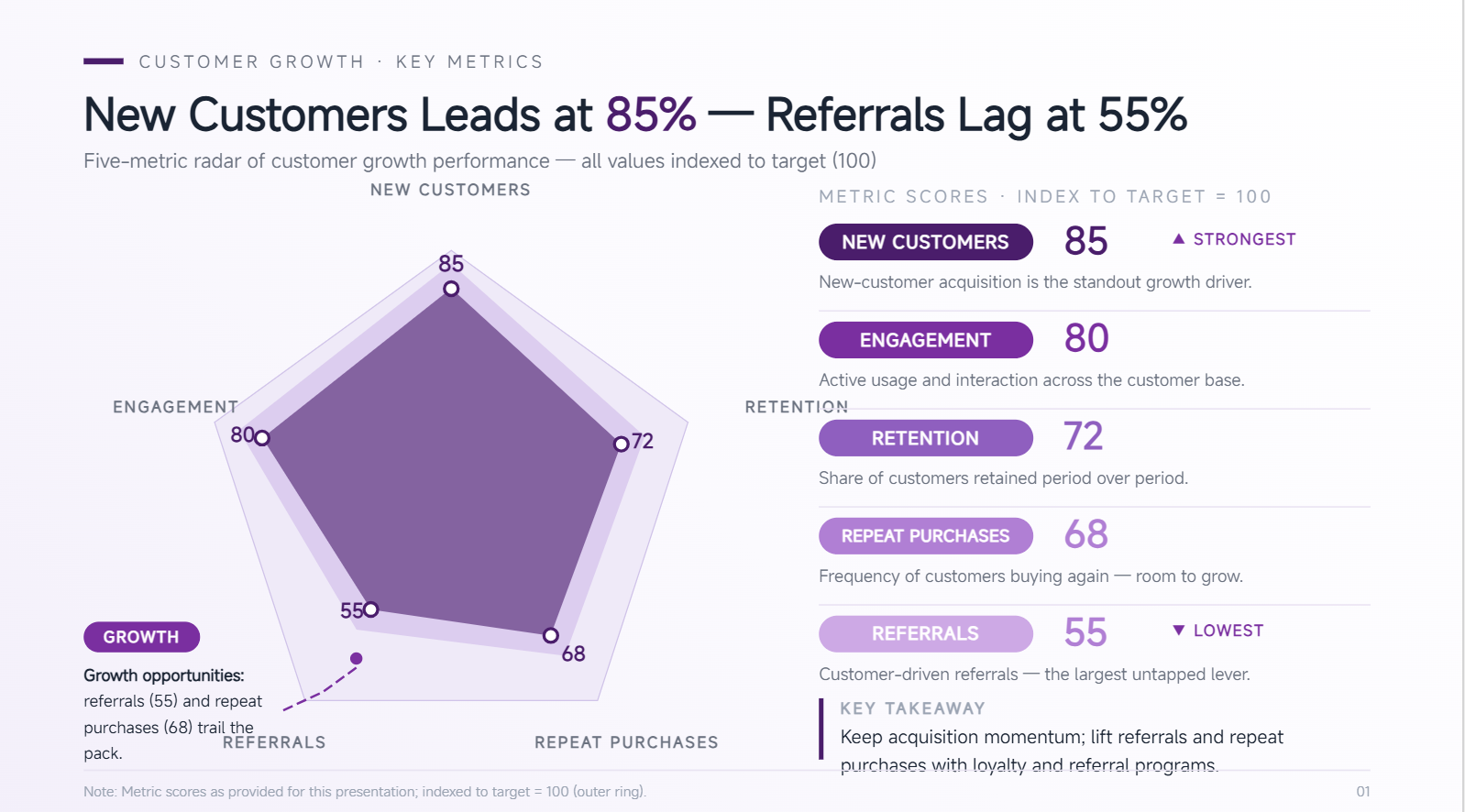
| Customer growth graph | Radar chart | Customer totals and growth milestones | Acquisition reports, subscriber updates, growth presentations |
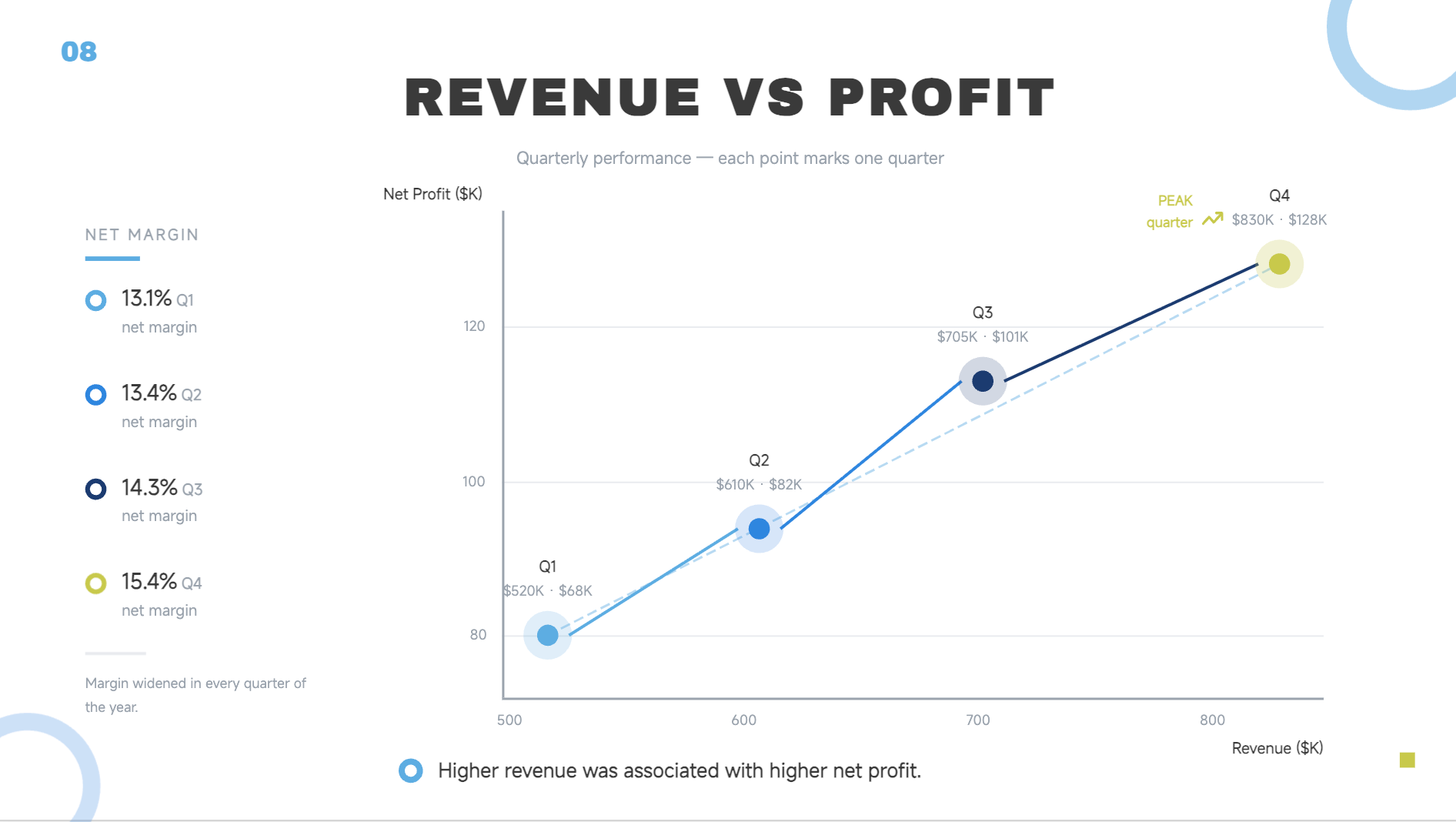
| Financial performance graph | Scatter chart | Revenue and operating profit | Executive reports, financial reviews, business planning |
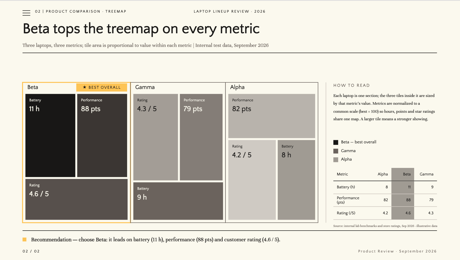
| Product comparison graph | Treemap | Features, scores, and ratings | Product presentations, buying guides, sales decks |
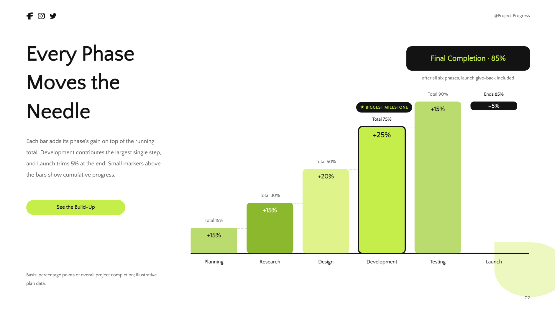
| Project progress graph | Waterfall chart | Completion percentage by phase | Project updates, team meetings, status reports |
| Statistical data graph | Funnel chart | Percentages, benchmarks, and key findings | Surveys, research reports, customer feedback presentations |
10 graph PowerPoint templates to upgrade your presentations
Choosing the right graph is not only about showing data. It's about making your message easier to see and remember. Kimi Slides, an AI presentation maker, can turn your data and instructions into presentation-ready graphs, with layouts, labels, highlights, and animations arranged for you. The 10 templates below were all created with Kimi Slides and cover different ways to visualize business, financial, customer, product, and project data.
Sales growth graph template
A sales growth graph makes it easier to see how sales performance changes over time. It can help businesses present monthly or yearly results, spot strong periods, and show overall growth. It is a useful choice for sales reports, business reviews, and performance presentations.
How to use
Step 1: Enter your prompt
Describe the sales data you want to visualize, including the time period, figures, important changes, and any key result you want to highlight. Be specific about the visual style and animation, so the generated result matches your presentation needs.
Prompt:
Step 2: Let AI generate your PPT
Kimi Slides will turn the sales figures into the requested graph and automatically arrange the labels, growth callouts, and animations.
Step 3: Review and export the PPT
Check that every monthly figure is correct and the growth trend is easy to understand. Preview the animation, make any needed changes, and export the finished PPT.
Revenue comparison graph template
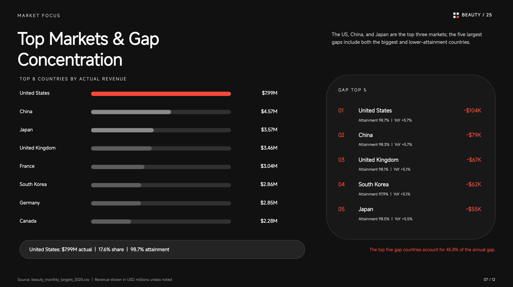
A revenue comparison graph helps viewers quickly understand which categories generate the most revenue. It can compare regions, products, departments, or other business segments side by side. This makes it especially useful for reports where clear performance differences matter.
How to use
Step 1: Enter your prompt
Provide the revenue figures for each region, product, or business unit you want to compare. Mention that the data should appear as a bar graph, with the highest-performing category clearly highlighted for quick comparison.
Prompt:
Step 2: Let AI generate your PPT
The AI will organize the regional revenue figures into a comparison graph and add the requested labels, highlights, and bar animations.
Step 3: Review and export the PPT
Confirm that all four regions have the correct figures and that the East stands out as the highest. Play the animation to make sure the comparison is clear, then export the PPT.
Market share graph template
A market share graph shows how a market is divided among different companies or brands. It makes competitor positions easier to compare and helps audiences understand who holds the largest share. It works well for marketing reports, competitive analysis, and business strategy presentations.
How to use
Step 1: Enter your prompt
Enter companies or brands, their market-share percentages, and the ranking or key insight you want to communicate with. Include instructions about labels, ordering, emphasis, and animation for a focused result.
Prompt:
Step 2: Let AI generate your PPT
Kimi Slides will convert the percentages into a ranked market-share graph and apply the requested ordering, labels, and animation.
Step 3: Review and export the PPT
Check that all market-share percentages are accurate and correctly ranked. Make sure the market leader is clearly identified before exporting.
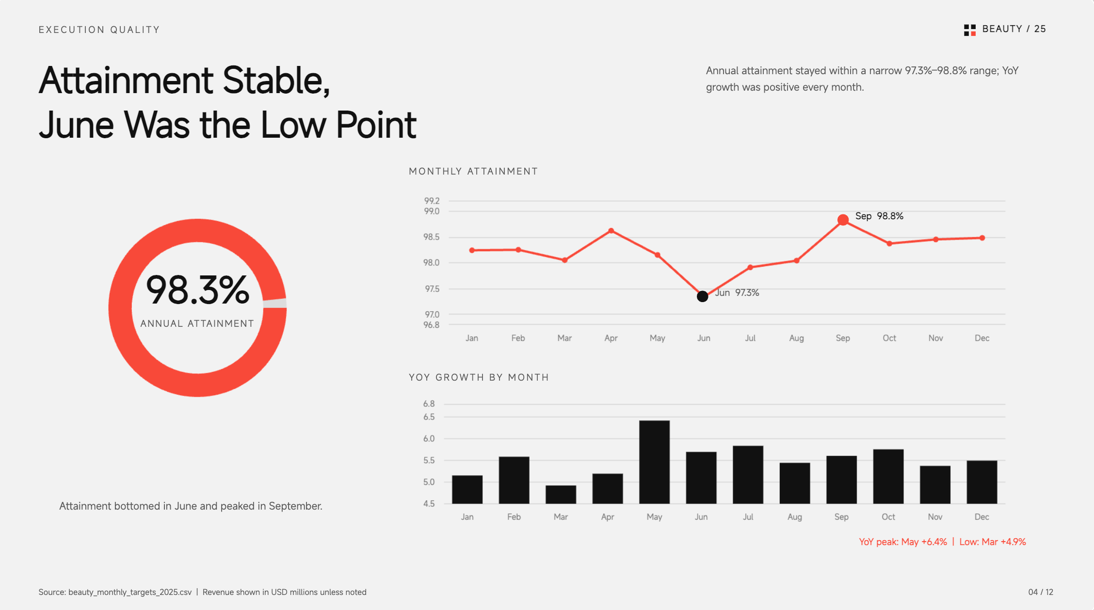
Profit trend graph template
A profit trend graph shows how profitability changes across different periods. It can reveal steady growth, temporary declines, or important peaks that may need attention. This type of visual is useful for financial reports, management meetings, and business planning.
How to use
Step 1: Enter your prompt
Add the profit figures for each month or quarter and mention any significant increase, decrease, or peak. Include the main financial insight you want highlighted, so the graph tells a clear story.
Prompt:
Step 2: Let AI generate your PPT
The AI will plot the monthly profit figures and build the trend with the March decline, June peak, and supporting annotations.
Step 3: Review and export the PPT
Make sure the profit values are accurate, and the important changes are easy to see. Preview the animation to ensure the story flows naturally before exporting.
Monthly performance graph template
A monthly performance graph brings results from several months together for quick comparison. It can be used to track leads, sales, revenue, productivity, or other recurring metrics. By showing every month together, it becomes easier to identify strong and weak periods.
How to use
Step 1: Enter your prompt
Specify the performance metric and provide the value for every month. Also mention the month you want to emphasize and the conclusion you want the graph to communicate.
Prompt:
Step 2: Let AI generate your PPT
Kimi Slides will organize the monthly figures into a performance graph and add the requested data labels, highlights, and grouped animations.
Step 3: Review and export the PPT
Check that all 12 months and lead counts are correct and readable. Preview the animation to make sure the yearly progression is easy to follow, then export.
Customer growth graph template
A customer growth graph shows how a customer base expands over a selected period. It can help businesses communicate acquisition progress, subscriber growth, or changes in their user base. It is particularly useful for showing strong growth and the final customer milestone.
How to use
Step 1: Enter your prompt
Provide the customer totals for each period and explain the growth milestone you want to emphasize. Include the final figure, important growth message, and animation behavior you want the AI to create.
Prompt:
Step 2: Let AI generate your PPT
The AI will turn the quarterly customer totals into a rising growth graph and add the final milestone and supporting message.
Step 3: Review and export the PPT
Verify each quarterly customer figure and make sure the final 5,600 figure is easy to notice. Play the animation and adjust any crowded elements before exporting.
Financial performance graph template
A financial performance graph brings important business figures together to show how the company is performing. It can help compare revenue, profit, expenses, or other financial measures across several periods. Combining related metrics makes it easier for executives to understand the overall financial direction.
How to use
Step 1: Enter your prompt
List the financial metrics, provide their figures for each period, and explain the relationship you want to highlight. Include any summary or takeaway that should appear alongside the data.
Prompt:
Step 2: Let AI generate your PPT
Kimi Slides will create the two financial trend lines, arrange their labels, and apply the animation sequence specified in the prompt.
Step 3: Review and export the PPT
Check both revenue and profit figures carefully and ensure the two trends are easy to distinguish. Preview the animation and make any final layout adjustments before exporting.
Product comparison graph template
A product comparison graph helps audiences evaluate several products using the same set of criteria. It is useful for product presentations, buying guides, sales decks, and reviews. Showing the results together makes differences in features or performance much easier to spot.
How to use
Step 1: Enter your prompt
Enter the products you want to compare and provide their scores or measurements for each category. Mention which product performs best and any recommendation you want the final graph to communicate with.
Prompt:
Step 2: Let AI generate your PPT
The AI will arrange the three products and their measurements into a clear comparison graph with separate animated sections.
Step 3: Review and export the PPT
Check that every product has the correct values and units. Confirm that Beta is correctly identified as the strongest overall option before exporting.
Project progress graph template
A project progress graph shows how much work has been completed across different project stages. It helps teams communicate what is finished, what is underway, and what still needs attention. This makes project updates much easier to understand at a glance.
How to use
Step 1: Enter your prompt
Enter each project phase together with its completion percentage and identify the phase currently in progress. You can also specify milestones, labels, and the order in which the progress should appear.
Prompt:
Step 2: Let AI generate your PPT
Kimi Slides will transform the project phases and percentages into progress bars and add the current-stage indicator with the requested animation.
Step 3: Review and export the PPT
Verify every completion percentage and make sure Development is clearly marked as the current stage. Preview the progress animation and export when everything looks correct.
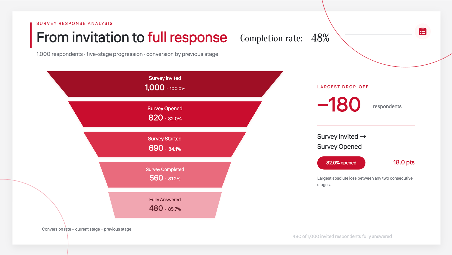
Statistical data graph template
A statistical data graph turns numerical findings into a visual format that is easier to read and compare. It can be used for surveys, research, customer feedback, and reports containing several data points. A well-organized graph helps the audience understand the main findings without studying a large table.
How to use
Step 1: Enter your prompt
Provide the statistical categories, their measured values, and any benchmark or important result you want to highlight. Explain the key finding so the generated graph can give extra attention to the most meaningful data.
Prompt:
Step 2: Let AI generate your PPT
The AI will organize the survey findings into a ranked graph and add the benchmark, insight box, and sequential animation.
Step 3: Review and export the PPT
Check that every percentage is accurate and the ranking is correct. Make sure the benchmark and key insight remain visible, then preview and export the PPT.
How does Kimi Slides help you build better graphs in PPTs?
Turning raw data into a clear graph can take more time than expected, especially when you have to fix layouts and labels yourself. Kimi Slides makes the process easier by helping you create, customize, and polish graphs quickly. Here's how this AI PPT maker can make your PPTs better.
Generate graphs from your content: Turn your data, notes, reports, or other source materials into presentation-ready graphs. Kimi Slides helps structure the information and visualize key data points, so you can skip the tedious process of building every graph from scratch.
Create different types of graphs for different data: Choose from bar charts, line graphs, pie charts, area charts, and other graph formats to visualize trends, comparisons, proportions, and more. Kimi Slides turns your data into visuals that fit your message and presentation.
Create polished graph layouts: Go beyond generating the graph itself. Kimi Slides automatically arranges graphs, titles, labels, key figures, and supporting content into balanced slide layouts, making dense data easier to scan and understand.
Flexible graph editing: Fine-tune your graphs however you prefer. Make changes manually, describe edits through natural-language prompts, or comment on specific elements for targeted adjustments. You can also add visual animations to make graphs more dynamic and engaging during presentations.
Export ready-to-use PPT with fully editable graphs: Take your graphs from AI-generated slides to fully editable presentations. Export your deck as an editable PPTX, so you can continue adjusting graph elements, data, text, and design details in PowerPoint.
Tips for using graph templates in PPT
Good graph templates can save time, but the way you use them still matters. A well-chosen design can make your data easier to follow, while a crowded or poorly formatted graph can do the opposite. Keep these simple tips in mind when working with PowerPoint graphics templates.
Choose a template that fits your data
Match the template to the type of information you are presenting. For example, PowerPoint bar graph templates work well when you need to compare values across different categories. Choosing a suitable format makes the data easier for your audience to understand.
Keep the key takeaway visible
Make the most important finding easy to notice on the slide. You can use a short heading, callout, or highlighted figure to direct attention to the main point. This helps your audience understand the message without studying every part of the graph.
Avoid overcrowding the graph
A graph should contain enough information to support your message without becoming difficult to read. Remove unnecessary labels, details, or decorative elements that add visual noise. Even free graph templates for PowerPoint can look much better when you keep the layout simple.
Keep formatting consistent across graphs
Use the same fonts, spacing, labels, and general visual style throughout your presentation. Consistent formatting gives your slides a more polished and professional appearance. It also makes it easier for viewers to move from one graph to another.
Check readability at presentation size
Always check how the graph looks when displayed at the size you will actually present it. Make sure labels, numbers, and headings are large enough to read from a distance. PowerPoint graphics templates can provide a strong starting point, but readability should always come first.
Update the graph when the data changes
Review your graphs whenever the source data is updated. Check that all figures, labels, percentages, and conclusions still match the latest information. This simple step prevents outdated numbers from appearing in an otherwise polished presentation.
Conclusion
Clear graphs can make even complex data feel easier to understand and act on. The key is to choose visuals that support your message without adding unnecessary detail. With the right graph PowerPoint templates, you can give your data a cleaner and more professional presentation. If you want to create polished graphs with less manual work, give Kimi Slides a try. Turn your data into presentation-ready visuals and see how much simpler graph creation can be.