Presenting information visually can make complex figures easier to understand, especially when the goal is to show how different parts contribute to a whole. Learning how to make pie charts in PowerPoint is therefore useful for anyone looking to turn numerical data into a clear, accessible presentation element. This guide covers practical creation methods, design considerations, and an AI-powered option for building charts more efficiently.
Overview of 2 methods for creating pie charts in PowerPoint
Whether you prefer PowerPoint's native charting tools or an AI-assisted workflow, the right method depends on how much control you want over the underlying data and visual presentation. Here is a quick comparison of both approaches.
| Method | Level of control | Design support | Main strength | Suitable for |
|---|---|---|---|---|
| AI-assisted creation | Moderate to high | Advanced, AI-assisted | Automates chart-building tasks | Faster visualization and presentation development |
| Manual creation | High | Basic, user-driven | Direct control over chart elements | Precise data handling and customization |
How to make pie charts in PowerPoint with AI
Kimi Slides is an AI presentation maker that can turn your ideas, data, or instructions into structured, presentation-ready slides. It can also generate charts and other visual elements based on your input, helping you create polished PowerPoint presentations without manually designing every element. Here is how to make a pie chart in PowerPoint with percentages using Kimi Slides.
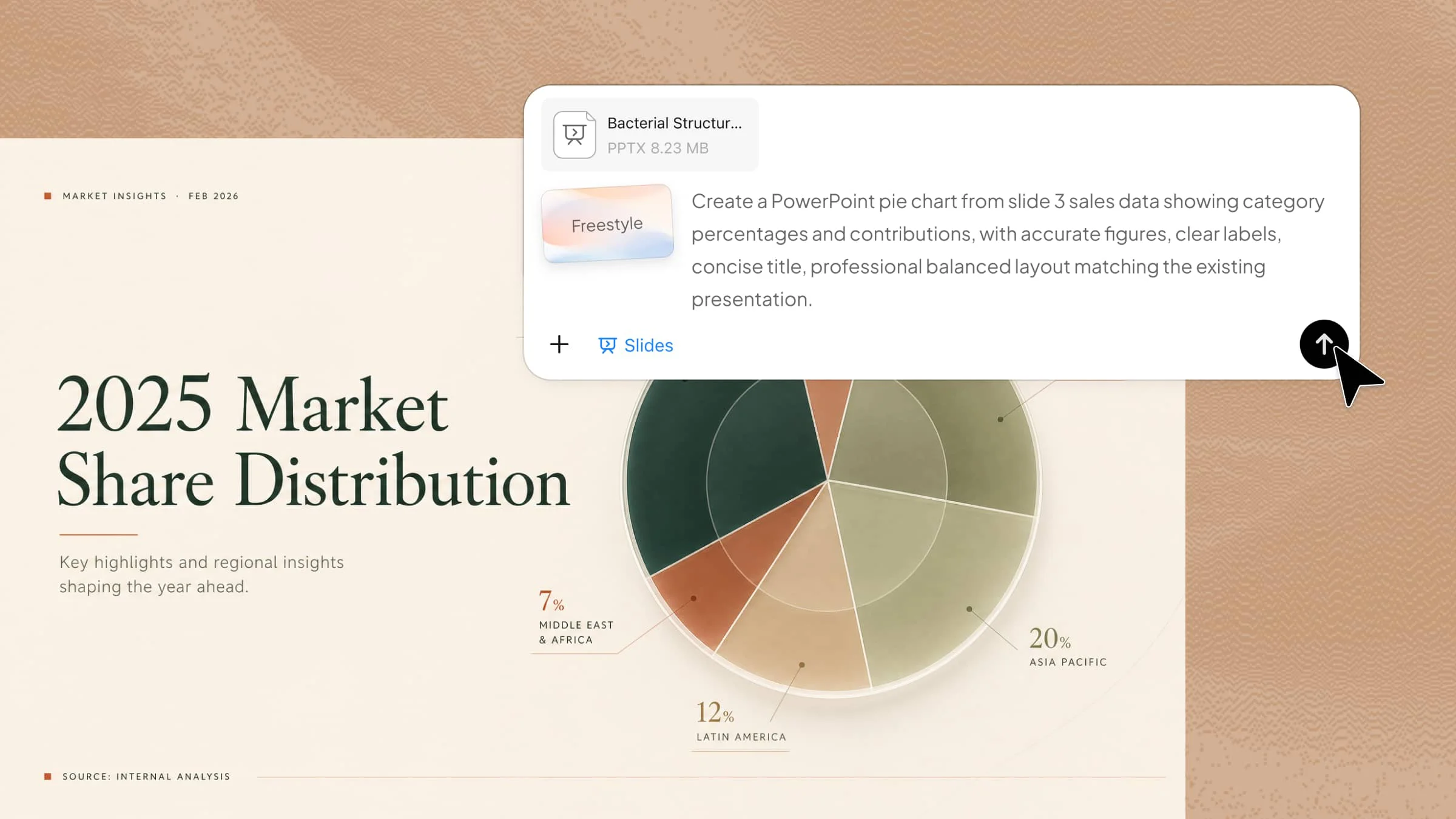
Step 1: Upload your PPT file and enter the prompt
Upload the presentation containing the data you want to visualize, then describe the chart requirements clearly. Mention the preferred data categories, values, placement, and visual treatment, so the AI understands the intended result.

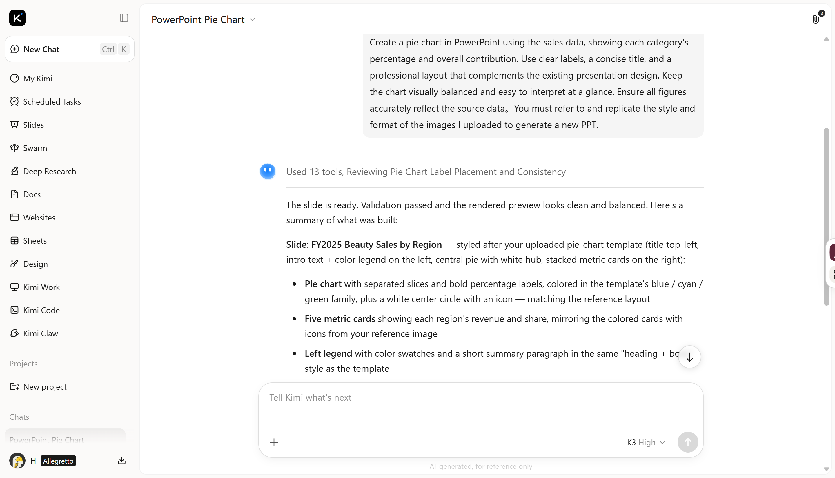
Step 2: Let AI process and generate results
Allow the AI to analyze your instructions and incorporate the requested visualization into the presentation. It can organize the supplied figures into proportional segments while arranging labels and supporting details for readability.
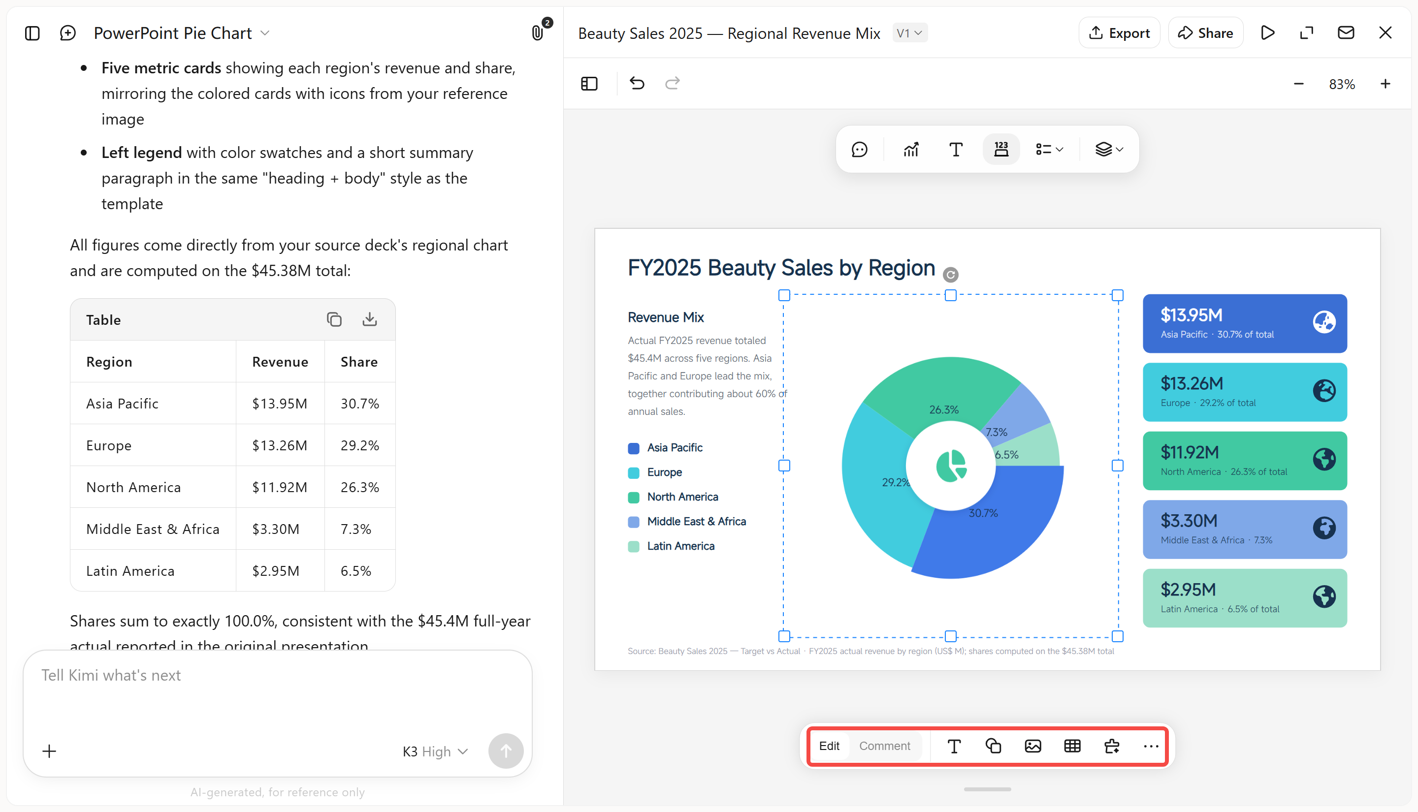
Step 3: Edit your PPT file
Review the generated chart and refine it as needed. Click "Edit" to manually adjust the font, text, position, chart colors, and other visual elements. You can also click "Comment" to leave feedback on a specific area of the chart, and the AI will apply your requested changes directly.
Step 4: Download the PPT file
Preview the completed presentation through the online playback function to check how the chart appears in context. Once everything looks correct, export the presentation as a PPT file for further use or sharing.
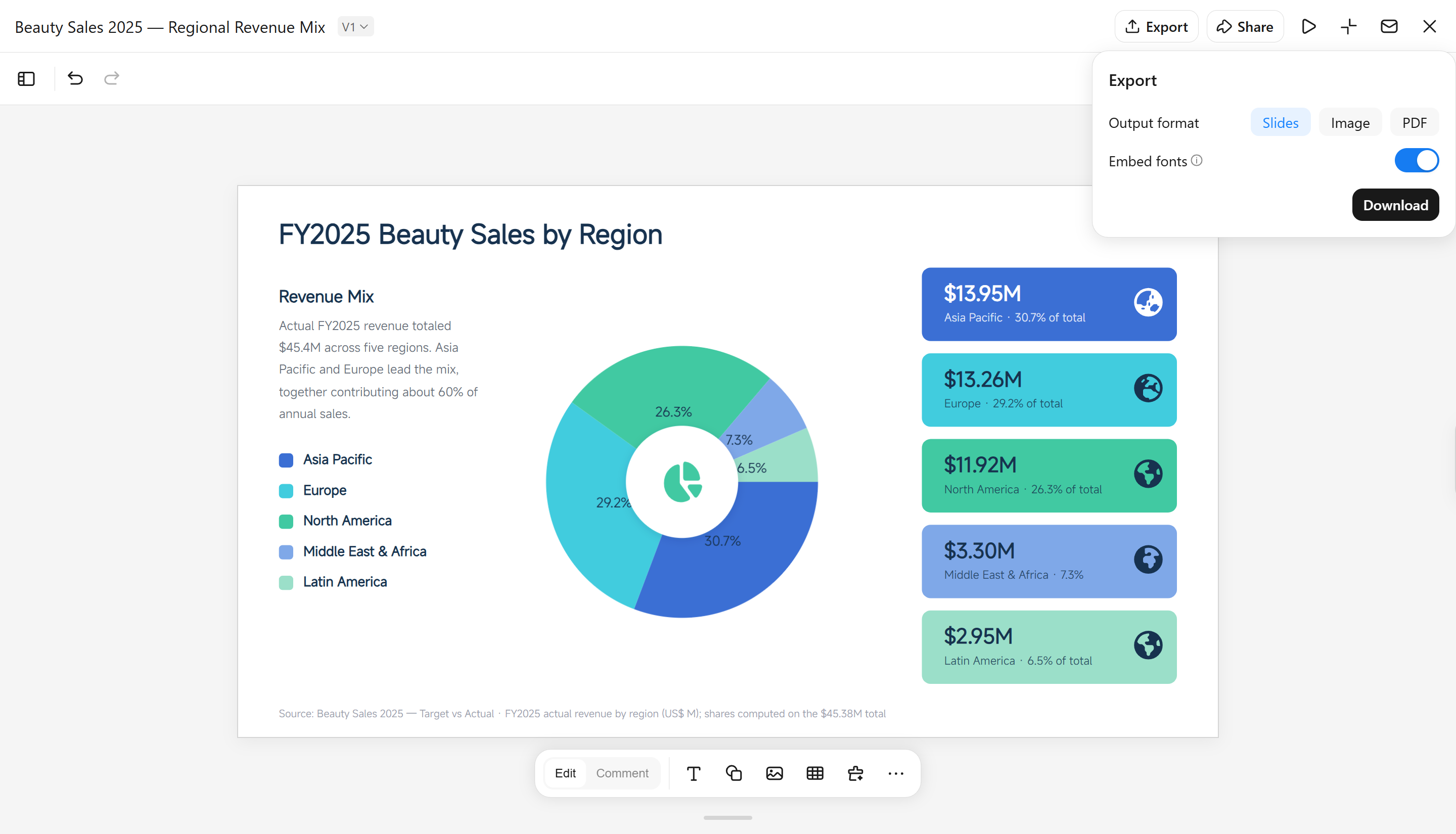
Main features of Kimi Slides
Generate pie charts from your data: Describe the chart you need in natural language and provide your sales figures or category data. Kimi Slides can turn your input into a presentation-ready pie chart, showing each category's share clearly without manual chart setup.
Match the presentation design: Kimi Slides can create the chart with a layout and visual style that fits the surrounding slides, helping the pie chart look consistent with the overall presentation.
Edit charts your way: Adjust the pie chart by entering a prompt, editing elements manually, or commenting on a specific element and asking AI to modify it. This gives you flexible control over data, labels, layout, and other chart details without rebuilding the chart from scratch.
Create editable PowerPoint slides: Generate the pie chart as part of a PowerPoint presentation so you can continue editing the chart and other slide elements after generation.
How to add pie charts in PowerPoint manually
Adding a pie chart manually in PowerPoint lets you control the data, labels, and overall appearance directly. Follow these steps to insert a pie chart and display percentages in your presentation.
Step 1: Insert the pie chart
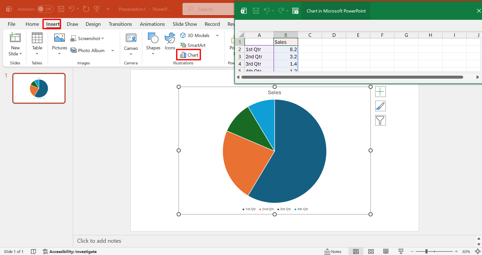
Open the slide where you want the visualization, select "Insert" > "Chart", and choose "Pie" from the available chart categories. PowerPoint will place a basic chart on the slide along with a data sheet for entering figures.
Step 2: Enter and organize your data
Replace the sample values with your actual categories and numbers in the accompanying spreadsheet. Keep the dataset concise and logically grouped, so each slice represents a meaningful portion of the overall total.
Step 3: Customize the chart appearance
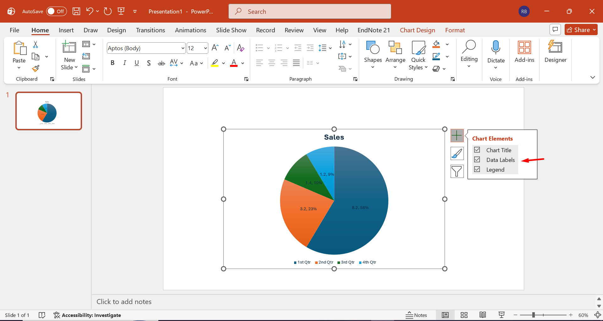
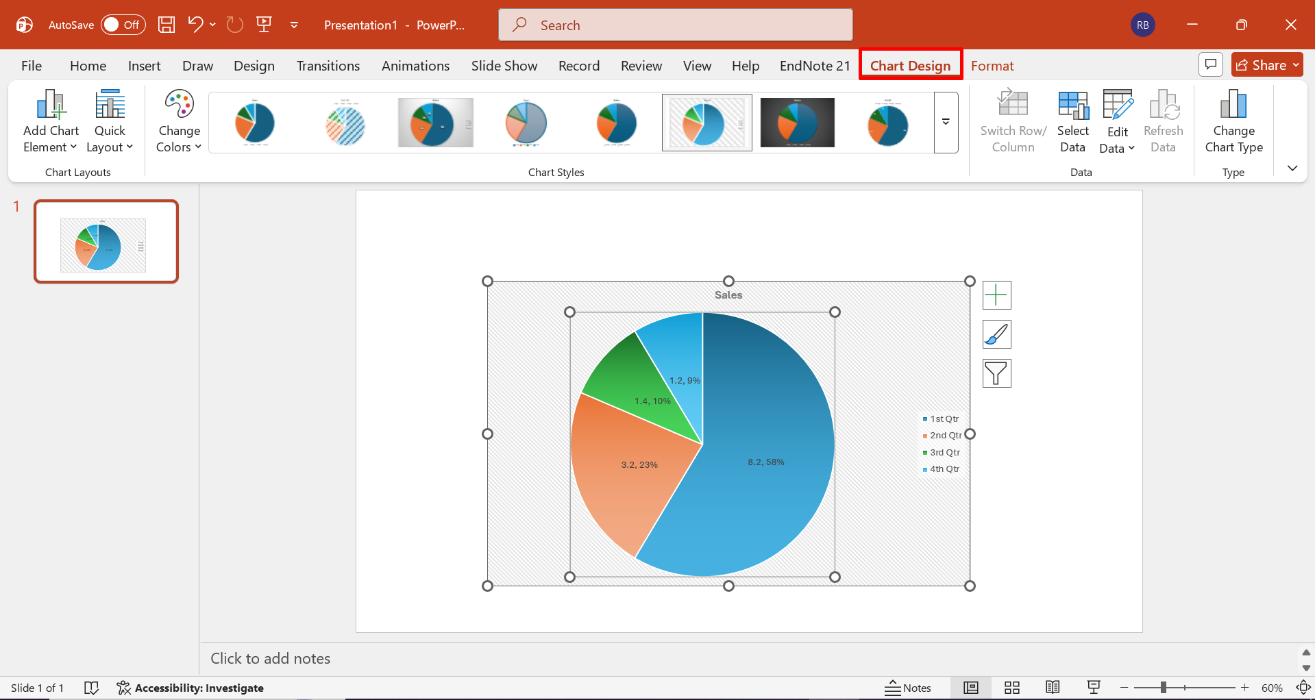
Use PowerPoint's formatting options to adjust the chart title, labels, legend, slice styling, and overall placement. Review the finished visualization against the surrounding slide content to ensure the proportions remain easy to interpret.
Do's and don'ts for making pie charts in PowerPoint
A well-designed pie chart should communicate proportions almost immediately, without forcing the audience to decode unnecessary visual details. The following practices help preserve accuracy, readability, and visual hierarchy.
Do's
Before refining the chart, consider a few practical design choices that can strengthen its overall clarity. The points below help the visual convey information naturally and keep the presentation easy to follow.
Keep the number of categories manageable
Limit the chart to a sensible number of segments so individual proportions remain discernible. Too many slices can create visual congestion and weaken the part-to-whole comparison.
Arrange slices in a logical order
Sequence the fragments deliberately, such as from largest to smallest or according to a meaningful category progression. A consistent arrangement gives the viewer a clearer path for interpreting the composition.
Label key data directly
Place essential values or percentages close to their corresponding slices when possible. Direct annotation reduces the need to repeatedly consult a distant legend and strengthens immediate comprehension.
Give the chart a clear takeaway
Use visualization to emphasize the most significant relationship within the dataset rather than merely displaying figures. A concise takeaway helps the audience understand why the proportions matter.
Don'ts
Before adding visual effects or extra information, consider whether each element improves interpretation or merely adds visual noise. These common mistakes can undermine an otherwise accurate chart.
Don't force every data point into the chart
A pie chart is intended for meaningful portions of a whole, not exhaustive datasets. Minor or unrelated values can be consolidated or presented through a more suitable visualization.
Don't use decorative elements that compete with the data
Excessive shadows, 3D effects, icons, or ornamental graphics can obscure the actual proportions. Keep embellishments subordinate to the information being presented.
Don't use colors that are too similar
Closely matched hues make adjacent segments difficult to distinguish, particularly when their values are comparable. Select sufficiently differentiated tones while maintaining a cohesive visual palette.
Missing or unclear title
A chart without an informative title leaves viewers to infer what the displayed proportions represent. Use a concise, descriptive heading that establishes the subject and context before the audience examines the slices.
Conclusion
In conclusion, mastering how to make pie charts in PowerPoint ultimately depends on presenting data in a way that feels purposeful, readable, and visually balanced. While manual tools provide detailed control, an AI-assisted approach can reduce the effort involved in shaping charts and integrating them into a complete presentation. Kimi Slides offers a practical alternative for turning chart requirements into presentation-ready slides while retaining room for further customization.