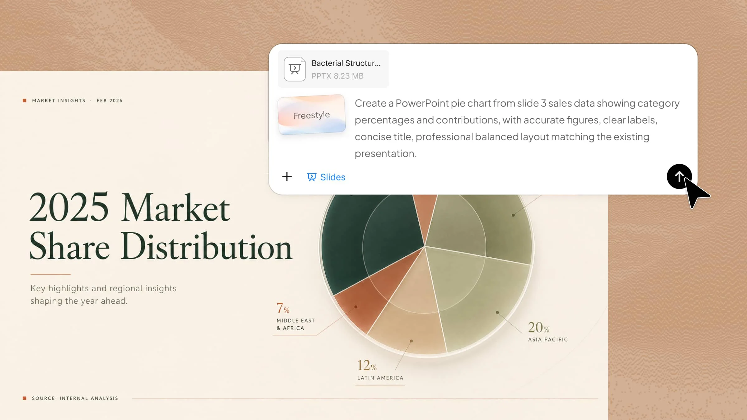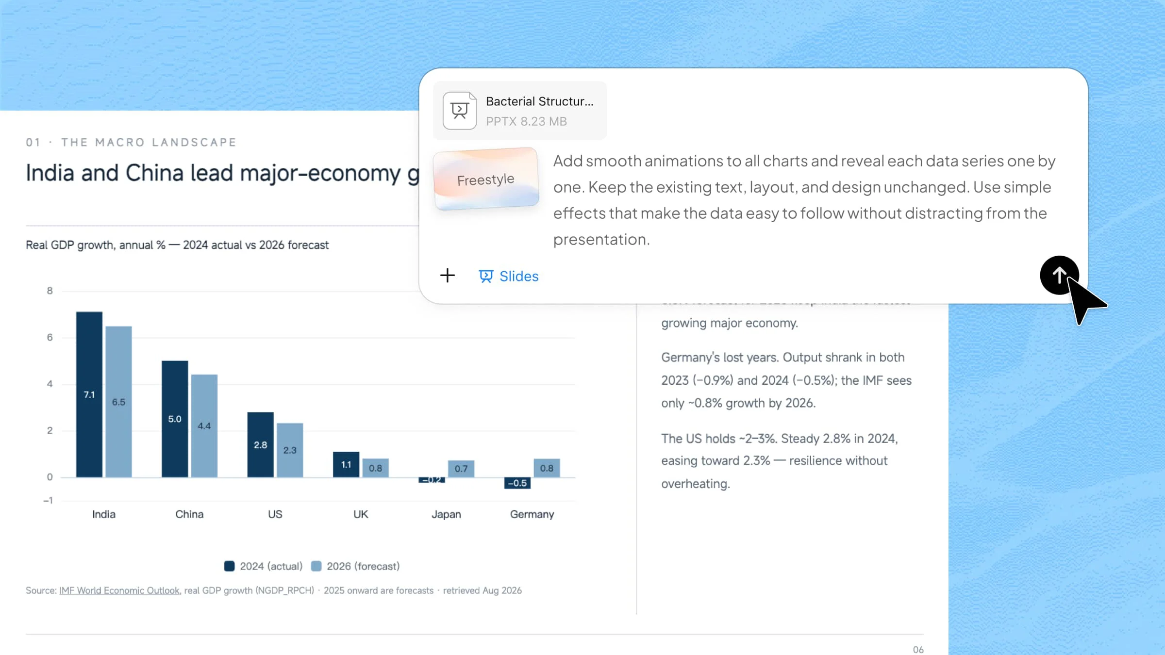
Charts can become difficult to explain when several figures or data series appear at the same time. PowerPoint chart animation helps reveal information in a clear sequence, so your audience can focus on one detail at a time. You can control the order, timing, and movement of chart elements to match your narration. This guide explains simple ways to animate Excel charts in PowerPoint and create more effective data presentations.
Overview of 2 methods for animating a Chart in PowerPoint
You can create animated graphs in PowerPoint either with the help of an AI tool or by configuring the animations yourself. Here's how the two approaches compare in terms of process, customization, and effort.
| Aspect | AI Tool | Manual PowerPoint |
|---|---|---|
| Process | Upload your PPT and describe the desired animation with a prompt. | Select the chart and configure animation effects manually. |
| Customization | Tell AI how you want the chart and animation adjusted. | Manually adjust effects, order, and timing. |
| Effort | Faster and requires less manual work. | More time-consuming but offers precise control. |
| Suitable for | Quickly creating polished animated charts. | Fine-tuning specific animation details. |
How to add graph animations to PowerPoint using an AI tool
Kimi Slides is an AI presentation maker that can help you prepare animated graphs in PowerPoint by organizing chart content and suggesting a clear sequence for presenting data. You can explain what you want to highlight, and the AI can help shape the animation plan before you apply it to your slide. Follow these steps to create and refine the animation smoothly.
Step 1: Upload your PPT file and enter the prompt
Go to Kimi Slides and upload your PowerPoint file, then enter a detailed prompt that clearly explains your requirements, such as the chart style, animation, layout, and content you want.

Step 2: Let AI process and generate results
Send the prompt and let Kimi Slides process your PowerPoint file based on your instructions. The AI analyzes the existing slides, applies the requested animation to the charts, and organizes the animation sequence to make the data easier to follow.
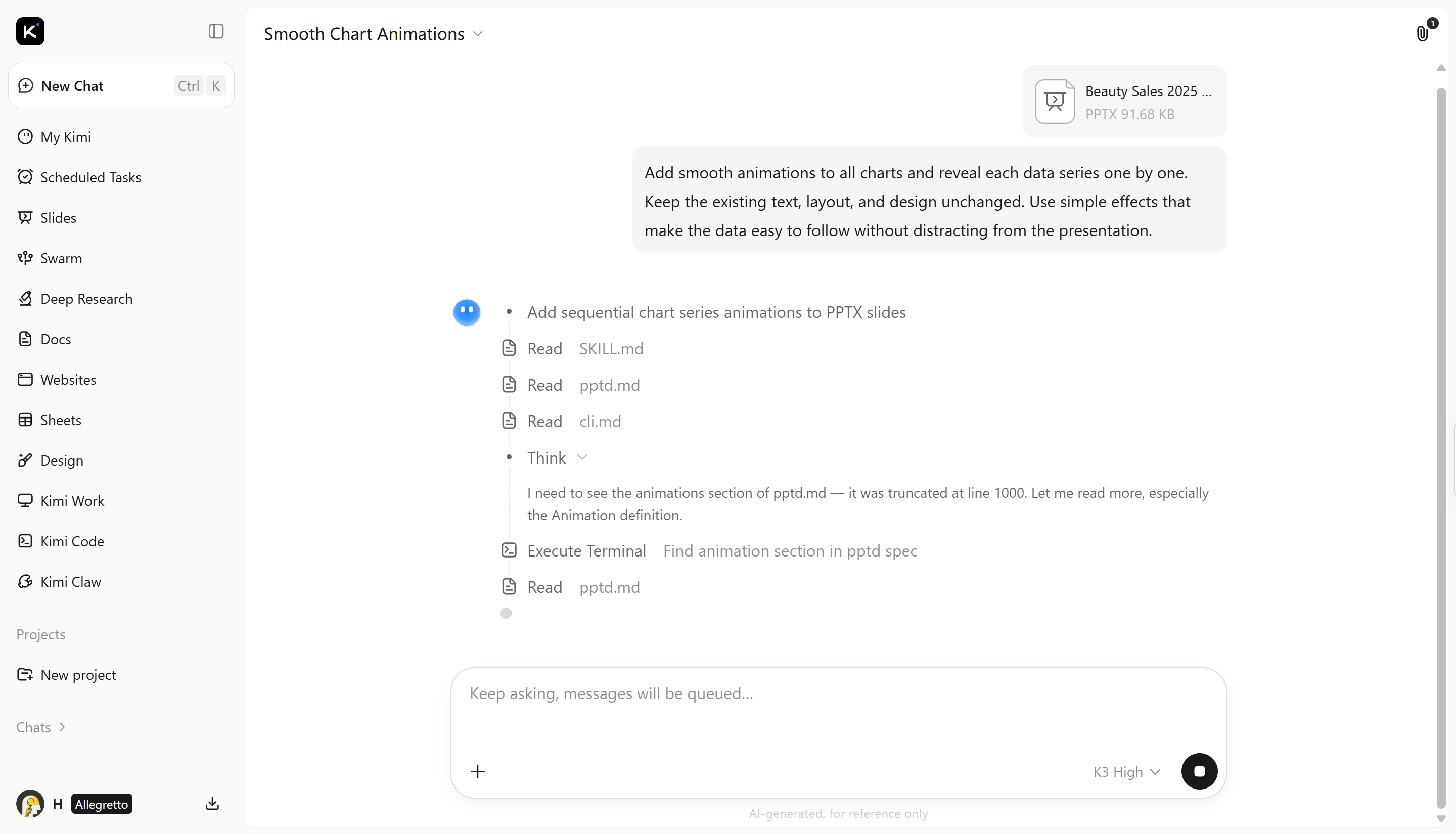
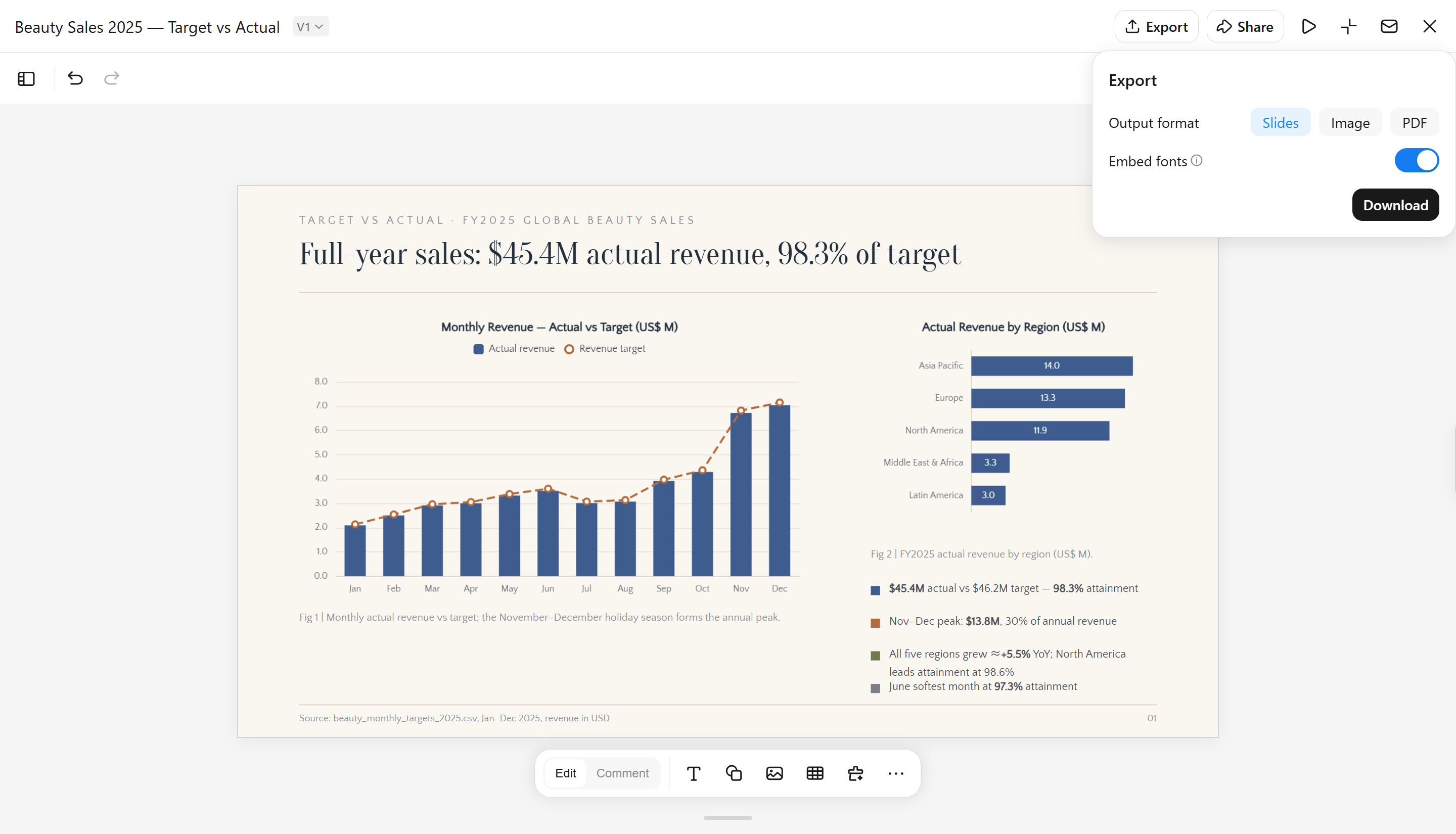
Step 3: Preview and download the PPT file
Preview the animated pie chart to check its appearance, timing, and overall flow. Make any necessary adjustments, then download the finished presentation as a PowerPoint file.
Once you are satisfied with the result, download the PowerPoint file.
Main features of Kimi Slides
Create polished charts with elegant animations: Kimi Slides adds smooth motion to data visuals, making trends and comparisons appear in a clear sequence. This helps the audience follow changes without losing sight of the main figures.
Generate presentation-ready charts from your content: It can turn data, notes, and documents into structured chart visuals for presentations. This reduces the manual effort involved in selecting information and arranging it into a useful visual format.
Build clear layouts around your charts: Charts are placed with headings, labels, key figures, and supporting content to create a balanced slide. The layout keeps related information connected while giving the main visual enough space.
Customize charts with natural-language prompts: You can describe the changes you want in plain language, including adjustments to style, labels, colors, or spacing. This provides a flexible way to refine visuals without editing every element separately.
Keep charts editable after generation: Generated PowerPoint animated graphs can be updated when figures, labels, or presentation requirements change. Editable elements make it easier to refine the final slide without rebuilding the design from scratch.
How to animate graphs in PowerPoint manually
PowerPoint lets you control how a graph appears during your presentation. You can reveal data series or categories one at a time, choose the animation order, and adjust the timing of each effect. For more control over the animation, you can configure these settings manually in PowerPoint instead of relying on pre-made templates. Follow the steps below to learn how to animate a bar graph in PowerPoint.
Step 1: Select the chart
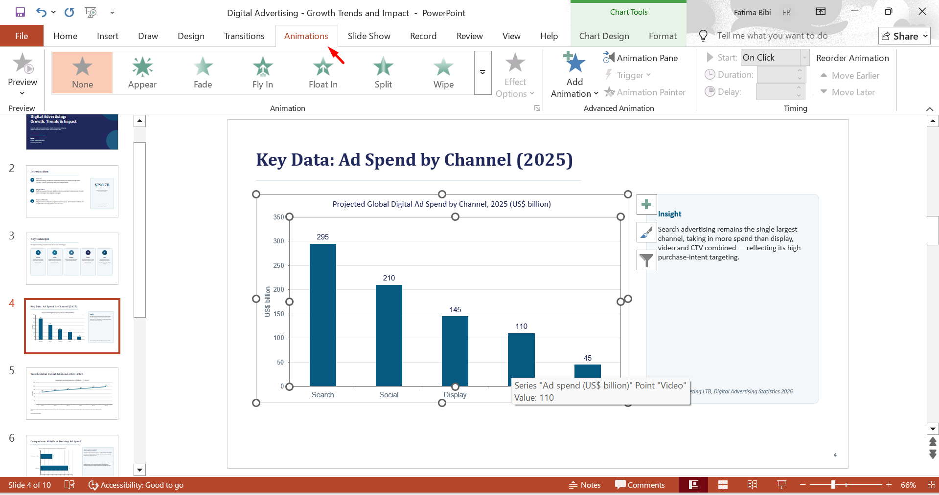
Open your PowerPoint presentation and click the chart you want to animate. Go to the "Animation" tab to view the available effects.
Step 2: Choose an animation effect
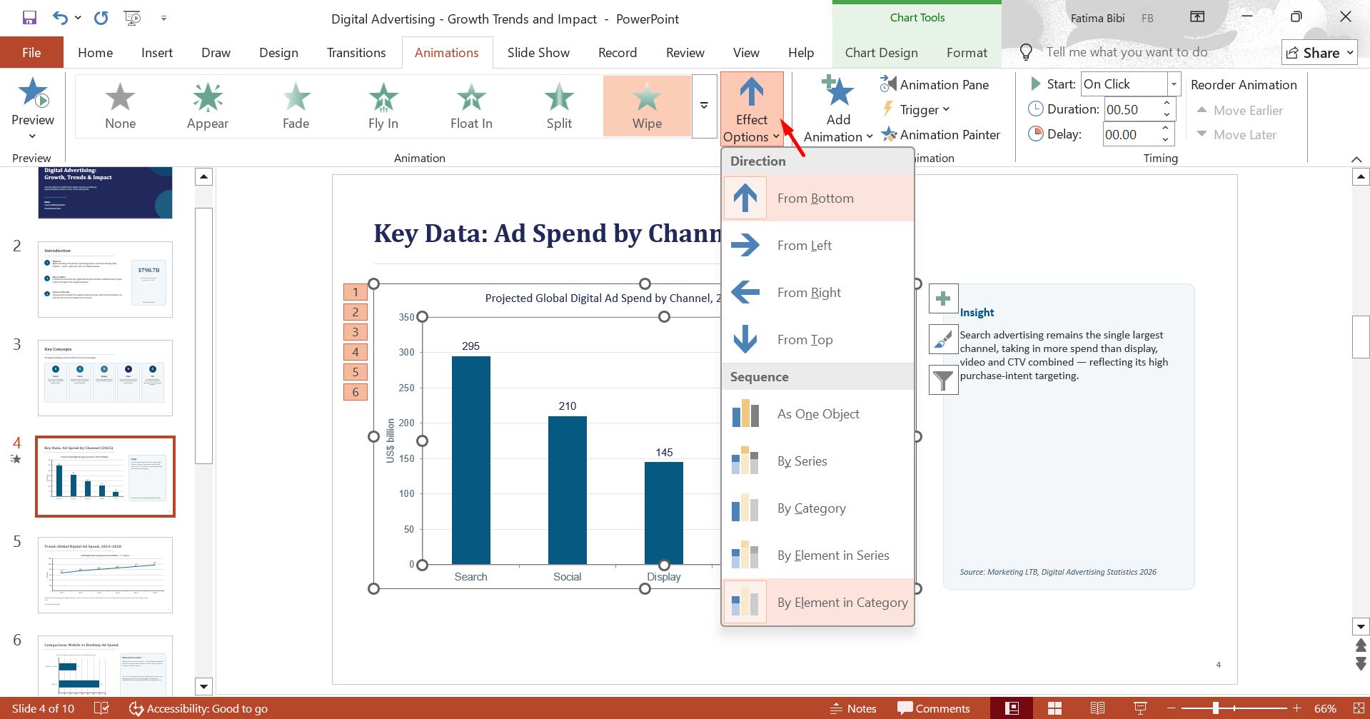
Click "Add Animation" to select an effect such as Appear, Fade, or Wipe. Open "Effect Options" to choose how the chart elements should appear, such as by series, category, or element.
Step 3: Adjust timing and preview
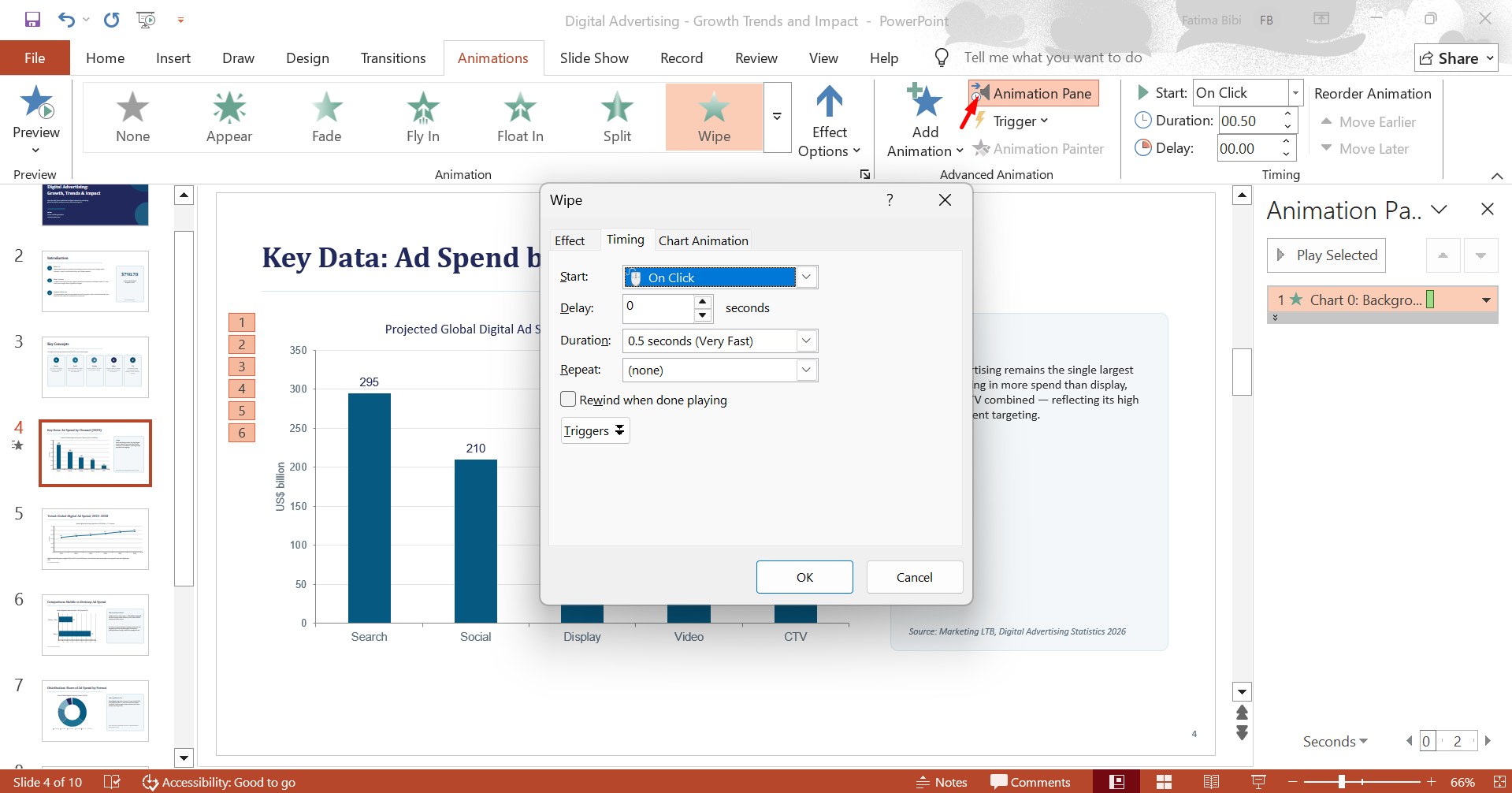
Navigate to the "Animation Pane," click "Effect Options" from the drop-down menu, and adjust the order and timing of the effects. Then preview the slide to check that the animation matches your explanation and keeps the data easy to follow.
Tips for better chart animations in PowerPoint
A well-designed PowerPoint graph animation can make data easier to understand and help your audience follow key information. Small adjustments to the animation can improve clarity, maintain attention, and keep the presentation professional. Consider the following points when animating your graph.
Animate by series or category
Use PowerPoint chart animation by series to introduce separate data sets one at a time, which works well for direct comparisons. Choose By Category when you want to discuss groups individually. This setting helps control the amount of information shown at each stage.
Choose subtle entrance effects
Select an effect that keeps the chart readable as new information appears. Fade, Wipe, and Appear are useful choices because they add movement without changing the chart's visual structure. Match the effect to the amount and type of data on the slide.
Match timing with your narration
Adjust Start, Duration, and Delay so the chart follows your speaking pace. For example, a new series can appear as you begin discussing its results. Proper timing gives viewers enough time to connect the visual with your explanation.
Use click triggers for key points
Click triggers let you control when specific elements of an animated bar chart appear. You can use them to reveal an important value, category, or comparison at the right moment during your explanation. This makes PowerPoint animated bar chart effects more useful when you want to present data in a clear sequence.
Keep Animations Minimal and Purposeful
Use movement only where it adds meaning to the chart. Animating every bar, label, or value can create unnecessary visual noise. Focus on elements that show an important comparison, change, or result.
Preview Animations in Slide Show Mode
Play the complete slide to evaluate how the chart behaves during an actual presentation. Check whether labels remain visible, elements appear in the correct order, and the pacing feels natural. Make adjustments if the animation interrupts your explanation or makes the data difficult to follow.
Conclusion
Well-planned chart animation can make numerical information easier to explain and give your slides a more engaging flow. When you animate a pie chart in PowerPoint, revealing individual sections at the right moment can make proportions easier to discuss. Kimi Slides can simplify the creative process by helping turn data and content into polished, editable presentation visuals with less manual work.