A cover photo may look perfect on your computer but appear cropped or poorly aligned when viewed on a phone. This can hide important text, cut off key visuals, and make a Facebook page look less polished. Knowing the right Facebook cover photo dimensions helps you avoid these issues and create a balanced design that displays properly across different screens. In this guide, you'll learn the recommended dimensions, safe areas, and practical tips for creating a professional-looking Facebook cover photo.
Facebook cover photo dimensions at a glance
Choosing the right dimensions helps your cover photo remain clear, balanced, and properly positioned across different devices. The following table summarizes the most useful Facebook cover photo size details, including dimensions, ratios, and formats for different Facebook cover types.
| Attribute | Recommended specification | Why it matters |
|---|---|---|
| Recommended dimensions | 820×360 px | Provides enough space to accommodate desktop and mobile cropping while keeping key content visible. |
| Desktop display | 820 × 312 px | Facebook displays the cover at this ratio on desktop, so keep important elements away from areas that may be cropped. |
| Mobile display | 640 × 360 px | The mobile view uses a taller crop, making the central area especially important for text, logos, and other key elements. |
| File format | JPG or PNG | JPG works well for photographs, while PNG is a good choice for designs with text, logos, or graphics. |
| File size | Keep it under 100 KB when practical | A smaller file can help the cover load efficiently without unnecessarily compromising image quality. |
| Safe area | Keep key content within the central 640 × 312 px area | Placing important text, logos, and faces toward the center reduces the risk of them being cropped on different screen sizes. |
Why Facebook cover photos look different on desktop and mobile
A Facebook cover photo can look well-balanced on one device but appear cropped differently on another. Understanding how each screen displays the image helps you place important text, logos, and visuals where they are less likely to be cut off.
Desktop and mobile use different crops
Facebook does not simply scale the same cover photo proportionally across every device. Desktop uses a wider layout, while mobile displays a taller and narrower crop, which affects how much of the original image remains visible.
The sides are more likely to be cropped on mobile
On mobile screens, the image is typically cropped from the sides to fit the narrower display area. Keep important text, logos, and faces away from the edges so they remain visible when using the correct Facebook cover photo size for mobile layout.
The top and bottom can be cropped on desktop
Desktop displays the cover in a wider format, which can cause parts of the top and bottom to be trimmed depending on how the image is displayed. Placing key content near the center helps reduce the risk of important details being cut off.
One design cannot show every pixel everywhere
Instead of trying to keep every part of the image visible on every screen, focus on a safe central area for essential content. This approach helps your design remain effective across different Facebook cover dimensions without sacrificing important information.
Design Facebook covers that fit perfectly on any device: Kimi Design
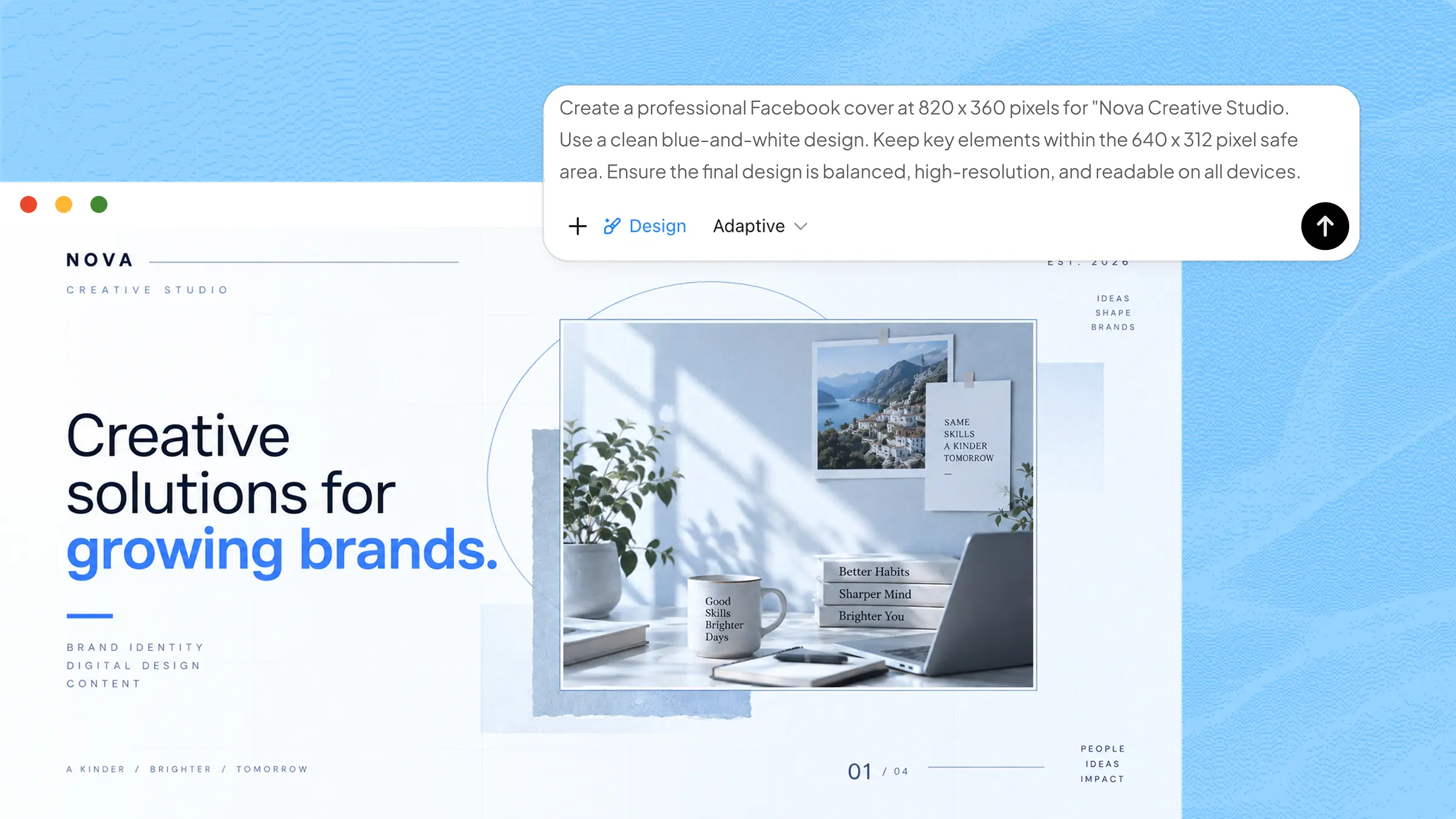
After understanding how Facebook displays cover photos differently on desktop and mobile, you can focus on creating a design that stays clear and balanced across screens. Knowing the Facebook cover photo size in pixels can also help you set up your design with the right dimensions from the start. Kimi Design can help you turn your ideas into a properly structured cover without requiring advanced design skills.
Kimi Design is an AI-powered design tool that lets you create visual content from simple natural-language instructions. You can describe your desired cover style, dimensions, colors, text, images, and branding elements in a prompt. It then generates a complete design that you can review and refine. You can also make manual adjustments to the layout, typography, and visual elements before exporting the finished cover. This makes it easier to create a professional Facebook cover that works across different devices.
Key features
Turn your ideas and visual materials into a polished Facebook cover: Describe your page, visual direction, preferred style, or key message, then upload photos, graphics, videos, or visual references. Kimi Design brings your ideas and materials together into a cohesive cover with balanced composition, typography, colors, and imagery.
Design with different screen sizes in mind: Create layouts that keep important text, logos, and visuals clearly positioned within the central area, helping your cover maintain its visual focus across desktop and mobile views.
Refine the design with conversation, click, or canvas comment: Ask Kimi Design to adjust the composition, visual style, colors, imagery, or text through conversation. You can also select elements and make more targeted edits directly on the canvas.
Export a cover ready for use: Once your design is polished, explore different versions, revisit earlier iterations, and export the final cover in a suitable image format for uploading to your Facebook page or sharing across platforms.
How to make well-sized Facebook covers with AI
A properly sized cover is easier to create when you plan the layout around how Facebook displays images on different devices. Follow the steps below to learn how to make a Facebook cover with AI while keeping the important content clear, balanced, and well-positioned.
Step 1: Explain your Facebook cover photo style
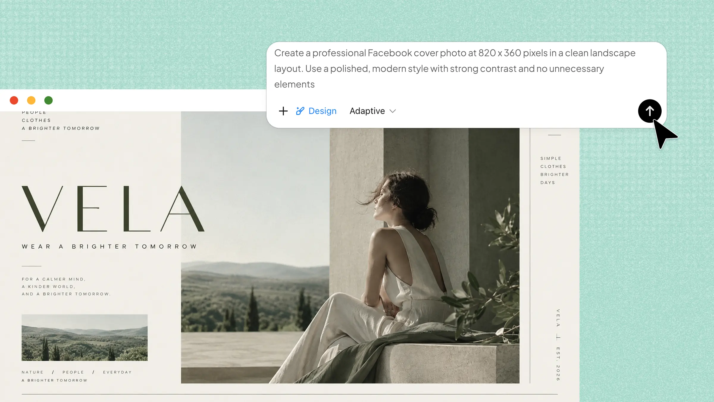
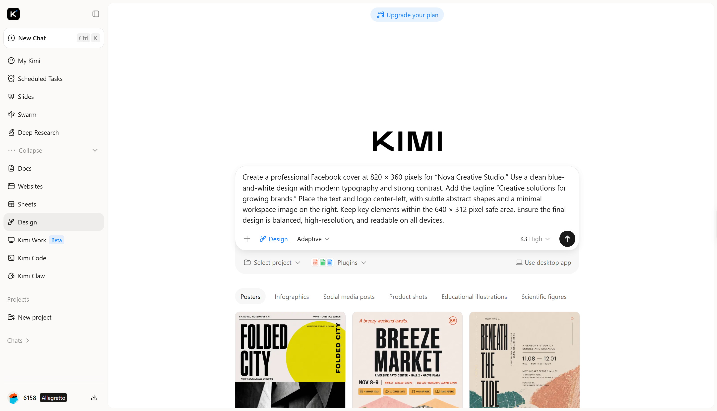
Start by describing the purpose of your cover, preferred style, colors, text, images, and branding elements. Mention the Facebook cover photo dimensions you want to use and ask for important content to remain within a safe central area.
Example prompt:
Step 2: Personalize the cover using AI
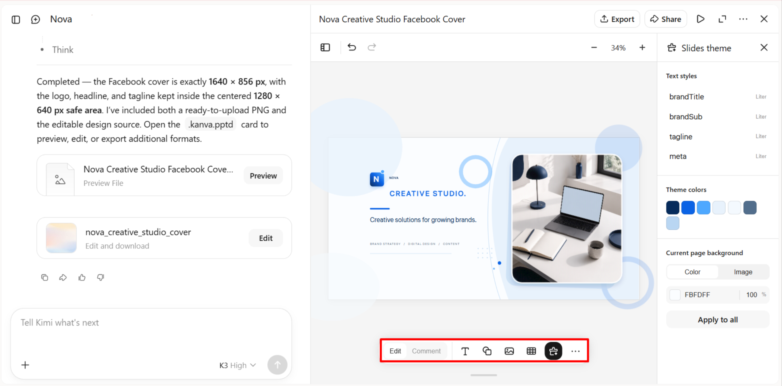
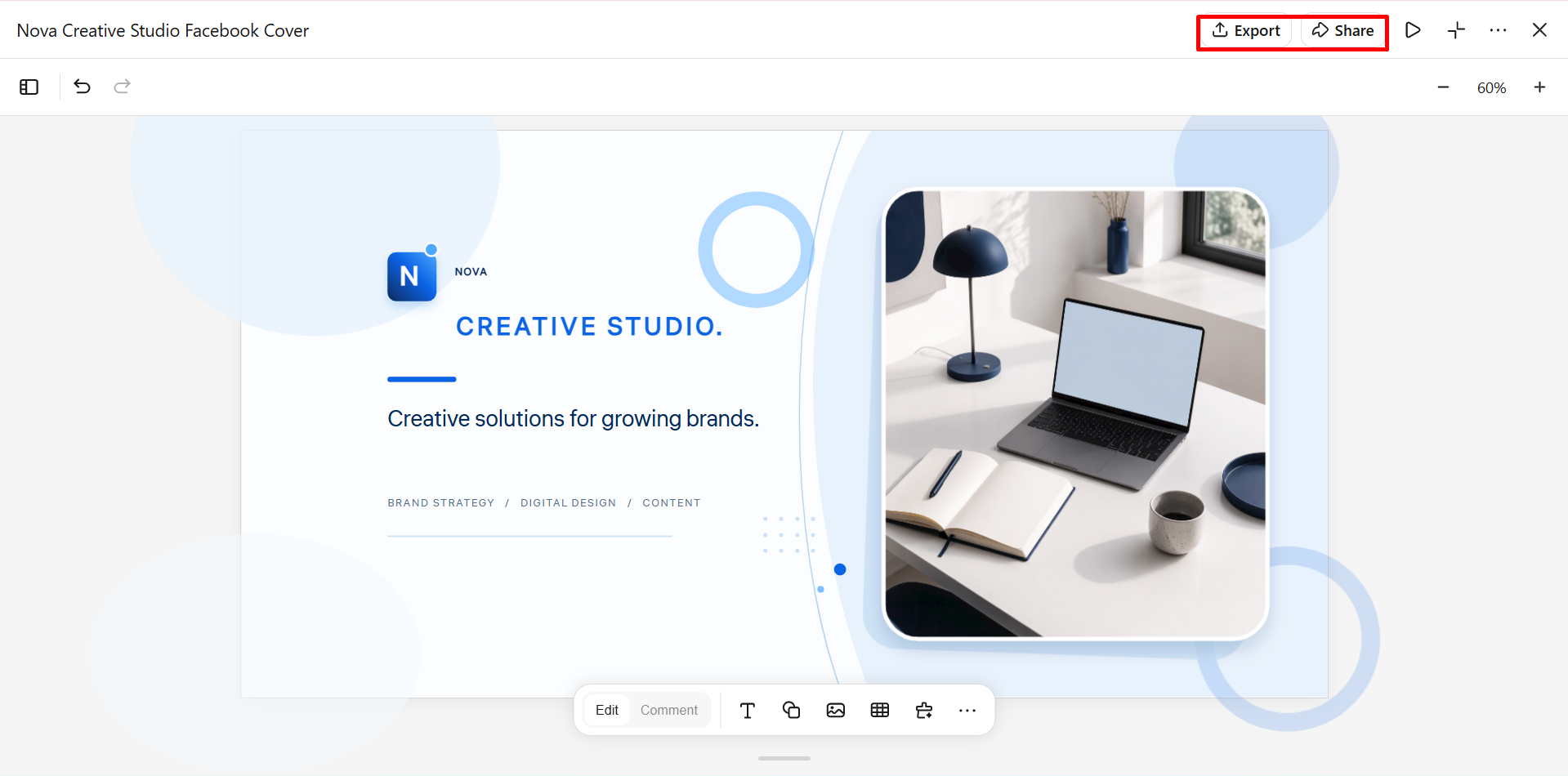
Review the generated cover and refine any elements that do not match your needs. Use AI chat to request broader changes, such as adjusting the color scheme or repositioning the text. You can also use "Comment" to select a specific element and describe the change, or choose "Edit" to manually adjust text, fonts, images, spacing, and other design details.
Step 3: Preview and export your cover photo
Preview the finished cover on different screen layouts and check that the text, logo, and important visuals remain visible. Make any final adjustments to spacing, alignment, or image placement, then export the completed cover in a suitable format for Facebook.
Creative ideas for Facebook cover photos
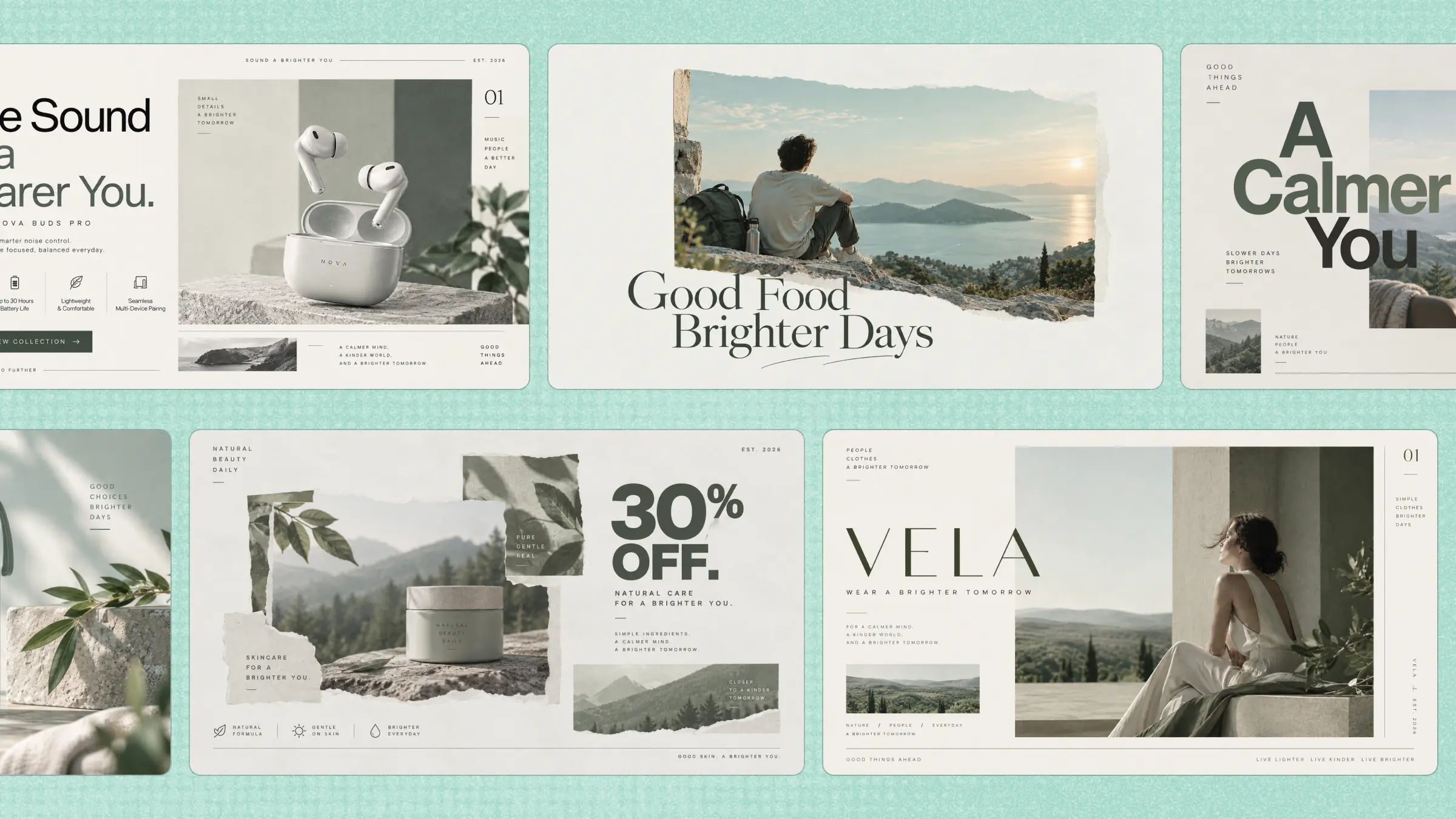
A creative cover can make a Facebook page more recognizable while giving visitors a quick idea of what the page represents. The right combination of imagery, typography, colors, and layout can also help your design look balanced across different screens. Here are some practical Facebook cover photo ideas you can explore with Kimi Design.
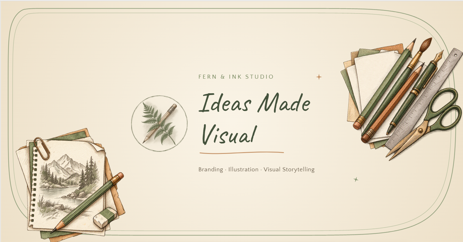
Hand-drawn illustrations
Hand-drawn illustrations can give a Facebook cover a friendly and distinctive personality. Use sketches, doodles, or illustrated characters that relate to your brand, interests, or page theme. Keep the artwork simple enough that important text and branding remain easy to see. This style works particularly well for creative brands, artists, and personal pages.
Example prompt:
Geometric shapes and graphic accents
Geometric shapes can create a clean and modern appearance without making the cover feel overly complicated. Combine circles, lines, blocks, and subtle patterns with a limited color palette for a structured design. Place decorative elements around the main content rather than directly behind important text. This approach works well for businesses looking for a polished Facebook cover photo for business or any other purpose.
Example prompt:

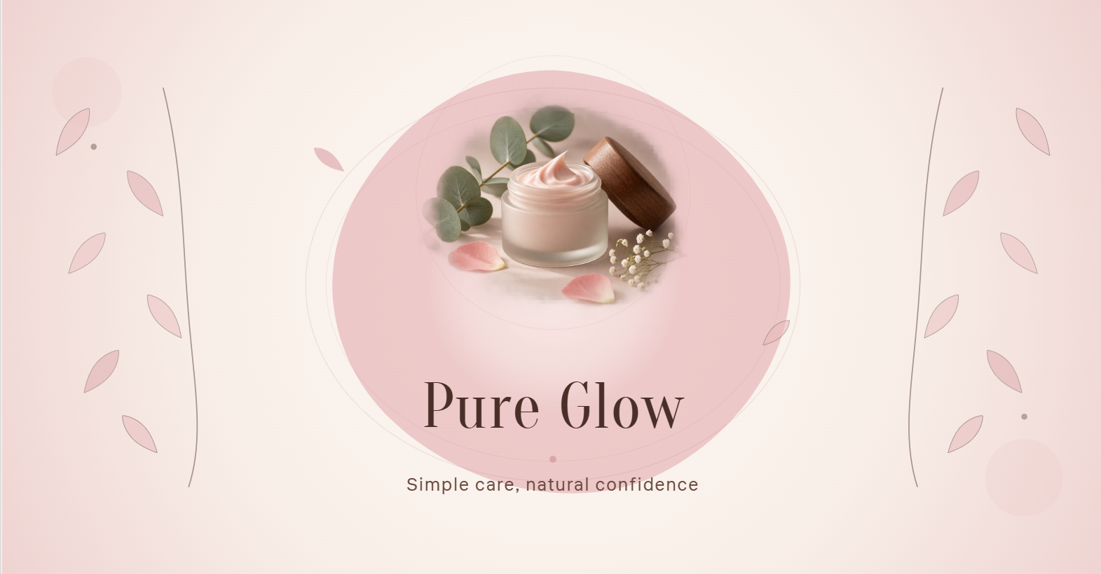
Lifestyle photography
Lifestyle photography can make a cover feel authentic by showing people, products, places, or experiences related to the page. Choose a high-quality image with enough empty space for text and branding elements. Position the main subject away from areas that may be cropped on smaller screens. This approach can work particularly well for a Facebook business page cover photo size layout.
Example prompt:

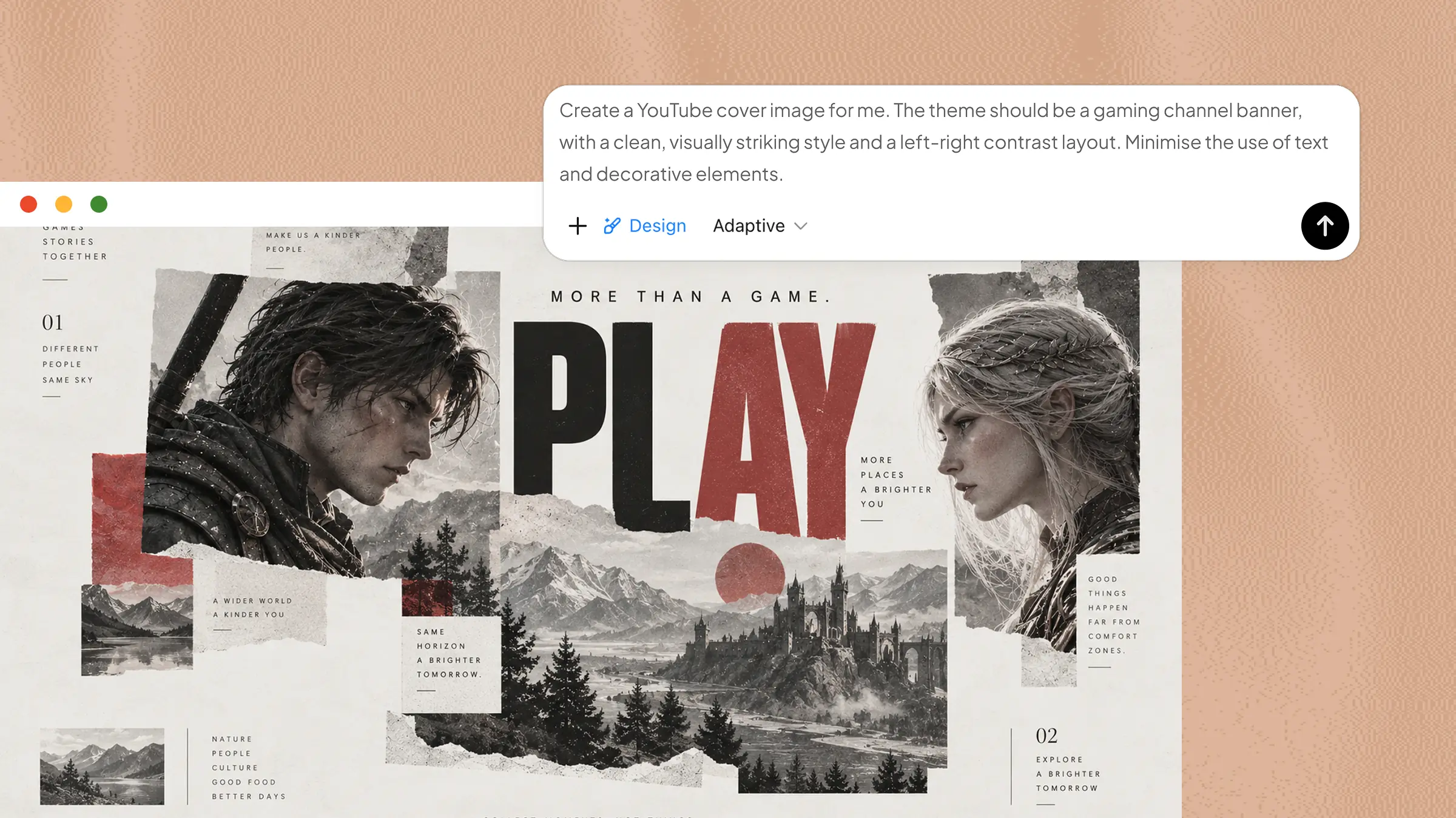
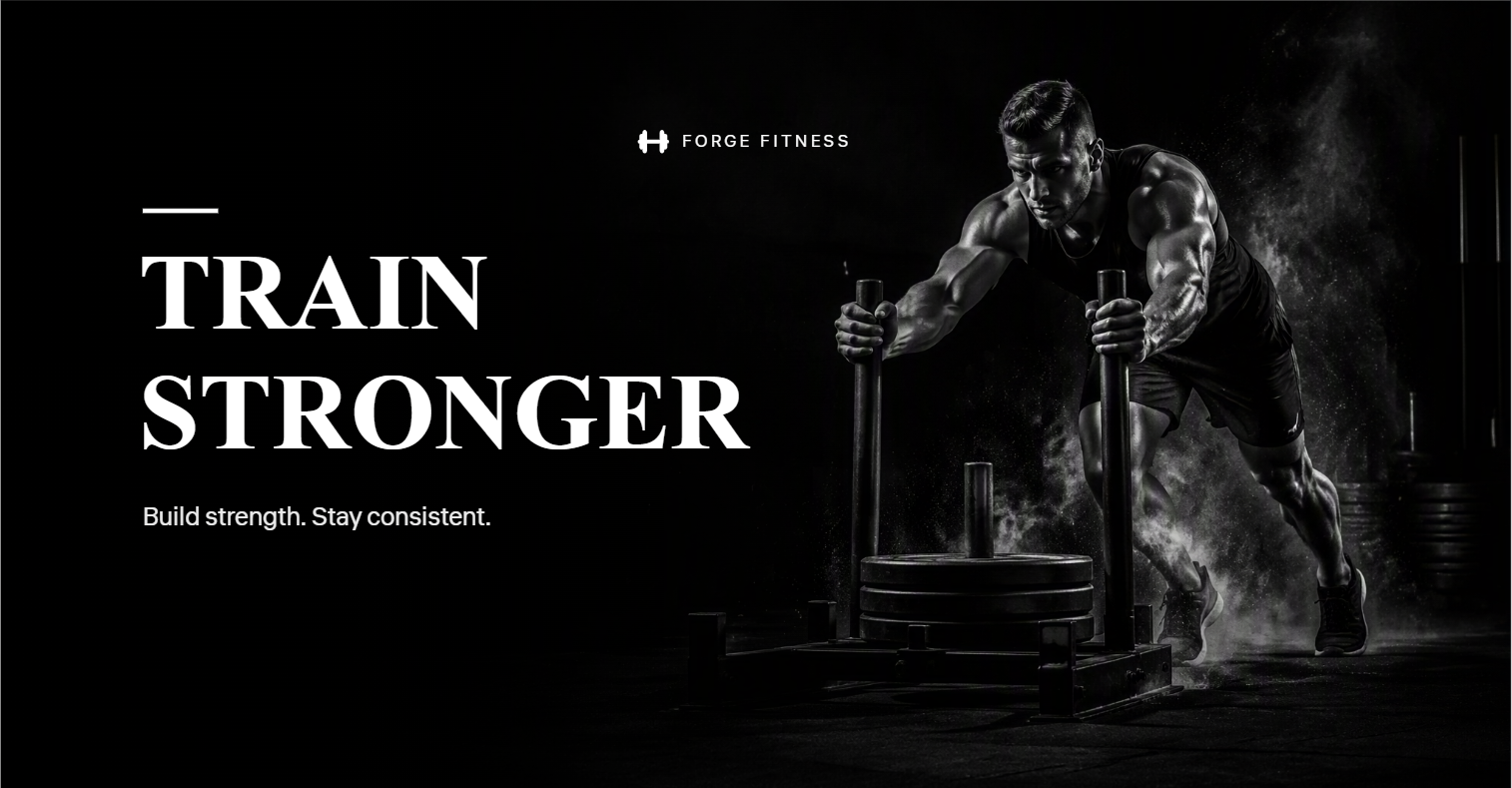
Bold text and image contrast
Strong text paired with a contrasting image can make the main message immediately noticeable. Use a short headline, clear typography, and an image that supports rather than competes with the text. High contrast between the text and background also improves readability. This style works well when the cover needs to communicate a clear message at a glance.
Example prompt:
Playful icons and visual symbols
Playful icons can make a cover more approachable while communicating the page's theme without relying on large amounts of text. Use a small collection of consistent symbols, such as stars, hearts, tools, or social icons, depending on the subject. Keep their size and placement balanced so they support the main message rather than becoming distracting.
Example prompt:

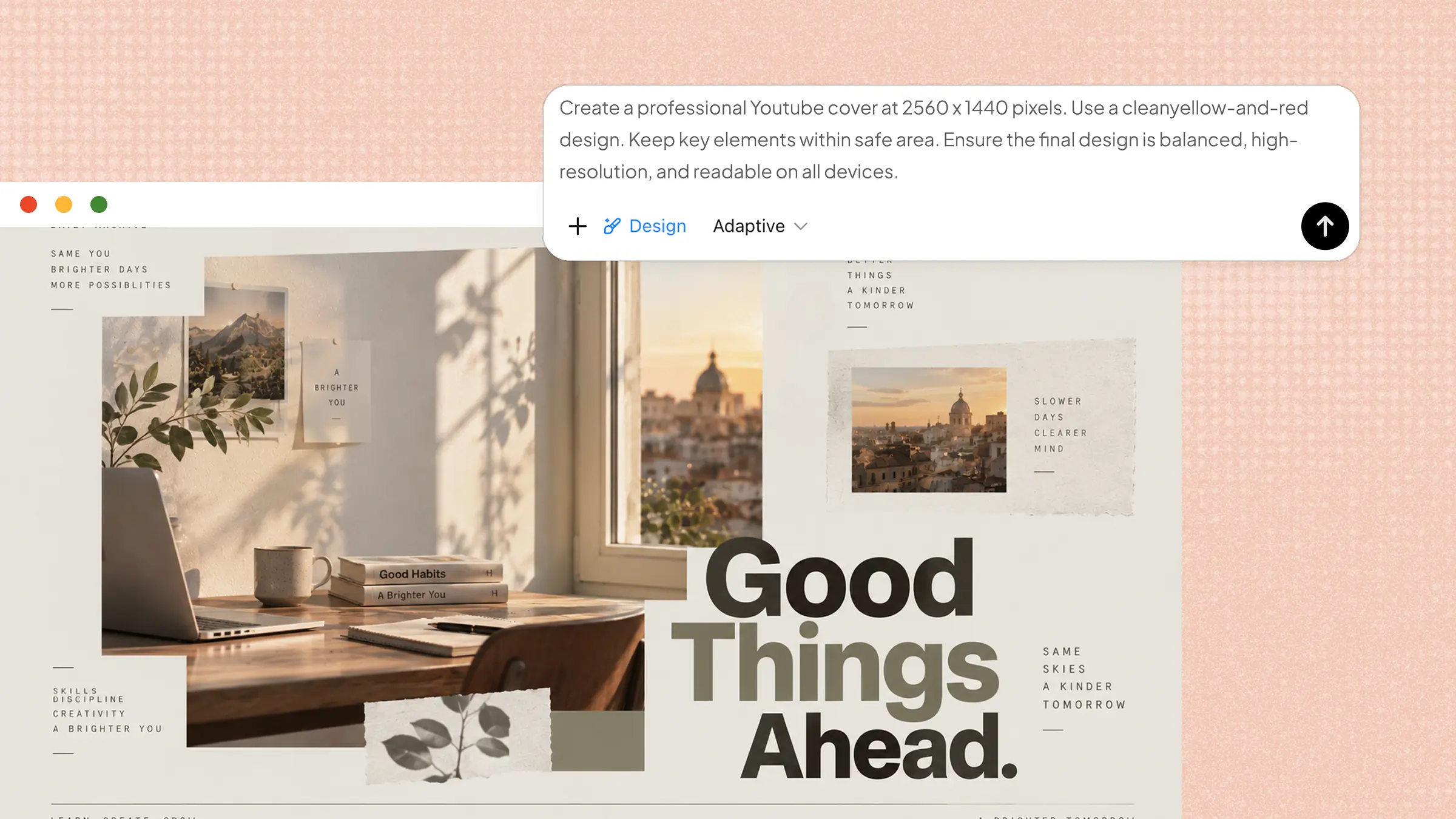
A focused color palette
A focused color palette can make a cover look more professional and visually consistent. Choose two or three complementary colors that match the brand or mood you want to create. Use the strongest color for important elements and softer tones for backgrounds or supporting details. This approach also helps maintain a cohesive look across different Facebook cover photo dimensions.
Example prompt:
Common Facebook cover photo mistakes to avoid
A cover photo can still look unprofessional when important details are cropped, the layout feels crowded, or the main message is difficult to notice. Avoiding these common mistakes will help you create a cleaner design that works well across different screens.
Ignoring desktop and mobile cropping
A cover can look perfectly positioned on desktop but appears differently cropped on mobile. Keep important text, logos, and key visuals within the central safe area, so they remain visible across different Facebook cover dimensions.
Overloading the design with information
Too much text, too many images, or excessive decorative elements can make the cover feel cluttered. Keep the message focused and leave enough empty space around the main content for a cleaner and more readable design.
Creating weak visual hierarchy
If every element has the same visual weight, visitors may not know where to look first. Use font sizes, spacing, contrast, and positioning to make the most important message stand out clearly.
Using low-quality or poorly cropped images
Blurry or badly cropped images can make a Facebook page appear unfinished. Use high-resolution visuals and check that important parts of the image remain visible when applying the recommended Facebook cover photo dimensions.
Making branding too dominant
A large logo or too many branding elements can distract from the main message and visual content. Keep your logo noticeable but balanced so it supports the design instead of taking over the entire cover.
Skipping a final check after uploading the cover
A design can look correct before uploading but appear slightly different once Facebook applies its display settings. Preview the uploaded cover on both desktop and mobile and check the text, logo, image placement, and overall alignment before publishing.
Conclusion
Creating a Facebook cover that looks professional across different devices starts with using the right dimensions, keeping important content within a safe area, and maintaining a clear visual hierarchy. Understanding the recommended best size for a Facebook cover photo can help prevent unwanted cropping and keep your design balanced. With a focused layout, high-quality visuals, and a final check after uploading, you can create a cover photo that represents your page clearly and makes a strong first impression.