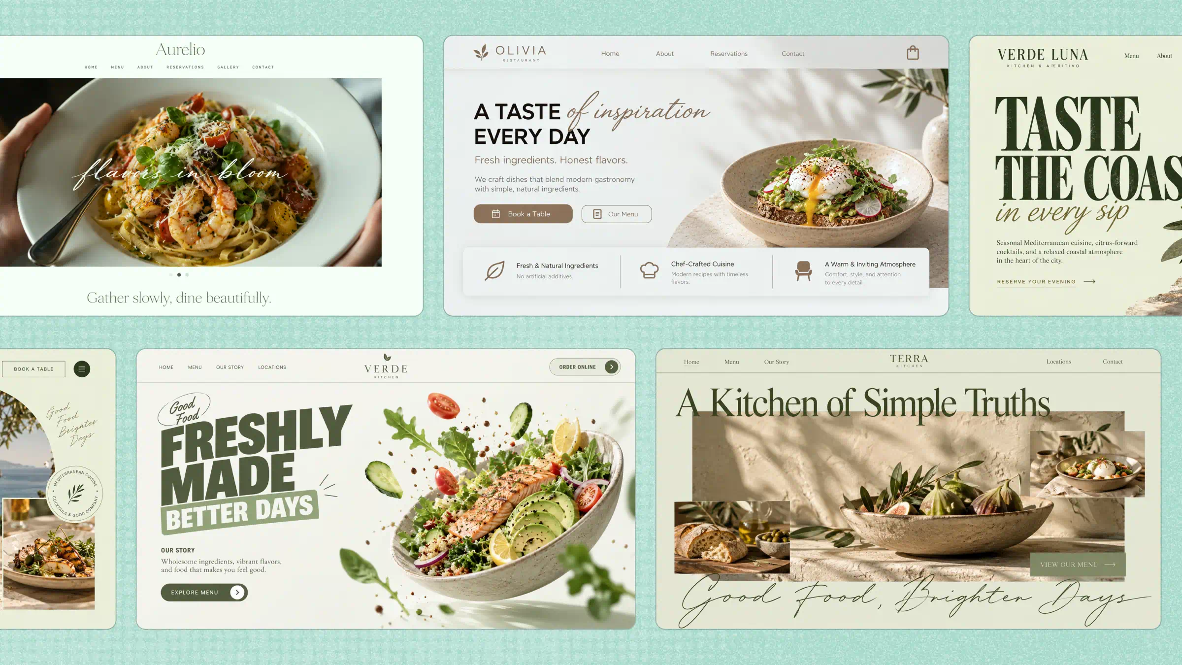
If you want your food business to stand out online, great photos alone aren't enough. A good website should make people hungry, help them explore your menu, and make ordering or booking a table easy. The right food website examples can give you fresh ideas for creating a site that looks inviting and keeps visitors coming back. Read on to explore 10 inspiring designs and discover how Kimi Build can help you create your own website without coding.
Overview of 10 food website design examples
From bold food photography to clean layouts and easy-to-use menus, every food website has something worth learning from. Let's explore 10 fast food website examples to see what makes each one stand out and how you can use these ideas for your own site:
| Website | URL | Category | What makes it a good example |
|---|---|---|---|
| Cassian Hollowell | https://eu5n5zve5rgqe.ok.kimi.link/ | Specialty Coffee & Subscription | Combines a sensory coffee catalog with a working brew-ratio calculator and flexible subscription builder; The roast curve creates a consistent through-line from discovery to checkout. |
| Casper Elsworth | https://4srbvf26dhx36.ok.kimi.link/ | Single-Origin Chocolate & Gifts | Turns flavor exploration into a sixteen-piece gift-box builder with dietary conflict warnings, transparent specifications, and a polished gift-message flow. |
| Tamsin Yewberry | https://d7m5r56vzpbdm.ok.kimi.link/ | Loose-Leaf Tea Library | A sensory tea finder, three-product comparison, and accessible brewing timer make selection practical while keeping the experience focused on flavor rather than wellness claims. |
| Bram Solano | https://n4etujj36zvgo.ok.kimi.link/ | Small-Batch Hot Sauce | Replaces heat-first marketing with a multidimensional flavor index and flexible three-bottle bundle builder, supported by complete product specifications. |
| Oren Tavener | https://pqfejzrpxj4qi.ok.kimi.link/ | Olive Oil & Pantry Provisions | Pairs calm pantry-ledger design with a useful food-pairing guide, clear oil comparisons, complete product data, and an uncluttered shopping journey. |
| Celia Quince | https://76ms34xjl3age.ok.kimi.link/ | Preserves & Marmalade | Expands preserves beyond toast through a guided pairing explorer and four-jar gift-box builder with customizable messages and original printable gift cards. |
| Kiran Elwood | https://wndh3xaztpxt6.ok.kimi.link/ | Spice Blend Atlas | An accessible aroma atlas and blend finder turn complex spice selection into an intuitive, culturally respectful shopping journey with transparent results. |
| Otis Millwick | https://zrtu62apt3nk4.ok.kimi.link/ | Heirloom Grains & Flour | Connects grain specifications, comparison tools, and baking-use matching so home bakers can choose products by texture, flavor, and intended use. |
| Nora Fieldhouse | https://fwzfxsjhnkmmi.ok.kimi.link/ | Meal-Kit Subscription | Makes plan pricing and meal selection tangible through serving controls, dietary exclusions, a five-meal tray, and a persistent subscription demo. |
| Ewan Hartleigh | https://np3cd37o5sp4i.ok.kimi.link/ | CSA Seasonal Produce Box | A transparent produce-box configurator combines size and frequency pricing, produce swaps, exclusions, and practical storage guidance without fake harvest data. |
10 food website examples to spark new ideas
Every food brand has its own way of making visitors hungry for more, and its website should reflect that. Let's look at 10 creative food websites to see how they present their dishes, connect with customers, and make the online experience more enjoyable.
Cassian Hollowell
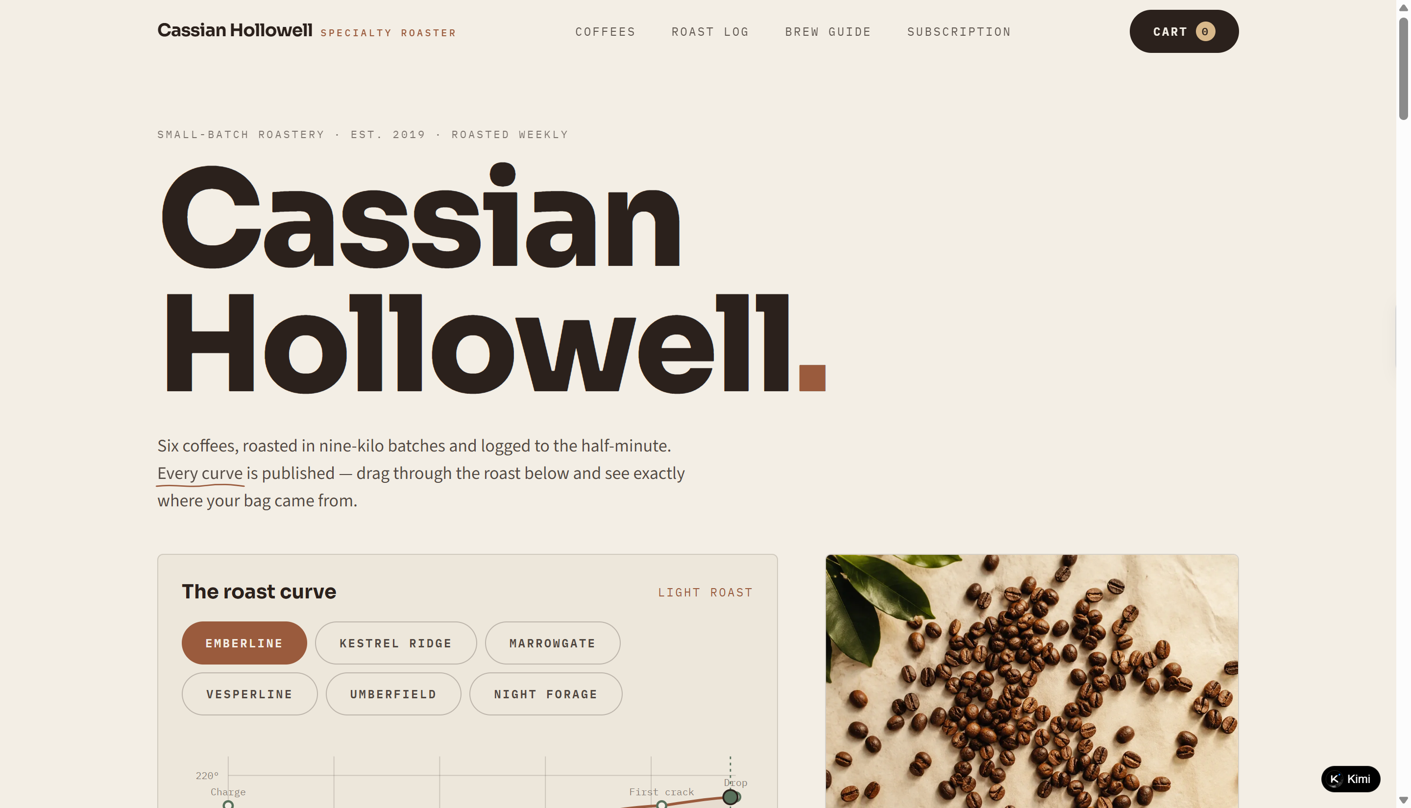
Cassian Hollowell is a fictional specialty coffee roastery website showcasing six small-batch coffees with distinct origins, roast profiles, and tasting notes. The design combines minimalist layouts, earthy tones, editorial typography, and coffee photography to create an authentic artisan brand identity. As a detailed food website example, it goes beyond a conventional product catalog by incorporating interactive roast curves, batch comparison tools, a brew-ratio calculator, and a customizable coffee subscription builder, bringing product transparency and practical functionality into the shopping experience.
Key characteristics
Minimalist brand presentation: Uses refined typography, neutral colors, and coffee-inspired imagery to establish a cohesive visual identity and highlight the craft behind specialty roasting.
Detailed coffee product catalog: Showcases six coffee varieties with origin information, processing methods, roast levels, tasting notes, altitude, and roast specifications. Category filters and sorting options make browsing easier.
Interactive roast curve visualization: Displays roast profiles with adjustable chart interactions, allowing visitors to explore roasting stages, bean temperatures, and rate-of-rise data.
Transparent batch comparison: Provides a roast log with production records, including charge temperature, first crack, development time, drop temperature, and weight loss. Visitors can select two batches for side-by-side comparison.
Practical brewing and subscription tools: Includes a brew-ratio calculator for adjusting coffee doses and water quantities, alongside a customizable subscription builder with coffee selection, bag sizes, delivery frequency, and grind options.
Casper Elsworth
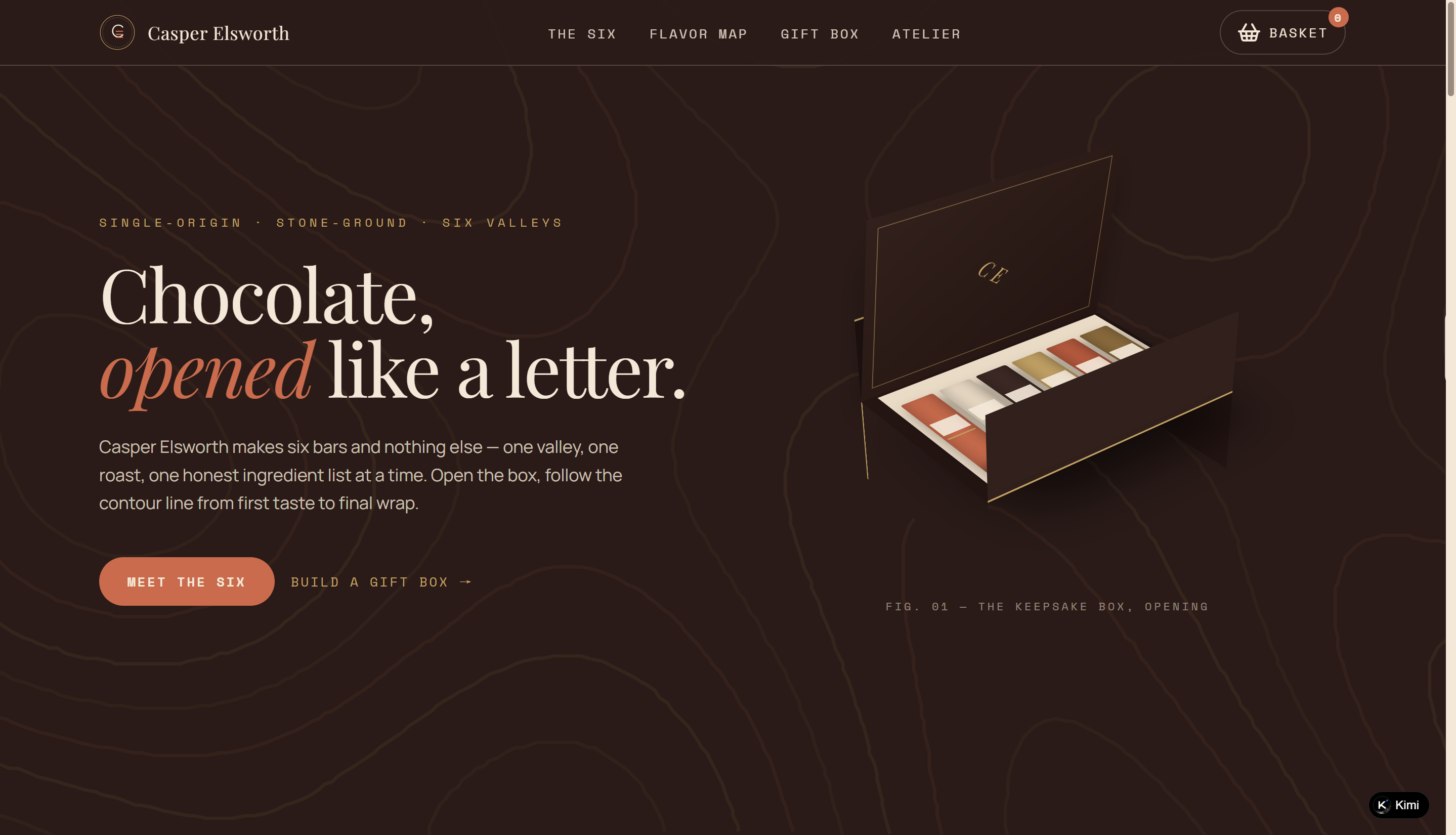
Casper Elsworth is a fictional single-origin chocolate brand website featuring a collection of six handcrafted chocolate bars sourced from six imaginary valleys. The website uses rich product photography, refined typography, and warm earthy colors to create a premium artisan chocolate aesthetic. Beyond showcasing its products, it incorporates an interactive flavor map, customizable gift box builder, and brand storytelling section to help visitors explore different chocolate varieties and create personalized gift selections.
Key characteristics
Premium editorial-style design: Uses elegant typography, warm colors, and detailed chocolate photography to communicate the craftsmanship and character of the brand.
Structured product showcase: Presents six chocolate bars with cocoa percentages, origins, flavor notes, prices, and product specifications for easy browsing.
Interactive flavor map: Visualizes the six chocolate varieties across flavor intensity and taste dimensions, allowing visitors to explore products based on their preferences.
Custom gift box builder: Lets visitors select and arrange up to 16 chocolate bars, follow product pairing rules, calculate the total price, and add a personalized gift message.
Brand storytelling: Introduces the fictional chocolatier's production methods, ingredient sourcing, and craftsmanship through dedicated atelier content and visual details.
Tamsin Yewberry
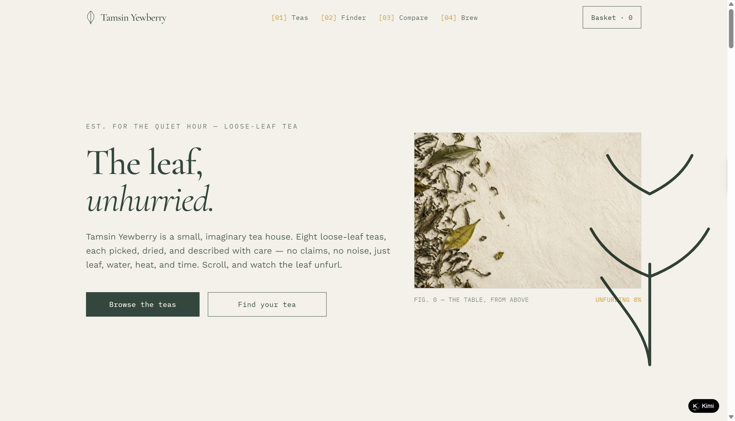
Tamsin Yewberry is a fictional loose-leaf tea shop website that combines editorial-style storytelling with an interactive shopping experience. Its warm neutral palette, elegant typography, and carefully arranged tea photography create a calm, refined atmosphere. The website showcases eight distinctive teas with detailed flavor profiles and brewing instructions, while interactive features such as a sensory tea finder, product comparison tray, and brewing timer help visitors explore the collection and find their preferred tea.
Key characteristics
Editorial-inspired visual design: Combines elegant serif headings, minimalist layouts, warm cream backgrounds, and natural tea photography to establish a distinctive brand identity.
Detailed product presentation: Showcases eight loose-leaf teas with flavor notes, tea categories, caffeine levels, prices, and brewing specifications.
Interactive product discovery: Includes a four-step sensory tea finder that recommends teas based on visitors' flavor preferences.
Side-by-side product comparison: Allows visitors to select up to three teas and compare their characteristics through a dedicated comparison tray.
Built-in brewing timer: Offers preset steeping times for each tea, as well as customizable brewing durations.
Bram Solano
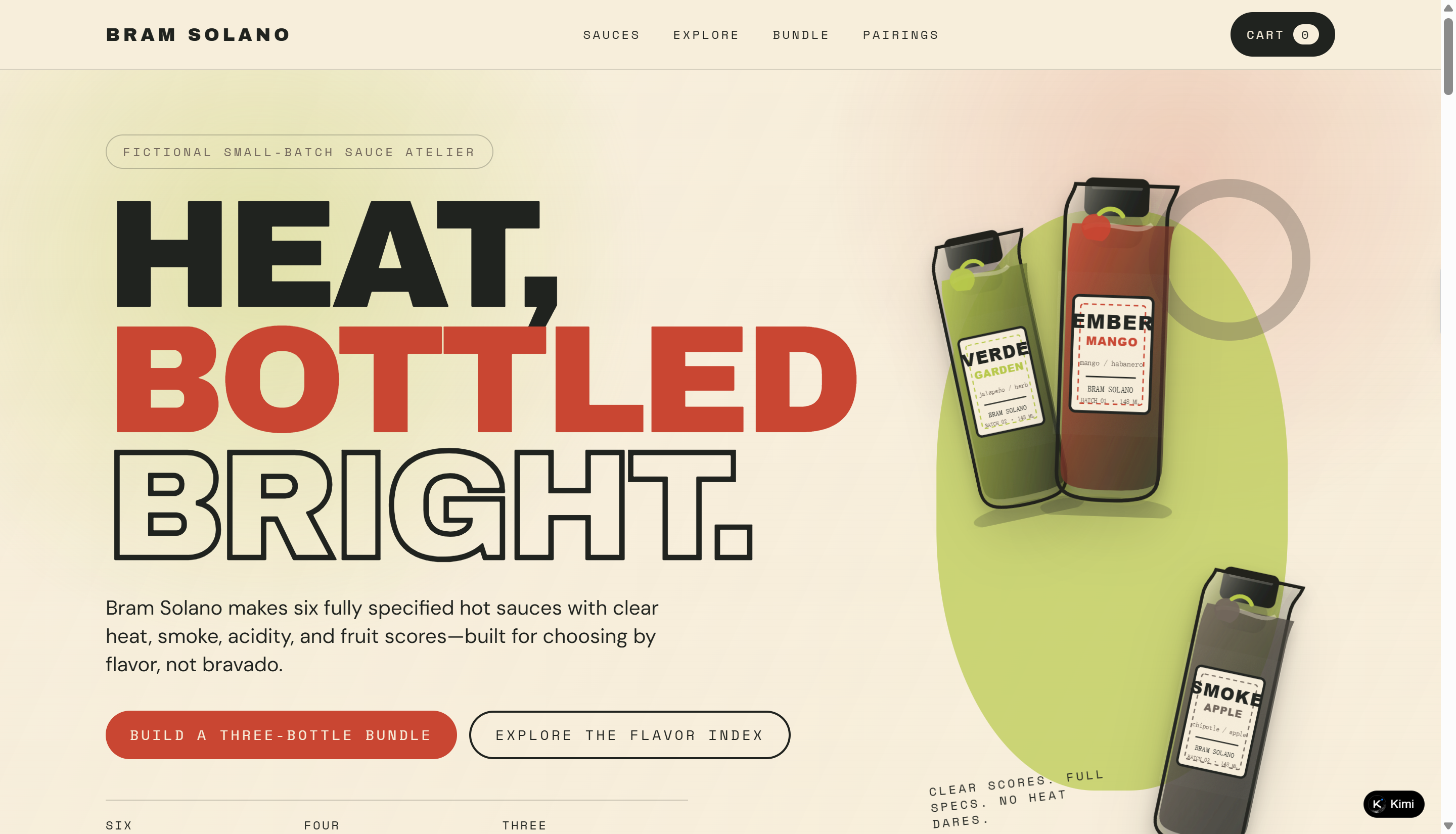
Bram Solano is a fictional small-batch hot sauce brand website featuring six distinctive sauces with different flavor profiles, ingredients, and heat levels. The website combines bold product imagery, clean layouts, and vibrant color accents to create a playful yet polished food brand identity. As a food website example, it goes beyond a standard online store with an interactive flavor explorer, customizable three-bottle bundle builder, visual flavor comparison, and food pairing suggestions, helping visitors discover sauces based on their individual taste preferences.
Key characteristics
Bold and distinctive visual identity: Uses colorful sauce labels, vibrant product photography, and clean typography to create a recognizable brand aesthetic that reflects the character of each sauce.
Detailed product catalog: Showcases six hot sauces with batch numbers, prices, ingredients, tasting notes, bottle sizes, food pairings, and four flavor scores covering heat, smoke, acidity, and fruitiness.
Interactive flavor explorer: Includes adjustable sliders for four flavor dimensions, allowing visitors to filter sauces by minimum scores and see matching products updated instantly.
Customizable bundle builder: Lets visitors select three bottles, including duplicate flavors, while automatically calculating the subtotal, bundle discount, and final price.
Visual flavor comparison and pairing guide: Features a dual-track flavor ruler that updates according to selected bottles, alongside dedicated pairing suggestions to help visitors discover suitable sauces for different dishes.
Oren Tavener
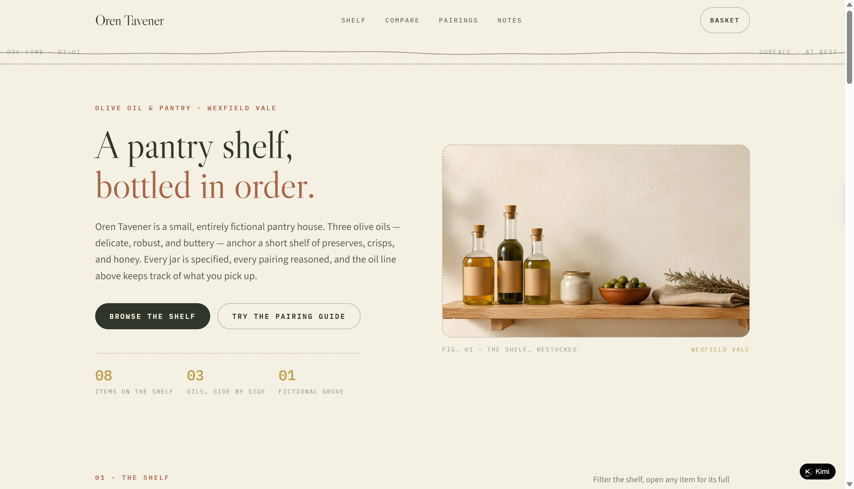
Oren Tavener is a fictional olive oil and pantry brand website featuring a curated collection of olive oils, preserves, bakery products, and pantry essentials. The website combines editorial-style layouts, warm earthy tones, and high-quality food photography to create a refined artisanal aesthetic. It goes beyond a traditional product catalog with interactive sensory comparisons, a food pairing guide, and practical pantry notes, helping visitors explore product characteristics and discover suitable food combinations.
Key characteristics
Artisanal visual identity: Uses elegant typography, muted natural colors, textured backgrounds, and carefully composed food photography to convey a premium pantry aesthetic.
Organized product catalog: Presents eight pantry products across different categories, with clear descriptions, prices, sizes, and flavor profiles. Category filters make product discovery easier.
Interactive sensory comparison: Allows visitors to compare three olive oils by fruitiness, bitterness, and pepper intensity through visual ratings and detailed tasting notes.
Food pairing guide: Connects pantry products with different foods, explains the reasoning behind each pairing, and lets visitors save up to three combinations in a printable notebook.
Informative editorial content: Includes practical pantry notes on olive oil storage, pouring techniques, and tasting methods, adding useful content beyond product promotion.
Celia Quince
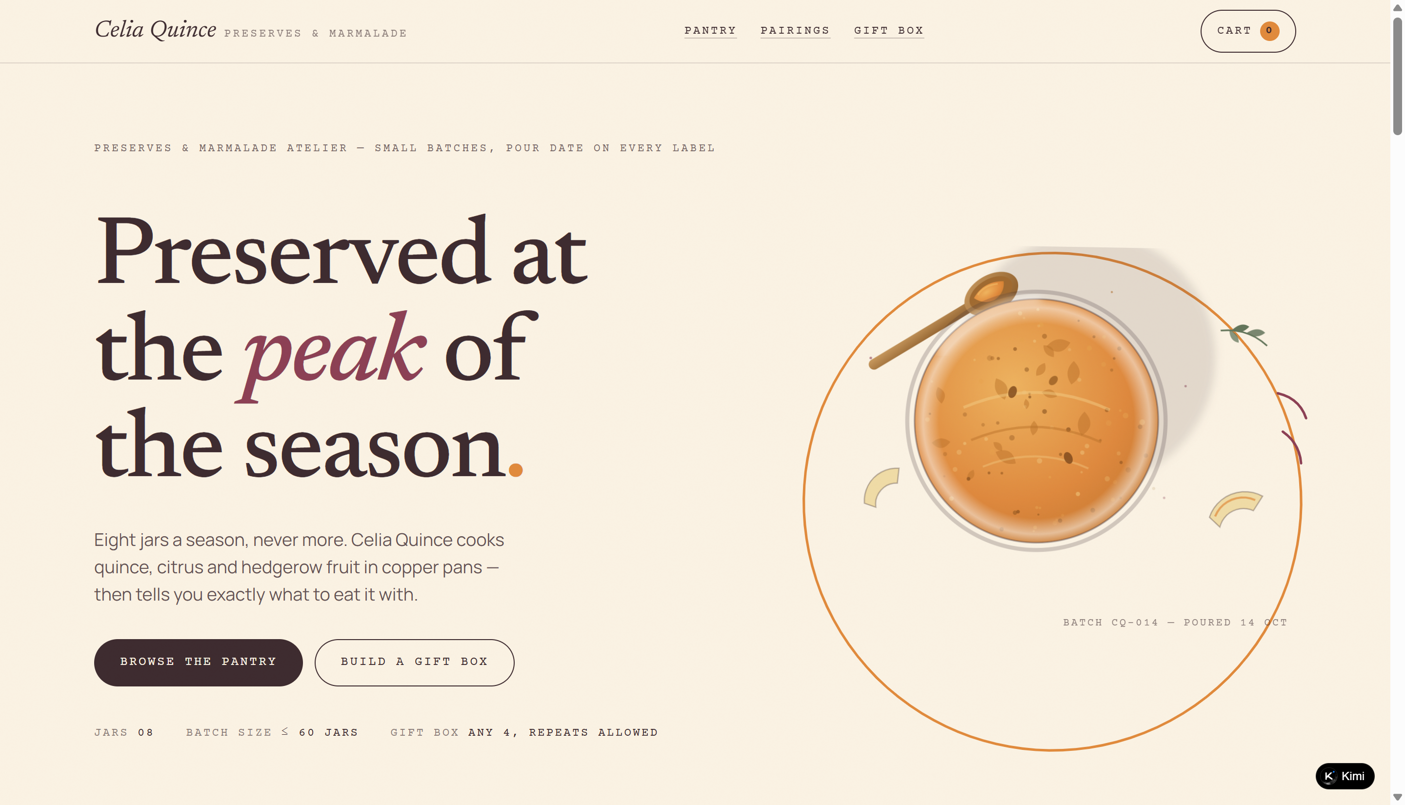
Celia Quince is a fictional preserves and marmalade atelier website featuring eight small-batch jars made with seasonal fruits, herbs, and spices. Its warm, editorial-inspired design combines paper textures, copper-pan imagery, and understated typography to create a traditional pantry aesthetic. As a food website example, it brings product discovery and gifting together through a detailed preserve catalog, an interactive pairing explorer, and a customizable four-jar gift box builder. Each product includes batch details, weight, set, sweetness, and serving suggestions, helping visitors explore different flavors and find suitable pairings.
Key characteristics
Seasonal visual identity: Warm paper tones, earthy colors, and editorial typography create a handcrafted pantry aesthetic.
Filterable product catalog: Eight jars feature detailed batch, weight, sweetness, flavor, and serving information, with filters for style, sweetness, and season.
Interactive pairing explorer: Visitors can select a preserve to discover suggested cheese, bread, and drink pairings, then save their favorites.
Custom gift box builder: Visitors can choose four jars, select a gift sleeve, and add a personalized message card.
Batch-focused product storytelling: Pour dates, batch numbers, seasonal ingredients, and cooking notes highlight the small-batch production process.
Kiran Elwood
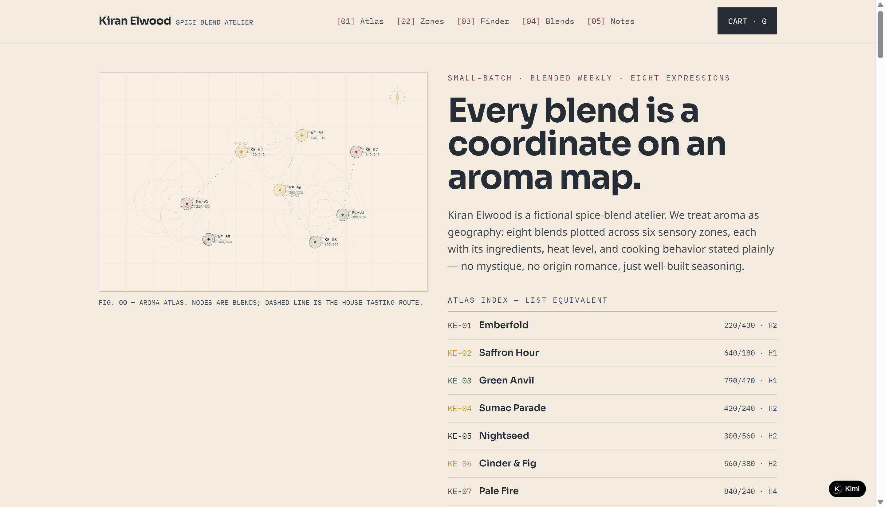
Kiran Elwood is a fictional spice-blend brand website featuring eight small-batch seasoning blends, each mapped across six sensory zones according to its aroma profile and heat level. The website combines an editorial-inspired layout, earthy color palette, and abstract visualizations to create a distinctive culinary brand identity. As a food website example, it stands out with an interactive aroma atlas, customizable blend finder, detailed product specifications, and practical cooking notes that help visitors explore seasonings and choose blends based on their cooking methods, flavor preferences, and dietary requirements.
Key characteristics
Aroma-inspired visual identity: Uses a coordinate-based aroma atlas, abstract constellation illustrations, and a restrained palette of saffron, sumac, herb, and ink tones to establish a distinctive brand aesthetic.
Organized sensory product catalog: Showcases eight spice blends with ingredient lists, aroma notes, heat ratings, package sizes, prices, cooking methods, and dietary information.
Interactive aroma atlas: Maps eight spice blends across six sensory zones, including Bright & Tart, Warm & Sweet, Smoke & Char, and Green & Herbal, helping visitors understand their flavor characteristics.
Customizable blend finder: Offers filters for cooking methods, aroma preferences, heat levels, and ingredient exclusions, allowing visitors to narrow down suitable spice blends.
Practical cooking guidance: Provides dedicated usage notes covering spice blooming, finishing techniques, steeping aromatics, heat adjustment, storage, and salt management.
Otis Millwick
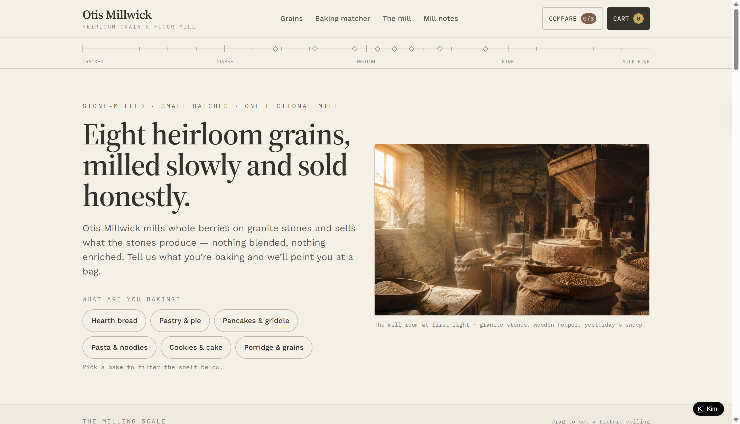
Otis Millwick is a fictional heirloom grain and flour mill website featuring eight varieties of stone-milled grains, each with detailed milling and baking information. Its rustic editorial design combines warm photography, grain-inspired textures, and mill journal entries to communicate the craft behind small-batch production. As a food website example, it offers practical product discovery through baking-based filters, an interactive flour matcher, and a texture comparison scale that helps visitors choose grains for different recipes.
Key characteristics
Rustic mill-inspired design: Warm-toned photography, natural textures, and editorial typography reflect the traditional milling process.
Detailed grain catalog: Eight grains display protein content, extraction rate, texture scores, flavor notes, prices, and available bag sizes.
Baking-based product filters: Visitors can filter grains for baking purposes, including bread, pastry, pancakes, pasta, cookies, and porridge.
Interactive baking matcher: A three-question tool recommends a suitable grain and provides an original recipe outline based on baking needs, texture, and flavor preferences.
Grain comparison and mill journal: Visitors can compare up to three grains and explore journal entries about stone dressing, milling methods, and seasonal production.
Nora Fieldhouse
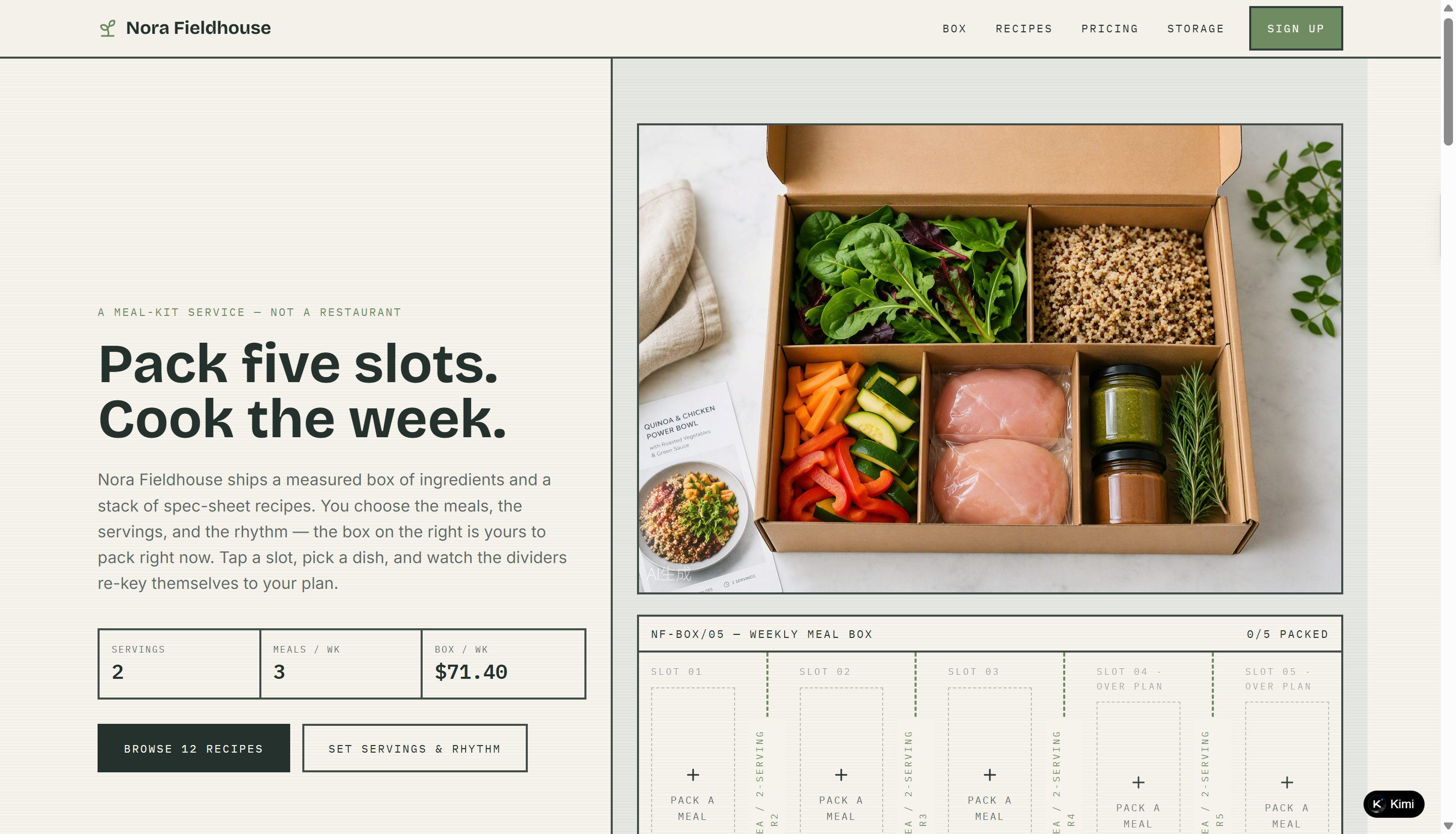
Nora Fieldhouse is a fictional meal-kit service website built around a customizable weekly meal box. Its clean, editorial layout presents 12 recipes alongside meal planning, pricing, and food storage information. As a food website example, it features an interactive box builder that lets visitors select meals, adjust serving sizes and delivery frequency, and see how their choices affect the weekly price.
Key characteristics
Interactive meal box builder: Visitors can fill five meal slots with recipes and see the box layout update based on their selections.
Filterable recipe catalog: Twelve recipes can be filtered by protein type, heat level, and preparation time, with links to full recipe specifications.
Flexible meal planning and pricing: Visitors can adjust servings and meals per week, with a pricing table showing the corresponding per-serving rate and weekly total.
Practical food storage guidance: Four dedicated sections explain how to store greens, cooked grains, sauces, and proteins.
Demo signup form: Visitors can save their meal plan by entering their contact details, with no payment or actual delivery involved.
Ewan Hartleigh
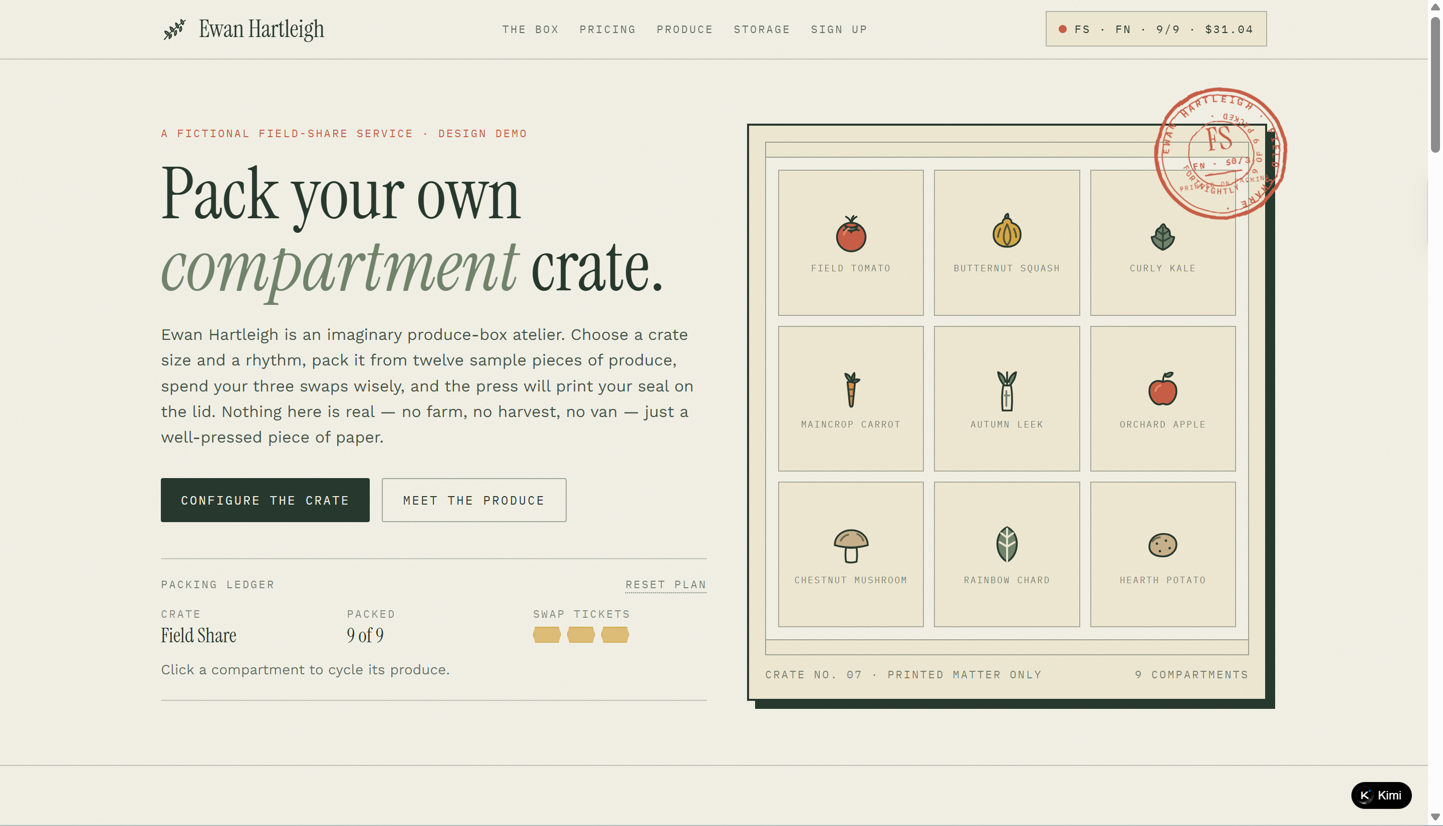
Ewan Hartleigh is a fictional CSA produce-box service website that lets visitors customize a seasonal produce crate. Its rustic visual style combines botanical illustrations, earthy colors, and editorial typography to reflect a farm-to-table identity. As a food website example, it features an interactive crate builder, flexible delivery plans, produce storage guidance, and a demo signup form.
Key characteristics
Farm-inspired visual identity: Botanical illustrations, field-inspired colors, and print-style typography create a distinctive agricultural aesthetic.
Interactive produce crate builder: Visitors can choose a crate size, adjust delivery frequency, and pack or exclude individual produce items.
Flexible pricing calculator: Three crate sizes and three delivery rhythms update the per-crate price and seasonal total in real time.
Produce catalog and storage guide: Twelve produce items include botanical names, color categories, and practical storage suggestions organized by storage condition.
Interactive packing rewards: Packing all five produce colors unlocks a printable storage-sorting card, adding a small discovery element to the crate-building experience.
Launch your restaurant website without any coding using AI
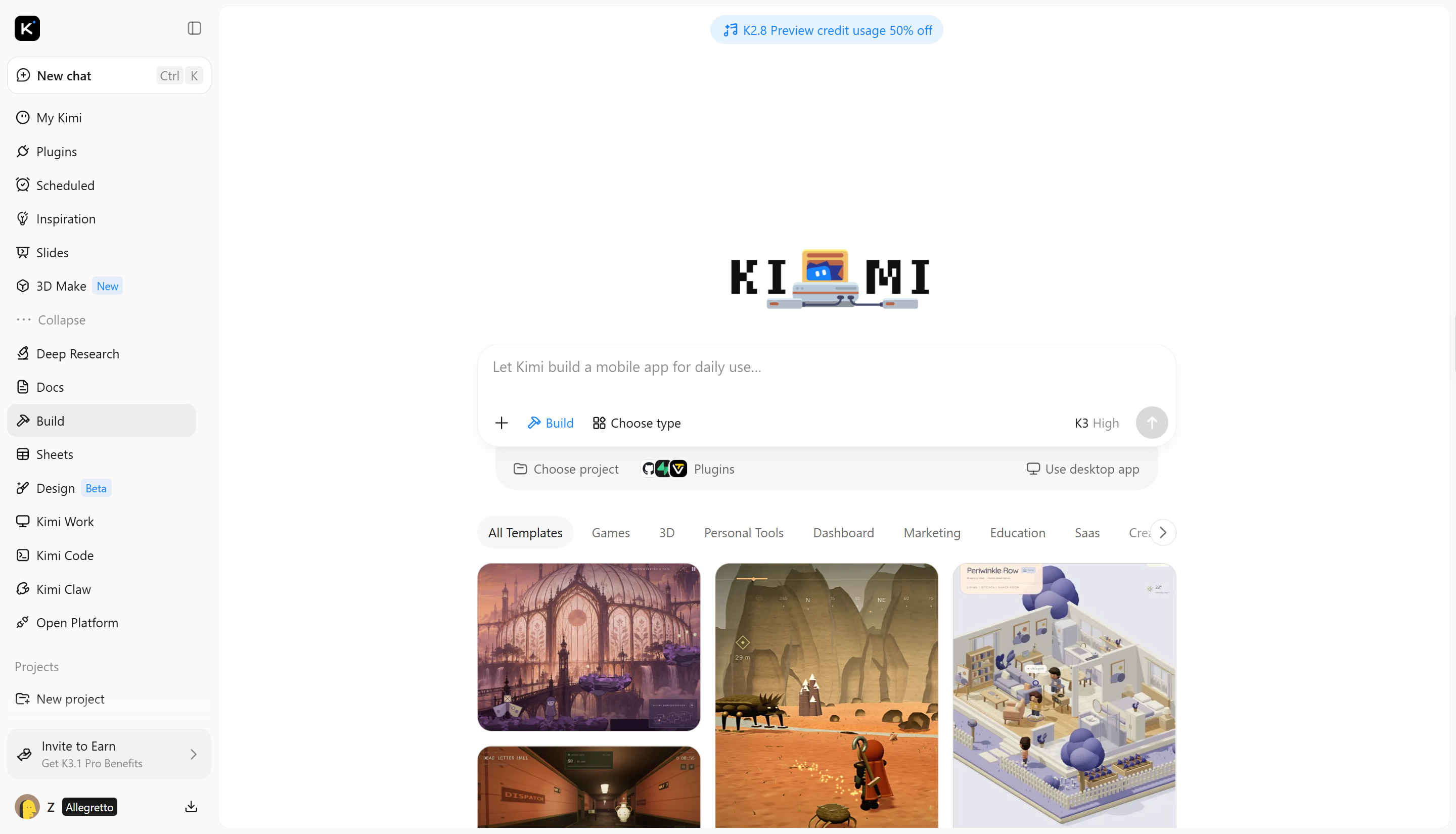
A great restaurant website doesn't have to take weeks to build or require coding skills. With Kimi Build, an AI website builder, you can turn your ideas into a professional-looking site using simple prompts. Add food photos, showcase your menu, share your restaurant's story, and make it easier for customers to find what they need. It's a simple way to bring your restaurant website to life without starting from scratch.
Main features
Create a food website from prompts and visual references: Describe your food business, cuisine, target audience, and design preferences in natural-language prompts, or upload food photography, brand references, and existing website materials to guide the design. Kimi Websites turns these inputs into a customized food website with cohesive visuals, clear page layouts, and a design that reflects your culinary style and brand identity.
Create visually cohesive food website designs: Combine your brand identity, food photography, signature dishes, and design references to establish a distinctive visual style. Kimi Websites helps arrange images, typography, colors, and page layouts into a polished design that highlights your culinary aesthetic and creates a memorable browsing experience.
Build multi-page food websites: Create connected pages for menus, product collections, locations, recipes, catering services, events, and contact information. Kimi Websites helps organize these pages into a cohesive online experience, making it easier for visitors to browse your offerings and find relevant information.
Update your food website as your business grows: Describe the changes you want in natural language and revise page copy, food images, color schemes, typography, layouts, or individual sections. Adapt your website to seasonal menus, new products, special events, and changing promotions without starting from scratch.
Preview, publish, and customize your food website: Review your website across desktop, tablet, and mobile screens before publishing. Deploy the finished site with a shareable link and access the generated source code for further customization as your food business's online presence evolves.
How to create a food website with Kimi Build
Creating a food website is easier when you have the right tools and a clear idea of what you want. With Kimi Build, you can turn your vision into a working website without writing code. Follow these simple steps to build your own food website, from choosing a design to adding your menu and other important details.
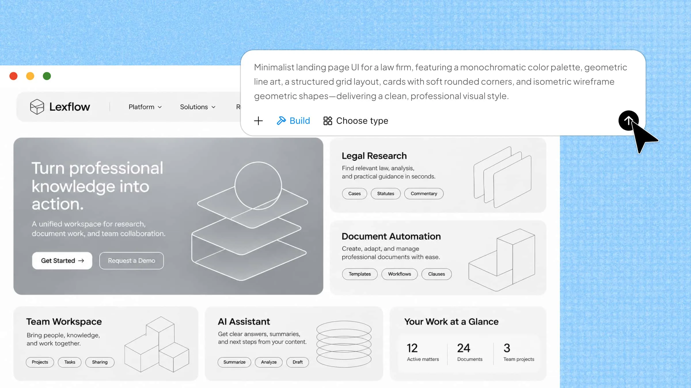
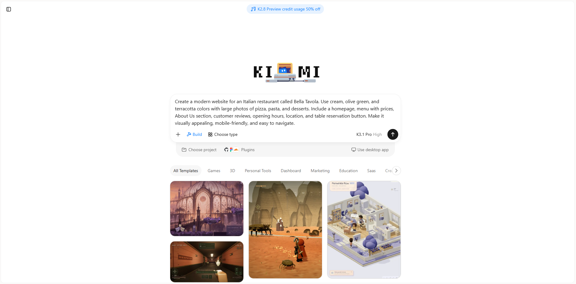
Step 1: Enter a clear prompt
Tell Kimi Build what kind of food website you want, including its style, colors, menu, and key features.
Example prompt:
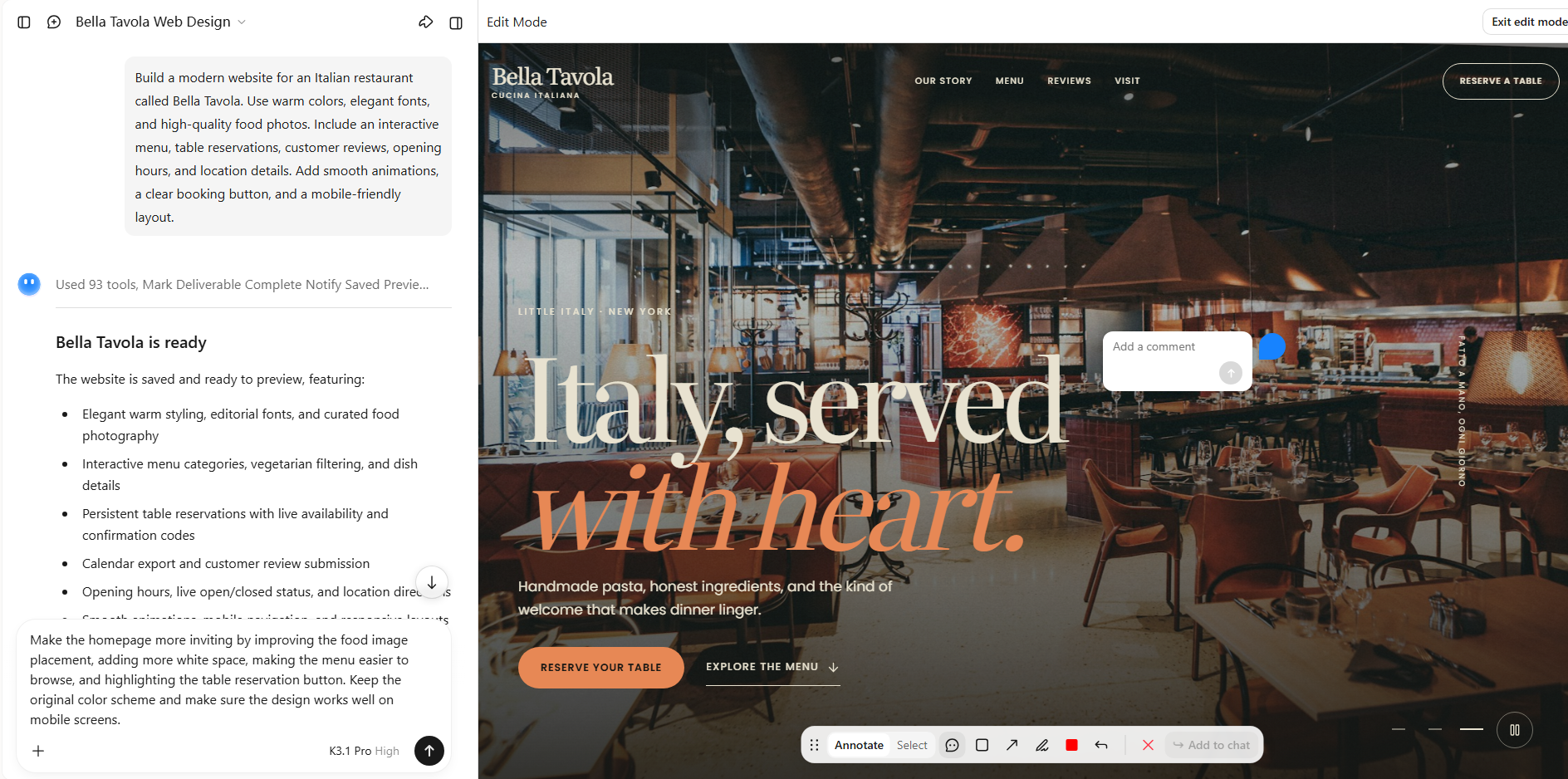
Step 2: Edit your website
Review the generated design and ask Kimi Build to adjust the layout, images, colors, or sections until the website matches your vision.
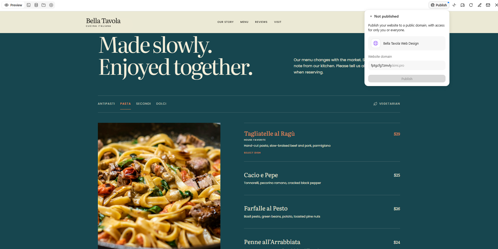
Step 3: Preview and publish
Check your website on desktop and mobile, test its buttons and links, and verify all menu details. Once everything looks right, use the available publishing options to launch your website.
Tips for making your food website stand out
Whether you run a restaurant, bakery, cafe, or food blog, your website should reflect what makes your food special. The right design choices can help visitors explore your offerings, find useful information, and decide what to try next. Keep these tips in mind when building or improving your food website.
Define a distinctive visual identity
Choose colors, fonts, and images that reflect your food brand. For example, a bakery might use soft colors and warm photography, while a modern restaurant could choose bold colors and clean layouts. Keep these elements consistent across every page so visitors can easily recognize your brand.
Write descriptive, engaging food copy
Describe your dishes in a way that helps visitors imagine their taste, texture, and freshness. Instead of simply writing "chocolate cake," try "rich chocolate cake layered with smooth cream." Keep descriptions natural and clear, and include important details such as ingredients, portion sizes, and prices where relevant.
Prioritize website loading speed
Large food images can slow down your website if they are not optimized. Compress images, use suitable file formats, and avoid adding unnecessary animations or features. A fast website helps visitors browse your menu without frustration, especially when using mobile data.
Make content easy to scan
Organize your website with clear headings, short paragraphs, and well-separated sections. Group menu items into categories such as starters, main courses, desserts, and drinks so visitors can quickly find what they want. Use readable fonts and enough spacing to make every page comfortable to browse.
Use SEO-friendly page structure
Use clear page titles, headings, and relevant keywords that match customer searches. Include your menu, location, and opening hours to help search engines understand your website. Location-specific keywords can also help nearby customers find your restaurant.
Give visitors a clear next step
Make it easy for visitors to take action by adding visible buttons such as "Order Online," "View Menu," or "Book a Table." Place these buttons where people naturally look for them, such as near the top of the homepage and beside relevant content. Use clear wording and ensure each button leads directly to the right page or action.
Conclusion
The best food websites bring a brand's personality to life while making every visit simple and enjoyable. Exploring food website examples can help you find a direction that fits your goals and the people you want to reach. You don't need to be a designer or know how to code to get started. Try Kimi Build to turn your ideas into a website with a few simple prompts. Create your food website today and see where your ideas take you.