A great e-commerce website should make shopping feel simple, enjoyable, and trustworthy. But with so many stores competing for attention, it can be hard to know which design choices actually make a difference. The right examples can give you fresh ideas for everything from product pages and layouts to branding and checkout. If you're looking for inspiration before building your own store, explore e-commerce website project ideas in this article to see what you can learn from the best.
Overview of 20 good e-commerce website examples
There are many ways to create a good e-commerce website design, and each brand takes a slightly different approach to attract customers and make shopping easier. The overview below highlights different layouts and features that can give you useful ideas for your own store.
| Ecommerce website | URL | Industry | What makes it a good example |
|---|---|---|---|
| Atelier Veil | https://g7ensj2tqrynu.ok.kimi.link | Perfume | An immersive fragrance experience built around four signature scents, with storytelling, curated product collections, customer testimonials, and complementary body-care products. |
| YUNWU TEA | https://dgg4c6xs2y674.ok.kimi.link/ | Tea | A strong product story centered on mountain origins, supported by origin stories, subscription boxes, product-specific brew guides, and interactive brewing tools. |
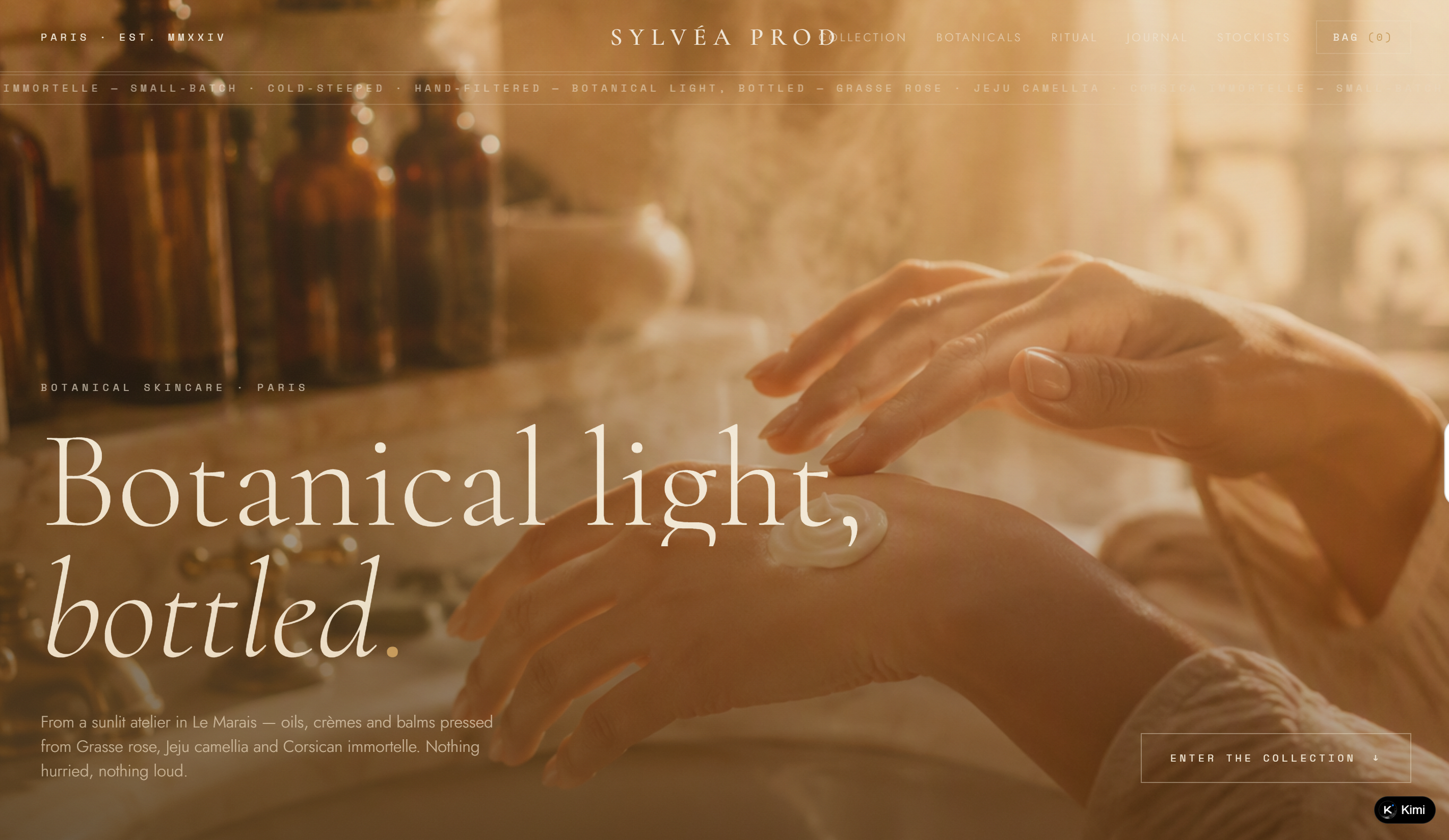
| SYLVÉA PROD | https://o33sx2vc4maaw.ok.kimi.link | Botanical skincare | A cohesive brand experience that connects botanical ingredients with product collections, origin stories, daily rituals, and editorial content. |
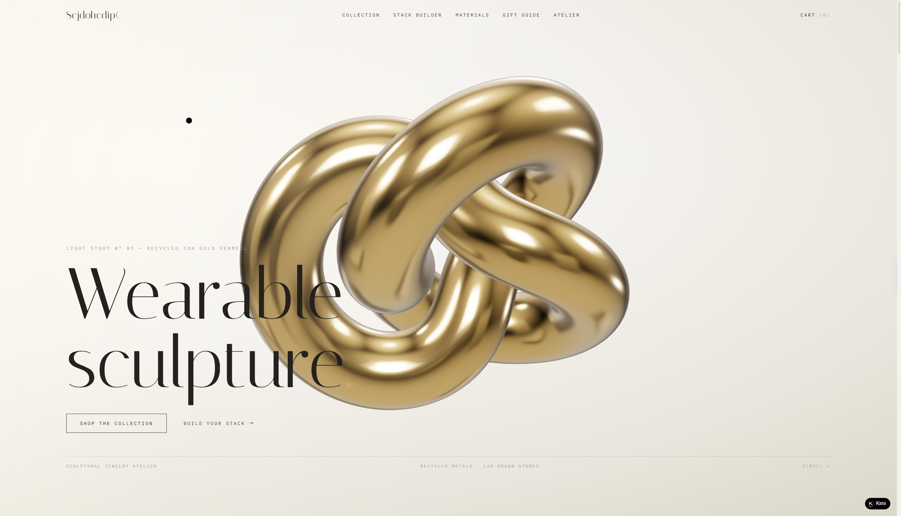
| ScjdohcdipC | https://dxe3x7n6euhaa.ok.kimi.link | Sculptural jewelry | An interactive approach to product discovery with a Stack Builder, alongside material details, craftsmanship stories, gift guides, and personalization options. |
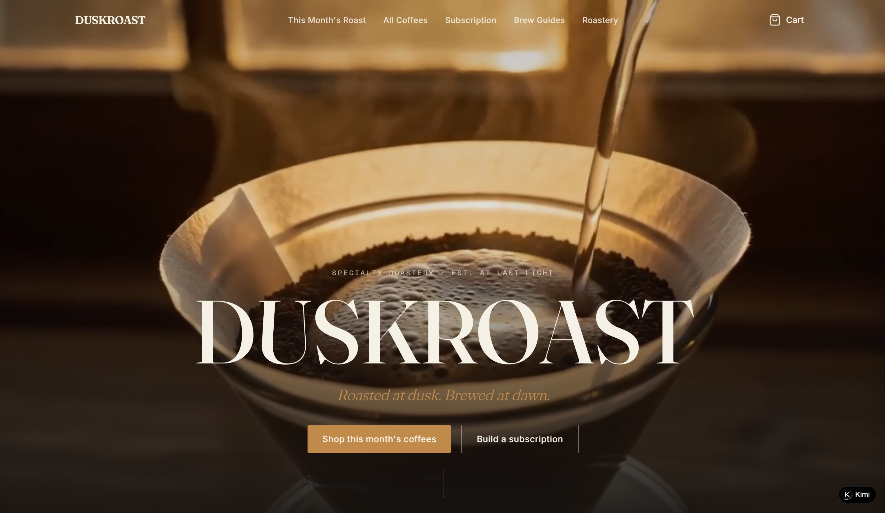
| Duskroast | https://q37rumfwcy6ke.ok.kimi.link | Specialty coffee subscription | A craft-focused coffee store featuring single-origin collections, detailed tasting information, customizable subscriptions, brewing guides, and transparent roasting stories that connect customers with each coffee's origin and production process. |
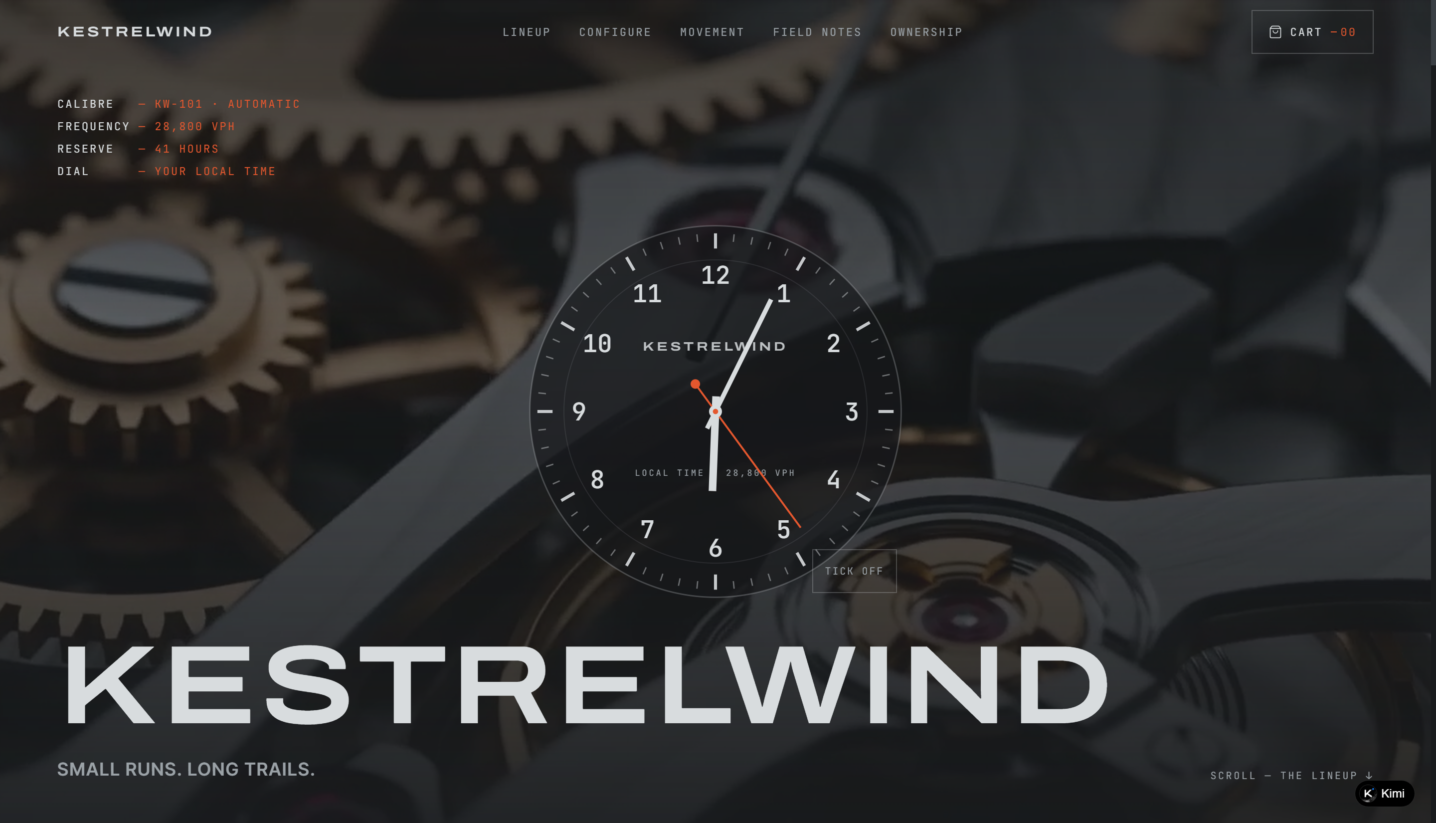
| Kestrelwind | https://hhvlljw4ptzui.ok.kimi.link | Mechanical field watches | A premium watch experience combining detailed product specifications, interactive customization, movement breakdowns, field stories, and ownership services to showcase craftsmanship and long-term value. |
| Glintwell | https://idr4pdmdj7l6w.ok.kimi.link | Small-batch sunglasses | A thoughtful eyewear shopping experience with shape-based product discovery, fit guidance, material storytelling, lens comparisons, and customer reviews that help shoppers choose the right frame. |
| Grainmoor | https://vgp2xjzuq2pm2.ok.kimi.link | Full-grain leather goods | A craftsmanship-driven leather goods store that highlights small-batch production, material origins, patina development, workshop processes, and long-term care services. |
| Fernhollow | https://dobjmp2snbiqm.ok.kimi.link | Camp & trail goods | A practical outdoor gear store that combines product filtering by weight and category, a camp set builder, curated packing lists, and detailed product information for easier trip planning. |
| Courtloom | https://265wzjaunyyze.ok.kimi.link | Everyday sneakers | A minimalist footwear store focused on everyday leather sneakers, featuring clear product presentation, size guidance, colorway exploration, and real-world wear documentation. |
| Groovehaven | https://yioiblcgw63u4.ok.kimi.link | Vinyl records & turntable goods | An interactive record store built around a crate-style browsing experience, with genre and format filters, 30-second needle-drop previews, vinyl accessories, and staff picks that encourage product discovery. |
| Edgeford | https://hijpfio4dkgyc.ok.kimi.link | Kitchen knives & edge care | A product-focused knife store that combines detailed blade specifications with edge-care guidance, sharpening information, product comparisons, and practical tools for choosing and maintaining kitchen knives. |
| Amberhive | https://hfiy2uy2ts2b2.ok.kimi.link | Raw honey & preserves | A honey-focused storefront that connects individual products with floral sources, harvest details, tasting notes, and preserve collections to give shoppers more context about each product's origin and character. |
| Verdalia | https://uruoo2g7nogvu.ok.kimi.link | Single-estate olive oil | An origin-focused olive oil store that highlights estate information, harvest details, tasting characteristics, production methods, and food-pairing guidance to make the provenance of each oil part of the shopping experience. |
| Roamwell | https://iaxf73jtourxs.ok.kimi.link/ | Everyday carry backpacks | A commuter backpack store with three sizes, an interactive product matcher, detailed capacity and material specifications, and a pocket map that helps shoppers understand what each bag can carry. |
| Sagefoam | https://edx3y4umotixk.ok.kimi.link | Cold-process soap & bath | A small-batch soap store that makes the curing process part of the shopping experience, with batch information, scent profiles, curing dates, a mood guide, and a gift box builder. |
| Flowform | https://fo5kzvxvgrzhm.ok.kimi.link | Cork yoga equipment | A specification-driven yoga equipment store centered on cork mats, with thickness-based product filtering, interactive practice guidance, technical surface comparisons, and detailed material and geometry information. |
| Dozeling | https://qtn6gyjoso5si.ok.kimi.link | Baby sleepwear | A minimalist baby sleepwear store centered on organic cotton essentials, with material certifications, sleepwear guidance, gift options, and a soft visual identity designed around comfort and simplicity. |
| Snufflebrook | https://uf2y2m3tqq752.ok.kimi.link | Dog enrichment & trail gear | A playful dog gear store featuring enrichment toys and recycled trail equipment, supported by a dog size guide, field-inspired product storytelling, materials information, and a giveback section. |
| Mosslight | https://u7ir7vinpnwje.ok.kimi.link | Rare houseplants | A greenhouse-focused plant store that combines individually photographed houseplants with a light diagnosis tool, detailed shipping information, and messaging around slow cultivation and sending plants in their growing soil. |
20 good e-commerce websites worth exploring for fresh ideas
Good e-commerce design can look very different from one store to another, depending on the products, audience, and brand style. The following e-commerce website examples offer a range of approaches to help you discover what might work for your own online store.
Atelier Veil
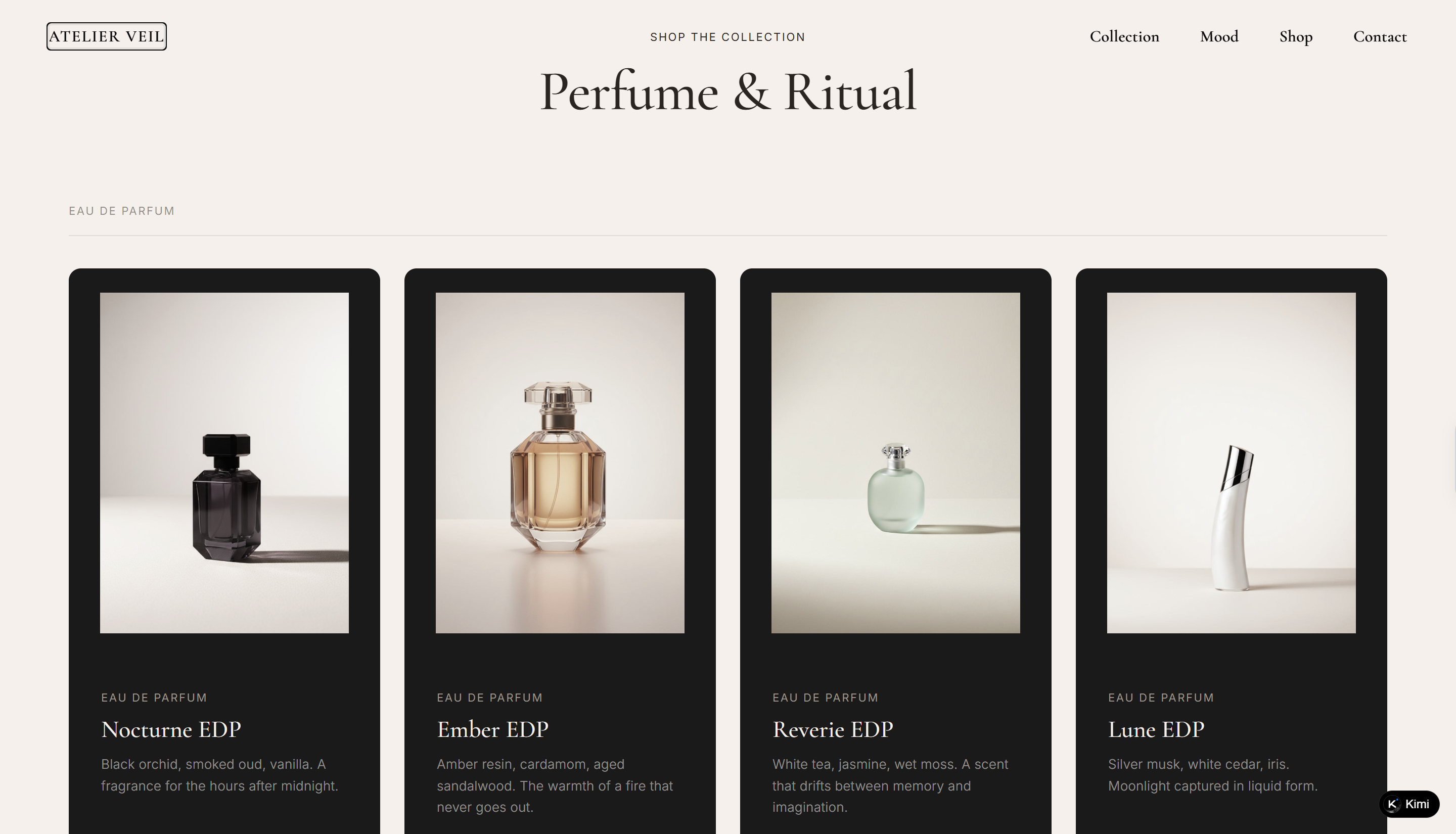
Atelier Veil is a fragrance e-commerce website built around four signature scents, each presented as a distinct olfactory world with its own mood and character. Product pages combine fragrance notes, evocative descriptions, and clear pricing to make the collection easy to explore. The site extends each fragrance into a broader body-care collection, including body oils, scrubs, hand cream, and hair mist. Customer testimonials and editorial-style sections add emotional context and reinforce the brand story throughout the shopping experience.
Key characteristics
Four signature scents organized as distinct product worlds
Storytelling-driven fragrance descriptions and product presentation
Complementary body-care products built around the fragrance collection
Customer testimonials integrated into the shopping journey
Editorial content that reinforces the brand narrative
YUNWU TEA
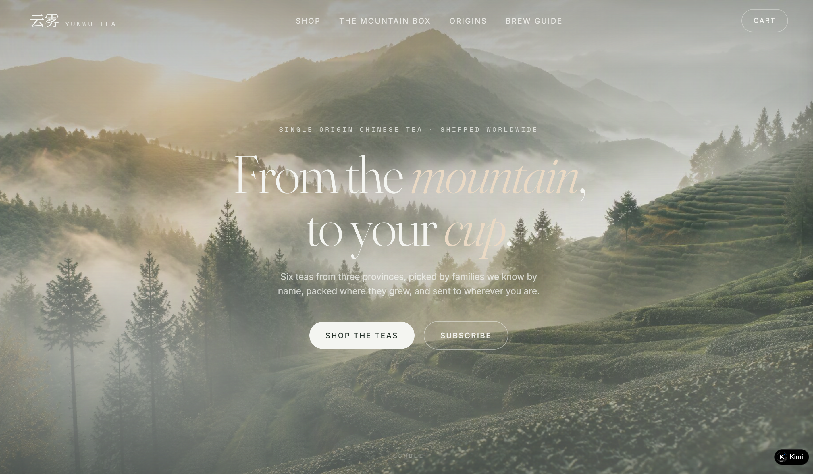
YUNWU TEA is an e-commerce website example of how product education can enhance online shopping. The website presents single-origin Chinese tea through detailed origin stories, including mountain regions, altitude, flavor profiles, and growing conditions. Subscription boxes, interactive brewing tools, and product-specific guides help customers better understand each tea before purchase while creating a more engaging shopping journey.
Key characteristics
Single-origin tea organized by mountain and regional provenance
Detailed product information including origin, altitude, and tasting notes
Subscription-based Mountain Box for recurring purchases
Product-specific brewing instructions and interactive timers
Origin stories that connect products with their growing regions
SYLVÉA PROD
SYLVÉA PROD offers good e-commerce website design inspiration for botanical skincare brands. The website connects products with their natural ingredients and geographic origins, using dedicated sections to explain Grasse rose, Jeju camellia, and Corsican immortelle. A structured skincare ritual and editorial journal further strengthen the connection between products, ingredients, and brand identity.
Key characteristics
Botanical skincare collection centered on distinctive natural ingredients
Detailed ingredient origin stories with geographic context
Step-by-step skincare ritual integrated into the shopping experience
Editorial journal covering sourcing, production, and the atelier
Product storytelling supported by strong visual and editorial presentation
ScjdohcdipC
ScjdohcdipC is a sculptural jewelry e-commerce website focused on distinctive forms, recycled metals, and lab-grown gemstones. Its Stack Builder creates an interactive product discovery experience, allowing customers to combine multiple pieces and receive a set discount. Material details, craftsmanship stories, gift guides, and personalization options provide useful e-commerce website project ideas for brands exploring more engaging shopping experiences.
Key characteristics
Sculptural jewelry collection spanning rings, earrings, necklaces, and cuffs
Interactive Stack Builder for creating multi-piece sets
Detailed material and craftsmanship information
Gift guides with engraving and gift-wrapping options
Small-batch brand story centered on recycled materials and handmade finishing
Duskroast
DUSKROAST is a specialty coffee e-commerce website centered around small-batch, single-origin coffee and a carefully crafted roasting experience. The site showcases a rotating selection of coffees from different origins, with each product featuring detailed information such as region, altitude, processing method, roast profile, tasting notes, and pricing. Beyond coffee shopping, DUSKROAST builds a complete coffee ritual through customizable subscriptions, brewing tutorials, and a transparent roastery story that highlights its roasting schedule and sourcing approach. Customer reviews and traceable lot details further strengthen the brand's craft-focused identity and connection with coffee enthusiasts.
Key characteristics
Single-origin coffee collection organized by origin, roast level, and flavor profile
Featured monthly roast with detailed sourcing and tasting information
Customizable coffee subscriptions based on delivery frequency, grind, and size
Step-by-step brew guides for different preparation methods
Roastery storytelling that highlights small-batch production and coffee traceability
Kestrelwind
KESTRELWIND is a mechanical watch e-commerce website focused on small-run field watches designed around durability, precision, and outdoor exploration. The site presents three watch references, each with detailed specifications, pricing, movement information, and design features, allowing customers to explore different case sizes, styles, and use scenarios. A dedicated configuration experience lets users customize their watch by selecting cases, dials, and straps, while interactive movement breakdowns and field stories provide deeper insight into the craftsmanship behind each timepiece. Warranty, servicing, and ownership details further reinforce the brand's long-term approach to mechanical watches.
Key characteristics
Three mechanical watch collections presented with detailed specifications and storytelling
Custom watch builder with selectable cases, dials, and strap options
Interactive movement breakdown showcasing internal components and engineering details
Field notes and customer stories connecting watches with real-world use scenarios
Transparent ownership support with warranty, servicing, and registration information
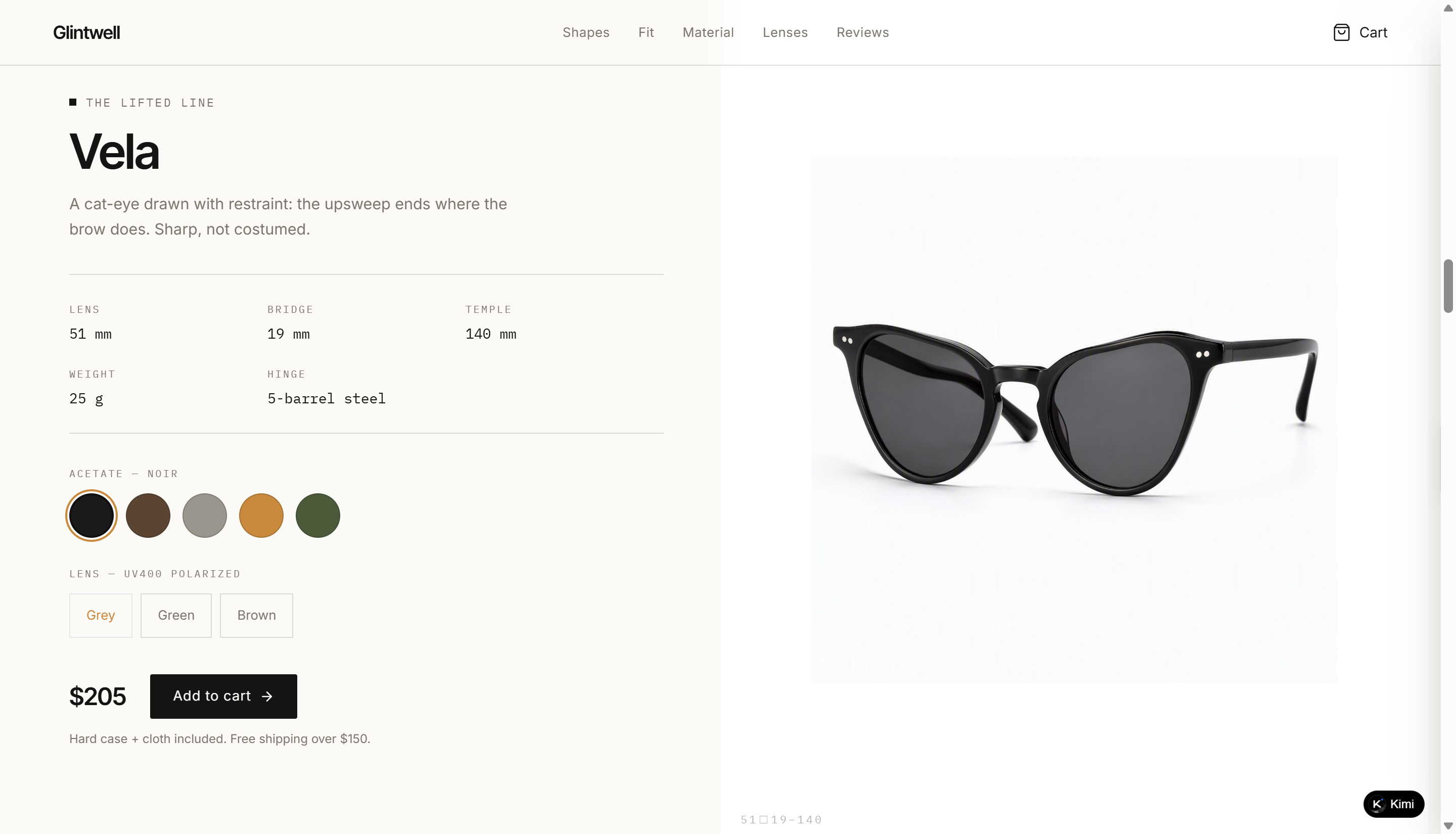
Glintwell
Glintwell is an eyewear e-commerce website focused on handcrafted sunglasses made from bio-acetate materials. The website presents four signature frame shapes with detailed information about sizing, materials, lenses, and pricing. Its face-width fit guide and lens comparison tools create a thoughtful good e-commerce website design approach by helping customers make more confident choices online.
Key characteristics
Four signature sunglasses shapes presented with detailed design and sizing information
Bio-acetate craftsmanship story covering the full frame-making process
Fit guide that helps customers select frames based on face measurements
Lens comparison experience featuring different color options and optical details
Customer reviews and warranty support integrated into the shopping journey
Grainmoor
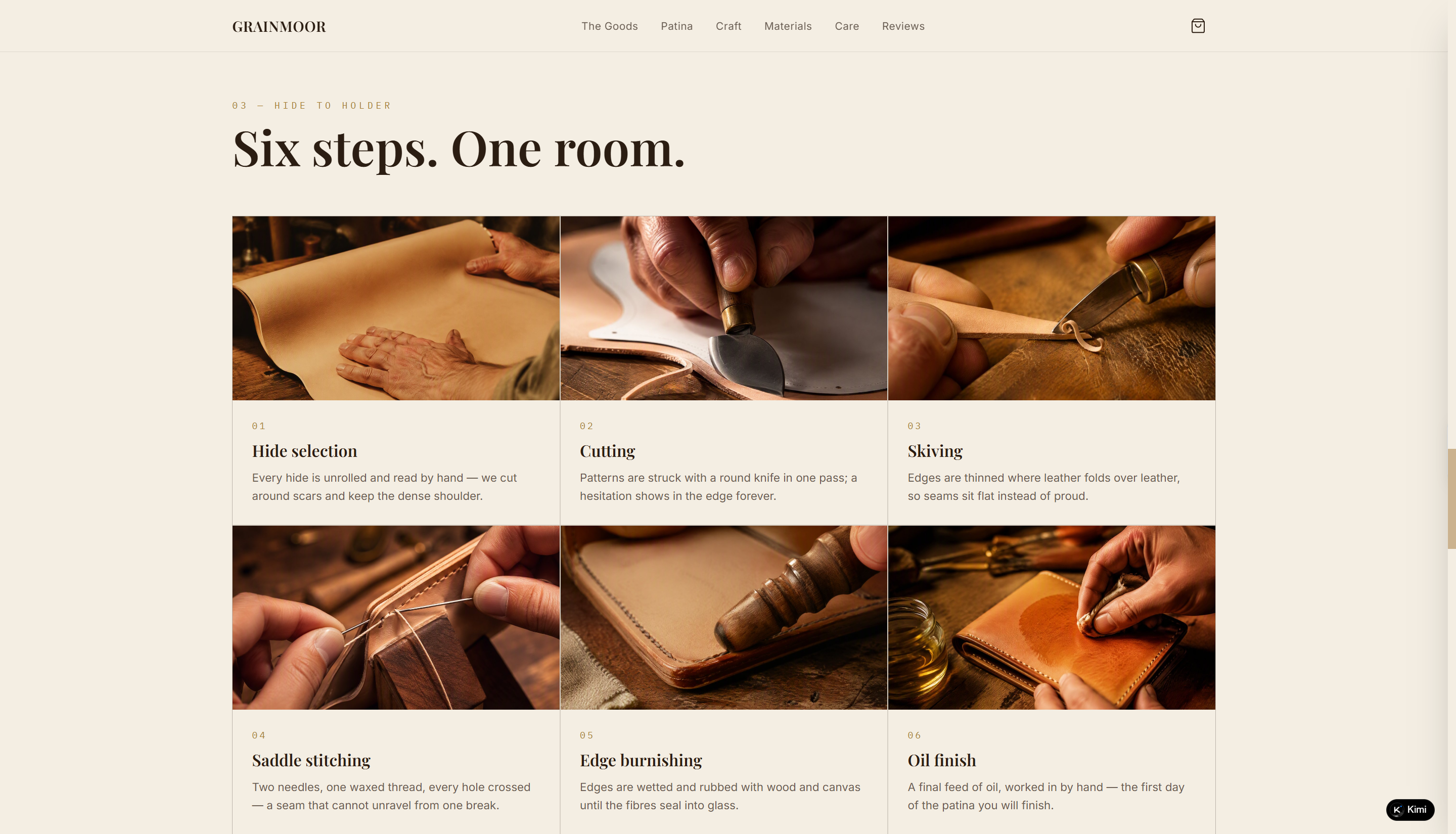
GRAINMOOR is a leather goods e-commerce website centered around handcrafted, full-grain leather wallets, belts, and card holders made in small batches. The site showcases nine core products across three categories, with each piece presented through material details, pricing, and craftsmanship stories. Beyond product discovery, GRAINMOOR highlights the full leather-making process, from hide selection and cutting to stitching and finishing, while using patina storytelling to show how each item changes over time. Care guides, repair services, and customer experiences further reinforce the brand's focus on durability, craftsmanship, and long-term ownership.
Key characteristics
Full-grain leather collection featuring wallets, belts, and card holders
Small-batch product presentation with detailed material and craftsmanship information
Patina storytelling that showcases how leather develops with long-term use
Step-by-step workshop process covering traditional leather-making techniques
Lifetime care and repair services integrated into ownership experience
Fernhollow
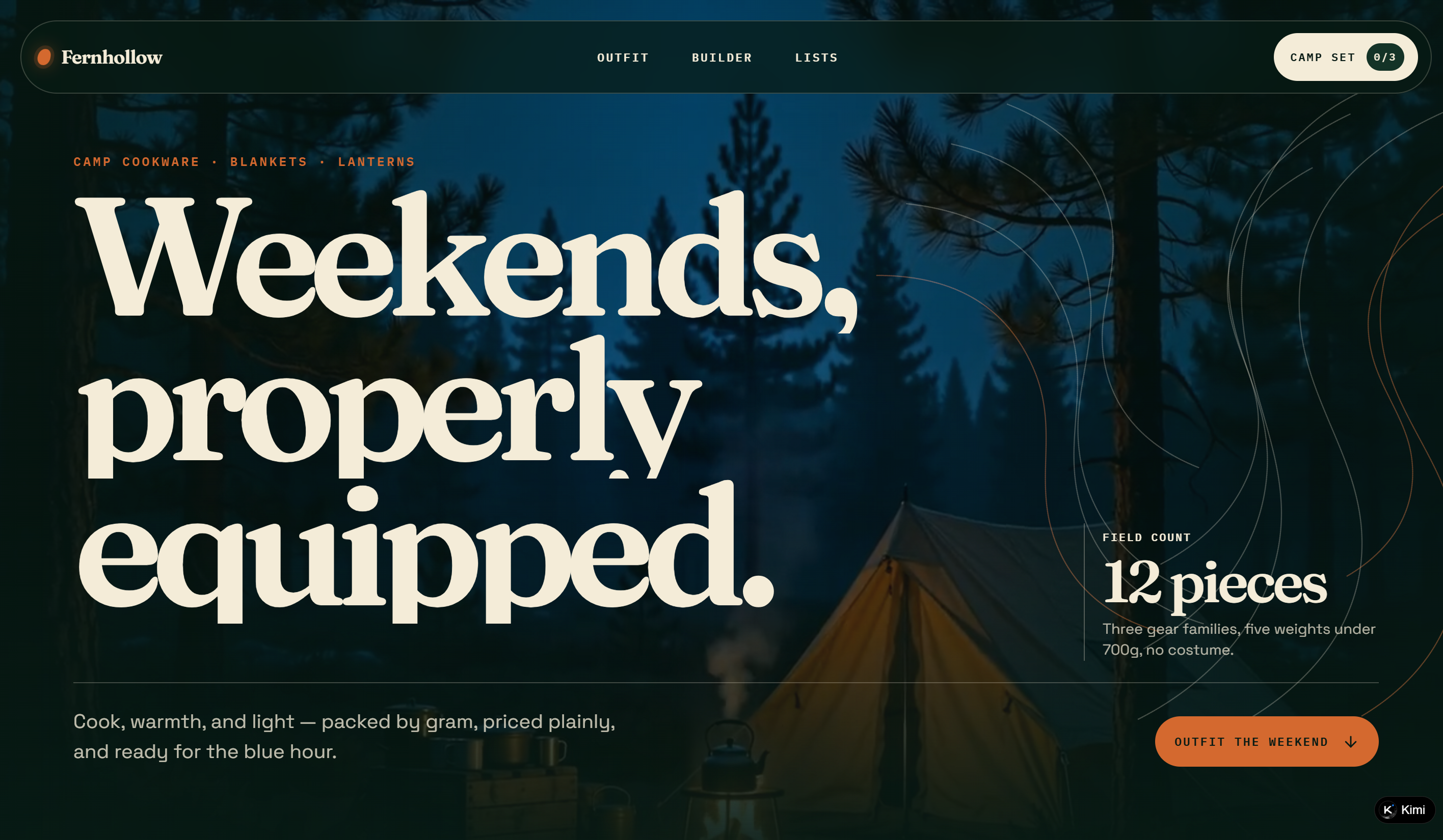
Fernhollow provides e-commerce website project ideas for outdoor brands that want to make product selection more practical. The website organizes camping products into Cook, Warm, and Light categories while showing materials, packed weights, and usage scenarios. Its camp set builder, weight filters, and curated packing lists help customers create suitable gear combinations more efficiently.
Key characteristics
Outdoor gear collection organized into Cook, Warm, and Light categories
Product details featuring materials, packed weight, and practical use cases
Interactive camp set builder for creating customized gear combinations
Curated packing lists designed for different weekend camping scenarios
Weight-focused shopping experience that helps users plan efficient setups
Courtloom
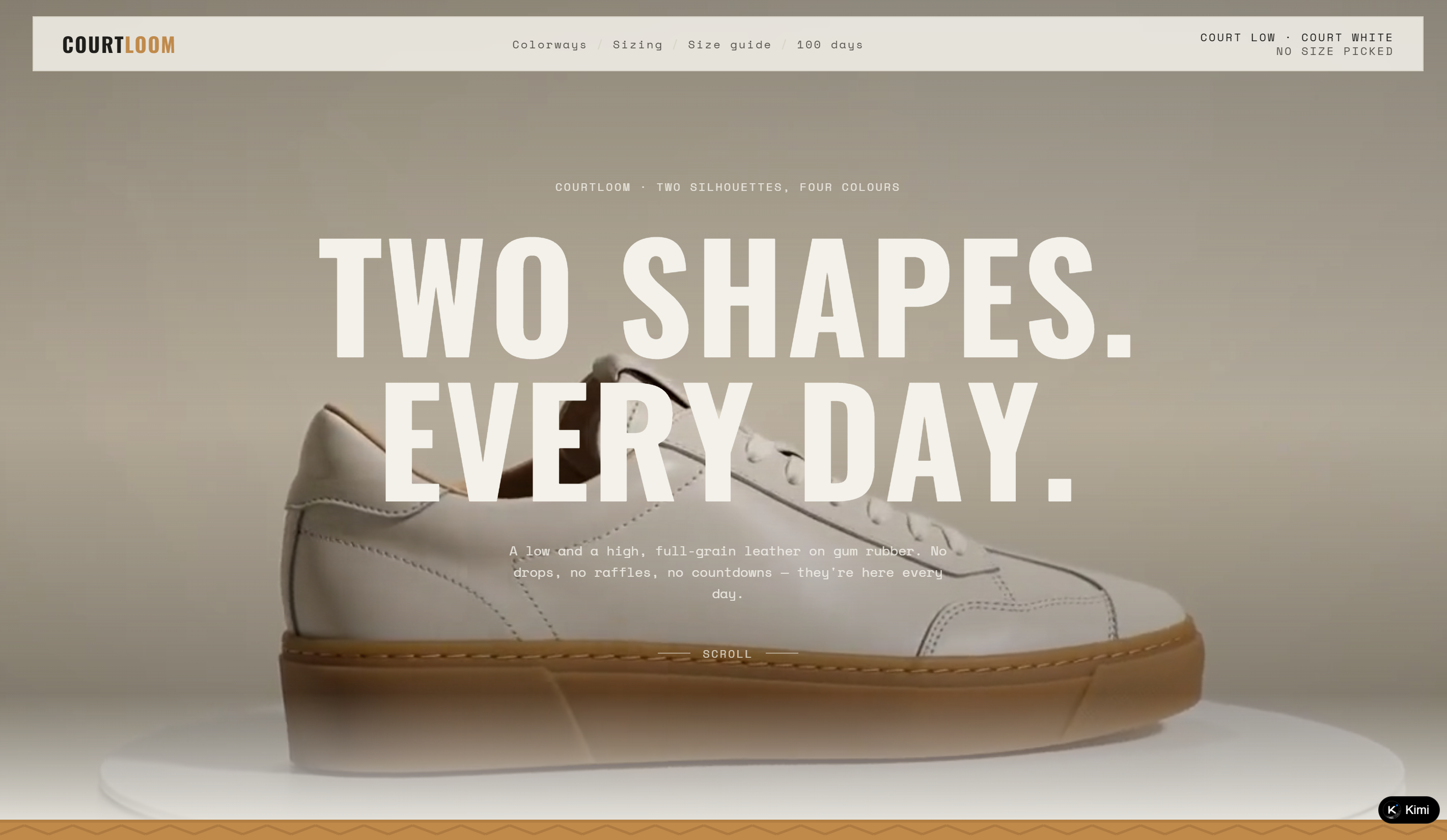
Courtloom is a footwear e-commerce website centered around everyday leather sneakers with a simple, timeless product approach. The site features two core silhouettes, Court Low and Court High, available in four colorways, with each pair presented through material details, pricing, and design characteristics. Beyond product selection, Courtloom provides a practical sizing experience with brand-based size conversion and a 200-day wear documentation section that shows how the shoes change over time. The straightforward shopping flow and focus on materials, fit, and everyday wear reinforce the brand's minimalist identity.
Key characteristics
Two signature sneaker silhouettes presented with clear design and material details
Four colorways featuring full-grain leather, nubuck, and suede options
Interactive size guide with brand-based size conversion support
200-day wear documentation showcasing real-life aging and patina
Minimalist product storytelling focused on everyday use and craftsmanship
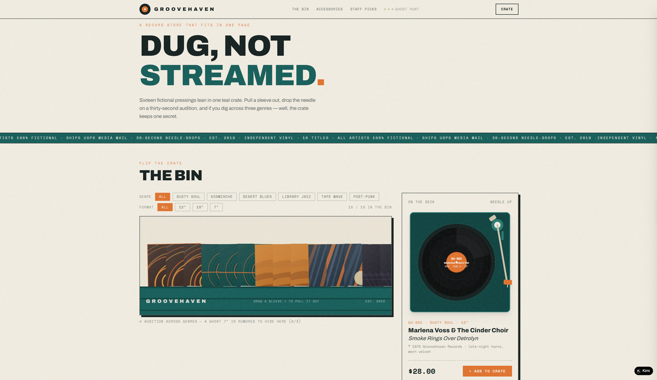
Groovehaven
Groovehaven is a one-page record store website built around a fictional collection of 16 independent vinyl titles, presented through an interactive crate-inspired shopping experience. Visitors can filter records by genre and format, pull individual sleeves from the crate, and preview 30-second needle-drops before adding records to their crate. The site also extends the record-store concept with vinyl accessories such as a tote, anti-static brush, inner sleeves, and slipmat, while staff picks and handwritten-style recommendations add personality to the shopping journey. Its playful copy, fictional record details, and retro visual language make it a distinctive, good e-commerce website example focused on discovery and storytelling.
Key characteristics
Interactive record crate with genre and format filters
16 fictional vinyl titles with 30-second needle-drop previews
Multiple genres including Dusty Soul, Kosmische, and Post-Punk
Accessories section for vinyl care and record storage
Staff picks with handwritten-style recommendations
Playful fictional record details, deadwax notes, and store lore
Edgeford
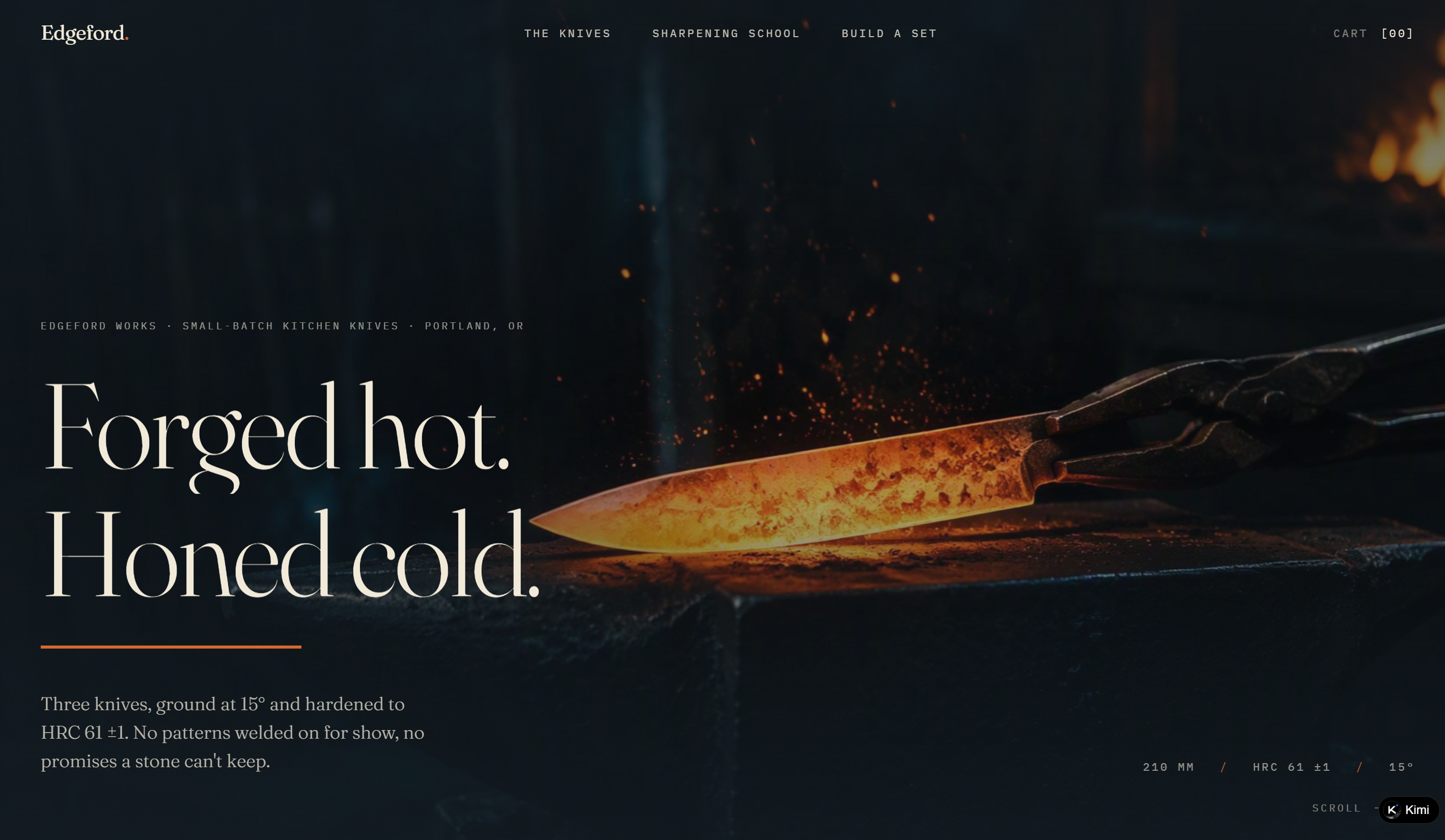
Edgeford Works is a small-batch kitchen knife maker based in Portland, Oregon. Its portfolio-style storefront presents three carbon-steel knives with detailed specifications covering dimensions, hardness, edge angles, grind, balance, weight, and materials. Beyond the products, the site includes a practical sharpening school, lifetime workshop re-sharpening, and an interactive set-building section that reinforces the brand's focus on craftsmanship and long-term knife care.
Key characteristics
Three kitchen knives with detailed technical specifications
Consistent 15° edge and HRC 61 ±1 hardness across the collection
Four-step sharpening guide with practical techniques and testing tips
Interactive knife and accessory set builder with live 12% bundle discount
Carbon-steel care guidance covering patina, drying, oiling, and sharpening
Lifetime free re-sharpening service at the workshop
Amberhive
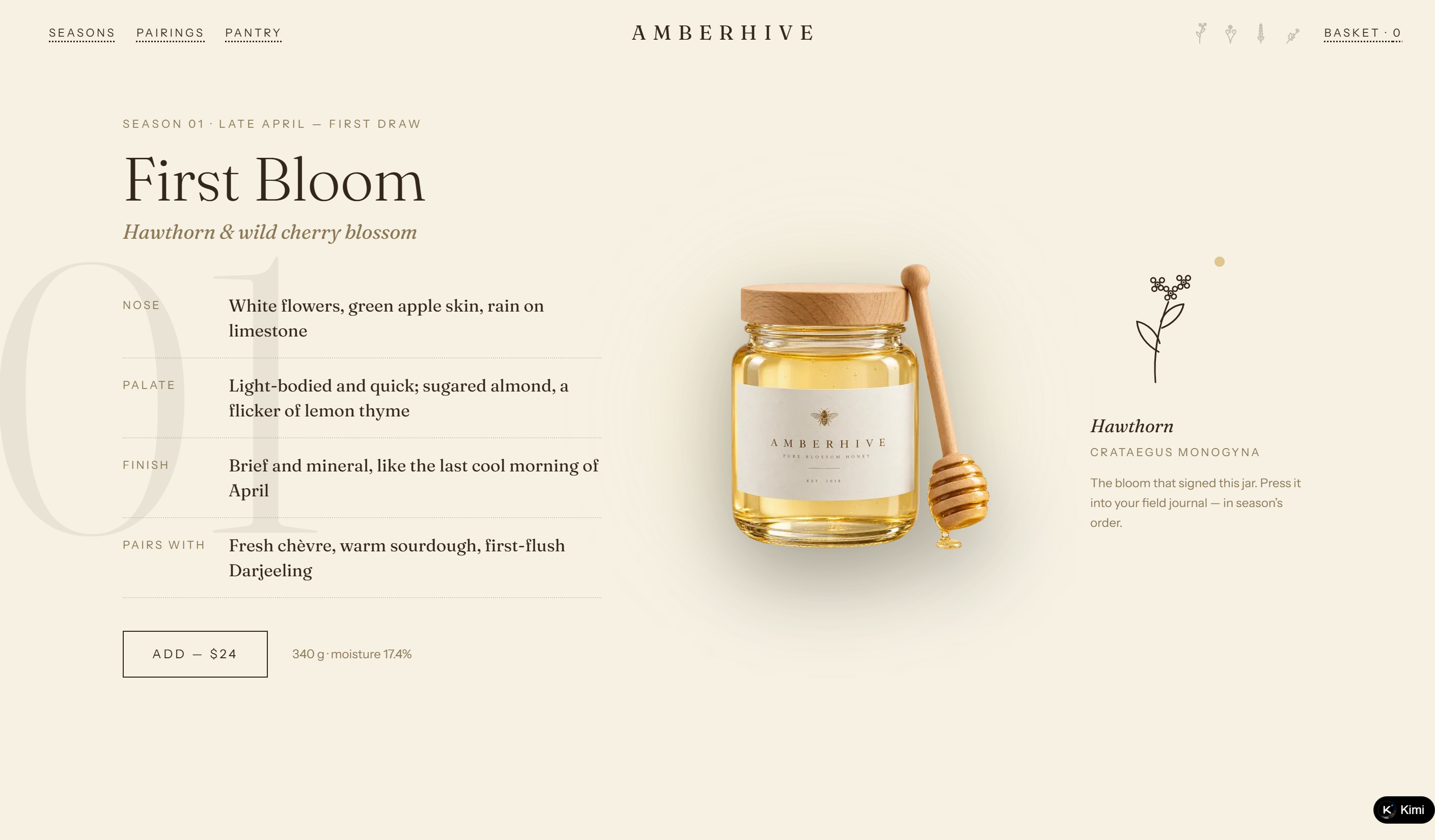
Amberhive is a raw honey and preserves brand built around a single hillside apiary and the changing blooms of four seasons. The website presents four seasonal honeys with detailed tasting notes, floral sources, pairings, and harvest records, alongside a pairing wheel and small-batch preserves made with the apiary's honey. Its field-journal concept gives the product story a strong seasonal and artisanal character.
Key characteristics
Four seasonal honeys tied to distinct flowering periods
Detailed tasting notes covering aroma, palate, finish, and food pairings
Interactive pairing wheel connecting cheeses and foods with seasonal honey
Small-batch pantry section featuring honey-based preserves
Field-journal concept with collectible seasonal flower sprigs
Transparent sourcing details covering hive count, extraction, and production methods
Verdalia
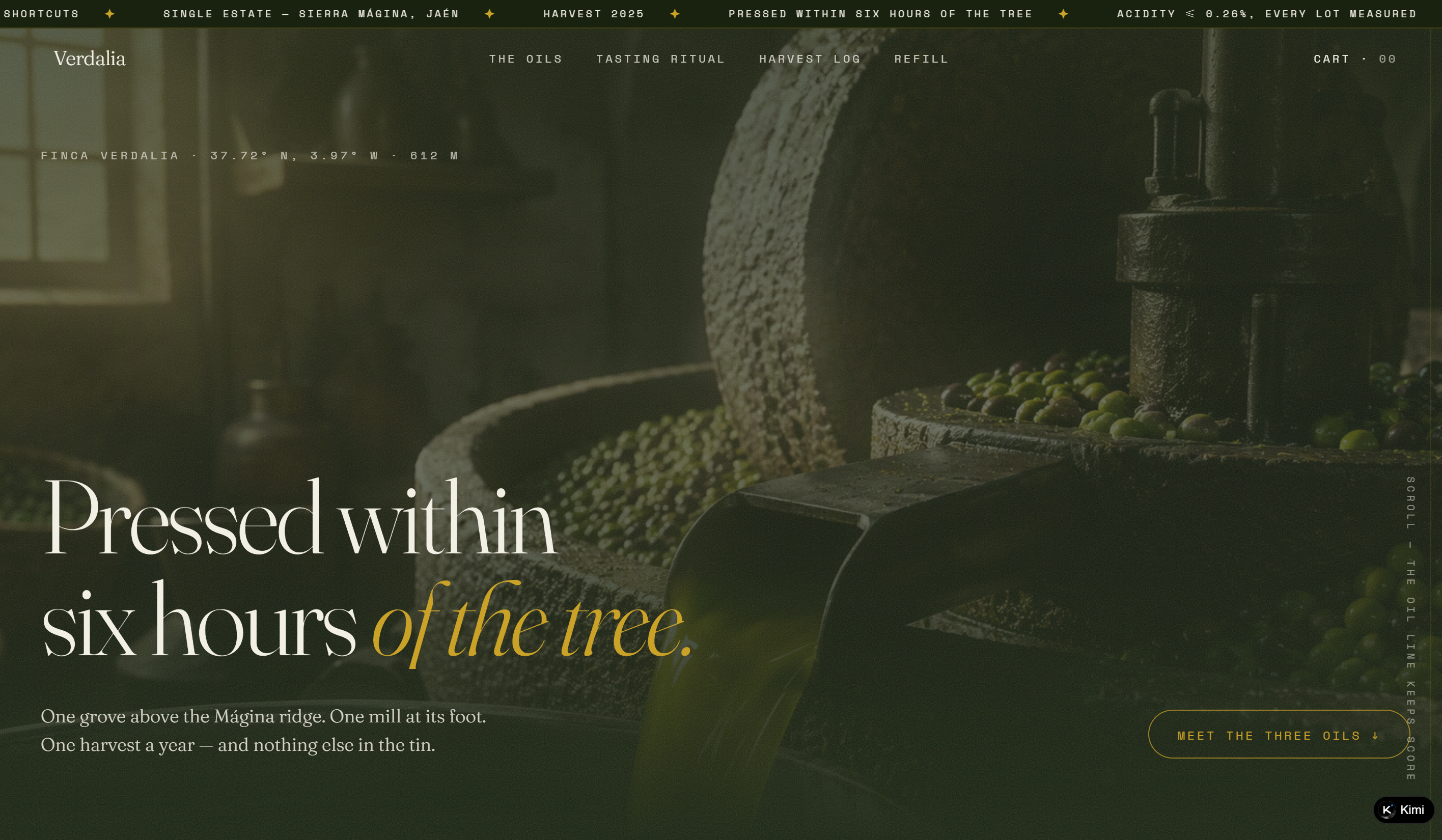
Verdalia is a single-estate olive oil producer based in Sierra Mágina, Jaén, Spain. Its portfolio-style website presents three oils from the 2025 harvest, each tied to specific olive varieties, grove blocks, harvest dates, and ripeness stages. Detailed tasting notes, harvest records, a guided tasting ritual, and a tin refill program make traceability, seasonality, and sustainable production central to the brand experience.
Key characteristics
Three olive oils organized by early, mid, and late harvest
Detailed tasting notes for aroma, palate, and finish
Harvest log tracking blocks, cultivars, acidity, yield, and pressing time
Interactive four-step tasting ritual with progress tracking
Tin refill program with return, reuse, and recycling options
Transparent production details including origin, pressing time, and lot measurements
Roamwell
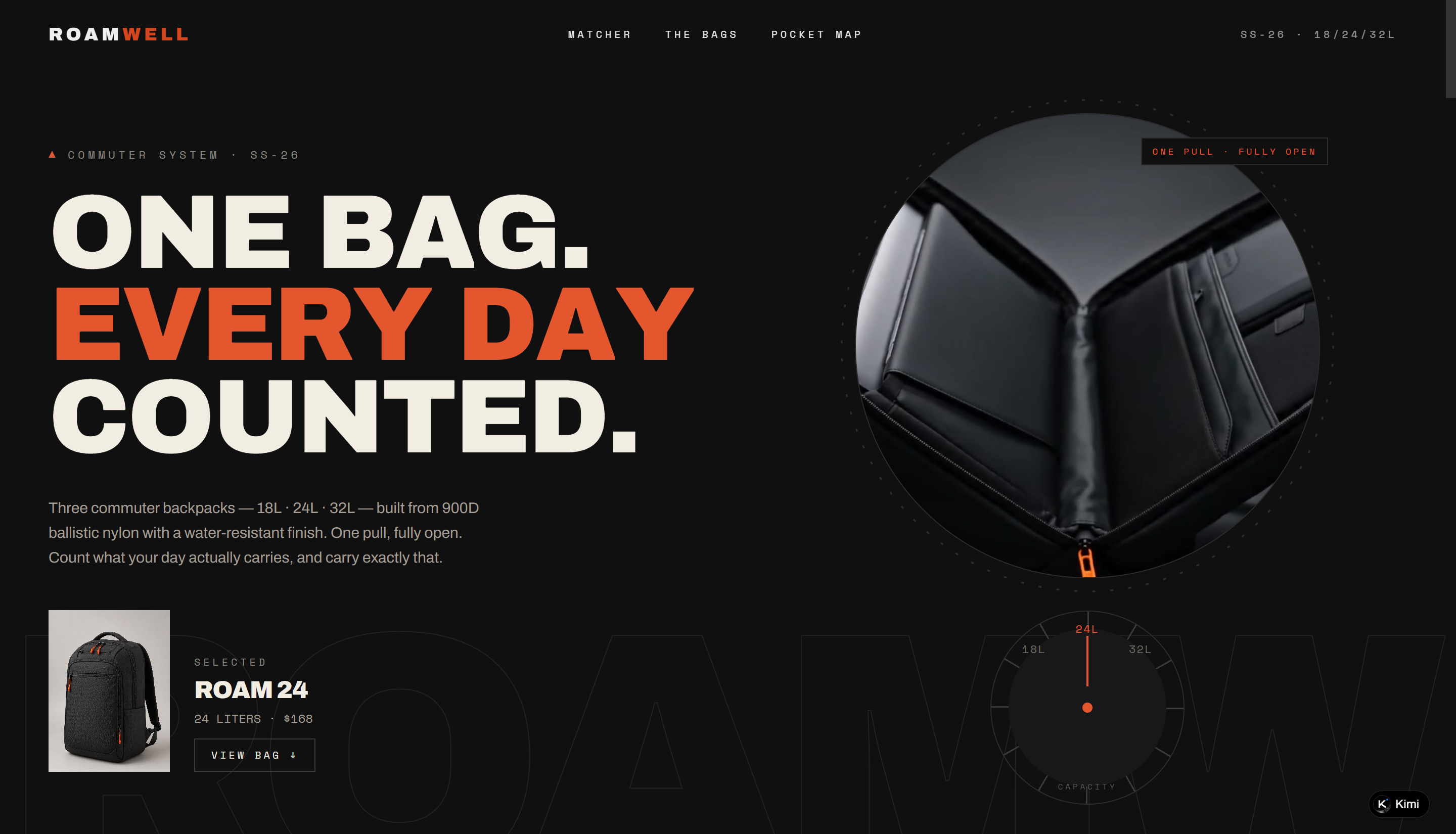
Roamwell is a commuter backpack e-commerce website built around three backpack sizes, 18L, 24L, and 32L, with each option presented according to different daily carrying needs. The site combines product specifications, pricing, dimensions, materials, and capacity details with an interactive matcher that recommends a bag based on factors such as laptop size, gym use, and overnight stays. A pocket map lets visitors explore what fits inside the bags, while product cards and technical drawings make the lineup easy to browse and inspect. Concise copy, structured product information, and interactive tools create a practical, good e-commerce website example focused on helping shoppers choose the right bag.
Key characteristics
Three backpack sizes organized around different commuting needs
Interactive matcher for personalized product recommendations
Detailed capacity, dimensions, materials, and warranty information
Pocket map showing how different items fit inside the bag
Product lineup with individual specifications, pricing, and colorways
Technical and functional copy reinforcing commuter-focused product design
Sagefoam
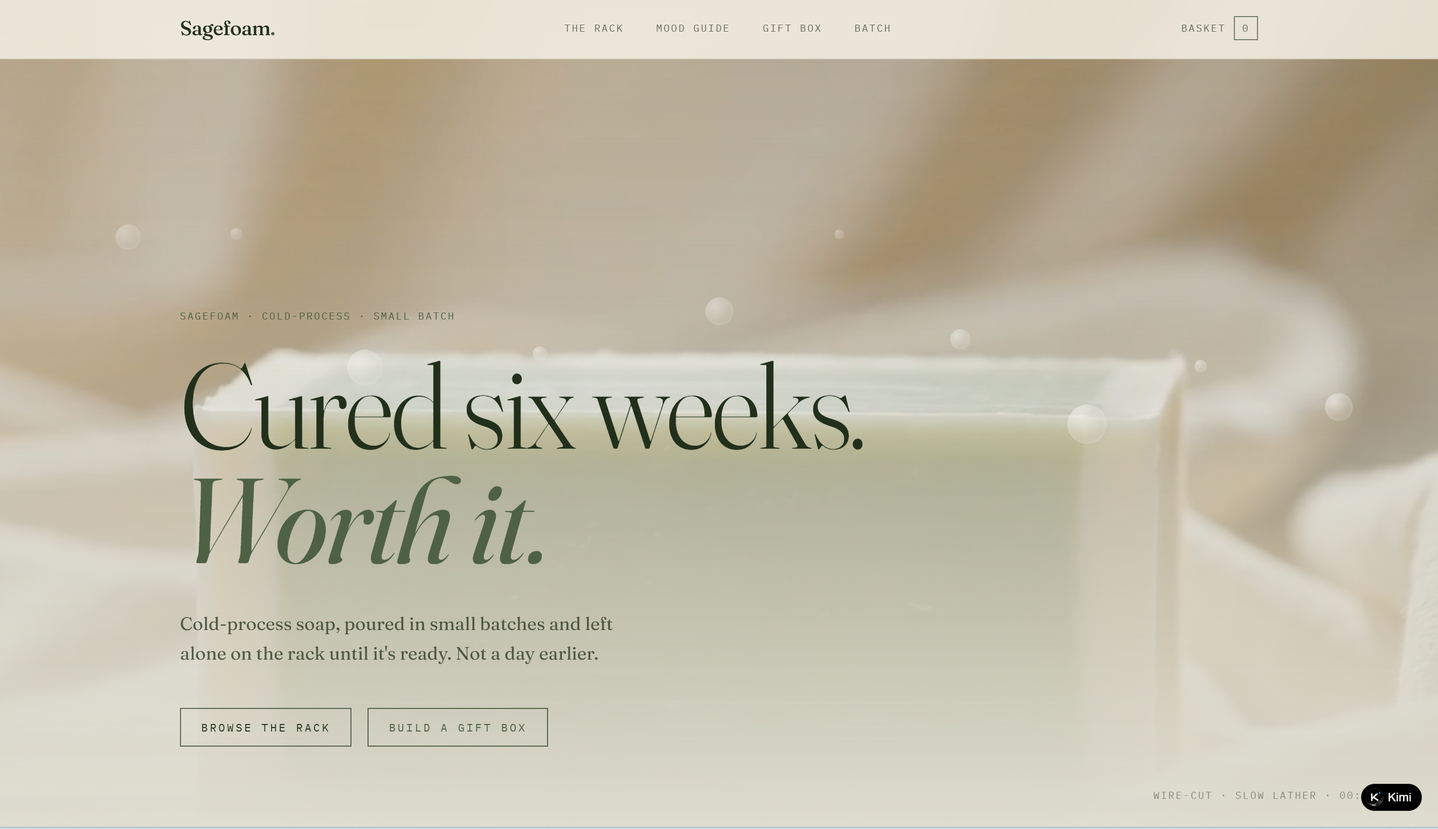
Sagefoam is a cold-process soap e-commerce website built around a small-batch collection of handcrafted bars, each presented with its scent profile, batch number, pour date, and curing date. The site makes the curing process part of the shopping experience, clearly separating ready-to-buy soaps from bars that are still curing and showing their expected ready dates. A mood guide connects scents such as Sage & Sea Salt and Lavender Field with different moments, while a gift box builder adds another way to explore the collection. Product storytelling, batch details, and playful micro-interactions give the site a distinctive, good e-commerce website example centered on craft and transparency.
Key characteristics
Small-batch soap collection organized by scent and curing status
Detailed batch, pour, and curing information for each product
Curing rack that distinguishes available and not-yet-ready soaps
Scent mood guide for exploring bars by mood and fragrance
Gift box builder for creating curated soap selections
Craft-focused storytelling and transparent product information throughout the site
Flowform
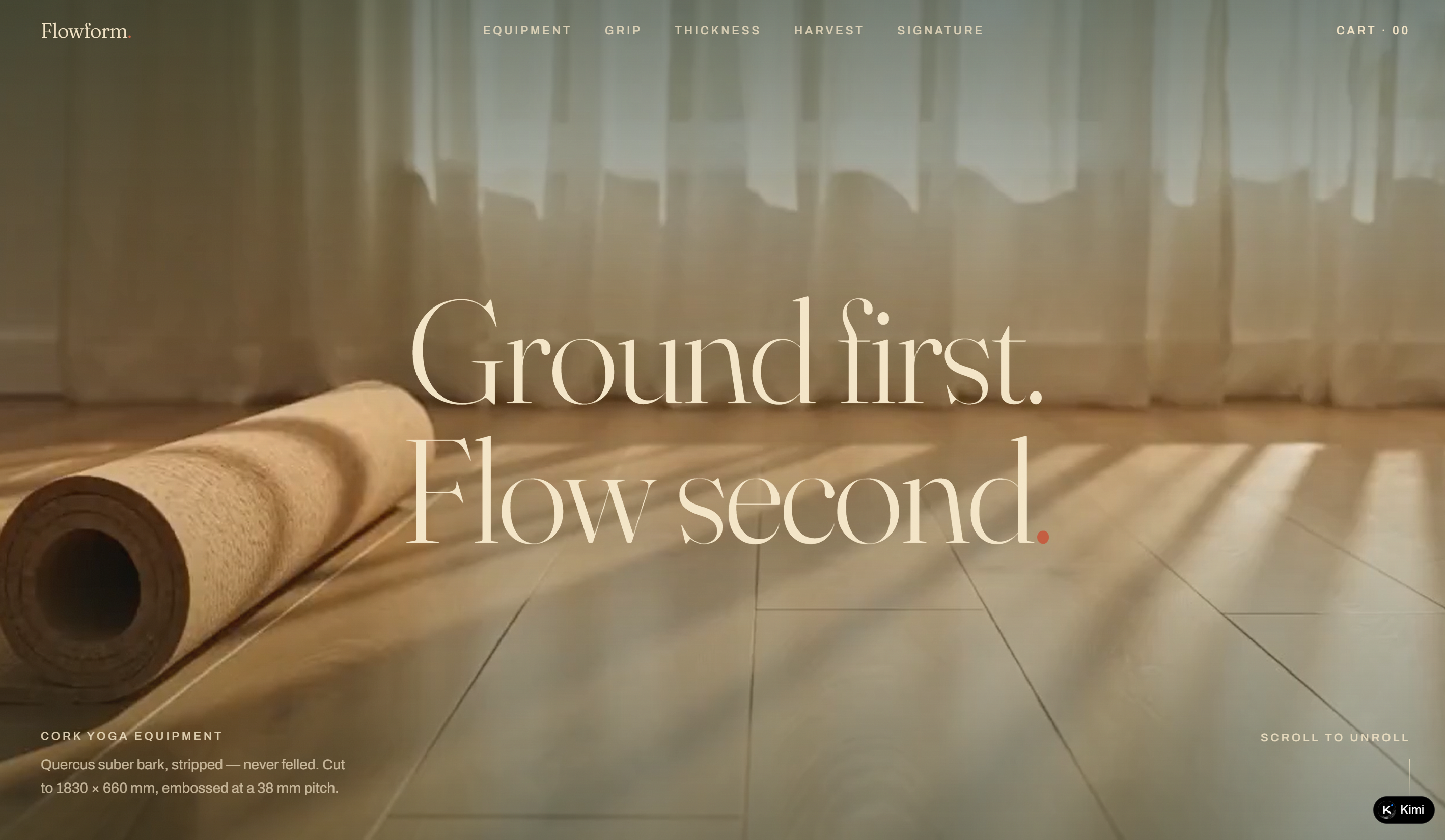
Flowform is a yoga equipment e-commerce website centered on cork mats and accessories, with products organized by thickness and intended practice. Instead of relying only on conventional product descriptions, the site presents measurable material and geometry specifications, including cork thickness, emboss pitch, dimensions, weight, and grip details. An interactive thickness guide connects different movement styles with recommended mat thicknesses, while the harvest cycle section explains how cork is sourced and why the material can be harvested without felling trees. Technical drawings, surface comparisons, and material specifications give the e-commerce website design a highly product-focused and informative character.
Key characteristics
Cork yoga equipment organized by thickness and functional use
Detailed material, geometry, and performance specifications
Interactive guide recommending mat thickness based on practice style
Technical comparison of cork and recycled crumb rubber surfaces
Harvest timeline explaining cork sourcing and regeneration
Technical drawings and measurable grip details supporting product transparency
Dozeling
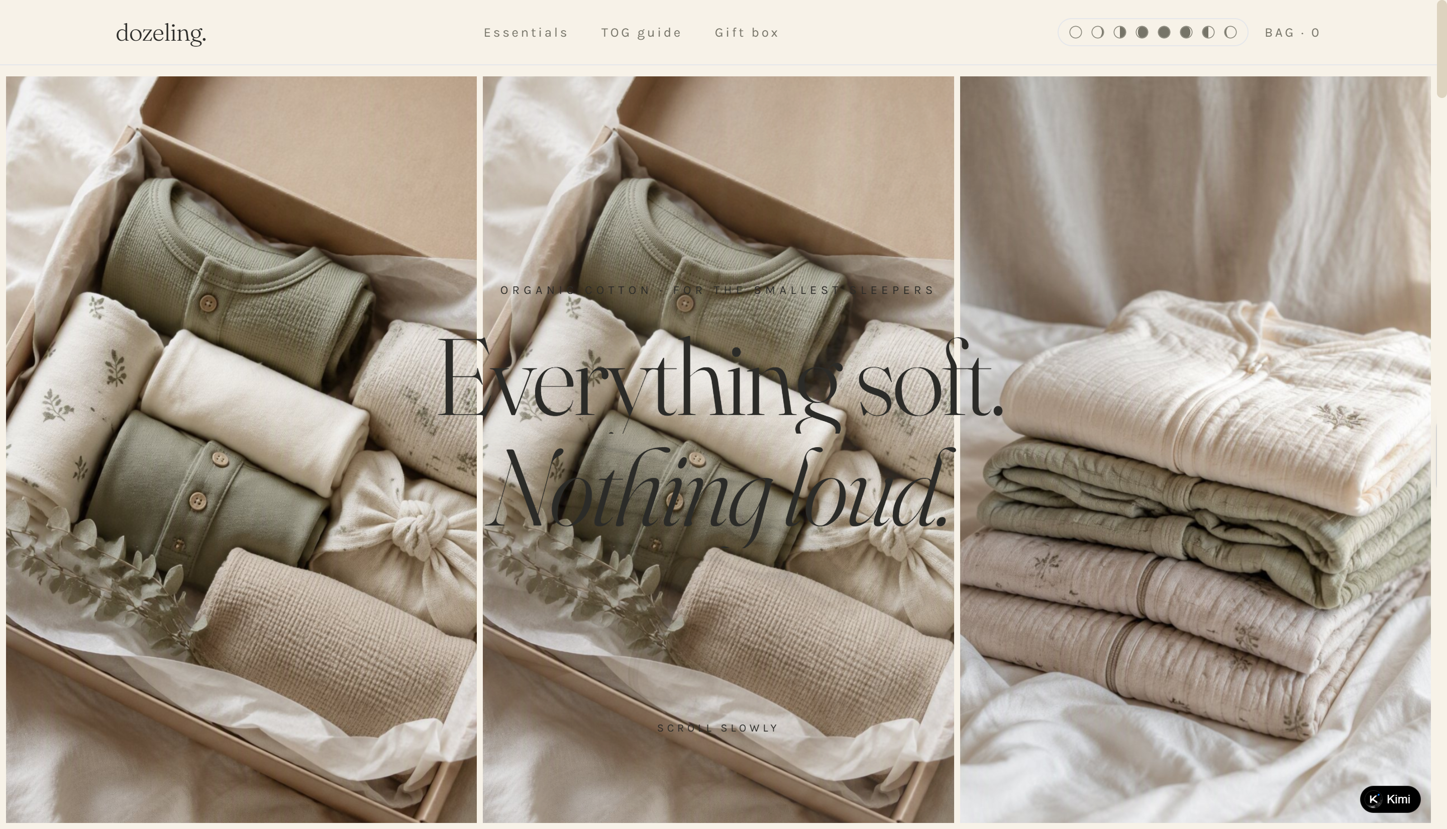
Dozeling is a baby sleepwear concept e-commerce website centered on soft, understated essentials made from GOTS-certified organic cotton. The site uses minimal product presentation and gentle visual language to emphasize qualities such as softness, pre-washed fabric, a gender-agnostic palette, and the absence of added flame retardants. Navigation is organized around essentials, a TOG guide, and a gift box, creating a simple shopping journey while giving practical context for choosing sleepwear. Its restrained copy and quiet visual identity make it a distinctive e-commerce website example focused on comfort and simplicity.
Key characteristics
Baby sleepwear essentials centered on organic cotton
Minimal product presentation with a soft, understated visual identity
Key material and product attributes highlighted throughout the site
TOG guide supporting practical sleepwear selection
Gift box section extending the shopping experience beyond individual products
Gentle micro-interactions and copy reinforcing the sleep-focused brand identity
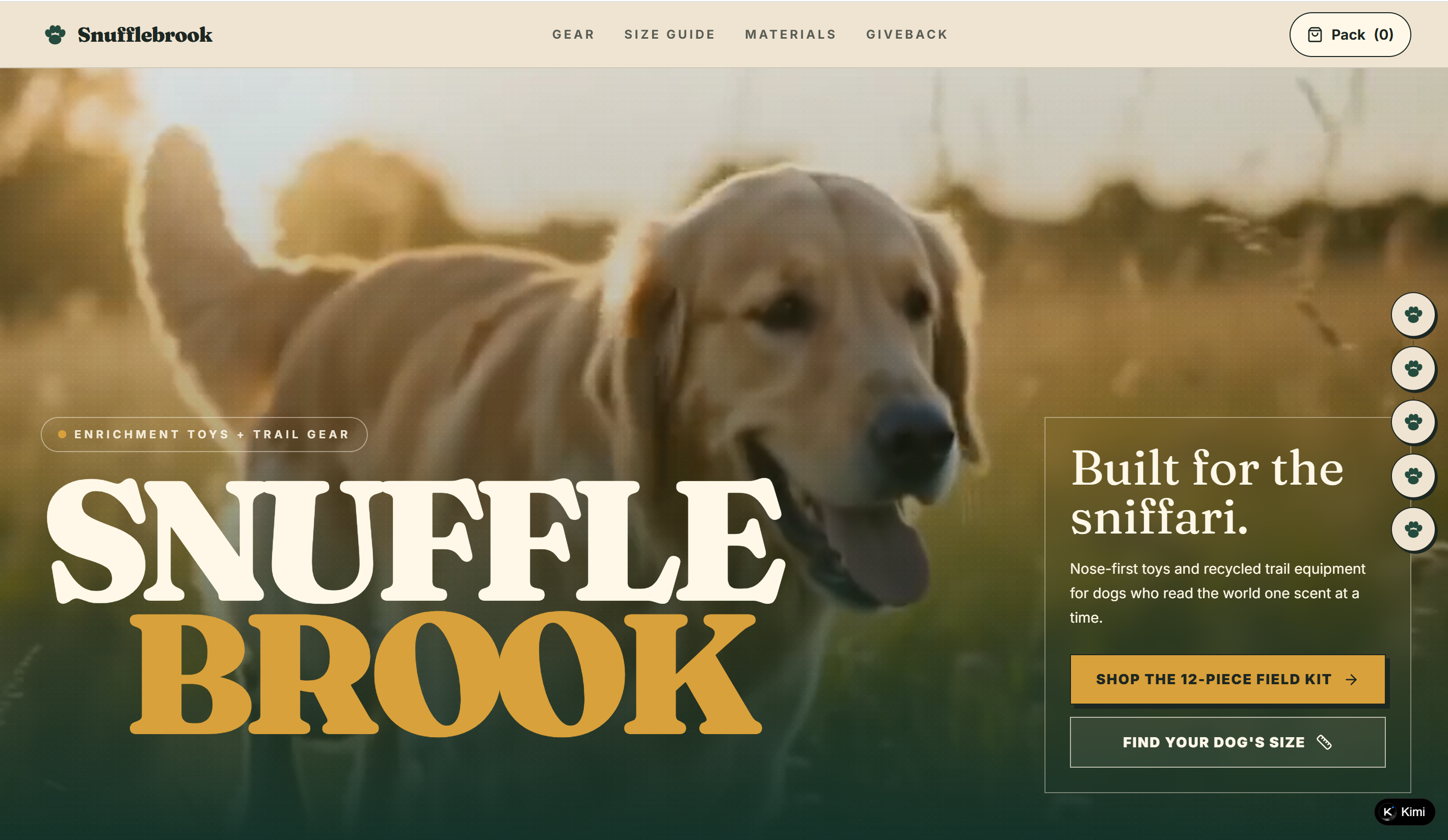
Snufflebrook
Snufflebrook is a dog enrichment and outdoor gear e-commerce website built around nose-first toys and recycled trail equipment for dogs. The site organizes its collection into a 12-piece field kit and uses a size guide based on height and chest measurements to help owners find suitable products for different dogs. Alongside the gear collection, materials and giveback sections provide additional context around the products and their environmental positioning. Playful copy and outdoor imagery reinforce the brand's focus on exploration, enrichment, and scent-led play.
Key characteristics
Enrichment toys and recycled trail gear organized as a field collection
Dog size guide based on height and chest measurements
Materials section providing product and sourcing information
Giveback section connecting purchases with broader brand initiatives
Playful outdoor storytelling built around sniffing and exploration
Clear navigation separating gear, sizing, materials, and brand information
Mosslight
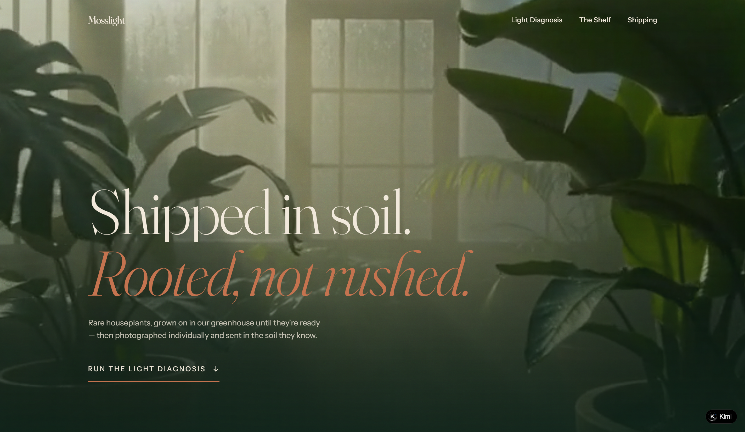
Mosslight is a rare houseplant e-commerce website focused on greenhouse-grown plants that are photographed individually and shipped in the soil they were grown in. The site emphasizes a slower, more considered approach to plant retail, with clear messaging around greenhouse cultivation and shipping practices. A light diagnosis tool adds practical guidance for helping customers understand their plants' lighting needs, while the Shelf and Shipping sections provide additional product and delivery information.
Key characteristics
Rare houseplants grown in a greenhouse before being offered for sale
Individual plant photography for a more specific shopping experience
Light diagnosis tool for understanding plant lighting needs
Shipping information focused on sending plants in their original soil
Greenhouse visits available by appointment
Minimal, straightforward brand messaging centered on slow cultivation and plant care
Build flexible e-commerce websites without coding
Kimi Build, an AI website builder, lets you create e-commerce websites using AI instead of writing code from scratch. You can generate layouts, product sections, navigation, and other website elements through natural-language instructions. The platform can also help refine the design and content as your store takes shape. This makes it easier to turn your e-commerce ideas into a functional, polished website without advanced technical skills.
Key features
Start with your products, goals, and visual references: Describe what you sell, your target customers, and the kind of shopping journey you want to create. You can also provide product photos, brand assets, screenshots, videos, or other references. Kimi Build uses these inputs to generate a structured storefront with a product-led homepage, intuitive categories, and clear paths for discovering products.
Design the key steps of the shopping journey: Make it easy for customers to find products, understand what they offer, and move toward purchase. Add category pages and search, then create product pages with images, descriptions, pricing, features, and promotional information. Connect these pages with cart and checkout flows to create a more complete shopping experience.
Add the functionality your store needs: Build beyond a visual storefront with features that support different stages of the customer journey. Depending on your requirements, you can create shopping carts, order and payment flows, customer accounts, login experiences, and order tracking. Full-stack capabilities also give you greater control over the logic and functionality behind your store.
Improve your store through AI-assisted edits: Describe the changes you want instead of manually working through individual sections. Ask Kimi to add products, revise descriptions, change prices or promotions, or restructure your homepage and product pages. You can also comment on a specific element or section to make focused adjustments without starting the website over.
Test the experience and publish it when ready: Review how your store works before launch, including product discovery, product details, cart, and checkout. Check the layout across desktop, tablet, and mobile screens, then publish the finished website with a shareable link. You can also access the generated source code if you want to continue developing the site yourself.
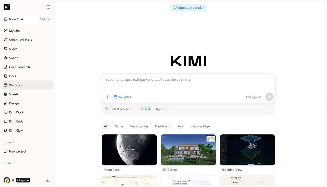
How to create your e-commerce website with AI
A well-designed e-commerce site starts with a clear idea of what you want to build, but turning that idea into a polished website can take time. Kimi Build can simplify the process by helping you create the structure, refine the design, and prepare the site for launch. Here's how to get started:
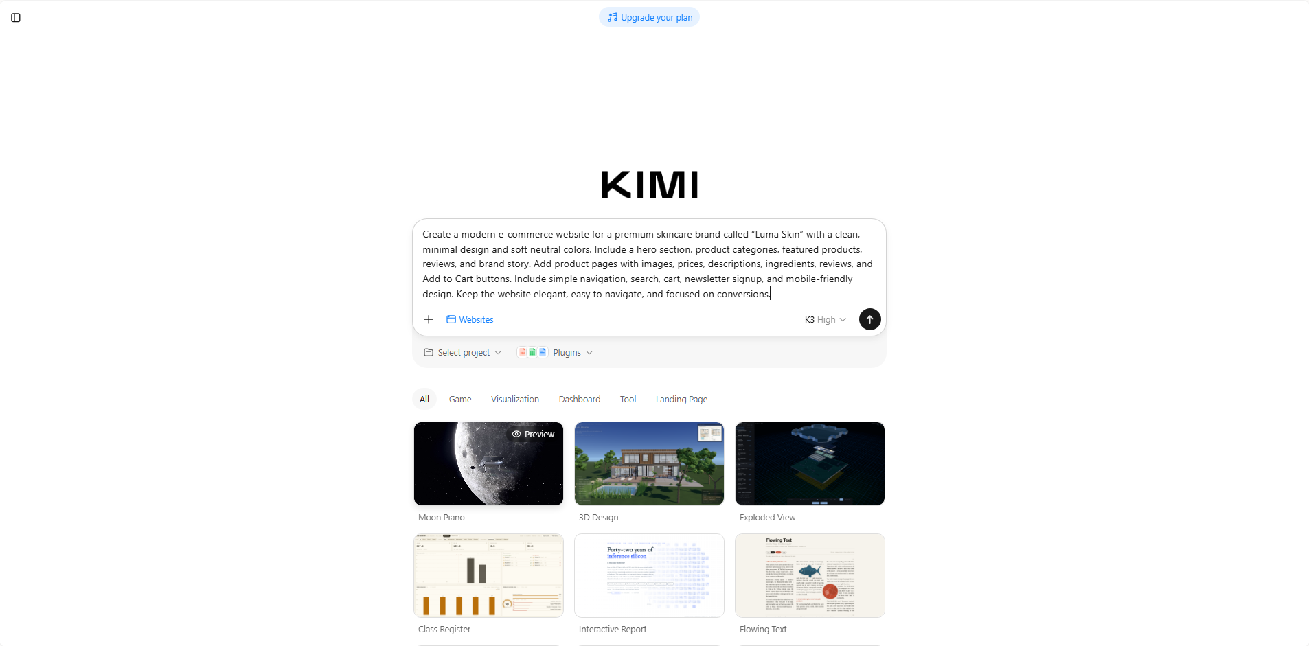
Step 1: Enter a clear prompt
Start by describing your store, products, target audience, visual style, and the features you want. A detailed prompt gives the AI enough direction to create a more relevant first version.
Example prompt:
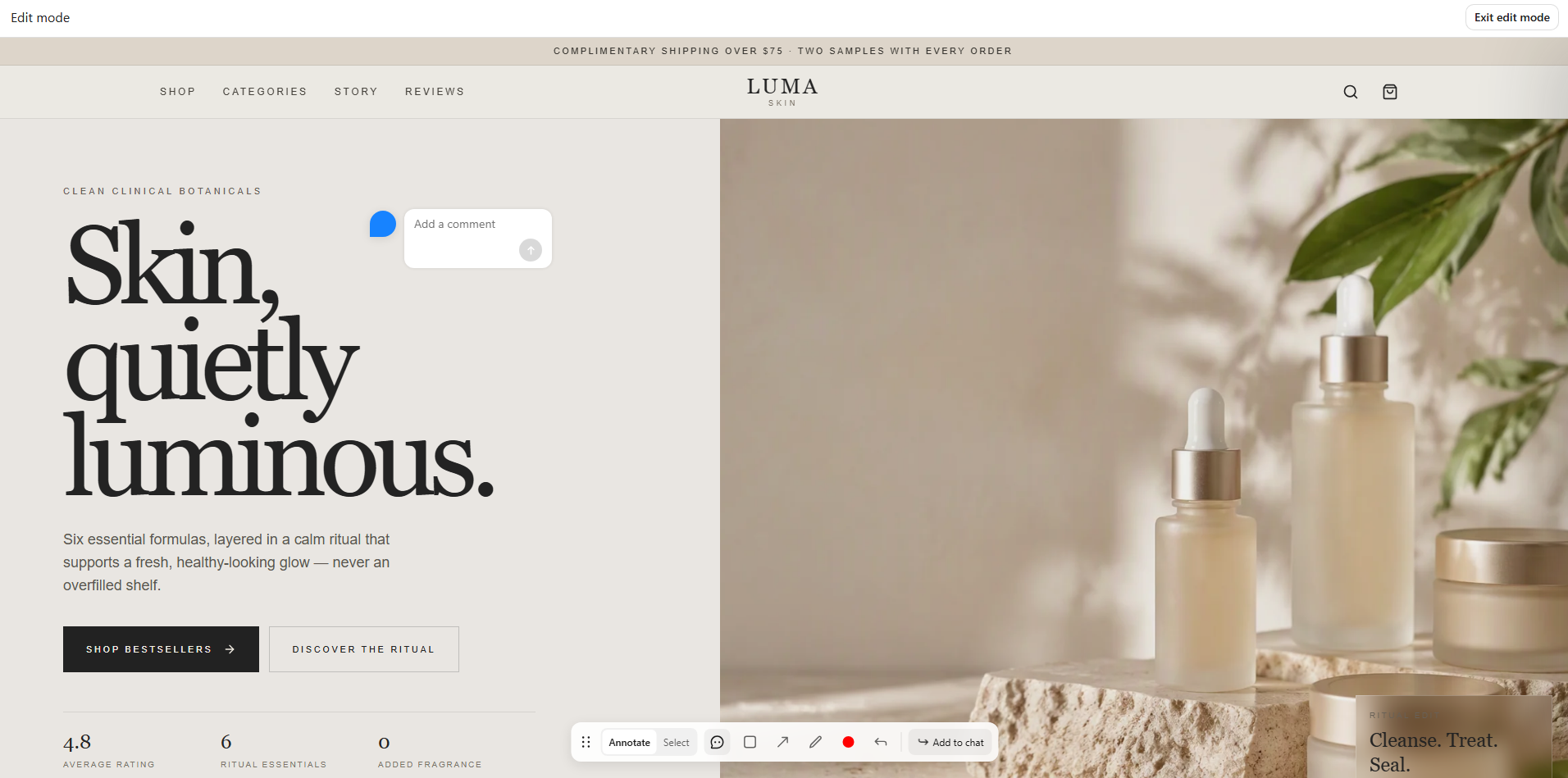
Step 2: Edit your website
Once the initial website is generated, review the layout and make changes wherever needed. You can use AI instructions or editing tools to adjust colors, typography, sections, product content, images, navigation, or overall styling.
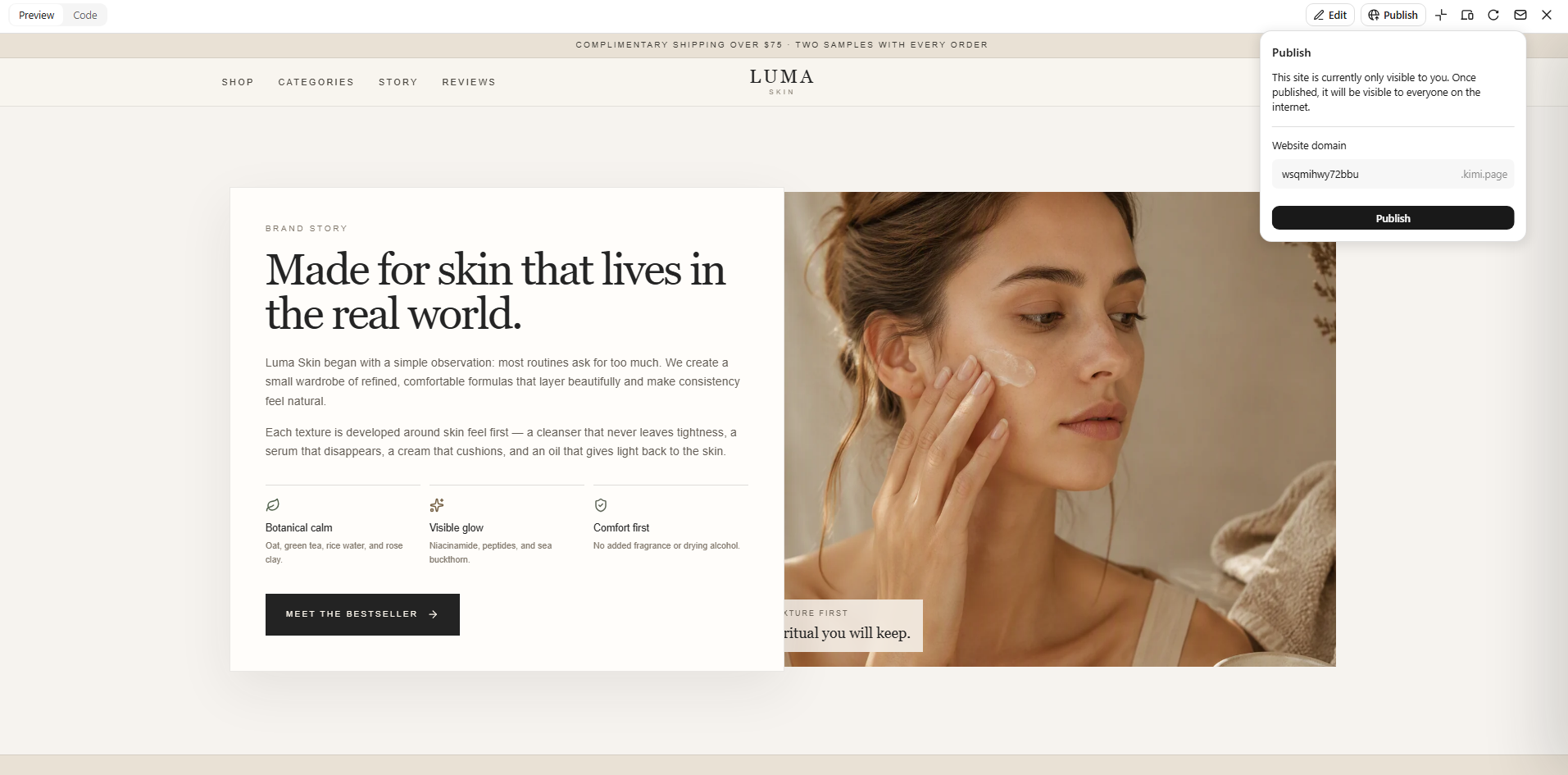
Step 3: Preview and publish
Preview the complete website to check how the pages, product sections, navigation, and calls to action work together. Make any final adjustments to the content or design before publishing. Once everything looks right, publish the website and make your online store available to visitors.
Tips for creating a memorable e-commerce site design
Your e-commerce website is often the first place customers interact with your brand, so it needs to make a strong impression. A thoughtful design can help visitors find what they need, feel confident about buying, and enjoy the overall experience. Consider these ideas when shaping your store.
Keep your branding consistent
Use the same colors, fonts, imagery, and visual style across every page of your store. Consistency makes your website feel more professional and helps customers recognize your brand. It also creates a stronger and more memorable identity.
Use high-quality product photography
Clear, sharp product images help customers understand what they are buying before placing an order. Show products from different angles and, when useful, include lifestyle images. Good photography can make products more appealing and increase customer confidence.
Make products easy to find
Organize products into clear categories and provide simple navigation and search options. Filters can also help shoppers narrow down large product collections quickly. The fewer steps customers need to find what they want, the better.
Keep checkout simple
A complicated checkout process can cause customers to abandon their carts. Keep the number of steps low and ask only for information that is necessary to complete the purchase. Offer familiar payment options and clearly show costs before the final order.
Add personalized recommendations
Recommend products based on what customers are viewing, buying, or browsing. Suggestions such as related products, popular items, or useful add-ons can help shoppers discover more. When relevant, personalization can also increase the value of each order.
Build trust throughout the shopping experience
Make important information such as shipping, returns, reviews, and payment security easy to find. Customer reviews, clear policies, and professional product pages can reduce doubts before purchase. Trust should be visible throughout the website rather than added only at checkout.
Optimize for fast mobile browsing
Your store should load quickly and remain easy to use on smaller screens. Keep menus simple, make buttons easy to tap, and ensure product images display properly on mobile devices. A smooth mobile experience helps prevent visitors from leaving before they complete their purchase.
Conclusion
Great e-commerce design is not about adding more features; it is about making the shopping experience feel clear and effortless. The top e-commerce website examples can help you find design ideas that suit your brand and audience. Once you know the direction you want, AI can make the building process much simpler. Kimi Build helps you create and refine your store through simple prompts.