Booking an appointment should be simple for both customers and businesses. A well-designed page helps visitors explore services, check available time slots, and confirm their bookings without unnecessary steps. Clear details and an easy layout can make the whole experience more pleasant while encouraging customers to return. In this article, you'll find 10 booking page examples with useful design ideas and features to inspire your own page.
Overview of 10 booking page examples
From service-based businesses to places offering unique experiences, booking pages can look and work in many different ways. Some keep things minimal, while others use detailed service sections and eye-catching designs to guide visitors. The table below gives you a quick look at 10 examples and their standout features.
| Website | URL | Category | What makes it a good example |
|---|---|---|---|
| Cinder & Sage | https://pf6db4wxggrc2.ok.kimi.link/ | Boutique hotel booking | Immersive destination storytelling, individually presented rooms, category-based filtering, and transparent accommodation details. |
| The Cedar Counter | https://ccbukl4oduwg4.kimi.site/ | Omakase restaurant reservations | Seasonal tasting menu presentation, clear dining policies, interactive reservation calendar, and a structured five-step booking process. |
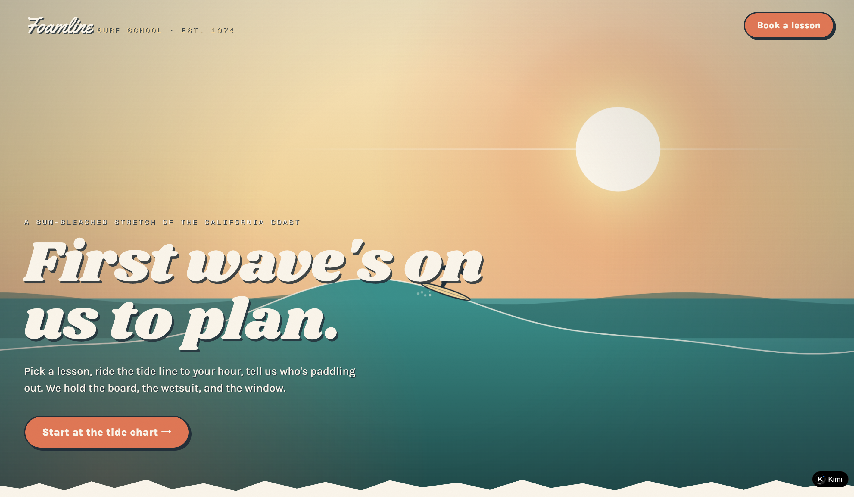
| Foamline | https://fa2icz3mwostu.ok.kimi.link/ | Surf school booking | Multiple lesson packages, tide-based scheduling, transparent session details, and a guided five-step reservation process. |
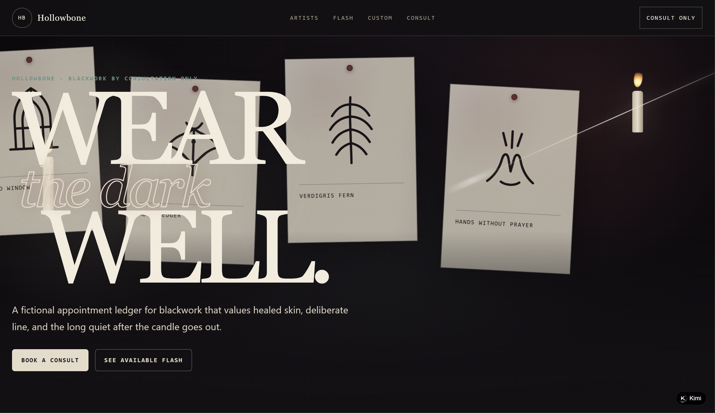
| Hollowbone | https://cm47zdhrznanm.kimi.site/ | Tattoo studio appointments | Artist portfolios, available flash designs, custom tattoo request forms, and artist-specific consultation scheduling. |
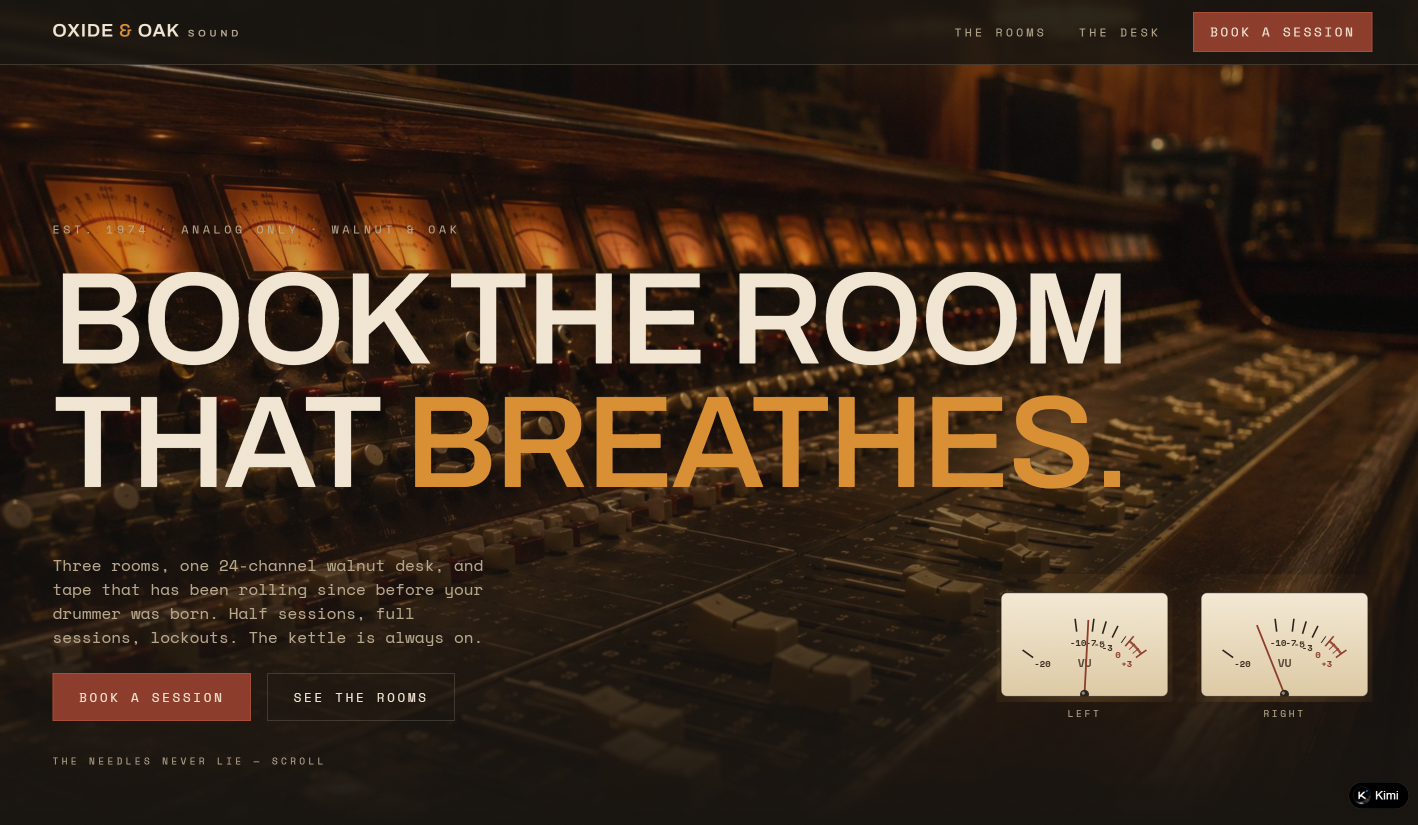
| Oxide & Oak | https://sozfrmr4hsnu4.kimi.site/ | Recording studio rental | Detailed studio profiles, equipment specifications, transparent rental rates, engineer selection, and a booking cost summary. |
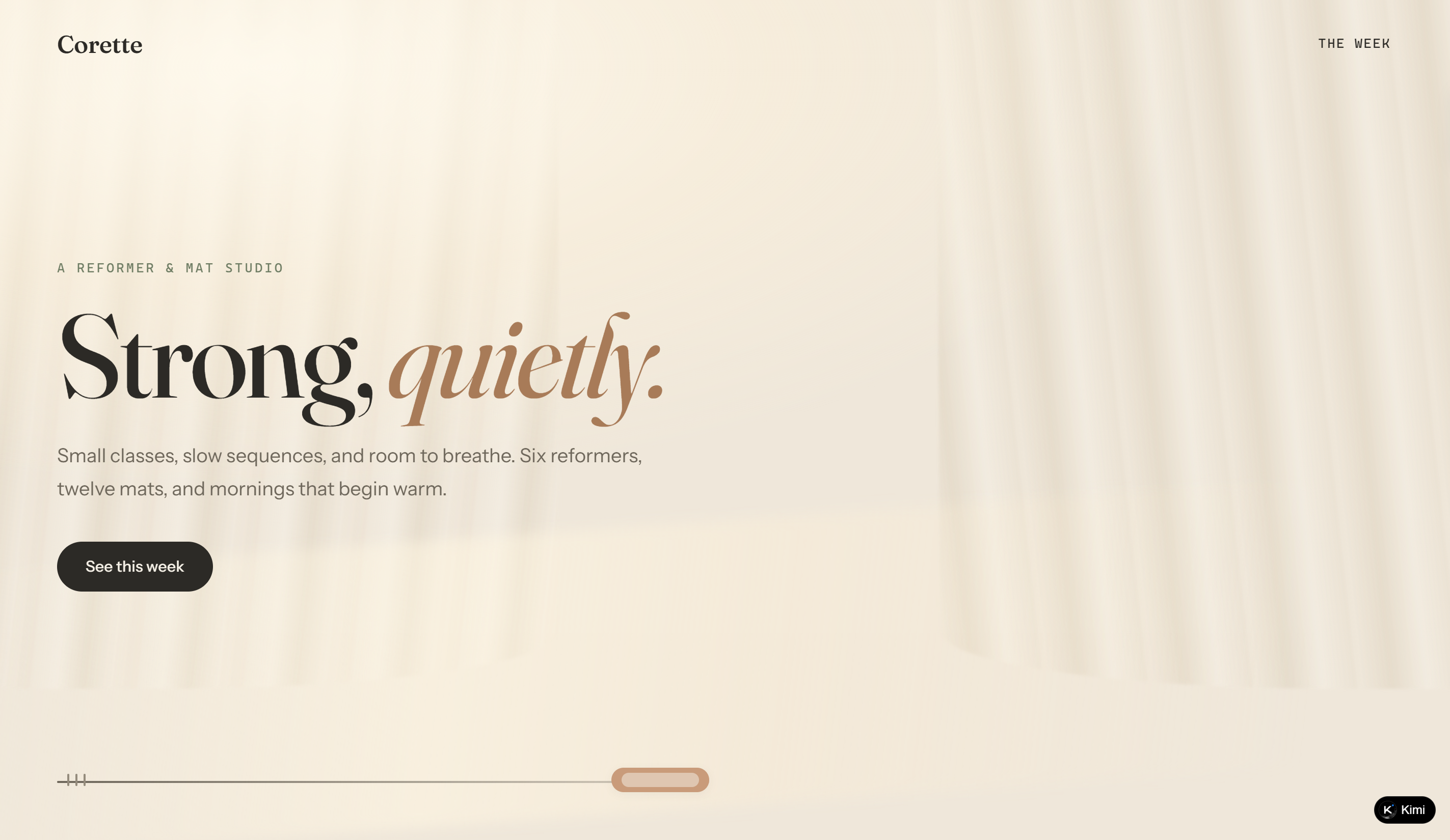
| Corette | https://rub42rnw4cok2.ok.kimi.link/ | Pilates class booking | Weekly class timetable, instructor and class filters, real-time availability indicators, and a personal booking dashboard. |
| Bram & Blade | https://isvft3qsxwwme.kimi.site/ | Barbershop appointments | Clearly priced grooming services, barber selection, appointment duration details, and a first-visit customization option. |
| Snefald Lodge | https://4lsc5ar5rzdfm.kimi.site/ | Cabin rental reservations | Individual cabin listings, seasonal pricing, interactive weather diaries, and a dynamic booking summary. |
| The Velvet Lock | https://6ne2y5uhwtnxk.ok.kimi.link/ | Escape room reservations | Story-driven experience listings, difficulty and availability indicators, multi-step ticket booking, and personal reservation management. |
| Bloomhouse | https://p6rrkpubacm5i.kimi.site/ | Afternoon tea reservations | Curated tea menus, seasonal storytelling, seating-time selection, flexible table preferences, and occasion notes. |
10 booking page examples to get inspired
Whether you're creating a booking page for appointments, consultations, or reservations, the design should make things easy for visitors. The following websites offer different approaches to presenting services and guiding customers through the scheduling process. Let's take a look at what each one brings to the table.
Cinder & Sage
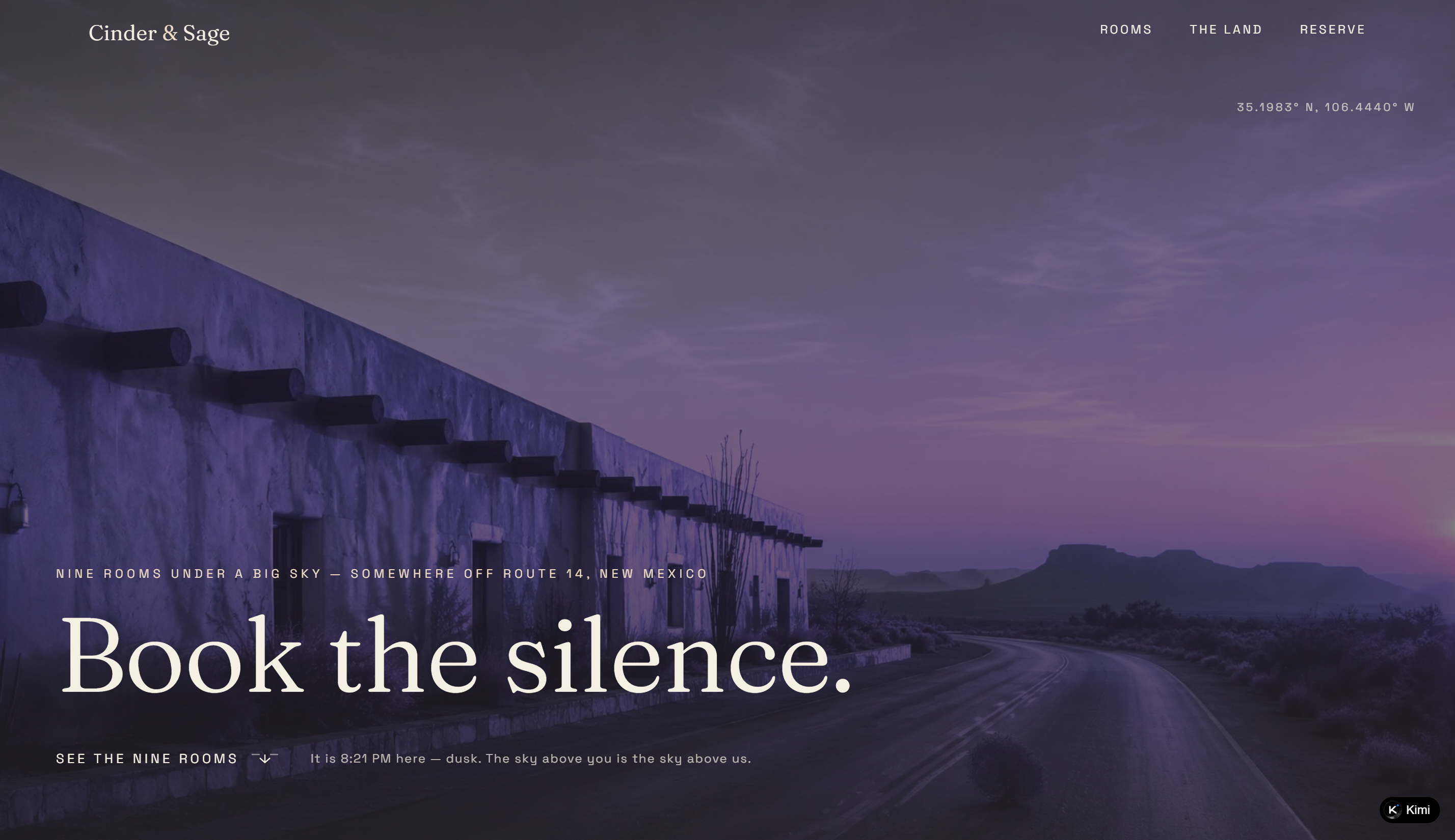
Cinder & Sage is a boutique desert inn in New Mexico, featuring nine thoughtfully designed rooms surrounded by vast desert landscapes. Its booking page combines immersive storytelling with detailed room listings, creating a distinctive reservation experience centered on privacy, nature, and tranquility.
Key characteristics
Immersive visual storytelling: Uses atmospheric desert photography, location details, and evocative copy to establish a strong sense of place and convey the inn's peaceful, secluded atmosphere.
Detailed room listings: Showcases nine individually named rooms with descriptions, photos, occupancy limits, nightly rates, and unique features, helping guests understand what makes each stay different.
Category-based room filtering: Organizes accommodations into categories such as Patio, Pool, and Dune View, allowing visitors to browse rooms based on their preferred setting and amenities.
Distinctive booking experience: Use concise, inviting CTAs such as "Book the silence" and "See the nine rooms" to guide visitors from exploring the property to making a reservation.
Transparent property and booking information: Provides practical details including location coordinates, contact information, minimum-stay requirements, pet policies, and reservation terms, helping guests make informed booking decisions.
The Cedar Counter
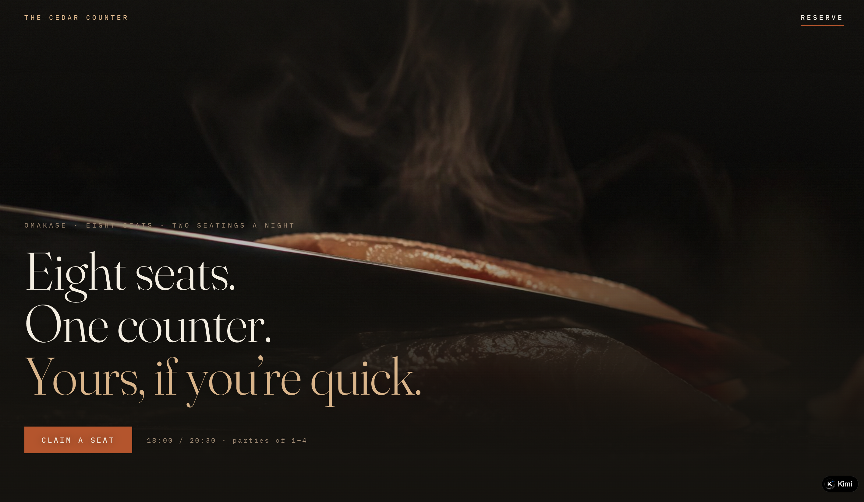
The Cedar Counter features an omakase restaurant booking page built around an intimate dining experience and limited counter seating. The page introduces the restaurant's atmosphere, presents a seasonal 18-course tasting progression, and guides guests through a structured reservation process. Its minimalist design and storytelling approach make the dining experience feel exclusive while keeping essential booking information accessible.
Key characteristics
Immersive restaurant storytelling: Introduces the history and craftsmanship behind the signature cedar counter, using detailed descriptions and atmospheric imagery to establish the restaurant's identity.
Seasonal omakase menu: Showcases an 18-course tasting progression with individual dish names and ingredient descriptions, helping guests understand the dining experience before booking.
Clear dining policies: Outlines important reservation requirements, including seating times, late-arrival rules, dietary restrictions, fragrance policies, and phone arrangements.
Interactive reservation calendar: Displays multiple months of booking dates, with unavailable dates crossed out and reservations opening within a rolling 60-day window.
Structured booking process: Breaks reservations into five steps: date selection, seating time, party size, seat selection, and confirmation. Guests can also see available seating times and party-size restrictions upfront.
Foamline
Foamline features a surf school booking page with a relaxed coastal aesthetic and a straightforward reservation experience. Visitors can browse different surf lessons, check pricing and session details, and follow a guided booking process to arrange their surfing experience.
Key characteristics
Multiple lesson options: Offers group lessons, semi-private sessions, and children's lessons, each with clearly displayed prices and session durations.
Step-by-step booking process: Organizes reservations into five stages: lesson, tide and time, surfer details, board selection, and ticket confirmation.
Tide-based scheduling: Includes a tide chart to help visitors choose a suitable lesson time based on surfing conditions.
Transparent lesson details: Highlights group sizes, instructor arrangements, equipment inclusions, and age requirements, helping visitors understand what each session offers.
Engaging visual identity: Uses ocean-inspired colors, coastal imagery, and friendly, informal copy to establish a recognizable surf-school brand.
Hollowbone
Hollowbone features a tattoo studio booking page centered on custom blackwork designs and artist consultations. Visitors can explore individual artists and their portfolios, browse available flash tattoo designs with estimated prices, or submit custom ideas. The page also provides a consultation booking system that lets clients select an artist and choose an available 30-minute time slot without an upfront deposit.
Key characteristics
Artist profiles and portfolios: Introduces three tattoo artists, highlighting their specialties, consultation schedules, and healed tattoo examples to help visitors find an artist whose style matches their preferences.
Available flash designs: Displays ready-to-claim tattoo designs with reference images, placement suggestions, estimated prices, and assigned artists. Availability is clearly indicated for each design.
Custom tattoo requests: Provides a dedicated form for submitting design ideas, preferred artists, body placement, contact details, and budget ranges.
Real-time appointment scheduling: Organizes available 30-minute consultation slots by date and artist, allowing clients to select a convenient time.
Transparent booking policies: Clearly explains consultation requirements, deposit arrangements, and appointment rules, helping clients understand the process before booking.
Oxide & Oak
Oxide & Oak Sound features a recording studio booking page with a distinctive vintage analog aesthetic. The page introduces three professional recording spaces, highlighting their equipment, acoustic features, and daily rental rates. Musicians and recording teams can explore each room and use a guided booking process to select a studio, choose an engineer, schedule a session, and provide booking details.
Key characteristics
Detailed studio room profiles: Introduces three recording spaces, each with dedicated photos, descriptions, equipment specifications, and daily rates, helping visitors choose a room that suits their recording needs.
Transparent pricing and equipment information: Lists the consoles, tape machines, microphones, instruments, and other recording equipment available in each room, alongside clearly displayed rental prices.
Multi-step booking process: Guides visitors through five stages: room selection, engineer selection, date and session block, booking details, and confirmation.
Booking cost summary: Provides an order-style booking overview that displays the selected room, engineer, date, session block, and total cost as visitors complete their reservation.
Distinctive vintage branding: Uses analog recording references, warm wood textures, retro-inspired typography, and studio photography to create a cohesive visual identity that reflects the studio's recording philosophy.
Corette
Corette features a Pilates studio booking page with a calm, minimalist aesthetic and a focus on making weekly class reservations easy to manage. Visitors can browse a full weekly schedule of reformer and mat classes, check instructor names and available spaces, and filter sessions by class level or instructor. The page also includes a personal booking area where users can keep track of their selected classes.
Key characteristics
Weekly class schedule: Displays a complete seven-day timetable with class times, session types, durations, instructors, and remaining spaces, making it easy to plan workouts in advance.
Class and instructor filters: Allows visitors to narrow down available sessions by difficulty level, class type, and instructor to find classes that match their preferences.
Real-time availability indicators: Shows remaining spots for each class and identifies fully booked sessions with waitlist information, helping users quickly assess availability.
Personal booking dashboard: Provides a dedicated section for reviewing selected classes and keeping track of weekly reservations in one place.
Minimalist studio branding: Combines soft colors, understated typography, and spacious layouts to create a calm visual experience that reflects the studio's Pilates philosophy.
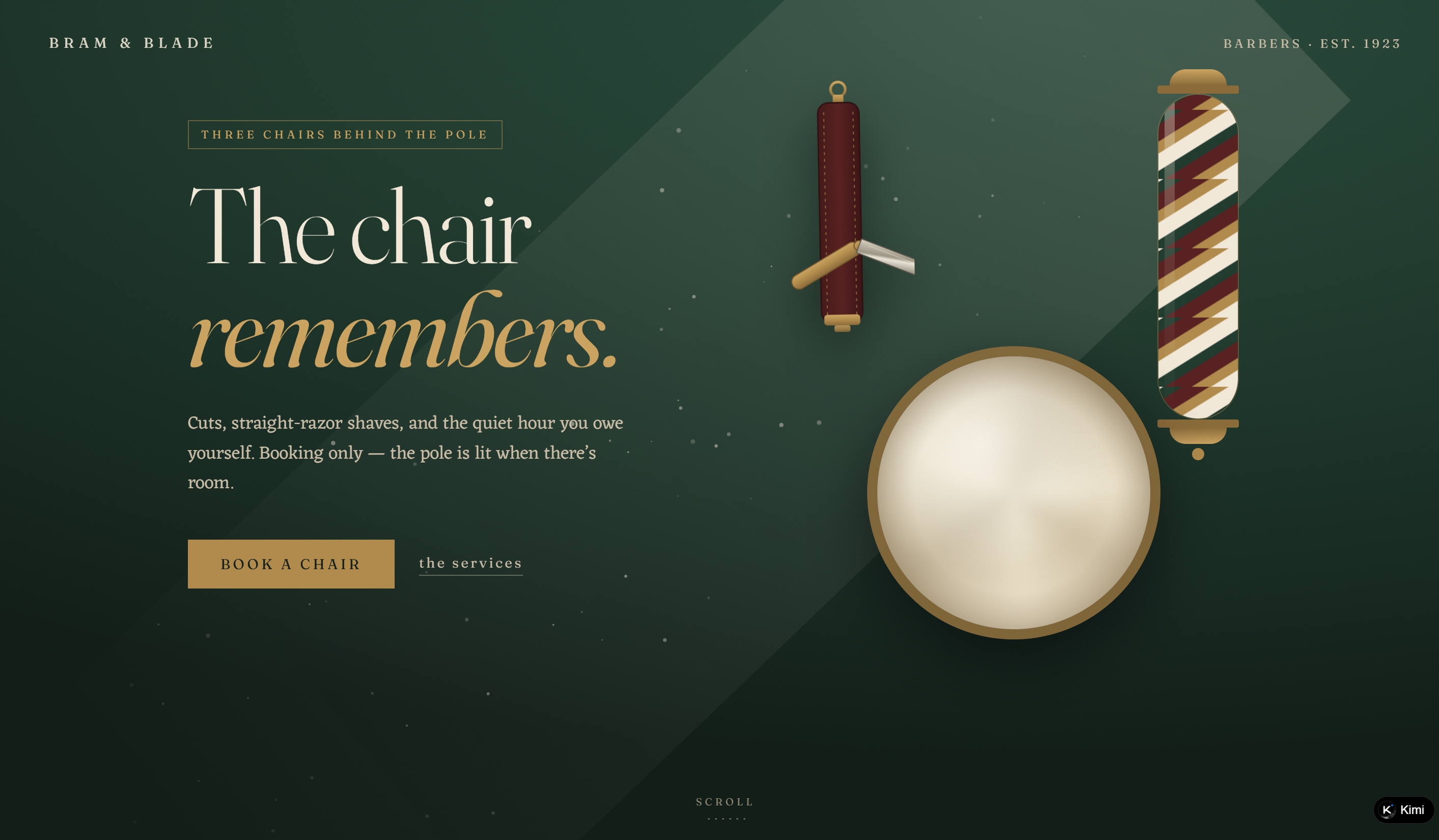
Bram & Blade
Bram & Blade features a traditional barbershop booking page with a vintage aesthetic inspired by classic barber culture. The page introduces three grooming services with clear descriptions, prices, and appointment durations, then guides customers through a step-by-step reservation process. Its straightforward layout and distinctive brand storytelling create a personal, old-school barbershop experience.
Key characteristics
Detailed service listings: Presents three grooming options, including haircuts, straight-razor shaves, and full-service treatments, with individual prices, durations, and service descriptions.
Step-by-step appointment booking: Organizes the reservation process into four stages: service selection, barber selection, chair and time selection, and customer details.
Transparent appointment information: Displays estimated service durations and explains what each package includes, helping customers choose the right grooming experience.
First-visit customization: Includes an option for first-time customers to add extra time to their appointment for a barbershop tour.
Distinctive vintage branding: Uses traditional barber-inspired language, understated typography, and nostalgic design elements to create a recognizable identity rooted in classic barbershop culture.
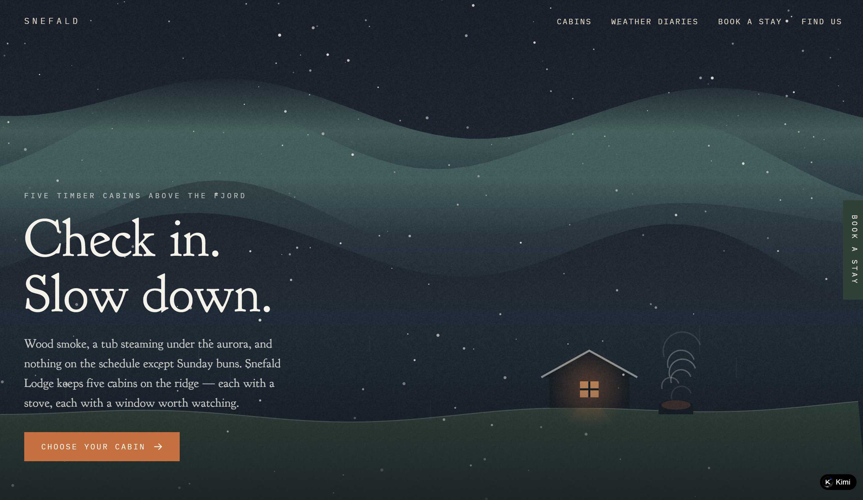
Snefald Lodge
Snefald Lodge brings together five distinctive timber cabins in a nature-inspired accommodation website. Each cabin is presented with its own character, amenities, guest capacity, and seasonal pricing, giving visitors a clear sense of what to expect from their stay. Beyond accommodation details, the website incorporates weather diaries that document snowfall across different years. A four-step reservation flow allows guests to choose a cabin, select their dates, add extras, and provide their booking details.
Key characteristics
Detailed cabin listings: Showcases five individual cabins with descriptions, photos, guest capacities, sauna arrangements, and unique features to help visitors compare accommodation options.
Seasonal pricing display: Provides nightly rates for different seasons, including deep winter, the thaw, midnight light, and ember autumn, making accommodation costs easy to understand.
Interactive weather diaries: Presents historical snowfall records through diary entries and a week-by-week visual calendar, adding a distinctive seasonal element to the website.
Step-by-step accommodation booking: Organizes reservations into four stages: cabin selection, stay dates, additional services, and guest information.
Dynamic booking summary: Displays selected cabin details, dates, seasonal pricing, and extras in a dedicated stay summary that updates as visitors make their choices.
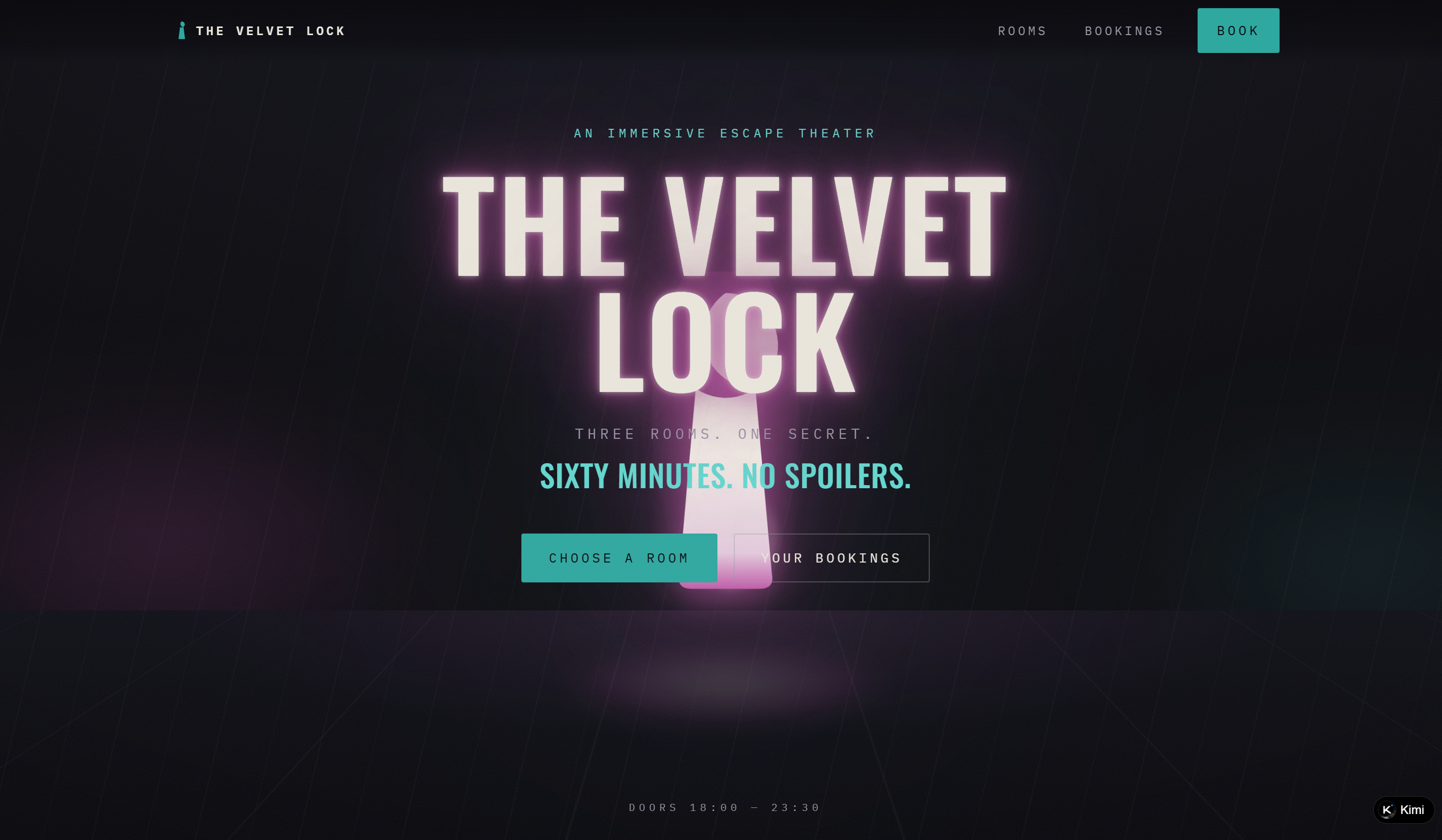
The Velvet Lock
The Velvet Lock turns an escape room reservation into an extension of the mystery itself. Rather than simply listing available activities, the page introduces three fictional escape experiences through intriguing storylines and atmospheric descriptions. Each room has its own difficulty, suspense level, player capacity, and session length. Visitors can choose an experience and proceed through the booking steps, from selecting a date and time to confirming their party size and tickets.
Key characteristics
Themed escape room listings: Showcases three distinct escape experiences with individual storylines and atmospheric descriptions, helping visitors choose an adventure that interests them.
Room difficulty and experience details: Displays difficulty ratings, dread levels, player capacity, and session duration for each room, giving visitors a clear overview before booking.
Interactive availability indicators: Uses visual countdown-style indicators to represent each room's remaining availability, adding urgency to the reservation experience.
Multi-step booking process: Organizes reservations into five stages: room selection, date, time, party size, and ticket confirmation.
Personal booking management: Includes a dedicated bookings section where visitors can review reservations held in their browser, with booking information stored locally on their device.
Consistent immersive branding: Combines theatrical storytelling, mysterious room descriptions, and atmospheric visual elements to make the booking experience feel like part of the escape adventure.
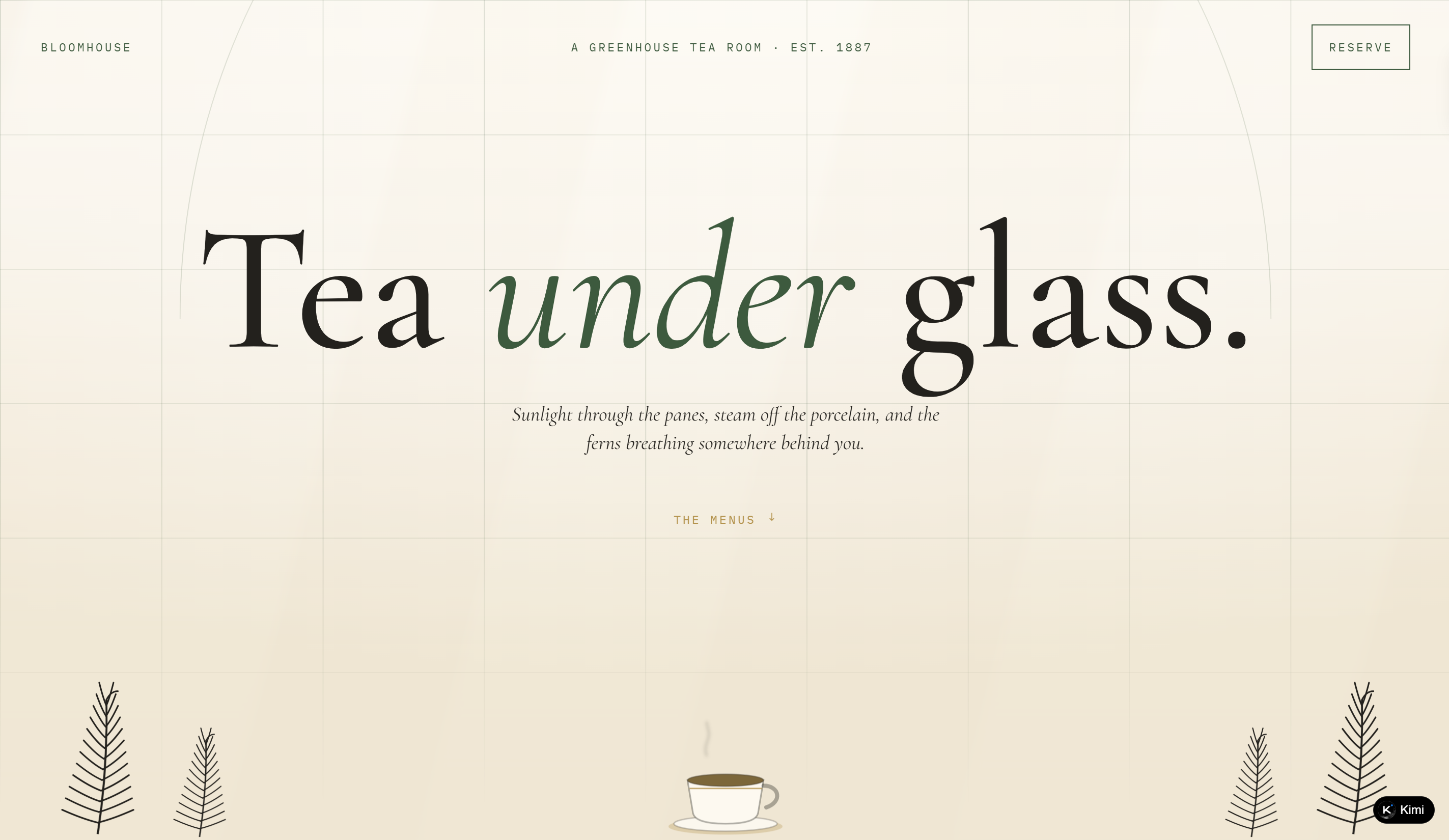
Bloomhouse
Bloomhouse presents an afternoon tea reservation experience set within a botanical greenhouse. The page introduces three distinct tea menus, each with detailed food and drink selections, pricing, and dietary information. Seasonal greenhouse themes run throughout the content, connecting the menu to the plants and ingredients growing throughout the year. Guests can make a reservation by choosing a menu, date, seating time, party size, table position, and occasion.
Key characteristics
Three curated tea menus: Showcases classic afternoon tea, botanical-inspired dishes, and a children's menu, with individual prices, course descriptions, and dietary information.
Seasonal menu storytelling: Introduces four greenhouse seasons, each associated with different ingredients, flowers, and growing conditions, giving the menu a sense of connection to the changing environment.
Seating-time selection: Offers three daily reservation slots, each presented with a distinctive greenhouse setting, descriptive atmosphere, and remaining table availability.
Flexible table preferences: Allows guests to specify party size and choose between window-side seating and tables along the aisle.
Occasion notes: Includes an optional field for birthdays, anniversaries, and other special occasions, allowing guests to share additional requests when booking.
Consistent botanical visual identity: Uses greenhouse imagery, plant-inspired descriptions, and delicate atmospheric details to carry the tea room's garden concept throughout the reservation journey.
Build your own custom booking page with AI
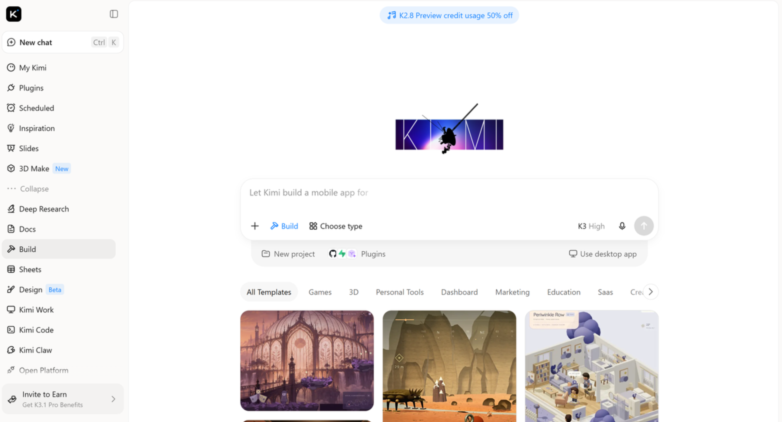
A booking page should do more than display available services. It should reflect your brand, present essential information clearly, and make it easy for customers to get in touch or book an appointment. With Kimi Build, an AI website builder, you can create a custom booking page by simply describing your ideas and design preferences. Add service details, pricing, images, contact information, and booking links, then refine the layout, colors, and typography to create a polished page that fits your business.
Main features
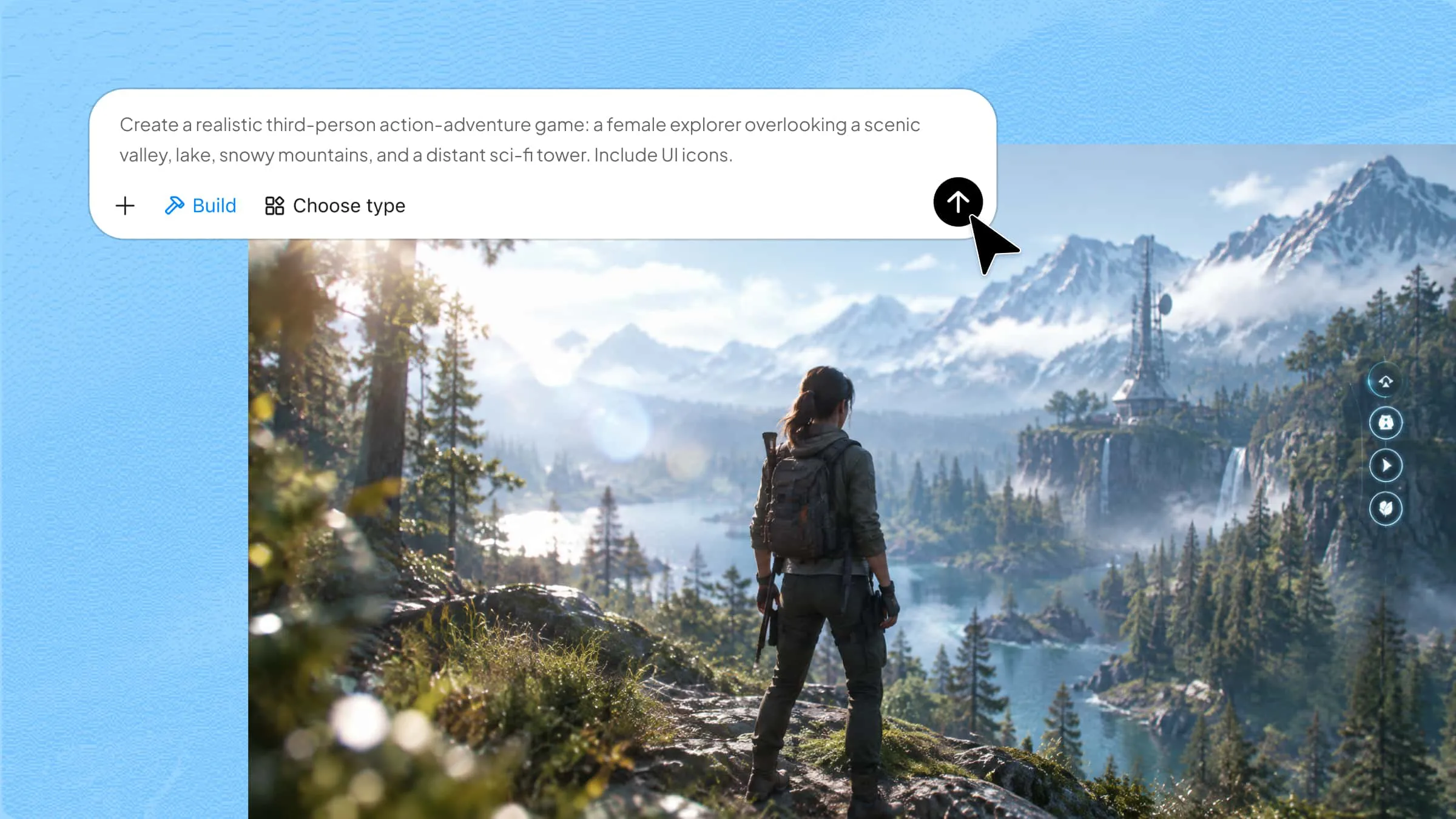
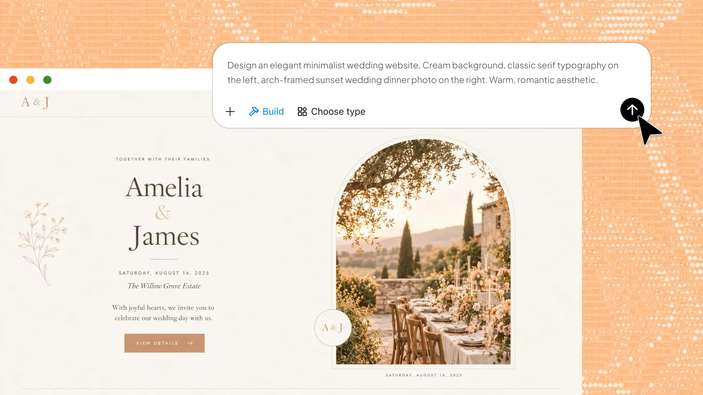
Prompt-based booking page generation with visual references: Kimi Build supports natural-language prompts and file uploads, allowing you to describe your business, services, booking requirements, and preferred design style while providing brand assets, screenshots, or visual references. It turns your input into a customized booking page without requiring coding skills.
Polished visual design with version history: Create booking pages with refined layouts, cohesive typography, engaging visuals, and interactive elements. Kimi Build helps translate your brand identity into a visually consistent website, while version history allows you to revisit previous designs or restore an earlier version.
Flexible AI and manual editing options: Kimi Build supports multiple ways to customize your booking page, including conversational prompt-based editing, targeted edits to specific page elements, and direct manual adjustments. You can refine text, images, colors, typography, layouts, and individual components with greater control over the final result.
Clear service and booking information presentation: Organize service descriptions, pricing, packages, appointment durations, and booking links into dedicated sections. A structured layout and prominent calls to action help visitors understand your offerings and find the relevant booking information.
Responsive previews and easy publishing: Preview your booking page in desktop and mobile views before publishing. Once finalized, publish it with a shareable link that you can distribute to customers or add to your social media profiles.
How to create a booking page with AI
Kimi Build makes it easier to turn a booking page idea into a working website without starting from scratch. You only need to explain what your business offers and how you want customers to book. Let's go through the steps to create your page with AI.
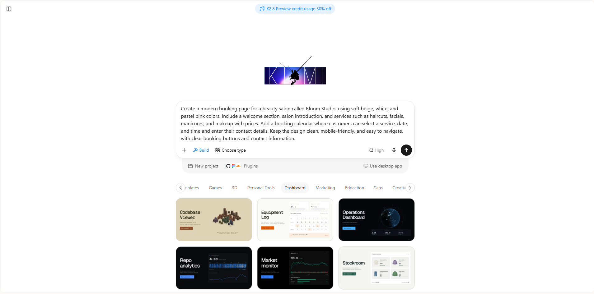
Step 1: Enter a clear prompt
Open Kimi Build and describe the booking page you want to create. Include your business details, services, preferred design, and booking features so AI can generate a page that matches your needs.
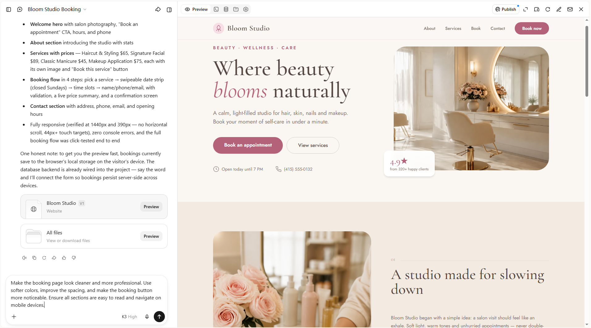
Step 2: Edit your booking page
Once Kimi Build generates your booking page, review the design and refine it using different editing options. Enter prompts in the chat interface to update colors, images, text, service details, or page layouts. You can also click "Edit" to select specific elements for targeted adjustments or make changes manually for more precise control over the final design.
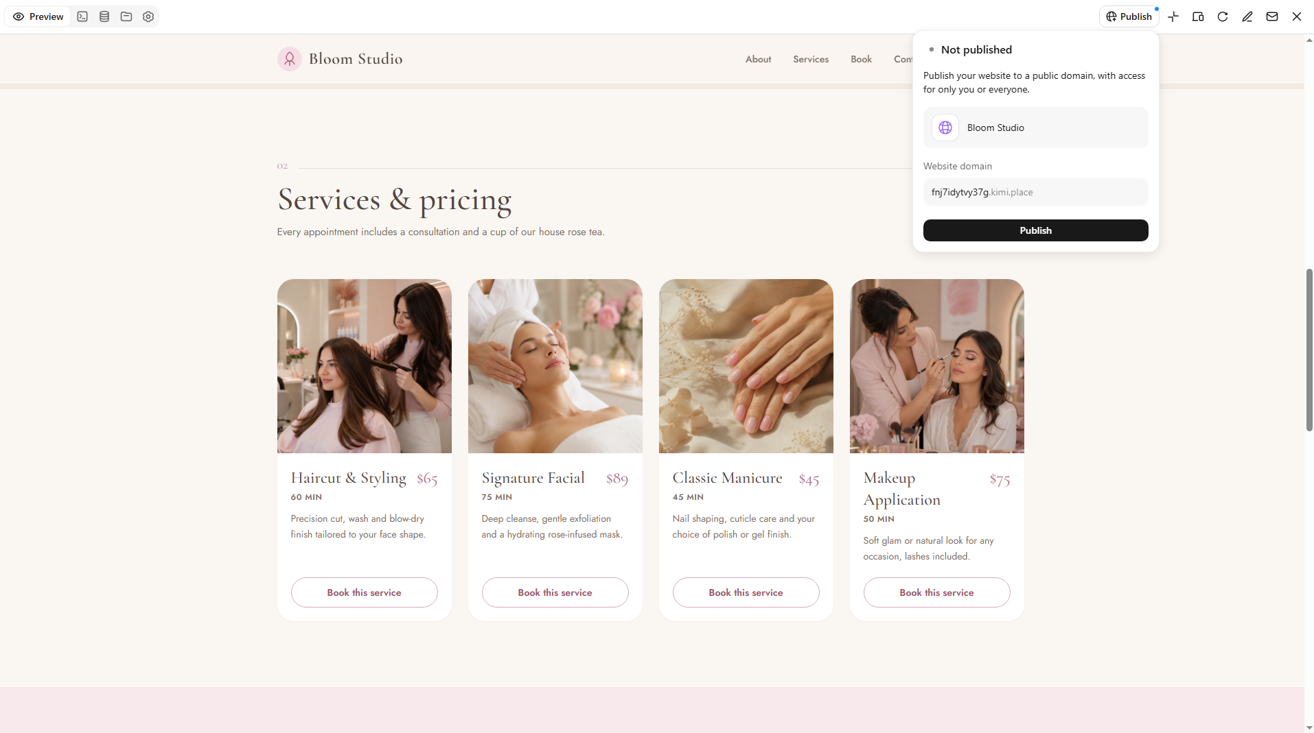
Step 3: Preview and publish
Preview your page on desktop and mobile to check its appearance and test the booking buttons and forms. Once everything works as expected, publish your page and share its link with customers.
What to avoid when designing a booking page
A booking page should make it easy for customers to find the information they need and schedule an appointment without confusion. Even a good-looking design can drive visitors away if the booking process feels complicated or important details are missing. Here are some common mistakes to avoid.
Too many steps in the booking process
Asking customers to complete too many steps before confirming an appointment can make them lose interest. Keep the process short by collecting only the details you actually need. Let visitors select a service, choose a time, and confirm their booking without unnecessary forms or extra clicks.
Unclear service descriptions and pricing
Customers should understand what each service includes and how much it costs before making a booking. Vague descriptions or hidden prices can create confusion and make visitors hesitate. Add short, clear explanations and display prices next to each service so customers know what to expect.
Complicated navigation
Visitors shouldn't have to search through several sections to find the booking option or service details. Use clear headings, simple menus, and visible buttons to help them move around the page. Keep important information easy to access so customers can complete their bookings without getting lost.
Missing availability and scheduling information
Always show available dates, time slots, and opening hours so customers can plan their appointments. If visitors have to contact you just to check availability, the booking process becomes less convenient. Keep your schedule updated to prevent customers from selecting unavailable time slots.
Poor mobile experience
Many customers visit booking pages on their phones, so your design should work smoothly on smaller screens. Make buttons easy to tap, keep text readable, and ensure forms fit mobile displays. Test the entire booking process on different screen sizes to catch layout issues before publishing.
Distracting design elements
Too many colors, animations, pop-ups, or decorative elements can take attention away from the main purpose of your page. Use a consistent color scheme, readable fonts, and relevant images to keep the design balanced. Make the booking button stand out without filling the page with unnecessary visual details.
Conclusion
A well-planned booking page can make your business easier to approach and help customers feel confident about scheduling. Booking page examples show how different designs can serve different business needs. Choose the elements that fit your services and give them your own touch. Want to turn your idea into a website? Try Kimi Build and create a custom booking page with a simple prompt.